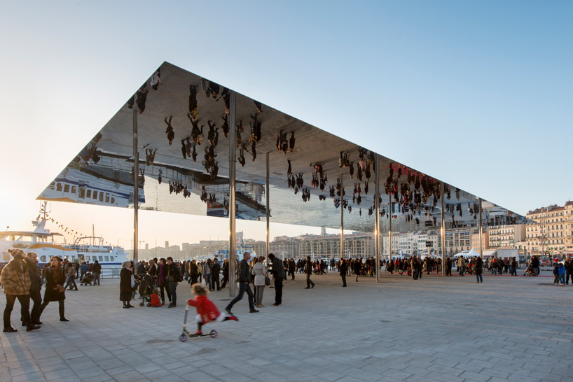
‘vieux port pavilion’ by foster + partners, marseille, franceimage © nigel young / foster + partners
a simple intervention on a french quayside, foster + partners newly inaugurated ‘port vieux’ pavilion is a literal reflection of the idyllic surrounding wharf. the 46 by 22 meter canopy is made of highly polished stainless steel such that it reflects the inverted pedestrian area and harbor at the water’s edge. the project is part of a larger move to reclaim quaysides as civic spaces and is accompanied by the relocation of platforms and clubhouses over the water.
the landscape design was developed by michel desvigne and includes a subtle granite surface that mimics the original limestone cobbles. these elegant and roughly textures materials weave into the port setting and are mirrored in the covered space, which anticipates becoming a space for events, markets and special occasions. while the gleaming pavilion appears to be a quiet silver line on the horizon, the impact of the lightweight steel structure’s underbelly is undeniable. the grand space of the harbor is multiplied and invites users to respect and enjoy the waterscape by becoming both spectator and a component of the spectacle.
UPDATE: the redevelopment of marseille’s ‘vieux port’ was jointly awarded the 2014 european prize for urban public space at a ceremony in barcelona on april, 25th 2014. the biennial prize, which attracted 274 entries from 30 countries, is organized by seven architecture institutions and is the only award of its kind in europe.
 the pavilion reflects the bustling port in marseilleimage © nigel young / foster + partners
 part of a greater revitalization effort, the covered area is envisioned as an event space and possible market place image © nigel young / foster + partners
 spectators can become part of the landscape spectacle image © nigel young / foster + partners
 the horizontal plane of stainless steel mirrors the quayside and pedestrian traffic image © nigel young / foster + partners
FOSTER AND PARTNERS (290)
 Apr 11, 2024
 Apr 03, 2024
 Mar 20, 2024
 Mar 06, 2024
 Feb 09, 2024
PRODUCT LIBRARY
 Apr 02, 2024
 Mar 31, 2024
 Mar 21, 2024
 Mar 20, 2024