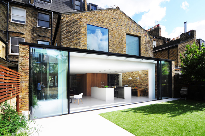
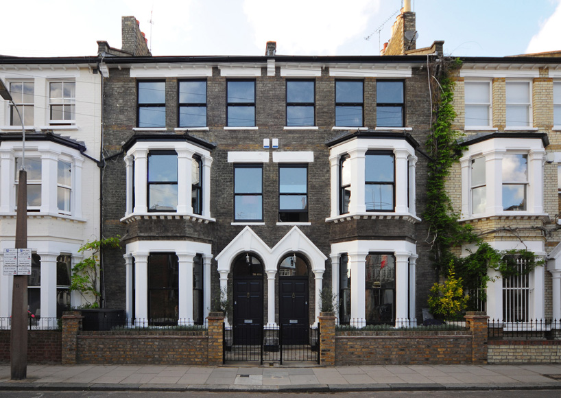
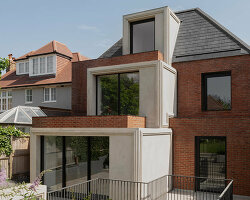
‘homemade’ single family residcence by bureau de changefront facade
‘homemade’ is the first residential scheme by london-based design studio bureau de change. the project takes two neighbouring houses and merges them into a single family home with a new extension providing a kitchen and living space at the rear of the lot. the plan connects the two properties by opening up many of the dividing walls and creating openings to give visibility, access and a more unified feel.
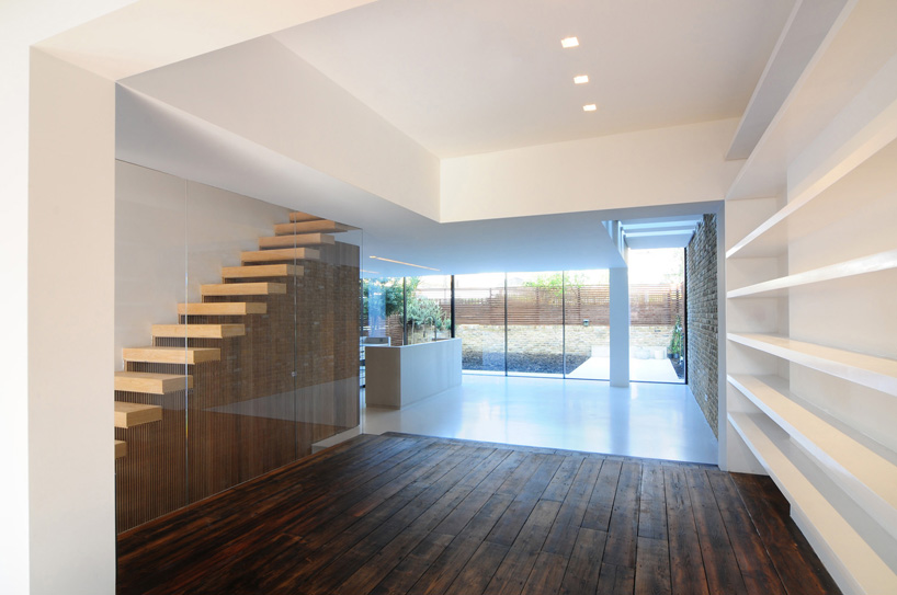
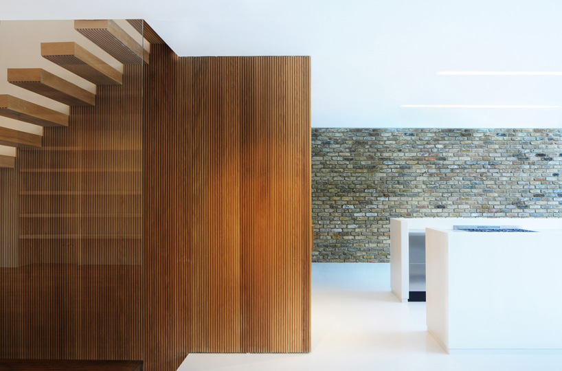
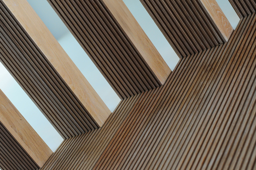
the ‘heart’ of the family space is created through an oak-wrapped box which sits at the meeting point between the original house and the new family room. within this fabric is contained storage, partitions and a new cloakroom. at its edge sections of timber are peeled at right angles to form an open staircase leading to the floors above. beyond this core sits the new kitchen and dining space – created by wrapping the entire rear facade in glass, as though the two buildings are being physically pulled together by the glazing.
 entrance view
the 11 metre-long façade consists of tall sliding glass doors which blur the boundary between the inside and outside. at the edges, the glass doors ‘climb’ over the original building, creating skylights and windows with the same finish and detailing. inside this space, the steel kitchen islands are hidden within two oversized resin shells which appear to have been pulled up from the floor.
 core/staircase
 staircase detail
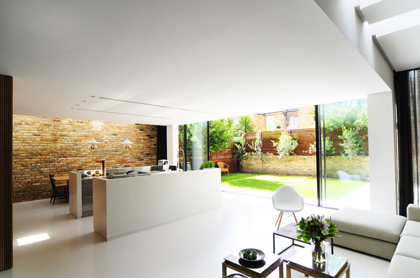 new living area
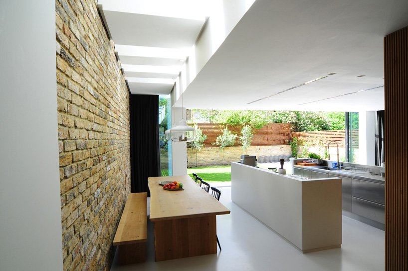 new dining area
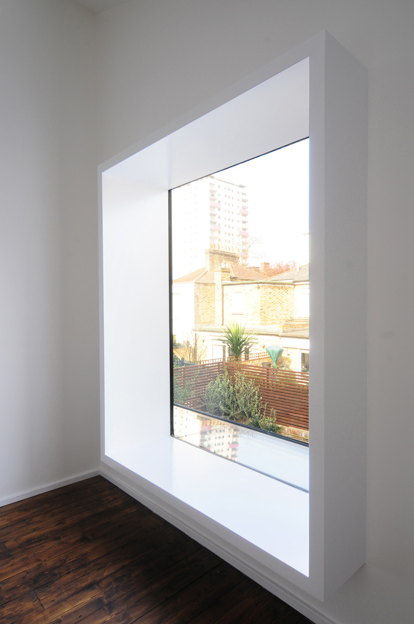 study room window
 entrance
designboom has received this project from our ‘DIY submissions‘ feature, where we welcome our readers to submit their own work for publication. see more project submissions from our readers here.

BUREAU DE CHANGE ARCHITECTS (12)
 Sep 15, 2023
 Jun 01, 2022
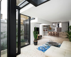 Dec 01, 2020
 Jul 02, 2019
 Mar 29, 2019
PRODUCT LIBRARY
 Apr 02, 2024
 Mar 31, 2024
 Mar 21, 2024
 Mar 20, 2024