‘berlin combines the culture of new york, the traffic system of tokyo, the nature of seattle, and the historical treasures of, well, berlin’, describes professor hiroshi motomura. however, this eclectic urban environment is not only found at its surface, but below it, in its vibrant and bustling underground public transit system. every day, the U-bahn travels a distance equivalent to circling the earth 8.7 times, where a striking personality of colors, graphics and typography comes to life.
pixartprinting’s latest project explores the vast subterranean network through photography, documenting its riders and their personal connection to it. through the stories of dozens of U-bahn passengers, pixartprinting and photographer sebastian spastic offer a private yet personable peek at berlin’s bustling subway system.
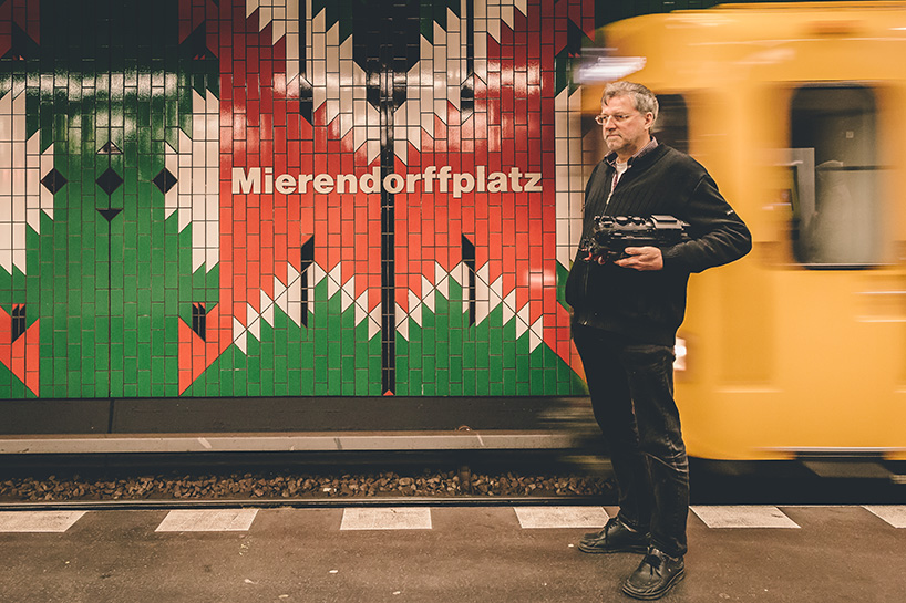
‘homage to heroism’ | hartmut weidemann at mierendorff platz
neighborhood: charlottenburg | year: 1980 | font: transit/futura/verdana/helvetica | colors: green, red, white, and black
discover excerpts about each of the stations and their passengers below, and more stories from the series on pixartprinting.
some berliners say the psychedelic decoration of mierendorff platz gives them headaches. but the inspiration behind the red, black, and white butterfly-like shapes is not lightheaded whimsy. it’s all about the letter ‘M’, as in mierendorff – carlo mierendorff. a socialist politician and scholar, he is one of the heroes of the unsung german resistence to nazism. unfortunately, he did not see the liberation of his country because he was killed in 1943 in an allied bombing on leipzig. the homage to mierendorff was done by rainer g. rümmler, the famed architect from the 1970s. one subway lover, hartmut weidemann, has no problem with the trippy red ‘M’s. of course that’s to expected, since he loves just about everything on rails and runs a specialized shop for model railroad trains, including the U-bahn.
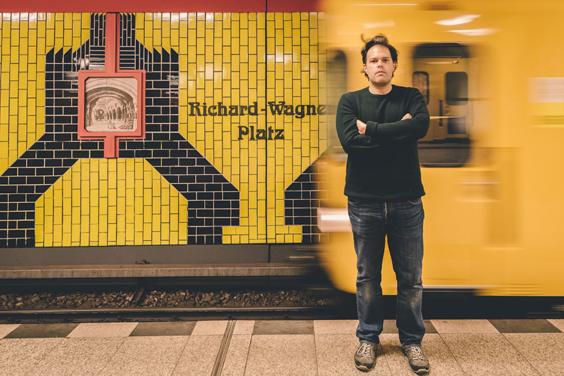
‘berlin’s quintessence’ | george pavlopoulos at richard – wagner platz
neighborhood: charlottenburg | year: 1906 | font: jugendstil | colors: yellow and black
‘this station stands for all the things that I always thought berlin was: there is a famous composer, there is a nazi past, there is colourful design, and there is the transformation of old buildings into new ones…’, says george pavlopoulos to sum up why he loves this station so much. the original was designed by alfred grenander, one of the most prominent architects during the early period of the U-bahn. later, it was redesigned by rainer g. rümmler, the other architect inextricably associated with berlin’s subway. rümmler designed the station using colorful tiles around images of richard wagner’s operas, in homage to the composer’s legacy. the architect also incorporated a series of byzantine-style mosaics from the demolished bayernhof hotel, near potsdamer platz: a transformation and reuse approach that is typical of berlin, george points out.
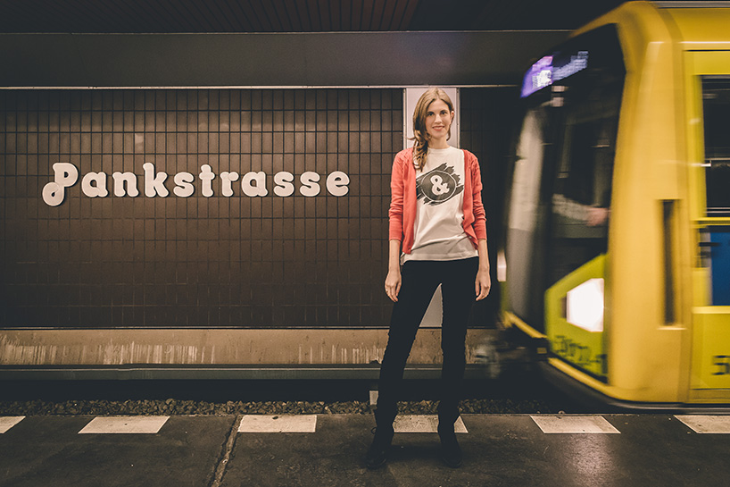
‘opening the bunker’ | charlotte schippmann at pankstrasse
neighborhood: gesundbrunnen | year: 1977 | font: octopuss | colors: black
pankstrasse is a symbol of care and hope for charlotte schippmann. near this station she meets weekly with a 14-year-old migrant girl to mentor her with her everyday problems. she volunteers at schülerpaten berlin E.V., an organization whose offices are close to pankstrasse, too. its objective is to improve educational opportunities for children and encourage cultural exchange. the positivity charlotte associates with the station seems to be confirmed by the funny font (octopuss) in which the name of the station is written. however, the station’s past is dark. just on top of the train lines is one of the few remaining bunkers hitler built all over berlin when he sensed the end was near. the bunker was maintained during the cold war. it could house more than 3,000 people for half a month in case of a nuclear attack. the bunker corridor leads directly to the U-bahn station platform. in the event of an emergency, two trains would stop there to hold more people.
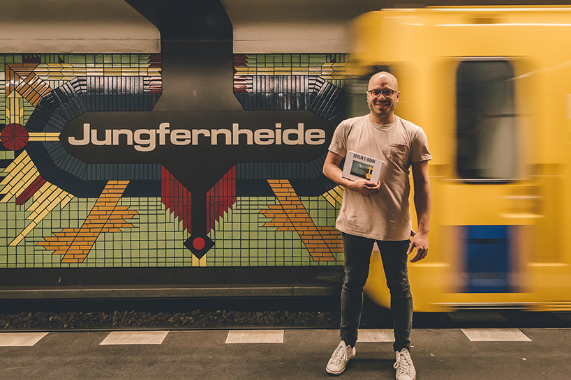
‘underground forest’ | justin raymond merino at jungfernheide
neighborhood: charlottenburg | year: 1980 | font: eurostile extended | colors: green, yellow, red, blue, and black
jungfernheide means ‘maidens’ forest’, named after a large forest that once stood near the station. cultural activist justin raymond merino believes that a new forest has replaced it – underground. merino runs kulturspace, a brand and design consultancy that also publishes books and organizes events. last year he was approached by a photographer, claudio galamini, who had spent months photographing all 173 stations of berlin’s underground, waiting for the right moment for each platform to be completely devoid of people. ‘it’s a surreal visual experience looking at these pictures as opposed to standing on the platform in the flesh, where we’re so often distracted by the chaos and bustling crowds that we forget to appreciate the history and art surrounding us’, says justin.
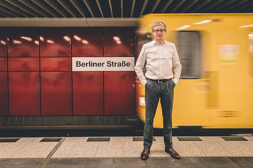
‘plea for preservation’ | udo schmitz at berliner strasse
neighborhood: charlottenburg | year: 1971 | font: transit/futura/verdana/helvetica | colors: red
‘the subway station berliner straße is as west berlin as it can get’, says udo schmitz about this iconic station covered in intense red panels. one of the more heavily trafficked in berlin, the station was built in 1971 by the unique architect rainer g. rümmler, whose list of accomplishments includes schools, pavilions and three U-bahn stations. udo, a graphic designer, is working on an art project aimed at capturing the belief in progress during rümmler’s years, the 60s and 70s.
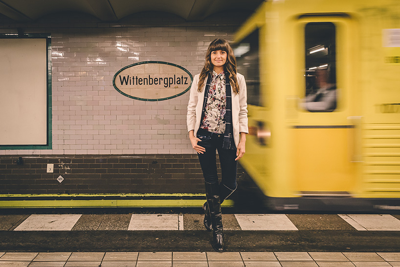
‘endless inspiration’ | nele blu at wittenbergplatz
neighborhood: schöneberg | year: 1902 | font: transit/futura/verdana/helvetica | colors: white, green, and black
the beautiful art nouveau entrance hall at wittenbergplatz station fired the imagination of the young nele blu, when she first went to berlin from her town in the lausitz region. ‘that station was my first stop, and it still is, whenever I get back from a trip,’ she says. built in 1913 by leading U-bahn architect alfred grenader, the station is one of the oldest in berlin. one of its platforms features a sign with the station’s name in the distinctive round, red and blue style of signage on the london tube. it’s not a coincidence. the sign was donated by london transport in 1952 to commemorate the 50th anniversary of the U-bahn.
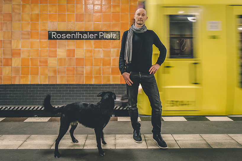
‘crossing point’ | mathias bratsch at rosenthaler platz
neighborhood: brunnenstrasse | year: 1930 | font: transit/futura/verdana/helvetica | colors: orange and black
‘rosenthaler platz stands for the departure point into a new era’, says mathias bratsch. the place has been an important junction since its creation. it once hosted the rosenthal gate, a roman-like triumphal arch with columns, that was the only point through which jews could enter berlin. after being a ghost station for decades, it became a border crossing once the wall came down. ‘then, people from east and west came together: this is the symbol of intercultural understanding’, says matti. he is in love with the orange color of the tiles, the inspired choice of alfred grenander, the architect who designed most of the early underground stations in berlin.
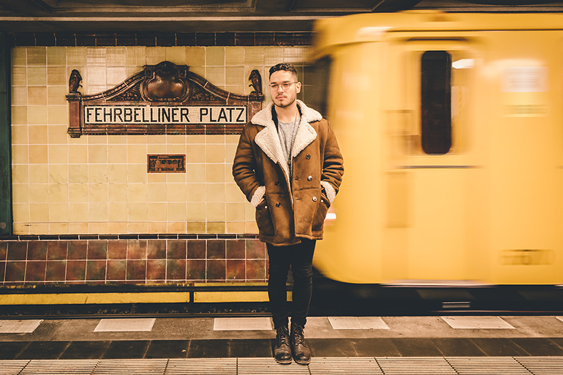
‘mother lode of creativity’ | arthur lagoeiro alvarenga at fehrbelliner platz
neighborhood: wilmersdorf | year: 1913 | colors: cream and brown
the 1970s facade of this station is often compared to an oil platform set down in the middle of the city. according to arthur lagoeiro alvarenga, berlin’s U-bahn is filled with riches, but not of the black gold variety. ‘on friday and saturday nights, young groups of every tribe hop inside the subway cars: people with all sorts of clothes, hair, skin, eye colors…’, says this brazilian who has ‘simply fallen in love with the city’s freedom, acceptance and creative impulse’.
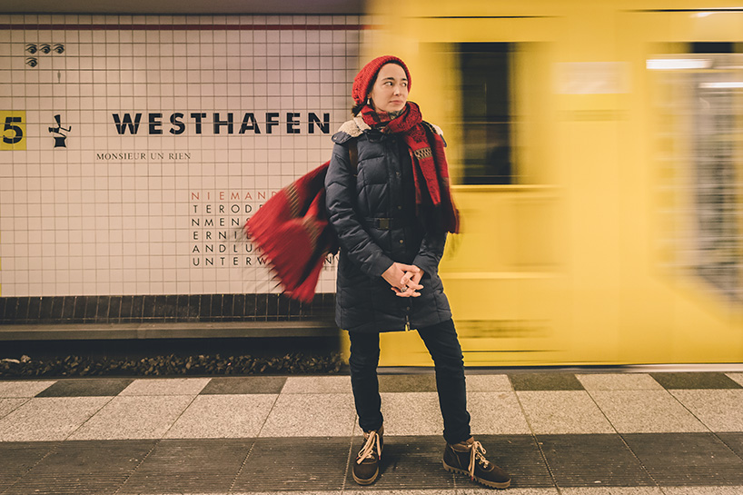
‘crossroads of style’ | elisa zeller at westhafen
neighborhood: moabit | year: 1961 | font: transit/futura/verdana/helvetica | colors: ivory
‘I love using the underground because people with very different cultures and styles mix there’, says elisa zeller, a jewelry designer. ‘I see a woman close to me with an interesting ring: when I go home, I sketch it and keep the drawing for inspiration.’ a favorite spot for new discoveries is westhafen station, located near west harbor, a gigantic inland port built in 1923 whose bustling activity shaped berlin’s industrial landscape in the 20th century. the station opened in 1961, soon after the building of the berlin wall. in the year 2000, artists françoise schein and barbara reiter erased its gloomy origins with a renovation, including the installation of wall texts from the universal declaration of human rights, and quotes by the writer heinrich heine in both german and french.
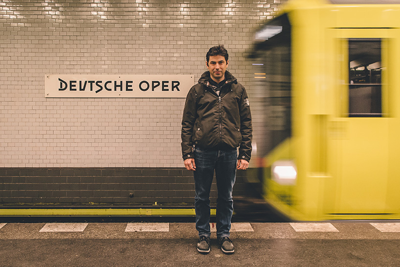
‘architectural masterpiece’ | antonio luque at deutsche oper
neighborhood: charlottenburg | year: 1906 | colors: white and black
antonio luque immediately fell in love with the deutsche oper underground station when he arrived in berlin four years ago. ‘I wanted to work as an architect and I was attracted by the dynamism of the city’, he recalls. the station, which is featured in videoclips and movies, like the 1998 run lola run by tom tykwer, immediately grabbed his attention. ‘I was taken by its elegant metallic structure’, says antonio. then he discovered that its ‘marvelous’ tiles had been designed by the portuguese artist josé de guimarães and given as a gift to the city by the portuguese ambassador. ‘the station is a perfect combination of industrial architecture and the contemporary arts’, he says.
pixartprinting (6)
 Dec 13, 2016
 Oct 11, 2016
 Jul 06, 2016
 May 16, 2016
 Mar 01, 2016
 Mar 01, 2026
 Feb 05, 2026
 Jan 22, 2026