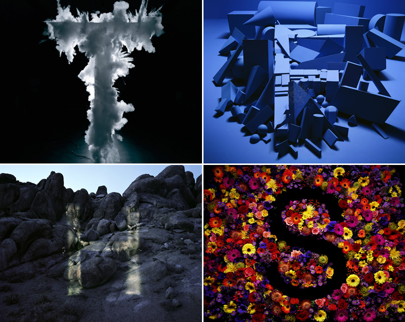
T, F, H and S from dan tobin smith’s ‘alphabetical’ project
‘alphabetical‘ sees dan tobin smith use anamorphosis to create helvetica letterforms.the project started in 2005/6 when creative review commissioned a letter a for their annual.
‘anamorphosis is a technique which dates back to the renaissance and found one of its first uses in photography with an image called ‘the human US shield‘ made in 1913, which shows a staggering 30,000 officers and men of camp cluster forming an enormous US shield. each letter has a different approach but uses helvetica as the base typography. most are temporary installations, some use landscape and some were conceived as primarily moving image (such as Letter T).’ – dan tobin smith


via type token
TYPOGRAPHY DESIGN (133)
 Sep 13, 2023
 Feb 23, 2023
 Jan 24, 2023
 Jan 19, 2023
PRODUCT LIBRARY
 Apr 17, 2024
 Apr 09, 2024
 Mar 27, 2024
 Feb 29, 2024