pantone swatch album art by david marsh
the british graphic designer has developed a series of pantone swatch constructed album art spanning from the 1960's to the present day.
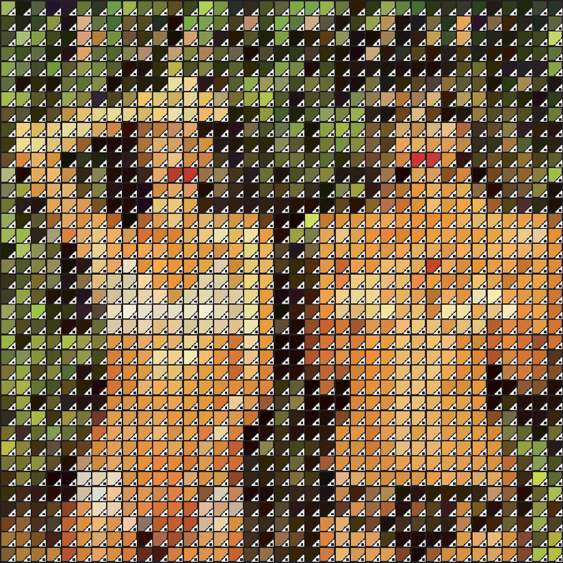 pantone swatch representation of roxy music: ‘country life’ (1974) by david marsh, 2011 all images courtesy the artist
british graphic designer david marsh has sent to designboom the newest additions to his pantone-constructed portfolio. marsh’s experimentation with swatch graphics in adobe illustrator results in artworks developed in as few colors and shades as possible, while still revealing an easily discernible famous image. his most recent abstract pantone-pixel series pictures iconic album art from the 1960’s to the present day revealed through 1369 small color blocks set in a square shape.
the artist elaborates on his process, explaining to designboom– ‘the purpose of this series is my own exploration and development along with the satisfaction I have when I complete an image I like to experiment with image creation and will stumble onto a technique and develop that and then archive it and resurrect it when I have a purpose for it. I will develop this idea into various new directions, the next being actually painting some of the covers that work best, hopefully on a very large scale or using collage to create the image. the options are endless and that excites me‘.
 nirvana: ‘nevermind’ (1991)
 left: new order: ‘true faith’ (1987) right: the smiths: ‘shakespeare’s sister’ (1985)
 the beatles: ‘with the beatles’ (1963)
 frank zappa and the mothers of invention: ‘weasels ripped my flesh’ (1970)
 pink floyd: ‘dark side of the moon’ (1973)
‘the first pantone swatch image I produced was titled ‘pantona lisa’ and was a rendering of that famous painting using the swatch graphics from adobe illustrator, the idea was to represent the artwork in as few colours and shades as possible yet still retain the realisation of the image, this worked brilliantly and so I did several more ‘famous’ paintings, warhols ‘marilyn’ and ‘jackie’, botticelli’s ‘the birth of venus’, vermeer’s ‘the girl with the pearl earring’ and hockney’s ‘a bigger splash’. I love design and print and I am passionate about music, so producing the album covers was an obvious direction to go from the fine art and pop art images.‘ -david marsh
 left: pink floyd: ‘atom heart mother’ (1970) right: primal scream: ‘screamadelica’ (1991)
 david bowie: ‘hunky dory’ (1971)
 left: grace jones: ‘island life’ (1985) right: bob dylan: ‘the free wheelin’ (1963)
 johnny cash: ‘at folsom prison’ (1968)
 patti smith: ‘horses’ (1975)
shop
your own online design shop — no sales commission collected