TOP 10 reader submissions of 2014 – art
art makes a statement. it grabs our attention, connecting with us in multiple ways on conscious and subconscious levels. we received several thousand submissions from our readers, with designers, artists and architects sending through a diverse range of works that we have shared with our audience over the last 12 months.
we believe that maintaining an open dialogue with our readership is extremely important, and we are happy to showcase the high level of original projects of our readership. from a graffiti-covered architectural icon, to a burning table of money, we highlight 10 artistic reader submissions of 2014.
xavier delory imagines corbusier’s villa savoye in a state of decay
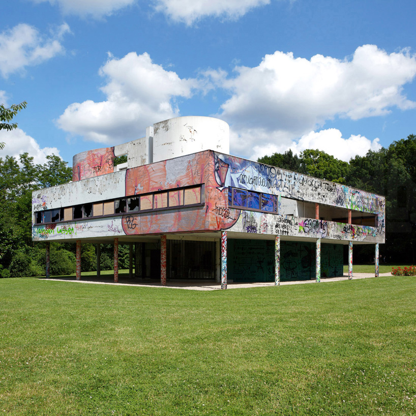
image courtesy of xavier delory
design is constantly contemplating the ways in which it can transcend time, reflecting the values of the current generation while suggesting possibilities for the future. in response, each building, product, and every other creation is an attempt to convey a pristine image, with innovative materials and unprecedented gestures that show no signs of aging. providing more commentary on the subject, visual artist xavier delory has asked ‘what remains of the utopias and the promises of a better future promised by the modern movement at the beginning of the 20th century?’he then elaborates with a quote from ’toward a new architecture’: ’but let’s not kick a man when he’s down, every era carries its own burden, and let’s not spoil our pleasure of ‘the wise, correct and superb play of masses gathered under the light.’ with this mindset, delory has set out to begin what he calls a ‘pilgrimage on modernity’.
qozop swaps the clothing of asian youths with their elders’
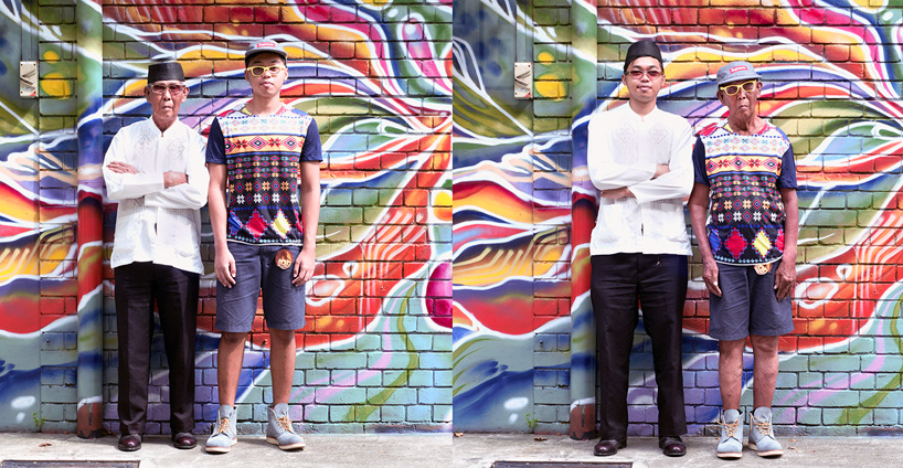
image courtesy of qozop
societal beliefs and traditions are often reflected through the clothing we wear. artist qozop captures this sensibility ever present in asian cultures through ‘spring-autumn’, a series of photographs that juxtapose the dress of youths with that of their elders. though asia has become westernized to a large degree, older generations often still dress in ethnic attire, while teens prefer contemporary styles. revealing the issues of identity and age, qozop swaps the clothing of youths and their elderly relatives, literally placing them in the others shoes. ‘it was easy to get the kids to agree to be photographed, the older folks required a little coaxing.’ qozop explains, ‘but once they have been photographed, they were often curious and amused to see themselves in their son’s or grandson’s attire – some were so comfortable in their new getup that they joked that they wanted to remain in that attire for the rest of the day!’
too much? by amarist + alejandro monge questions the value of money
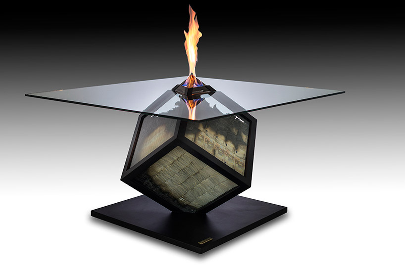
image courtesy of atelier amarist
‘too much?’ by atelier amarist and alejandro monge is an example of when contemporary art and design become one. the sculptural dining table, consists of a glass cube containing partially burnt notes with a thin biofuel flame rising above its surface. each intricate detail was taken into consideration as the artist meticulously reproduced the bills by gluing and coloring each individual piece of paper. yet, according to the artist, ‘the most complicated part of the process was to simulate the effect of burnt paper eaten by flames never using fire to achieve it.’ this required the use of a hyper-realistic technique which simulated the effect of a burning fire morphing and petrifying ashes with resin. consequently, the furnishing is meant to provoke deep thoughts within the mind of the viewer about the significance and value of money, time, and people. ‘a note is a dyed piece of paper that represents a number, 10, 20, 50 dollars, yens, euros. a figure that we exchange in order to acquire something wanted. a figure that within itself has no more value than the one given to the job or the time traded,’ said monge.
javier requejo installs black palafitos stilt houses in spain
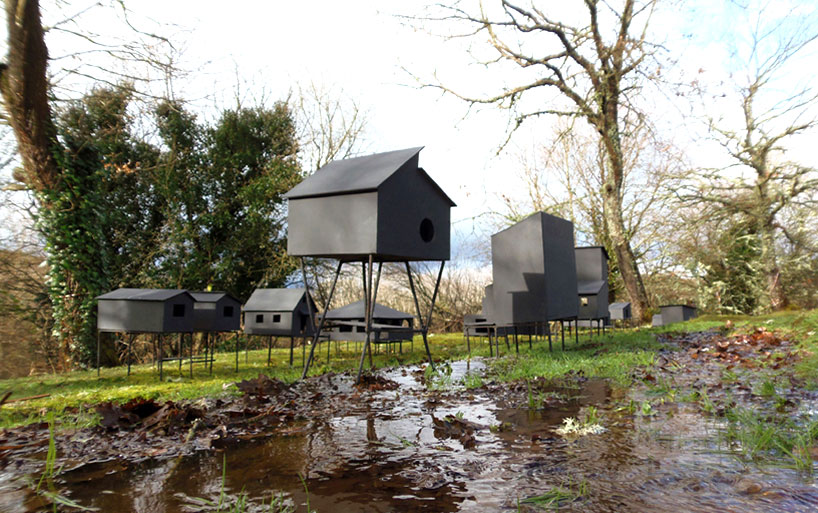
image courtesy of javier requejo
‘palafitos’ by spanish artist javier requejo is an installation of 13 black houses that represent the current economic situation in spain. constructed on stilts, the precariously propped dwellings are reminiscent of typical chilean architecture, where a number of such villages were built throughout the course of the 19th century. the small scale pieces are placed above ground, taking reference from a winter of constant rain, which has seen ‘palafittes’ constructions rise up to resist heavy floods. the use of a dark color and monotone material treatment aims to evoke a sense of mourning, the lack of hope felt in a country suffering from the recent european crisis.
miguel chevalier spreads magic carpets 2014 over sacre coeur in morocco
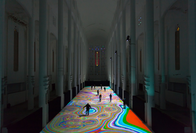
image courtesy of miguel chevalier
‘magic carpets 2014′ by french artist miguel chevalier is an interactive light display spread out across the floor of the former sacré coeur church in casablanca, morocco. covering it with a huge layer of light, the work references the world of biology, microorganisms, and cellular automata – as cells have the ability to multiply in abundance, divide and merge at different paces. pieces come together, fall apart and transform in shape at rapid speeds. the displayed organic universe mingles with a digital construction of overlapping pixels.
suh architects + kolon immerse visitors in kaleidoscopic habitats
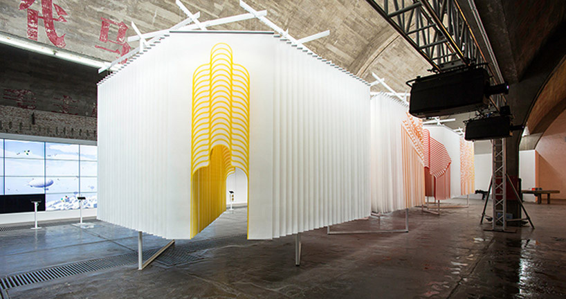
photo © kisu park
‘4 habitats’ is the coalescence of kolon corporation’s vision to establish its global identity and suh architects’understanding of its range of industrial products. the process started with a visit to the korean-based company’s factories, where the architects were introduced to fibers, films, and textiles. this was necessary for the project, as it led to the conscious decision to keep the components in their raw states. after two years of research, spunbond was selected as the main material of choice due to its use of polymer chips that have been cooled, compressed, and bonded into an climate-controlling, energy efficient web.
giant photoshop eraser sticks to london streets
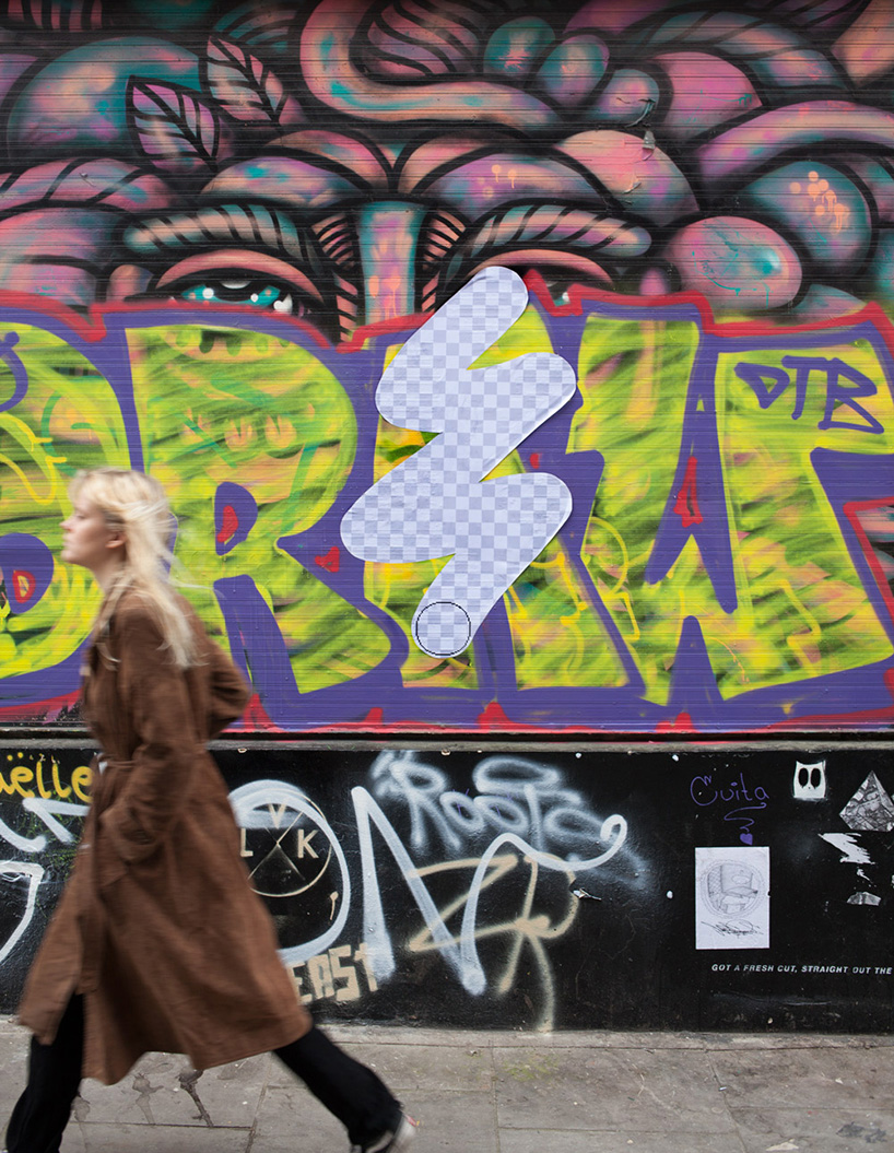
image courtesy of street eraser
two creatives behind the ‘street eraser‘ blog are merging the digital world with the analog, sticking their adobe-inspired art throughout london’s urban fabric. the giant playful labels illustrate the familiar grey and white checkerboard pattern, visible when using the eraser tool in photoshop. eliminating graffitti from traffic signs, color from mailboxes and portions of billboards, the intervention seemingly reveals a concealed world beneath our own. the team says of the digital tool interrupting everyday surroundings, ‘we rather like the idea that it’s hiding under the surface of everything around us.’
daino engages the daily lives of an ant colony with picket signs
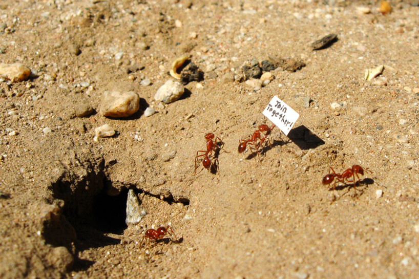
image courtesy of daino
for the project ‘we come in peace’, california-based artist daino enters into a temporary zone of proximity with a colony of ants living in the dirt just outside his riverside home. rather than displace them into his studio space, he comes to them, into the environment that they have built for themselves. as opposed to being there to aggressively wipe them out, he is there to observe them at a distance, participate with them, and join their network. their underground city might be limited, but it constitutes a world and, by entering it, he becomes a part of it.
people with disabilities empowered through mind-generated art
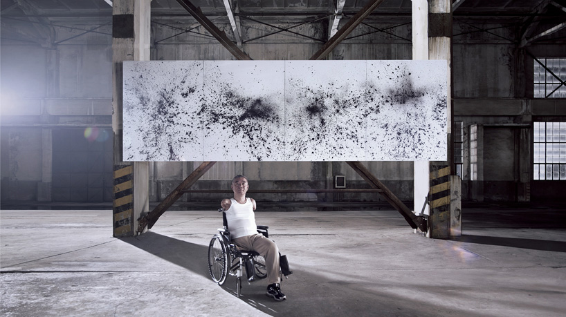
image courtesy of jody xiong
chinese artist jody xiong has collaborated with 16 handicapped people — recruited via social media — in the artistic and technological realization of the ‘mind art’ installation. the project participants were asked to choose a winsor & newton paint color, which was placed in balloons equipped with tiny detonators. large canvas panels surrounded the balloons on all sides.
fabrice le nezet’s elasticity materializes tension in space
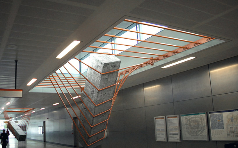
image courtesy of fabrice le nezet
with an urge to constantly explore the intersection between architecture, fashion, and product design, london-based artist fabrice le nezet has created ‘elasticity.’ the work materializes the idea of tension by making the notion of weight and stretch palpable through the use of four massive and abstract metal structures. these components run perpendicularly across the long edges of rectangular voids in the ceiling. by presenting this normal condition, several of the wires bend to support large prisms of concrete that provide a feeling of force and motion. as they drop down to occupy spaces below, movement is emphasized by their strategic orientation below clerestory windows shining light onto the forms. as observers move around the constructs, a contrast is created between the real properties of the materials and the way they are perceived.
to be part of this cultural network, we invite you to join the conversation and submit your work.
see other reader submission articles from the categories of art, architecture and design here.
TOP 10 LISTS OF 2014 (23)
 Dec 31, 2014
 Dec 30, 2014
 Dec 29, 2014
 Dec 27, 2014
 Dec 25, 2014
PRODUCT LIBRARY
 Apr 19, 2024
 Apr 17, 2024
 Apr 09, 2024
 Mar 27, 2024