Elemis retail interiors by matt millington from uk
designer's own words:
British brand Elemis, produces outstanding skin care products, originally formulated for Spa treatments. Elemis’ brief, was to create a global retail design for the brand. Elemis wanted a vision of the ‘ultimate’ in store environment as well as a scaled down version for typical site situations.
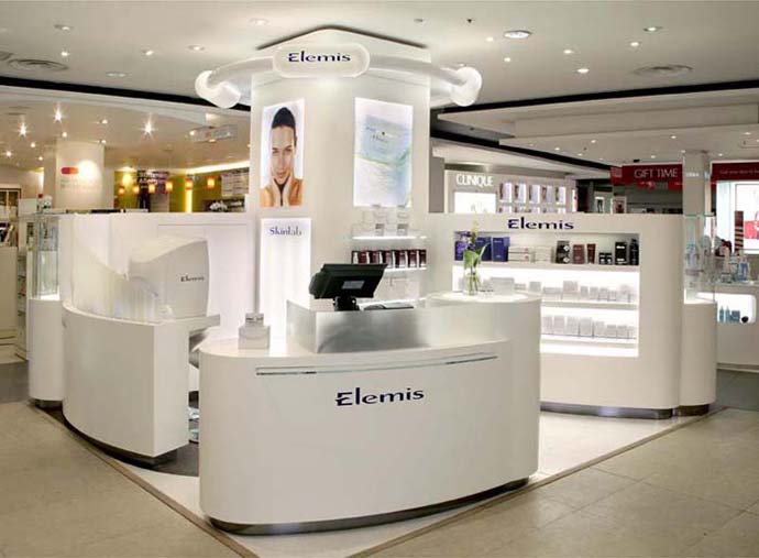
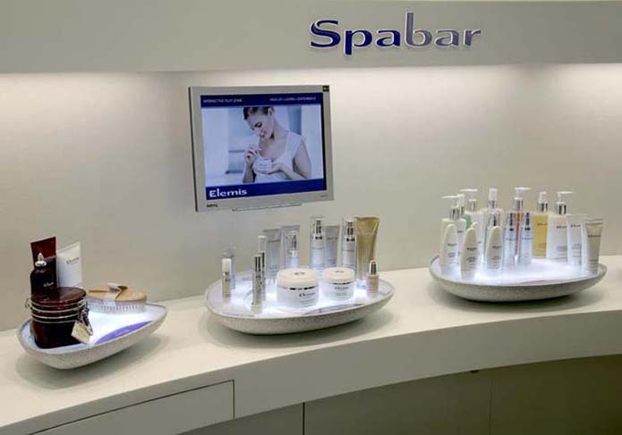
The design concept provided a number of entry opportunities for the customer. Introduction to the brand starts at the Spa bar, where the beauty adviser first takes the customer through the broader aspects of his or her skincare needs. From there it is into the Skin lab where facial mapping helps the customer to understand their skin and treatment needs in greater depth, followed by the Spa pod beauty room. The Spa Pod is also the link to Elemis’ heritage and their world of Spa treatments.
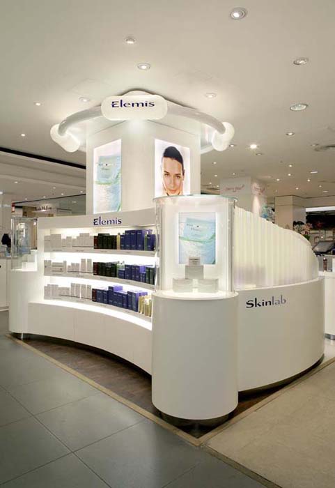
The design concept required that all the materials and particularly the way they are joined were seamless, soft to the eye and smooth to touch as if sculptured from a solid block of material. Corian provided the perfect material to achieve these design objectives and is used throughout the site furniture for the principle surface finish. The ability to join different sections in a seamless fashion, the texture and look of Corian were all perfect for this particular application. Moreover, Corian provided a material that could be shaped or moulded to follow the shapes and contours that no other surface material would allow us to achieve. Other benefits were that we were able to specify a number of elements such as image and movie monitor frames so that they were again truly integrated into the furniture. The material also provided benefits in terms of discrete housing of lighting and the management of cabling throughout the site.
To give definition, the sites also feature a new corrugated pearl acrylic to screen the facial mapping areas and tinted glass to differentiate and highlight particular lifestyle areas around the Spa bar.
Lighting is also a key feature with principle logos back illuminated with bright white LED’s and product highlighted with a slightly softer cool white fluorescent on every shelf. In the Skin lab, tungsten up-lights are used to maximize the spectrum of pink to blue colours intrinsic to the pearlised acrylic. Inside the Spa pod (beauty room) the walls are finished with silk fabric and timber detailed furniture and flooring in dark stained mahogany. Cold cathode, neon and fibre optic lighting is digitally controlled to create different ambient moods.
‘We are totally delighted with the performance achieved especially when you consider that this is a new brand in an already very competitive market’ – Sean Harrington, Managing Director, Elemis.
Designs pictured: Harvey Nichols Knightsbridge
Harvey Nichols Knightsbridge counter
 Product bay
 Interactive display units and Spa Bar