Less by sébastien poupeau from france
designer's own words:
Less, concept
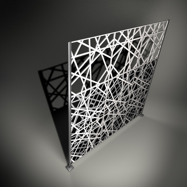
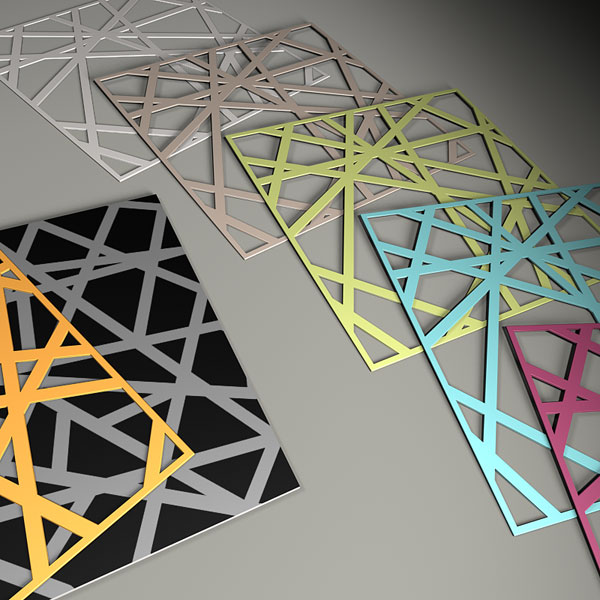
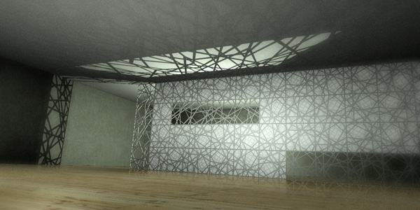
Less is my idea of infinity. This 2D graphic, based on a regular grid, is built up of straight lines with different grayscales in a random way. As the graphic is seamless, one can rotate and mirror the square and play with the numerous possibilities of setting up. The more you add, the more it is interesting. With this graphic, I want to experiment different techniques like sublimation, laser cutting, lithopanie... put them together to see the result. Sometimes it is a panel with variable thickness, sometimes it looks more like a frame.
Full and empty, monochrome and vivid, shadow and light, one and multiplicity, more and less...
Less
 detail
 application
shortlisted entries (121)