
airbnb rebrand – introducing the ‘bélo‘ symbol
today airbnb unveiled a new brand identity designed by designstudio. the rebrand promotes ‘belonging’ as the core value – represented with a new stylized ‘A’ symbol known as the ‘bélo’, accompanied by a custom version of ‘circular‘ by type foundry lineto and a bespoke color called ‘rausch’.
‘previously airbnb didn’t have a brand as we know it. despite being incredibly engaged with the community globally and having a massively successful product, the brand was rooted in the technology and not the people. with this project, we set out to create a top-to-bottom transformation of the airbnb brand to reflect the growing global audience. part of our goal was to design a marque anyone could draw – something that transcended language and formed the foundation of the new brand.’ – designstudio
video introducing the new ‘bélo’ symbol that airbnb will now use.
the new airbnb logotype by designstudio
‘what started as a way for a few friends to pay the rent has now transformed into something bigger and more meaningful than we ever imagined. and what we realized is that the airbnb community has outgrown the original airbnb brand. so joe, nate, and I did some soul-searching over the last year. we asked ourselves, ‘what is our mission? what is the big idea that truly defines airbnb?’
‘for so long, people thought airbnb was about renting houses. but really, we’re about home. you see, a house is just a space, but a home is where you belong. and what makes this global community so special is that for the very first time, you can belong anywhere. that is the idea at the core of our company: belonging.’
‘airbnb is returning us to a place where everyone can feel they belong. like us, you may have started out thinking you were just renting out a room to help pay the bills. or maybe you were just booking a bed for a night on an unexpected layover. however we first entered this community, we all know that getting in isn’t a transaction. it’s a connection that can last a lifetime. that’s because the rewards you get from airbnb aren’t just financial—they’re personal—for hosts and guests alike.’ – brian chesky, CEO and co-founder of airbnb
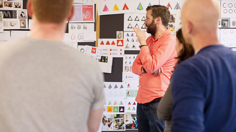
designstudio and airbnb team reviewing early proposals.
‘having never actively sat down to design an overall brand beyond a series of logos to meet the needs of a rapidly growing business, the founders identified the importance of this to be able to push the company forward to the next level. we had unparalleled access to joe gebbia and brian chesky, two of the founders of airbnb. both are trained designers who understand the value and power of a design-led business and the need to create a brand to match.’ – designstudio
‘no two briefs are ever the same. for this reason, designstudio has no prescribed method or off-the-shelf solutions for our clients’ creative challenges. we know how important collaboration is, and so as true partners, we worked between the US and UK, camping out at airbnb’s san francisco headquarters in a pop-up studio with an open door policy, as well as our own london studio. this enabled us to have fluid conversations, flash sessions and stakeholder access to quickly overcome the challenges of a rebrand of this scale, before returning home for focused creative sprints and the eventual creation of the chosen route.’ – designstudio
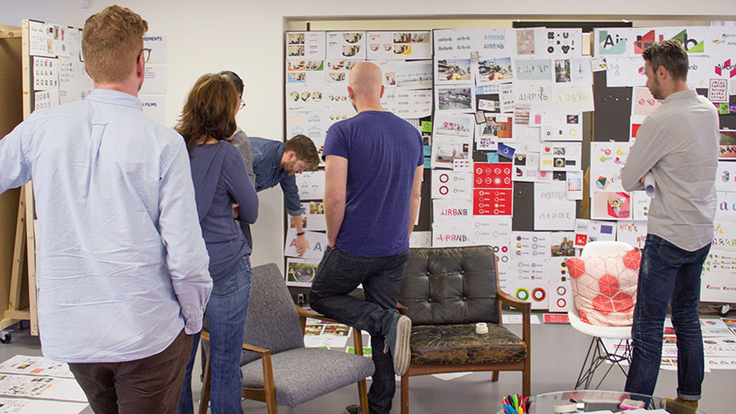
designstudio and airbnb team reviewing early proposals.
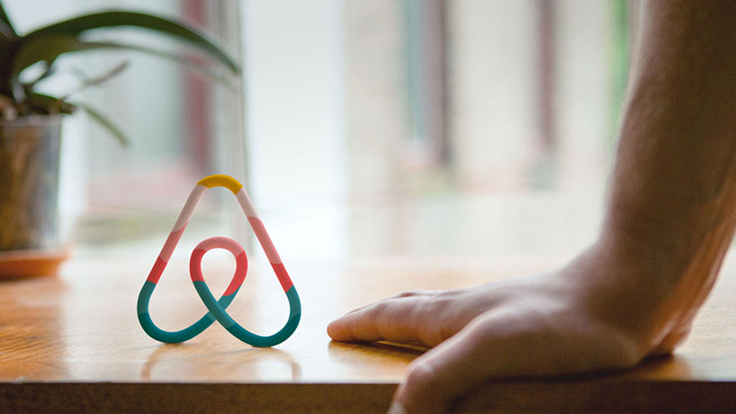
the ‘bélo’ symbol
the bélo is a simple ‘universal’ mark designed with the idea that anyone can easily draw and recognize it. as explained in the video above it stands four things: people, places, love and airbnb.
the ‘bélo’ is described as a ‘community mark’ – one that can be expressed differently by each community member and in every listing through an online application called ‘create airbnb’ which is housed on the airbnb website. the app allows for modifications in color, textures, line styles and much more. community members can stretch bélo’s flexibility to the limit at times but given the symbol’s simplicity it does seem to work no matter how much it’s customized.
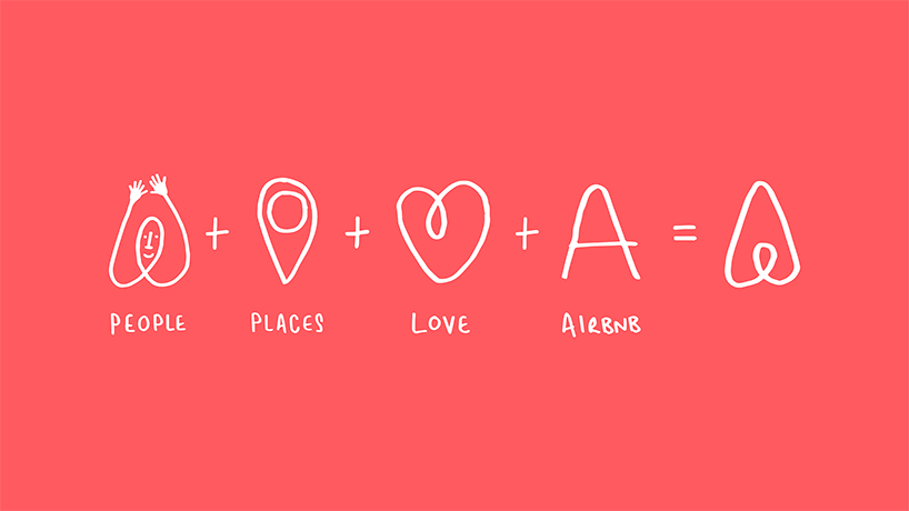
the bélo stands four things: people, places, love and airbnb.
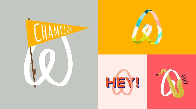
variations of the bélo created by the airbnb community using ‘create airbnb’.
‘with create airbnb, we’re letting everyone create their own unique symbol under our shared banner. this homemade symbol can be as unique as every one of us, and it will always be a little different whenever you meet it. so we want you to make your own unique symbol, and we’ll help you bring your story to life with merchandise that showcases the experience you’re proud to provide.’ – brian chesky
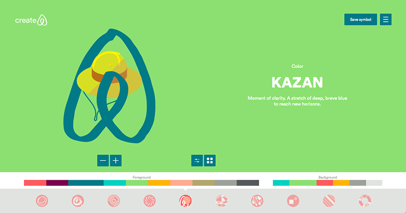
create airbnb – a digital platform to enable community members to truly participate into the visual brand.
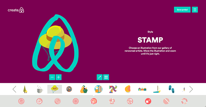
create airbnb – an interactive online tool where any airbnb user can create their own symbol of belonging, and share their story.
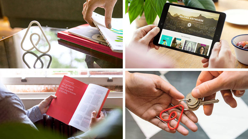
physical application of the the bélo.
color
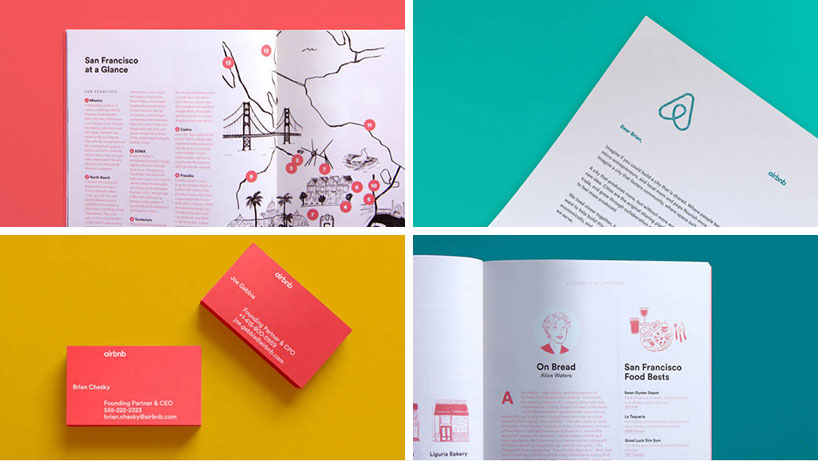
the bespoke color ‘rausch’ is named in honor of the street where airbnb was founded. designstudio describe it as a color of ‘passion’ but ‘without the aggression of pure red’. rausch is supported by a secondary palette, with colors and names drawn from continents and world cities.
various applications of the bélo and new brand language.
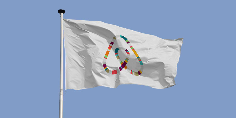
multicolored application of the new symbol.
various applications of the bélo and new brand language.
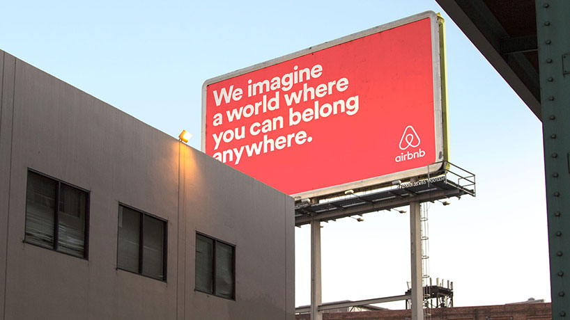
billboard advertising showing the custom version of ‘lineto’ in use.
typeface
the custom version of ‘circular‘ will be used for the logotype and across all print and digital products.
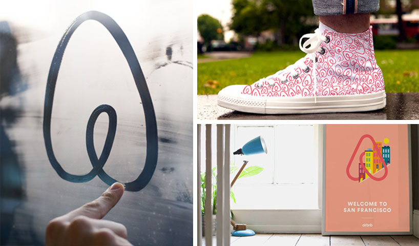
the belo can be drawn easily by anyone.
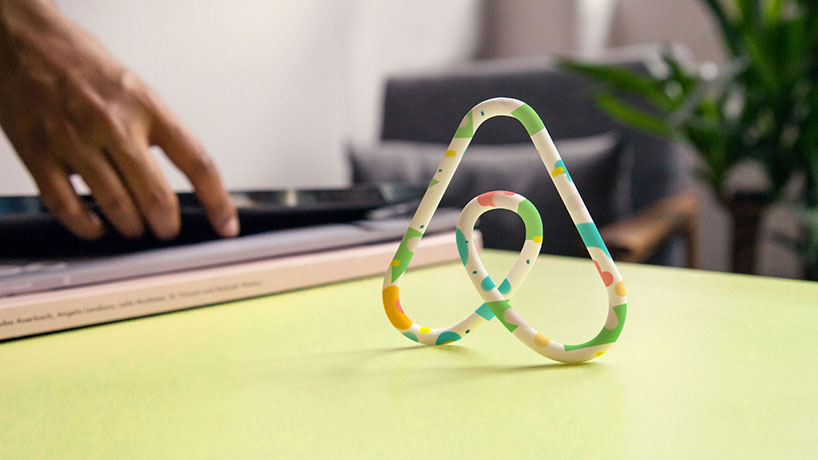
physical application of the the bélo.
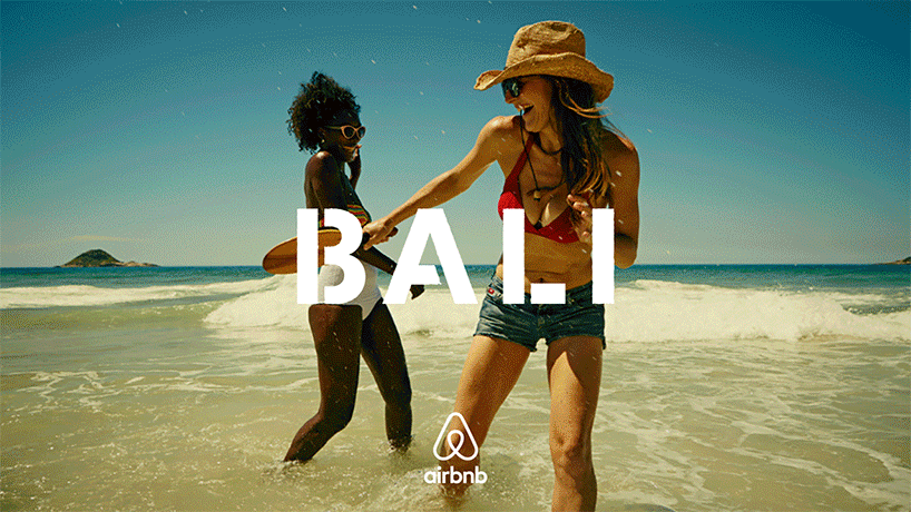
supporting imagery
for photography and illustration, designstudio worked with the internal airbnb team to establish principles to guide the commissioning and creation of assets for the brand.
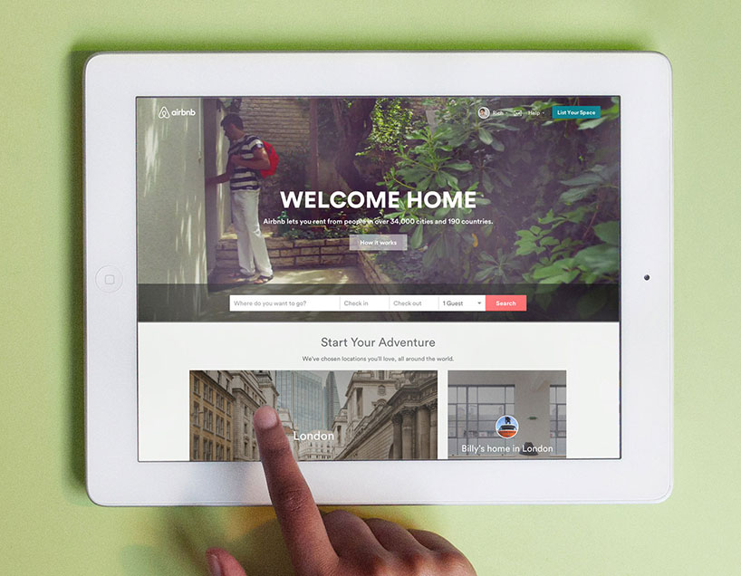
the airbnb website has also been revamped in-keeping with the new branding.
online experience
four members of the designstudio team worked at airbnb’s headquarters for the duration of the project and were fully embedded in the platform teams of designers, engineers and managers from all over the world. this approach was to ensure that the application of the brand across all touchpoints had direction from those who had created it, and to deliver the inspiration that flows from the brand around the world.
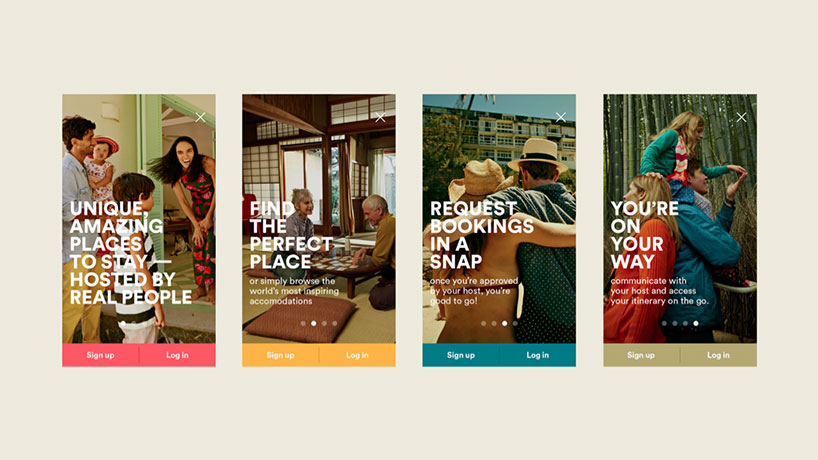
mobile version of the new airbnb website.
instead of a simple re-skin of the existing products, designstudio undertook a complete redesign of the homepage of what is one of the most visited websites in the world. seamlessly merging brand assets and user experience with rich content such as a video billboard header exhibiting ‘moments of belonging’ from across the globe, we wanted to guarantee any visitor, new or old, could experience the true meaning of airbnb – community and belonging.
AIRBNB (69)
 Sep 27, 2023
 Aug 21, 2023
 Jul 31, 2023
 Jul 26, 2023
 Jul 13, 2023
DESIGNSTUDIO (4)
LOGO DESIGN (244)
 Aug 14, 2023
 Aug 02, 2023
PRODUCT LIBRARY
 Apr 15, 2024
 Apr 15, 2024
 Apr 12, 2024
 Apr 04, 2024