for the edition of the ambiente 2017 fair, the united kingdom was the official partner country, following in the footsteps of previous partners; italy, the USA, japan, france and denmark. with over 150 UK companies promoting their brands and products, including such names as joseph joseph, T&G woodware and wedgwood, the trade show was immersed with british design and creativity. scottish graphic designer janice kirkpatrick, founder of multi-disciplinary design studio graven images, was asked to create a special display that showcased key elements of british design to an international audience. by running an award winning practice for over 30 years, as well as being an accomplished writer and lecturer, janice used her unrivalled knowledge of the nation’s creative community to proudly present the craft traditions of UK manufacturers.
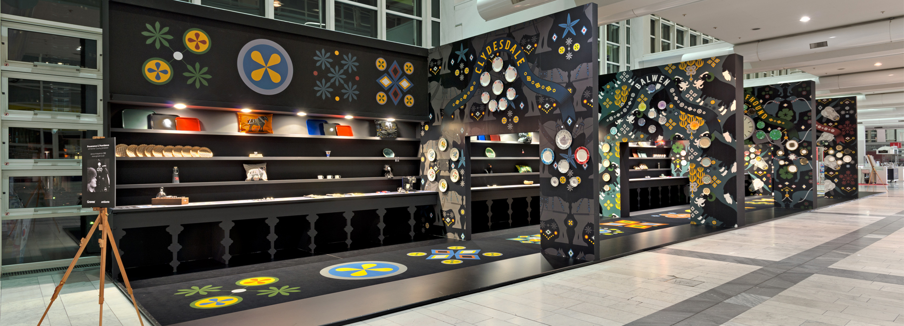
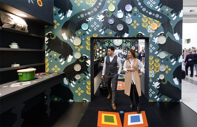
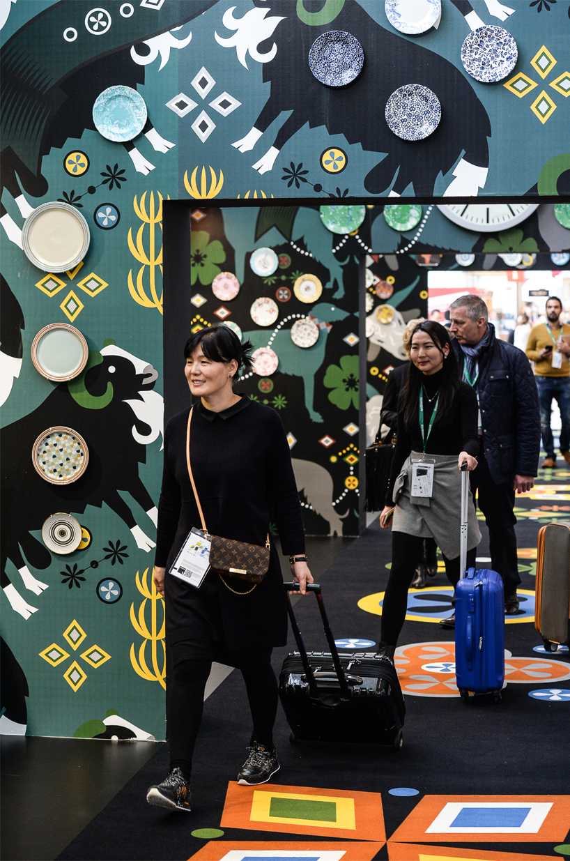
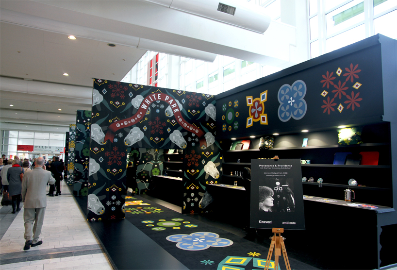
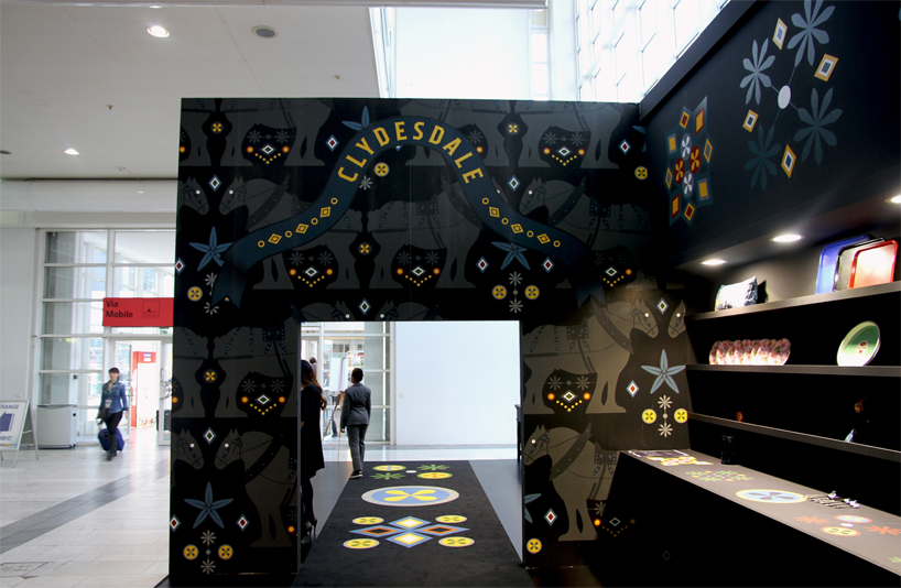
the areas reflect stately rooms of traditional british country houses
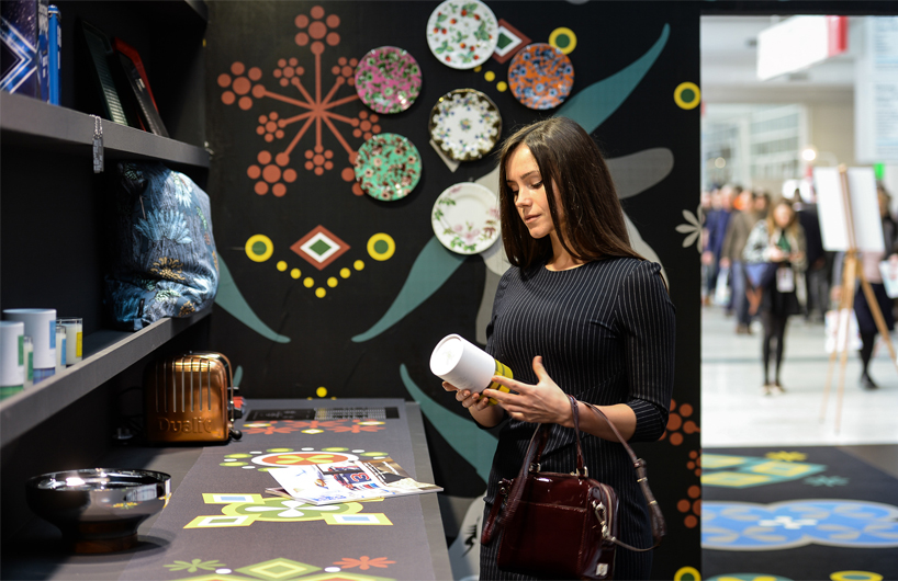
image credit herding / messe frankfurt (main image as well)
at the ambiente 2017 fair in frankfurt, janice kirkpatrick created and curated the ‘providence & provenance’ presentation as a special exhibition for the UK – the fair’s partner country this year. it focuses on the diversity and contrast between the design in the regions of england, wales, northern ireland and scotland, emphasizing their values in a truly global environment. with a collection of over 200 specific products, she carefully curated the presentation to showcase items that embody british traditions, handicrafts and lifestyle. these objects are proudly displayed in a grand stand that reflects elements of symmetry, diplomacy, and most importantly, fun.
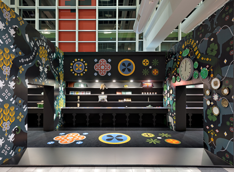
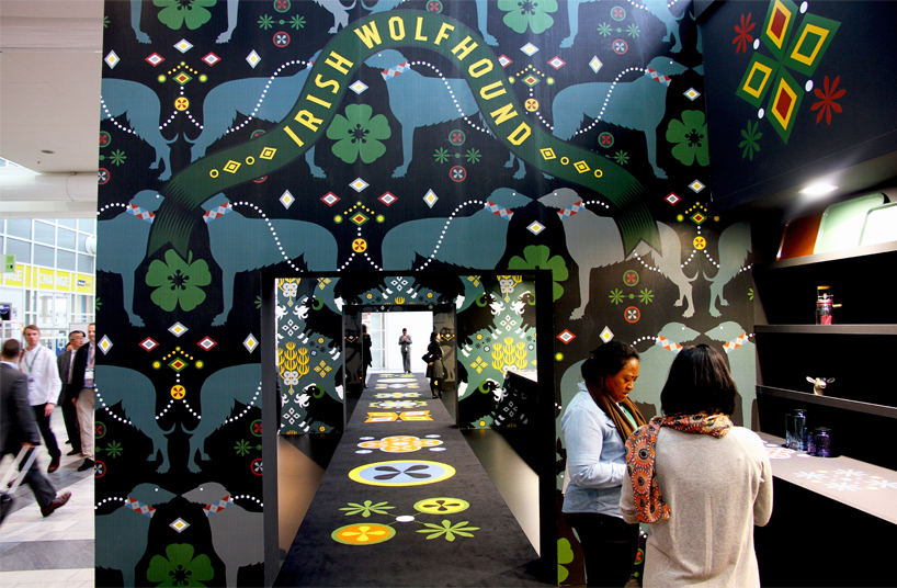
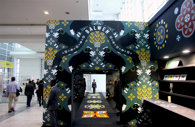
a different nation of the UK and their respective rare animals, are featured in their own rooms
image credit herding / messe frankfurt
at the fair, designboom sat down with graven images’ co-founders janice kirkpatrick and ross hunter, who provided further insights into the design and curation processes of the exhibition. as well, the duo discussed the importance of showcasing the unique design identities of the UK’s four nations; england, wales, northern ireland and scotland, analyzing the political issues that lie beneath the overall quirky appearance.
DB: named ‘providence & provenance’, what was the process in designing ambiente’s partner country’s exhibition?
janice kirkpatrick (JK): the whole project probably took about six months. in terms of design, it is quite a small project as it took a few days to actually get the concept decided and then researched properly. it was a difficult challenge to do this year though. I met nicolette naumann, the vice president of ambiente, 19 years ago at a forecasting exhibition called self-service. we kept in contact ever since, and because of the issues of the scottish referendum and brexit, she thought it would be interesting this year to address a different perspective on the UK at present. we were challenged with expressing the UK, as ambiente’s partner country, at a time when everything is up in the air and no one really knows what direction to go in.
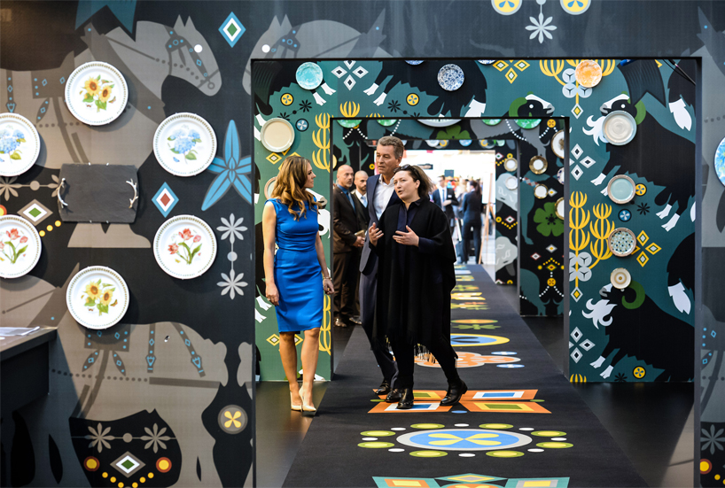
(from left to right) elizabeth hurley, detlef braun (member of the executive board, messe frankfurt), and janice kirkpatrick
image credit pietro sutera / messe frankfurt
DB: what are the key ideas of the presentation?
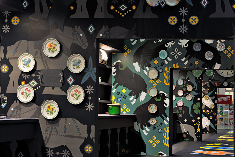
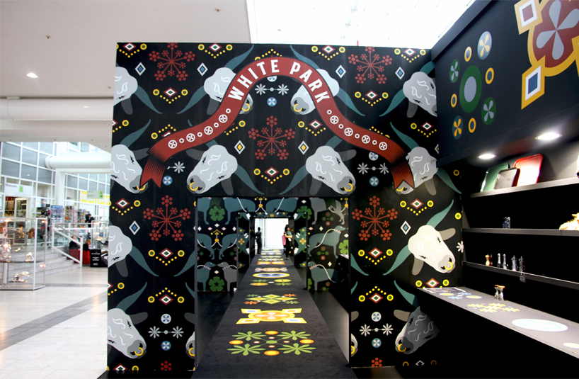
JK: very quickly I decided to not use national flags as they are very contentious. instead, I decided to look back in time a bit. there are a lot of companies in the UK who have been about for hundreds of years; churchill and wedgwood for example, and when you think back to that sort of time, you consider what else you have to play with, what other stories do we have to tell about these places that actually go beyond the national boundaries. I then had a thought about national animals because there are lots of very rare british breeds, and this idea seems pretty cool at the moment. talking about national animals, which actually enabled us to cross boundaries and ease the issues of northern ireland and ireland, we chose the clydesdale horse for scotland and the white park cattle for england, which is this really mythical white beast with black noses and ears that are very striking and go back nearly 2,000 years. all these animals reference the mythology of all four british countries, as well as scandinavian and northern european countries. the clydesdale horse is a great export, it is the most revolutionised agriculture in north america, australia, russia etc. it was an amazing piece of genetic engineering by scotland. we chose the irish wolf hounds for ireland; they were given as gifts to royal houses of europe and cleared their lands of wolves. the animal for wales is this really rare breed of sheep that is exported to north america because the artisan weavers love it due to its particular fibre. genetically, it is quite weird but interesting because its genes come from corsica and sardinia. it has a mongrel element to it, which, if you scratch beneath the surface, brings a lot of politics to the stand. it raises many political questions which was quite deliberate from my side because I think that it time for everyone to tackle these surrounding issues head on. it is more than flags and fiscal matters; there are lots of different, deeper and older reasons for us collaborating and, in terms of the ambiente, for trading.
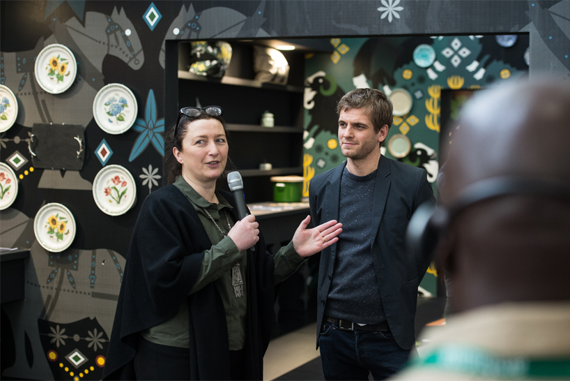
janice kirkpatrick giving a tour of the ‘providence & provenance’ exhibition
image credit pietro sutera / messe frankfurt
DB: how did the concept of national animals lead to the physical design of the stand and the products displayed?
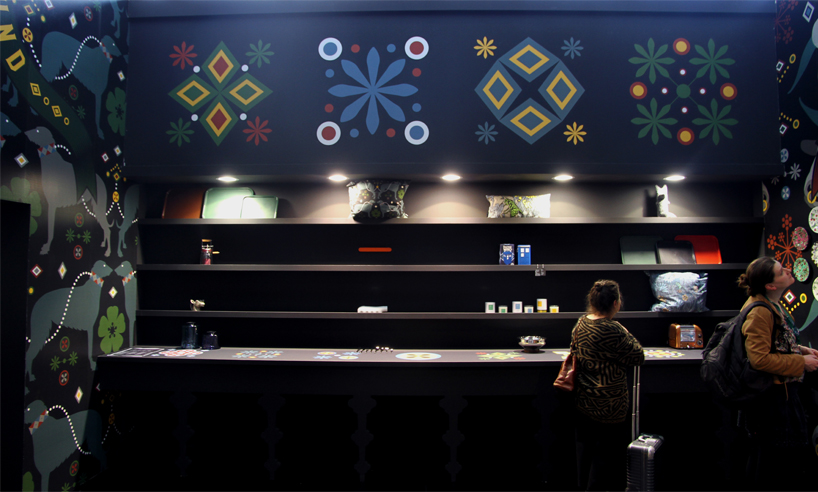
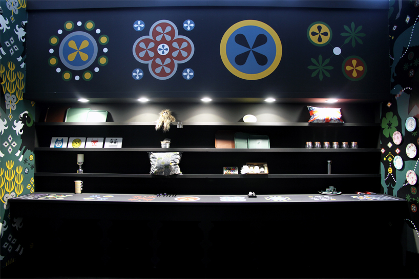
JK: many of the companies that I decided to feature in the exhibition are very much from the ceramics and cutlery industries. the way that the exhibition is organised is almost like the stately rooms of british country houses. the wallpaper is literally a backdrop and a back story because it has a hidden narrative about the context. each room features a very long dresser down its side. it is a very big type of british furniture where people display collections of items on – something the british love to do. every part of the UK has a different name for dressers; the scottish call it, ‘armoury’ which is from the french ‘armois’ because a lot of their history is linked to france. each of these rooms is a dining room, and in a way, represent the state banquets that are the backdrop for diplomacy, a much needed quality at present. it is all about bringing some of that rhetoric into the exhibition as well.
the exhibition gives visitors, consumers and the press a basis for positive discussions about politics, brexit and also design. the UK, although we have an incredible history of design education, is great at exporting its talent. jony ive, who studied at newcastle’s polytechnic, has achieved great things with apple in california for example. we are not so good at using design at home, where we have a great deficit of design in the UK, so I am very keen to get the message out to visitors that we really need to appreciate the people who produce in our industry. this value, and to rebuild our manufacturing industry, is needed now more than ever. we could learn a lot from the cutlery and ceramic industries as they have been through many manufacturing revolutions and political upheaves.
ross hunter (RH): there is a huge depth in creativity in the catalogs of manufacturing brands because they go back so many years. some of those patterns and styles might not be trendy but actually, when you start looking at the details, some of the things that the victorians and edwardians did was absolutely crazy and shows phenomenal creativity. they do not get enough credit for the amount of depth to creativity that they have and have shown over the years. we only saw these examples by looking through companies’ storage and pattern books.
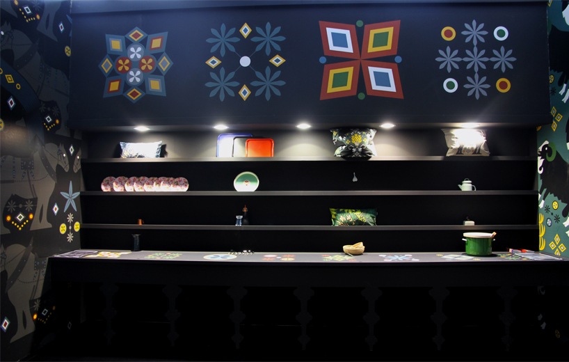
there is a strange symmetrical style when looking down the exhibition
image credit pietro sutera / messe frankfurt
DB: how do you compare the history of brands to their designs of today?
JK: many have recalibrate their designs by using living designers today. they let them in their doors to come and play with what they have in terms of technology and craft. these crafting traditions is gold dust for designers as it is truly great to work with companies that really have a depth of experience and the technology to achieve things others can’t. many of these manufacturers have taken moments in their history to revive themselves and make themselves new again. there are also a lot of contemporary designers that we feature here in the exhibition which aren’t showing themselves at the ambiente.
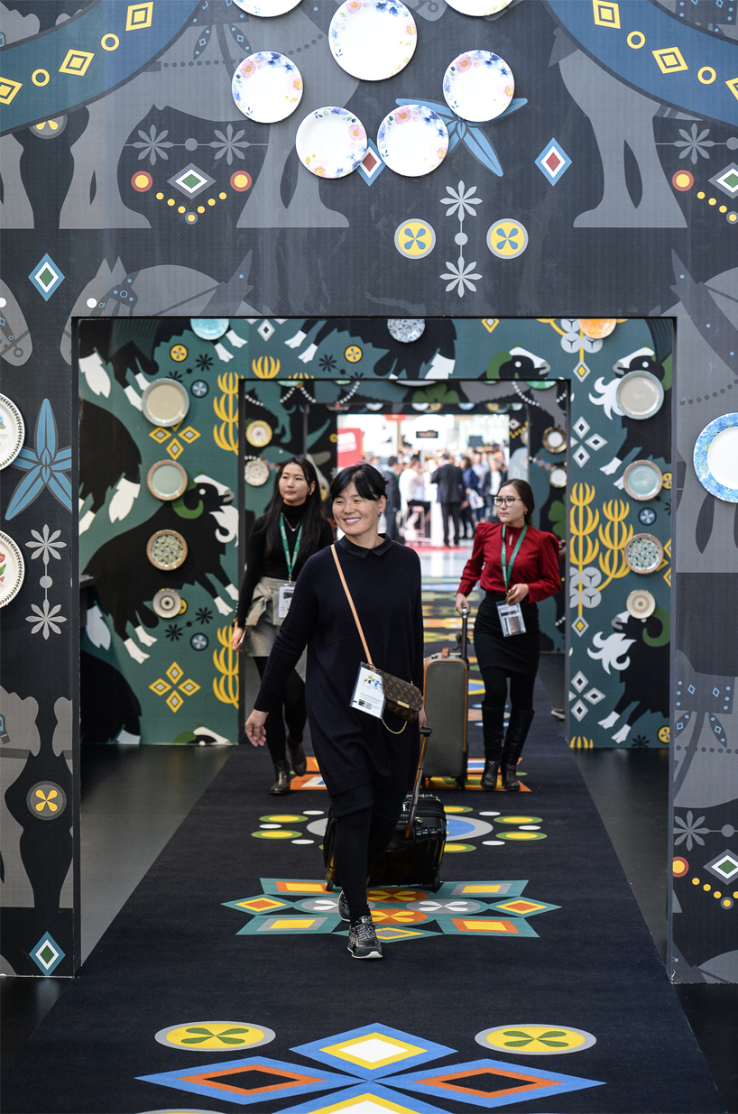
image credit pietro sutera / messe frankfurt
DB: so you were able to feature designers who aren’t actually on show at the fair?
JK: yes, we didn’t realise that we could feature non-exhibitors at first, but then we found out that we could chose about 10% of designers and manufacturers who aren’t here at the ambiente. it is becoming the biggest trade fair of its type in the world, its got a greater reach and platform than any other fair. it is the show for design, and if you want to be a major player, you should really be presenting here anyways.
RH: it would have been nice to be able to show more products, but the showpiece would have been absolutely enormous. we had to have a limit on what and how many brands we could show.
JK: they asked us to chose around 70 products and I chose over 200 from over 50 different countries. I was really pushing my luck.
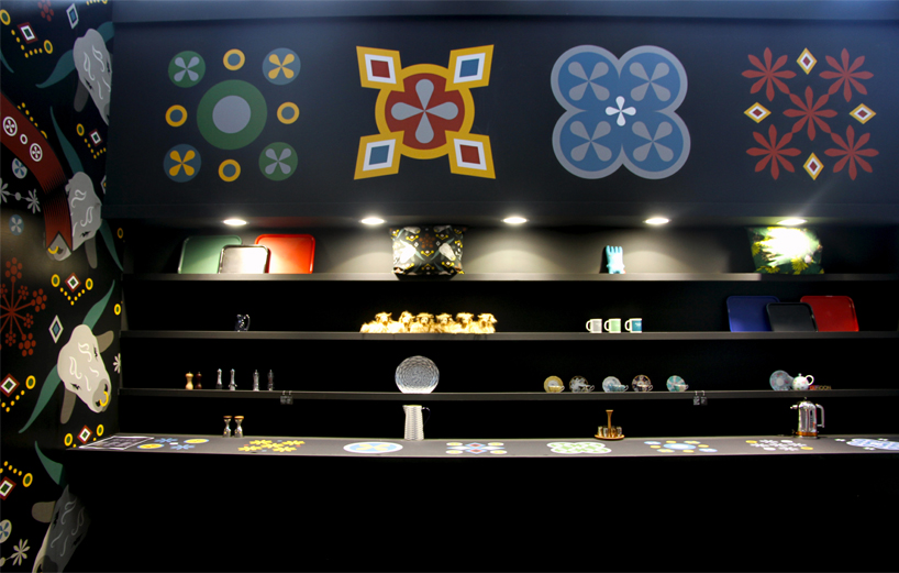
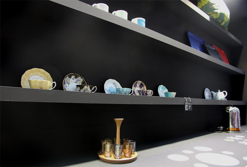
the walls are adorned with a special wallpaper and british ceramic products
image credit pietro sutera / messe frankfurt
DB: can you tell us more about the ceramic artwork placed on top of the wallpaper, and the reasoning behind it?
JK: originally, before I had the final list of exhibitors, I had hoped that we could have had ceramics purely from each country but as it was, there was so many more from england that we had to mix them up.
RH: there are a lot of ceramic manufacturers up in the midlands and the north of england.
JK: as well, there are scottish and irish designers working for these english companies and vice versa, so it made more sense to mix the ceramics around the whole exhibit. I also wanted the whole thing to feel energetic and a little bit crazy because I think we need it right now.
RH: we were really pleased with the way the graphics turned out. they are big, bold, dynamic and show great symmetry. we have done graphics like this before and so I was happy to experiment with different details. some of those big repeat patterns and big graphics were fun to mess around with.
JK: all the little patterns came from traditional scottish clydesdale horse harnesses. it was weird because when we changed the colors and scales slightly, all of a sudden it looked like the perpendicular gothic revival style by augustus pugin, who was the architect of the british parliament building.
the dressers proudly display exquisite item of british craft
image credit pietro sutera / messe frankfurt
DB: what was your curation process for choosing which products to show?
JK: it was very hard. we decided most of them ourselves, but there were one or two products which were more of a negotiation, which depended on what ceramic companies had on production at that point of time. this is because there is quite a delay in what they have on their website, what they want to bring to the show, and what they have in production. generally, I was looking for things that were either absolutely traditional or were things that adorned an updated flavour from a contemporary designer.
RH: one set of items, the paper plates, are a good example of tradition with contemporary. they are completely paper but they look just like a traditional ceramic plate, it is very cool. its pretty much cheap art that works beautifully.
AMBIENTE 2017 - MESSE FRANKFURT (7)
 Jan 15, 2018
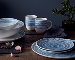 Feb 14, 2017
 Feb 14, 2017
 Feb 13, 2017
 Feb 07, 2017
PRODUCT LIBRARY
 Apr 17, 2024
 Apr 15, 2024
 Apr 15, 2024
 Apr 12, 2024