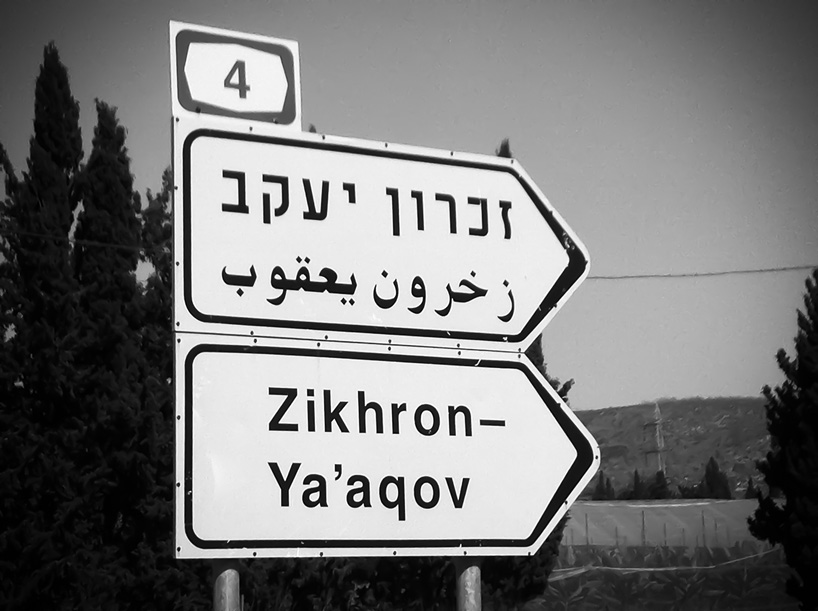
aravrit typeface’s 638 hybrid letters unite hebrew and arabic
all images courtesy of liron lavi turkenich
gifs by designboom
israeli designer liron lavi turkenich has crafted 638 characters for the ‘aravrit‘ typeface, a project she describes as ‘utopian in nature‘, particularly since it unites two languages, cultural identities and geographical locations. the set of hybrid letters merge hebrew and arabic, with a dissected arabic letter on the upper half and a hebrew counterpart as the base. the characteristic features of each form are retained, yet in their finality maintain readability with limited detriment to the original script. ‘in this experimental writing system‘ turkenich tells us ‘each person can read fluently the language they feel most comfortable with without compromising on grammar or vocabulary, without ignoring the other, which is always present.’

an animated gif illustrates the process of manipulating the two characters into one
gif by designboom
with her own experiences growing up in israel as a starting point and source of reference, turkenich began to research the intricacies of language and typography. ‘in israel’s public space we are accustomed to multilingual use of hebrew, arabic and english.’ turkenich describes ‘mostly those are set with unattended visual connection between them, resulting in thoughtless placing of them side by side. despite the differences between the scripts, they share the same origin and influence each other throughout our lives.’
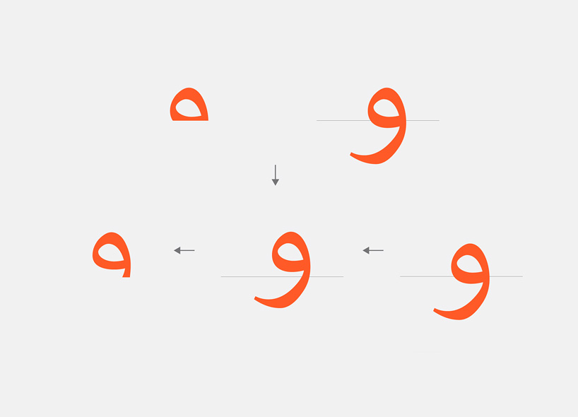
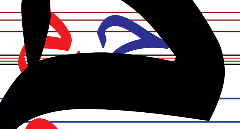
the arabic glyph ‘waw’ dissected
she describes her study ‘after experiments, followed by louis émile javal’s research [a french ophthalmologist who examined the visual processes involved in reading], I found that when reading only the upper half of arabic, the script is still readable. on the contrary, it is possible to read only the bottom part of hebrew, where most of the distinctive letter features are present. the letters in each script were divided to form the base letter parts which aravrit is constructed from. in those, the forms were reduced, leaving only the essence — the core of each character.’
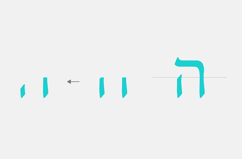
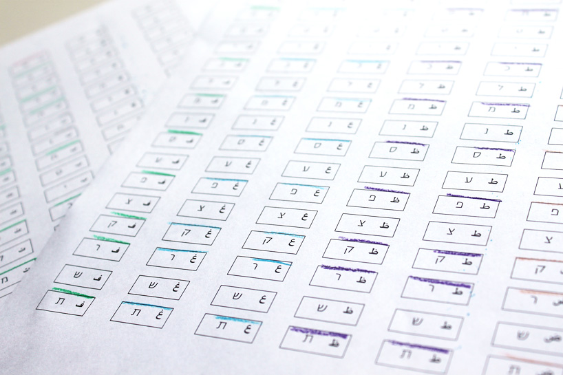
hebrew letters, halved
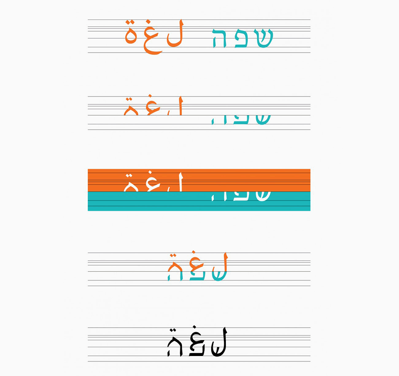
because most words in hebrew and arabic do not share the same sounds and letters — indicated by the word ‘language’ : ‘safa’ in hebrew and ‘lura’ in arabic — each letter-to-letter combination was required. achieving the task of completing a vast permutation of possible combinations necessitated compromises in each script: in arabic the separate form of each letter has been used and in hebrew there is no use of the final letters. despite a sense of irregularity, ‘aravrit’ is still legible.
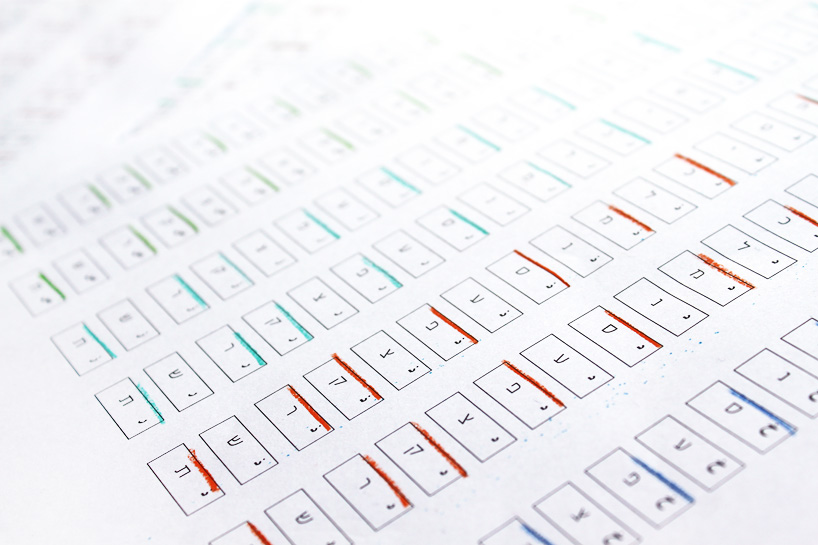
parts of letters were manipulated slightly to accommodate to the rest of the form
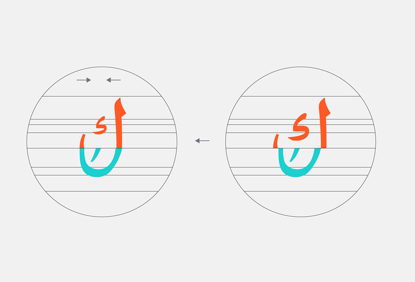
how a word has been formed from the two sets of characters
aravrit process and procedure
video courtesy of liron lavi turkenich
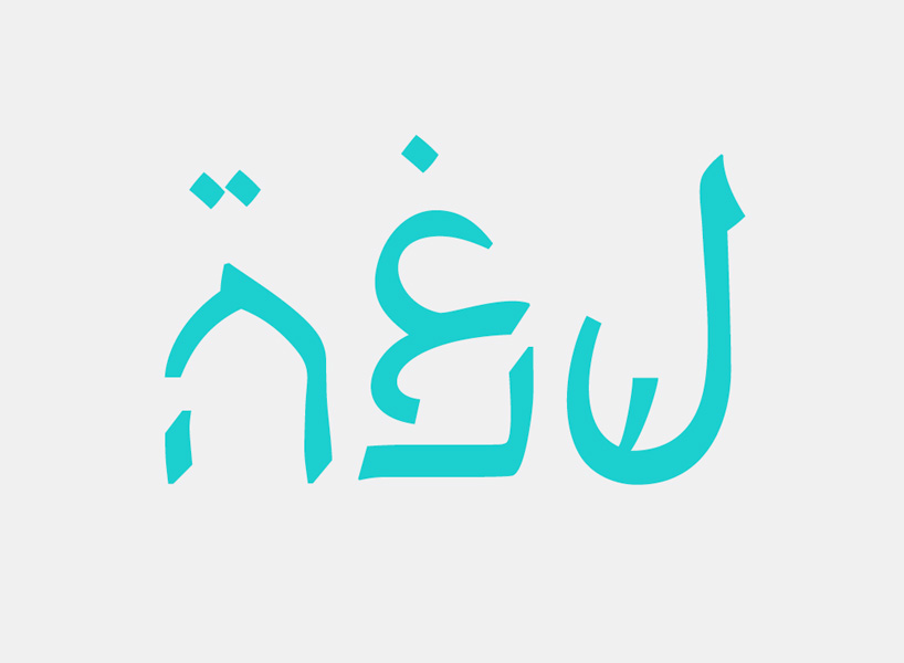
‘language’
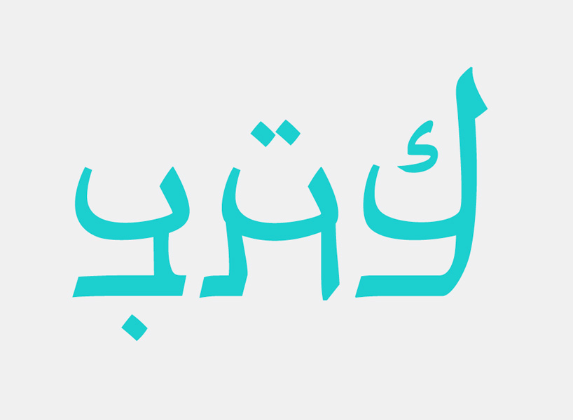
‘script’
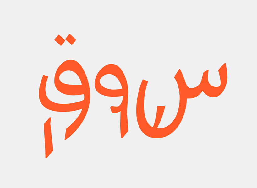
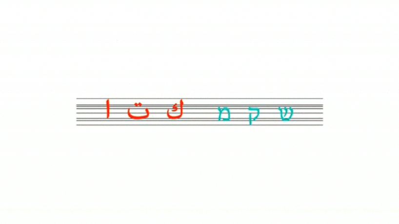
‘market’
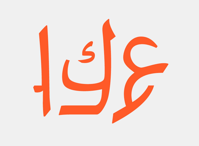
‘acre’ (city in israel)
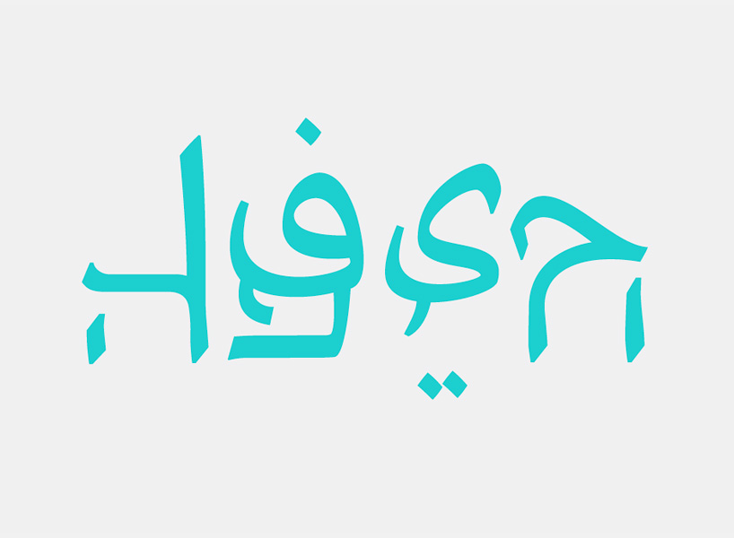
‘haifa’ (city in israel, and the designer’s hometown)
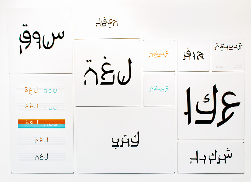
printed visual materials for the project
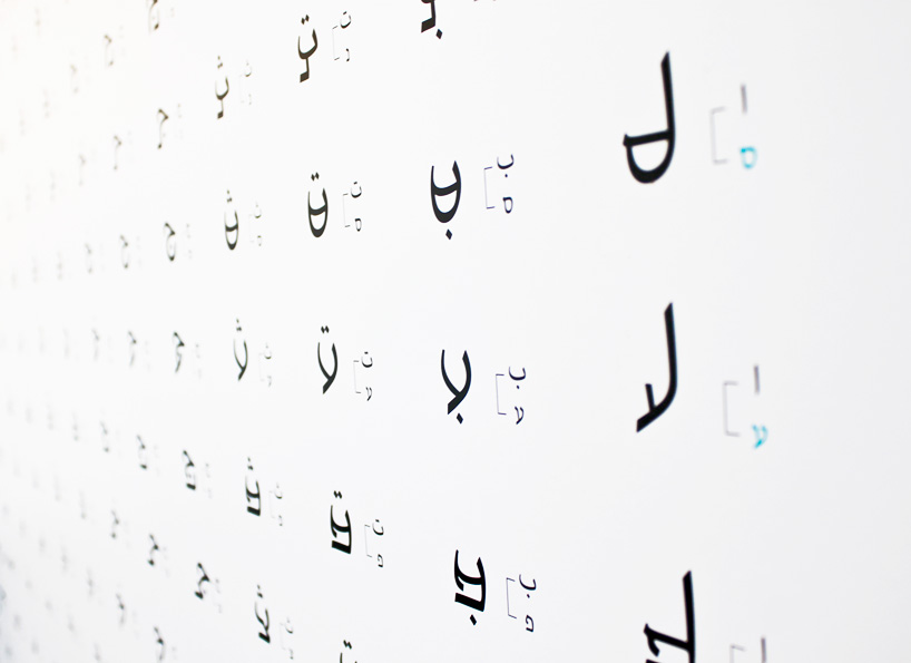
the breakdown illustrates the parts of each letter that have been used
typography design (135)
 Oct 23, 2025
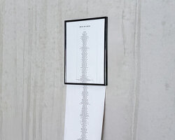 Jul 24, 2025
 Sep 13, 2023
 Feb 23, 2023
 Jan 02, 2026
 Dec 28, 2025
 Dec 17, 2025
 Dec 04, 2025