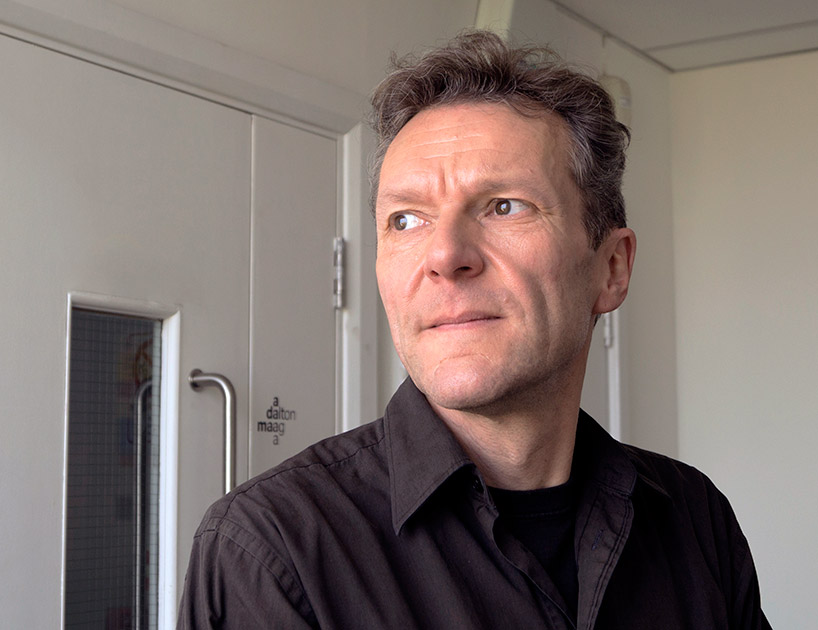
bruno maag interview
we spoke to bruno maag, co-founder and creative director of the font foundry dalton maag.
DB: why did you decide to specialize in type design?
BM: I fell into it by accident. after a failed attempt at being a mechanical engineer, I began a four year apprenticeship as a typesetter where I instantly fell in love with type and ink. the move into type design was cemented during my studies at basel school of design. I simply fell for the simplicity of shape and counter-shape, straight and round, and not having to worry about color and other inconsequential stuff.

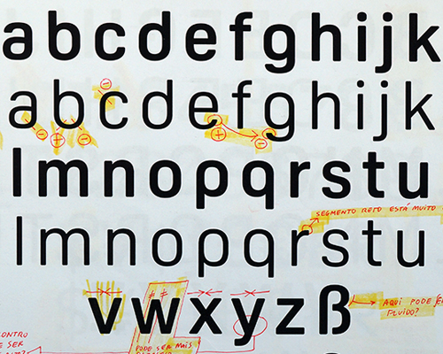
rio 2016 olympics typeface – sketches

rio 2016 olympics typeface – development
DB: how do you justify the time and cost of designing a new typeface to the client?
fonts have to be paid for, whether they are commissioned or licensed off the shelf. they provide the foundation for any brand and are probably one of the most important elements in a company’s communication tool kit. designing a new typeface gives the client complete control over the look and feel, and probably more importantly, how this look and feel is translated across the diverse range of media we are operating in today. it is not just a question of drawing up a few letters, but rather understanding all the requirements and responding to them. all of this takes a lot of skill and a lot of time.
the actual drawing of the letterforms is only a part of creating a successful typeface. a large part of development time is taken up by technical activities such as font engineering and hinting. this makes sure that the fonts work in a broad range of environments, across both printed and and digital applications.
having a font designed can provide a sizable return on the investment, depending on the exact nature of the product. by just reducing the character widths a few percent – without affecting legibility – it is possible to save paper, ink, print times etc. when we designed the fonts for the BT (British Telecom) telephone directory, we did just that, and saved enough space for the cost of the fonts to be amortized after two print runs.

rio 2016 olympics typeface – final typeface in use

rio 2016 olympics typeface – logotype
DB: what influences you more, contemporary trends or historical preferences of your own?
I rarely encourage revivals of past designs, my feeling is that as a type designer I need to explore new ways of expression. this tends to happen within a very tight set of constraints since I also believe in functionality. the purpose of a typeface is to be read, to be the vehicle for a message to be conveyed from one person to another via the means of the written word. if I deliberately prevent the reader from absorbing the message then I fail at my job. I am not an artist, I am a designer, a craftsman. I have a job to do.
so, my influence comes from the task I am being set. it comes from conversations I have with users of my type, whether they are people who use my type to set, or the reader of the set type. I also do all that within a historical context that defines our habits of reading.

nokia typeface

nokia typeface – chinese characters during development

nokia typeface – hebrew characters development
DB: what mistakes or ‘traps’ should someone avoid when designing a new typeface?
BM: it is important to understand that a typeface is not a piece of art. it has a purpose, like a chair or an engine have. accordingly, before even putting pencil to paper, it is important to understand the requirements of what the typeface is trying to achieve. only once these requirements are known should actual design commence.
because a typeface contains potentially hundreds of different elements that all have to work cohesively, the design process has to be treated in a very organized fashion. establishing basic proportions and design features, expanding these to a larger group of glyphs, refining, expanding to a larger number of font styles, expanding the font family and full glyph set, testing, reviewing, testing again.
DB: do you think it’s important for a type designer to be able to draw?
BM: yes. drawing allows you to quickly visualize an idea and to make an assessment of whether the idea works or not. being able to draw also teaches you to learn to see. if you can’t see you can’t do.

HP typeface – used in a newspaper ad

HP typeface – used in on a livery ad

HP typeface – greek characters during development
DB: which characters do you find the most difficult to design?
BM: the ‘S’ in any type style. it is the character that presents the biggest obstacles. it’s simplicity is deceptive; it is a huge challenge to balance the proportions of top and lower bowl, to make sure it feels upright standing. I also think that the counter spaces in serifed ‘X’ are very difficult to harmonize. all the other letters are fairly straight forward to do.
DB: have you ever been impressed or upset with how somebody has used one of your typefaces?
BM: I have learned not to get too involved over the usage of my work as I have absolutely no control over it. of course, I am always pleased if I see my designs used in a way that respects the type and basic typographic rules. but I don’t get too upset or annoyed over the ‘wrong’ use of my font. in those moments I simply feel that maybe we need to improve typographic education.

aktiv grotesk typeface

aktiv grotesk – used by the english national ballet for their posters
DB: how do you think the popularity of online design resources have influenced the work produced today?
BM: there is a danger that access to these resources nurtures repetition and copying. on the other hand, it is a wonderful tool that allows people from other parts of the planet, who traditionally had little access to design, to absorb our views and trends, and add their own culturally inspired flavor to their work. design resources should be used as a platform that allow us to move an idea further, explore an innovation and expand on it to make it better still.

tesco tyepface – used on a newspaper ad
DB: besides design, what are you passionate about?
BM: I like design, but I am passionate about letterforms. a beautiful character gets me excited, a good design I appreciate. I have always liked my food, both eating and cooking. you hunt for quality ingredients, simple elements that combine into a grand composition of flavors and textures. it is exciting when you see harmonies emerging that are not obvious.
I have recently also become enamored with ballet. it is a wonderful artform that requires artistic skill, athleticism, dedication and technique. to see swan lake at the royal albert hall is spectacular; and seeing the black swan doing 32 perfect fouettes is simply breathtaking.
DALTON MAAG (2)
 Jun 09, 2014
GRAPHIC STUDIO INTERVIEWS (193)
 Nov 21, 2022
 Feb 10, 2019
 Jun 21, 2018
 May 17, 2018
 Oct 04, 2017
RIO 2016 OLYMPICS (25)
 Dec 02, 2016
 Sep 05, 2016
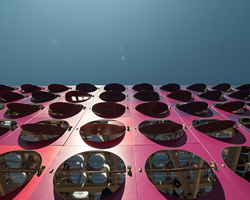 Aug 23, 2016
 Aug 17, 2016
 Aug 15, 2016
TYPOGRAPHY DESIGN (133)
 Sep 13, 2023
 Feb 23, 2023
 Jan 24, 2023
 Jan 19, 2023
PRODUCT LIBRARY
 Apr 17, 2024
 Apr 15, 2024
 Apr 15, 2024
 Apr 12, 2024