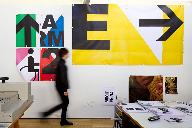
mockup tests of the innsbruck exhibition centre signage system that büro uebele made in their studio
designboom spoke to andreas uebele of büro uebele about the innsbruck exhibition centre signage system.
DB: please can you tell us about how you approached to the project?AU: we had to find a design solution suitable for the new and the old buildings of different architectural quality and a technical solution that could be realized with a very small budget.
the corporate identity had already been designed by another agency when we joined the projectand the client asked us to use the existing brand colours for our signage, but we found them too weak. when we presented the first draft with the powerful colours, it was obvious to everybody that this would be the right approach to develop further.
DB: what was the most challenging aspect?AU: we created an illogical graphic pattern and a set of visually untypical and strange kind of signboards, which are more abstract in an artistic way and do not refer to common signage systems. we wanted the design to be like a carpet or a poster that can be attached to all the different surfaces of the unequal buildings. we did not want the graphic to disparage the old buildings, but fit to the new, strong and beautiful architecture at the same time.


more about the concept behind the new system:national flags form the basis of the graphic design. they have been divested of their heraldic elements the shields and animals, the swords, sabres and stars – and of their national colour schemes, and allocated a single colour shade along with text. the individual text-patterns are assigned to particular halls where they fulfil a wayfinding function.
when the text-patterns are lined up together in the orientation overviews, the individual patterns become part of a different, larger system. the result is a systematic chaos, an orderly disorder, that responds to the venue’s intrinsic disorderly qualities. the brightly coloured strips make a bold statement, standing out against the non-uniformity of the setting. in the neatly dimensioned and relatively monochrome new building they add contrast and variation, providing a rhythmic element that naturally expands to cover whole walls in particular locations – such as staircases, a restaurant and the underground car park.
the system’s distinctive features include the treatment of umlauts – the two dots above the vowel are attached to the letter form itself, to prevent them being cut off, creating unusual shapes – and the structural simplicity of the basic two-tone composition (colour + contrast colour) which responds to the variety of surfaces, materials and colours in the halls.


 1:1 mock ups at the übele studio

 derivation of the graphic from flags of countries


project creditsplace: innsbruckyear: 2012communication design : büro uebele, visuelle kommunikationproject team: carolin himmel (project management), andreas uebeleclient: congress und messe innsbruck gmbhuser: congress und messe innsbruck gmbharchitect: cukrowicz nachbaur architekten photos: hanspeter schiess principal typefaces: akzidenz grotesk superawards: german designer club (ddc), good design 13, gold
BURO UEBELE (3)
 Aug 13, 2014
 Jul 31, 2013
PRODUCT LIBRARY
 Apr 15, 2024
 Apr 15, 2024
 Apr 12, 2024
 Apr 04, 2024