census infographic exposes racial segregation in america
images courtesy of dustin cable
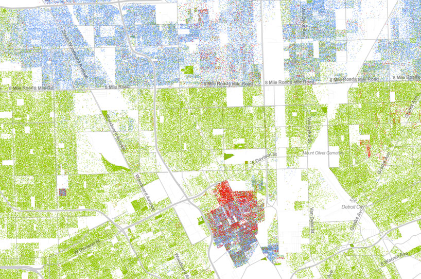
a colored census data map is a virtual snapshot of america’s racial divide. it provides an approachable way to visualize racial distribution, population density, and geographic dispersion in every neighborhood in the entire country. created by dustin cable, a demographic researcher at the university of virginia’s weldon cooper center for public service, the map references MIT media lab’s black and white version, but builds on the idea by adding data about ethnicity. the statistics displayed on the iconographic comes from the publicly available U.S. census bureau’s 2010 summary.
the map contains 308,745,538 colored dots, one for each person residing in the united states at the location they were counted during the 2010 census. each dot is color-coded by the individual’s race and ethnicity: white people are represented as blue dots; african-americans with green; and latinos with orange; asians with red, and all other categories represented by brown. looking at the map, every piece of visual information relays a different story about the character of the city, exposing some severe realities about socioeconomic division. a zoomed in view of detroit, for example, is almost precisely divided, with the population almost exclusively white on the north side of 8 mile road, while the majority in the south is african-american. a small, practically cut-out geometrical portion is red, indicating a strong presence of asian ethnicities.

the map of the united states visualizes racial distribution and population density

a view of manhattan shows a large white population living in the pricey upper west and upper east side neighborhoods

brooklyn, new york contains all of the ethnic groups, but they generally contained in regional sections

san francisco’s china town district is clearly indicated by a large number of red dots

the data from los angeles exposes a predominantly hispanic population

close up of denver shows urban sprawl
INFOGRAPHICS (19)
 Aug 06, 2020
 May 02, 2019
 May 07, 2018
 Apr 10, 2016
 Sep 08, 2015
MAP ART AND DESIGN (56)
 Jul 23, 2023
 Jul 29, 2022
 Nov 06, 2021
 Jun 13, 2021
 May 30, 2021
PRODUCT LIBRARY
 Apr 17, 2024
 Apr 15, 2024
 Apr 15, 2024
 Apr 12, 2024