the an ivy-encircled, shield- shaped insignia has been replaced by six crimson rectangles
chermayeff & geismar have designed a new logo for harvard university press (HUP), which celebrates its centennial in 2013.
six equal crimson rectangles that form an abstract H that can also be seen as ‘books on a shelf, windows, or a modern tablet’.
—following from chermayeff & geismar
harvard university press identity – an ivy-encircled, shield- shaped insigniahad resided beautifully on the spines of countless books, but was too complicated to work effectively in the digital realm, both in terms of rending and unifying the imprint across ever- proliferating platforms.
so the century-old publishing house came to chermayeff & geismar, which had designed logos for major publishers such as harper collins, princeton university press, the smithsonian institution and the library of congress to create a new identity designed for the digital age.
![]()
partner sagi haviv’s solution, an abstract H is simple enough that it will be effective both in traditional applications, such as book spines and title pages, and also in digital media such as app icons, browser icons, and ebooks.
‘striking a balance along the continuum between the traditional and the modern was a high priority for us in designing this mark. the new identity also puts the emphasis on the harvard name (previously obscured within the seal), underscoring the press’s historic and ongoing relationship with the university.’– sagi haviv
harvard university press will implement its new visual identity over the course of 2013, including on many first-time interactive digital projects, such as the emily dickinson archive; an e-ditions program that will make available for sale virtually all the books hup has published since its founding; and a website, www.hupcentennial.com, that will regularly post new excerpts from 100 significant hup books that have been published over the past century.
![]()
![]()

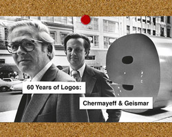
chermayeff and geismar (9)


logo design (244)
 Aug 14, 2023
 Aug 02, 2023
PRODUCT LIBRARY
 Apr 17, 2024
 Apr 15, 2024
 Apr 15, 2024
 Apr 12, 2024