
a look inside the design process yoko ono war is over! (if you want it) exhibition book
legendary artist, peace activist and musician yoko ono is currently presenting an expansive selection of her work at the museum of contemporary art australia. as part of the exhibition, claire orrell, designer at the museum, was tasked with creating a catalog, accompanying the vast selection of sculpture, immersive installations, written texts and films. designboom had the chance to ask the british designer questions about her process, the challenges and complications in compiling the book, her graphic selections (in terms of typeface and paper stock) and yoko’s own involvement with the work.
DB: what was the project brief?
claire orrell: the brief was to design a publication to accompany yoko ono’s solo show at the museum of contemporary art australia (MCA). I had an initial briefing meeting with the curator, rachel kent, who suggested the design be fun and youthful, more of an artist’s book than a catalogue. she mentioned that yoko wanted to create some ‘artist intervention pages’ to appear somewhere in the book. looking through the images of yoko’s work alongside contextual images the mca had sourced for the catalogue, plus reading the texts, helped to inform the look and feel of the book.
typography rendered in franklin gothic extra condensed
DB: how does working on an artist book differ from other publications, particularly from an exhibition catalogue?
claire orrell: yoko had recently had an exhibition in frankfurt for which a comprehensive hardback publication was produced. as the MCA show was following not long after we were keen to make a point of difference between the two books. I wanted the publication to be more conceptual, not just showcasing yoko’s work but really bringing it to life. the addition of the specially created artist pages, the style of texts commissioned, a playful design and use of tactile materials helped to create a different style of book.
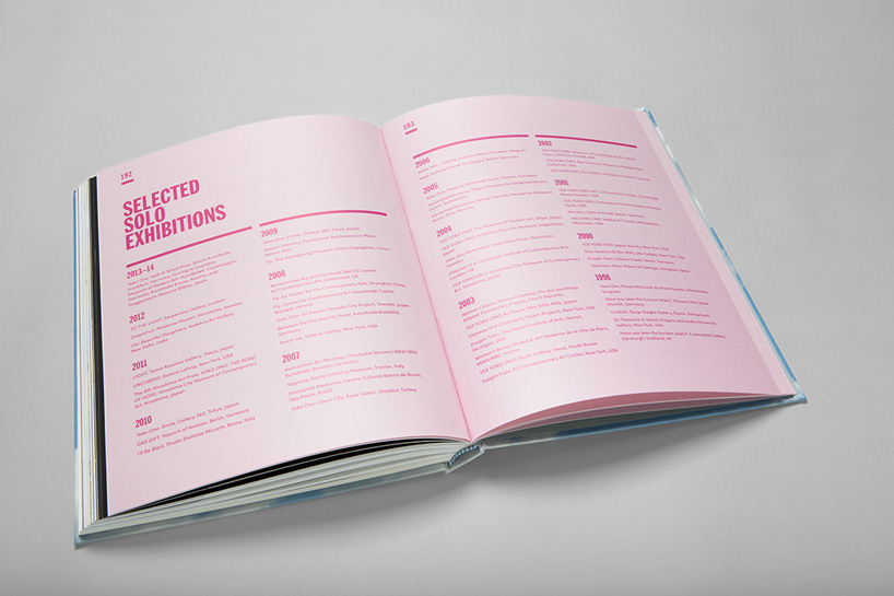
spreads outlining selected solo exhibitions
DB: what design did you propose for the book?
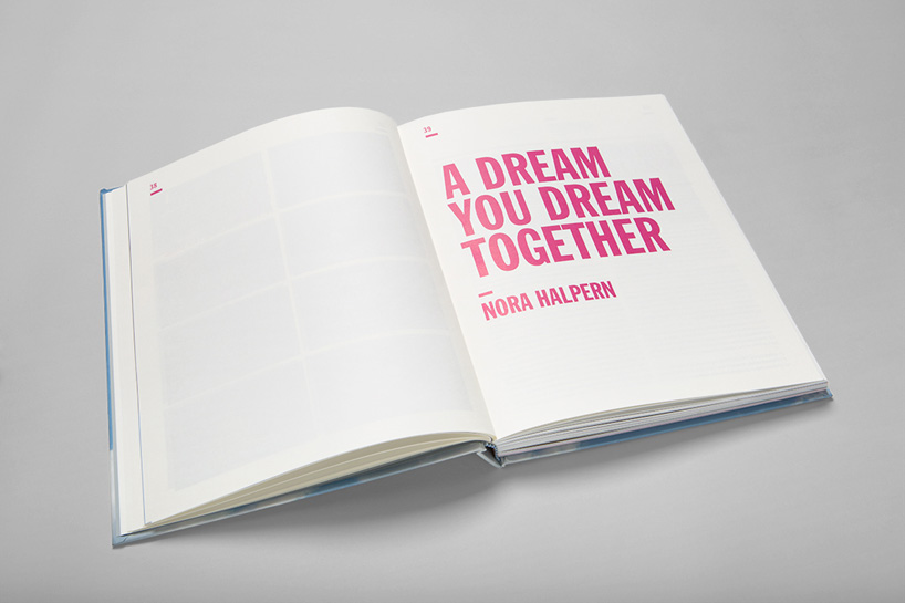
claire orrell: when I first heard about the artists pages, I decided that I’d like them to stand out in some way from the main body of the book. I thought it might work well to insert smaller pages throughout the publication so yoko’s ‘interventions’ become little surprises that you’d stumble upon now and then.
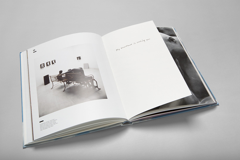
as the book took shape it seemed to be in three distinct sections; section 1– the texts and contextual information; section 2– the image plates; section 3– the biography and end matters. I wanted to use some tactile stocks and make the three sections each have a different feel whilst still feeling part of the whole. to achieve this I used a cream stock for the 1st section and contrasted that with a white silk stock for the image plates. the 3rd section also used the cream but with an all-over pale pink tint. the artists pages were printed on the cream as well and placed throughout the image plates section, forming stepping stones between the other two parts. another fun element of the catalogue are the collaged pages of yoko’s album covers and other printed ephemera which readers find as a special surprise amongst the end matters, and also the two embellished artist pages hidden amongst the image plates.
smaller pages throughout the publication highlight yoko’s interventions as little surprises
(continued) the pink color used throughout the first and third sections of the book is a reference to our marketing campaign. pink was chosen as it softens the bold type, is fun and really stands out! the typography of the book stemmed from the iconic and bold ‘war is over!’ poster campaign by john lennon and yoko ono in the late 1960s which formed the title treatment of the exhibition. the same typeface has been used throughout for the headings, although mainly in the bright pink to set it aside from the title.
the cover of the publication features an image of sydney clouds (taken from the MCA sculpture terrace). images of sky are a recurring theme in yoko’s work and she was keen to have this motif on the cover. a gun metal foil was chosen for the cover as a nod to yoko’s work ‘helmets – pieces of sky’ (2001/2013) along with a gloss white foil.
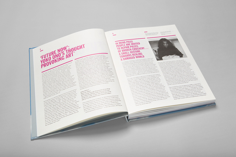
bold pink text characterizes quotes and headlines
DB: how did MCA work with yoko ono and her studio?
claire orrell: normally when developing a exhibition catalogue we show the artist the designs at several set stages along the way, however, for this book we worked very closely with yoko’s studio. the curator, curatorial assistant and I were in almost daily contact with yoko’s studio staff and at various stages throughout the process they presented the catalogue to yoko for feedback.
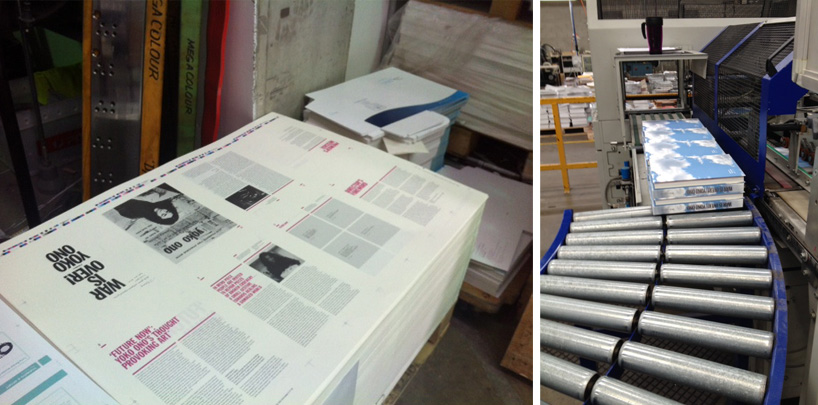
the printing process
DB: what were the technical challenges you faced?
claire orrell: the publication was technically very tricky to produce and I worked closely with garry gorman from peachy print to ensure the best possible outcome. says garry, “our goal was to produce an award winning catalogue on budget and within a very tight timeframe.the potential difficulties carried over from the printing to embellishing and then on to the binding process.”
we wanted to achieve an uncoated effect on the cover without leaving it vulnerable to scuffing and for this peachy suggested a matt uv varnish on the cover over a regular uncoated stock. this looked fantastic but created another problem as the foil stamp would not adhere to the matt uv varnish. to rectify this, foil was laid down first meaning that the registration of the uv varnish over the top had to be perfect.
the imposition of the internal pages was extremely complex due to the smaller artists pages and the fact that the book was to be section sewn. every section (of either 8, 12, 16 or 20 pages) had to be carefully worked out so as to position the artists pages exactly where we wanted them. then there was also the issues of the mixed stock throughout the book and the die cut and foil stamped pages to contend with.
the shorter artists sheets also led to some difficulty in the binding process as it created an uneven block with which to bind. as garry explains, “an even block is required to allow for equal pressure on the clamp to hold and give us an accurate trim on the final job so we had to pack the clamp to compensate for the uneven block and in doing so we managed a precise trim. from brief to final delivery there was a great deal of extra tlc required on this job especially on such a tight deadline but peachy is very proud to have been part of the team to produce such a high quality catalogue”.
specifications:
designer: claire orrell
fonts: headings and quotes: franklin gothic extra condensed / body copy: sofia pro
paper: cover – knight smooth white 300gsm + matt uv varnish / end papers – optix zena grey 140gsm by spicers / sections 1 & 3 – knight smooth cream 140gsm by doggetts / section 2 – sovereign silk 170gsm by doggetts
printing: peachy print, sydney
binding: section sewn
quantities: 1,000 softback / 500 hardback
retail price: $54.95 softback / $69.95 hardback
available at mca.com.au/store
PRODUCT LIBRARY
 Apr 15, 2024
 Apr 15, 2024
 Apr 12, 2024
 Apr 04, 2024