data cuisine by moritz stefaner visualizes information through food
when we think about a means of conceptualizing information, the boring and typical graphs and charts usually come to mind – pretty lack lustre and rigid in their appearance. designers have improved this area by incorporating symbols, interactive components and alternative schemes to make the delivery of facts more captivating. mortiz stefaner, together with prozessagenten, process by art and design, have taken data visualization to the next level with their initiative ‘data cuisine‘, in which they explore ways to render facts and statistics through a more digestible means, quite literally, by displaying them through culinary means.
the approach to ‘data cuisine’ still follows the theories set in place by ‘traditional means’ of data visualization, such as the implementation of marks (lines, geometric shapes, color etc) and their particular orientation to express variables, just using food as the medium. this opens up an entire menu of options that allow figures to be rendered in 2D and 3D, with changes indicated by a range of possibilities – from particular flavors and tastes, temperature to texture; alongside the small details that go into plating and presenting the dish. the vision definitely brings an alternative perception to how we consume information, but also makes way for extensive culinary experimentation.
‘data cuisine’ began as an open data cooking workshop in helsinki, and continued onwards to barcelona, providing quite the diverse cultural and illustrative results of delivering knowledge. here is a look at some of the results:
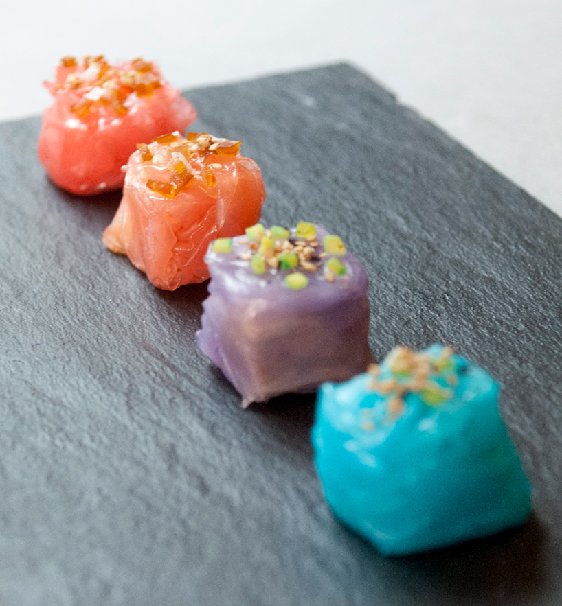
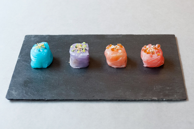
‘in & out’ by domestic data streamers
domestic data streamers have created a medley of dishes that speak to the world of dating and relationships. ‘in & out’ responds to the question: how often do couples have sex compared to singles? the dish answers this by using an informal survey taken from the studio’s own facebook contacts. each of the rice dumplings have two different fillings: men are represented by a reduction of meat, while females are represented by a reduction of fish – this decision is based on the way the spanish describe sex with men and women. men and women’s relationship status (in a couple, or single) can be deduced from the color – the latter identified by lighter hues. the garnish of sesames and salt on top of each morsel displays the frequency of sexual encounters of the different groups.
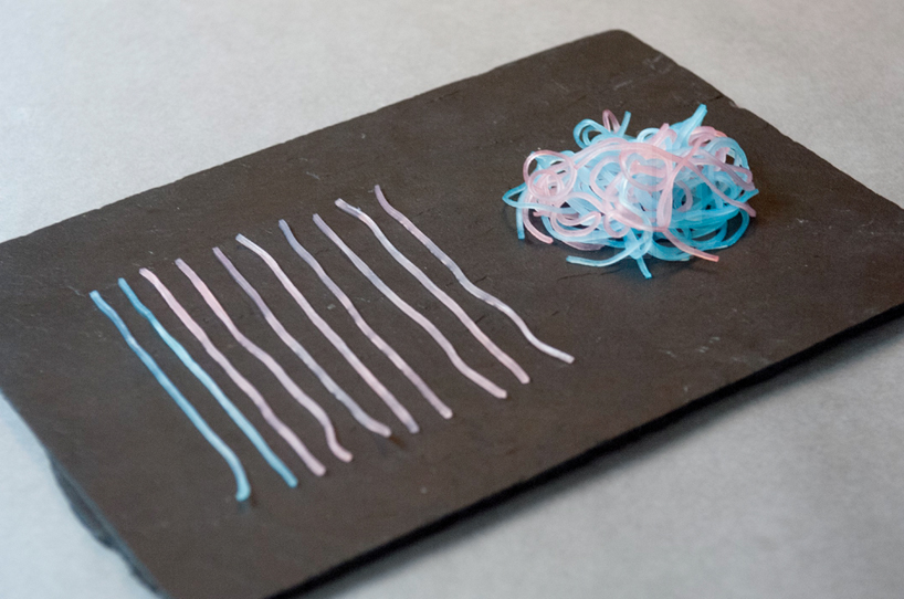
‘first date noodles’ by domestic data streamers
‘first date noodles’, also by domestic data streamers, investigates the sex life of young people in barcelona, showing who will have sex on the first date. again, taking information retrieved from their facebook friends, they came to the conclusion that 86% of men, and 59% of women did. the ball stands to show that part of the data set, and the color points to people’s gender. the abstinent men and women are highlighted by the straight noodles that are not touching.

straight noodles represent those who abstain from sex on the first date
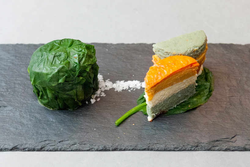
‘tortilla feliz catalana’ by dorit mielke & nora lidgus
dirt mielke and nora lidgus use a decomposed tortilla to represent the state of well-being in spain. data was obtained from the better life index with the individual layers symbolizing a different topic: community = peppers, life satisfaction = asparagus, jobs = potatoes, and education = onions. one half of the ‘tortilla tower’ is an indication of spain’s scores in these topics, while the other half reveals what people find important. the difference between these two statistics — for instance, people find education really important, but spain does not fare that well in this area — becomes apparent in the diverse tastes of the two portions.
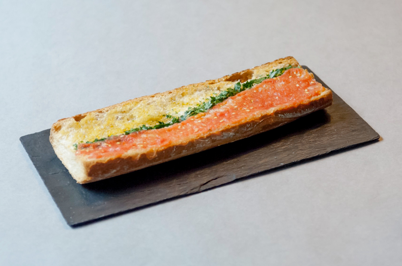
‘unemployed pan con tomate’ by samuel boucher & jahn schlosser
‘pan con tomate’ (bread with tomatoes) is an edible area chart by samuel boucher and jahn schlosser which displays the increase in youth employment. the increase in unemployment over time is shown through the decreasing amount of tomato, which makes the bread difficult to eat, thus the garlic portion becomes incredibly overpowering.
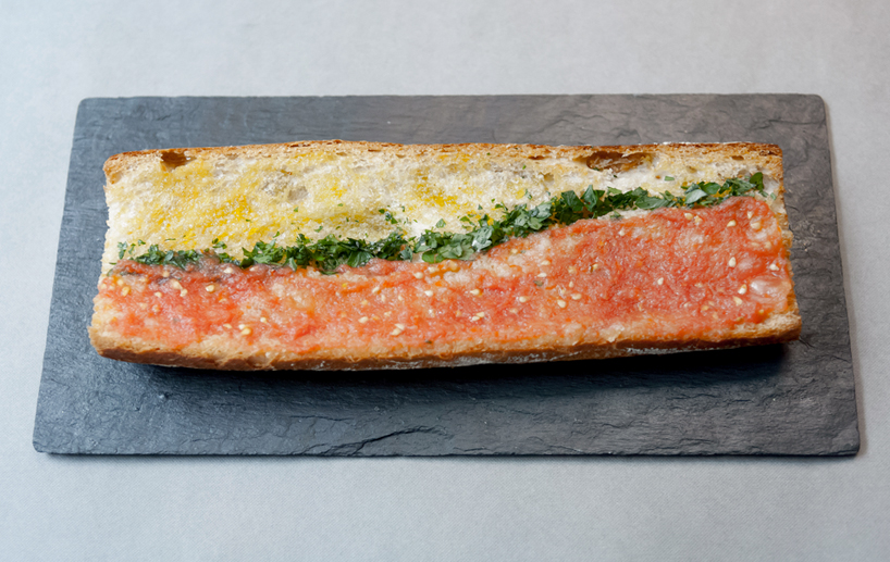
a decrease in tomato indicates the rise in unemployment amongst spain’s youth
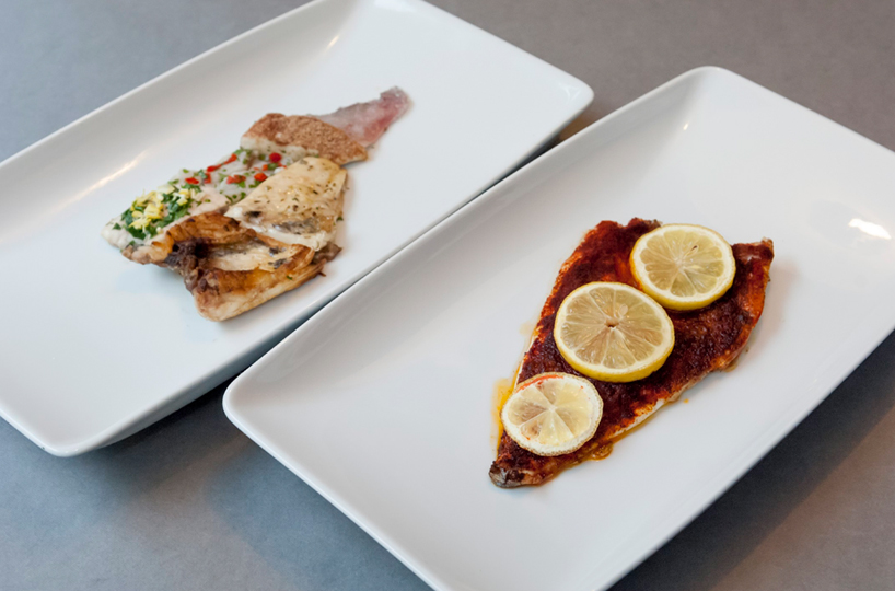
’emigration fish’ by samuel boucher & jahn schlosser
’emigration fish’ represents the emigration of young people from spain. a recipe also designed by samuel boucher & jahn schlosser, the base ingredient is fried dorada which stands as spain in red spices and yellow lemons, while the flip side shows where the spanish could emigrate to. broken down to the six most favoured countries, each of the pieces of fish are prepared in a way that is typical for the respective nation: battered for the UK; a wien sauce á la française for france; cooked in beer and parsley for germany; fried in bacon fat for the US; and a ceviche prepared for ecuador – the taste of each portion meant to transport you to that country.
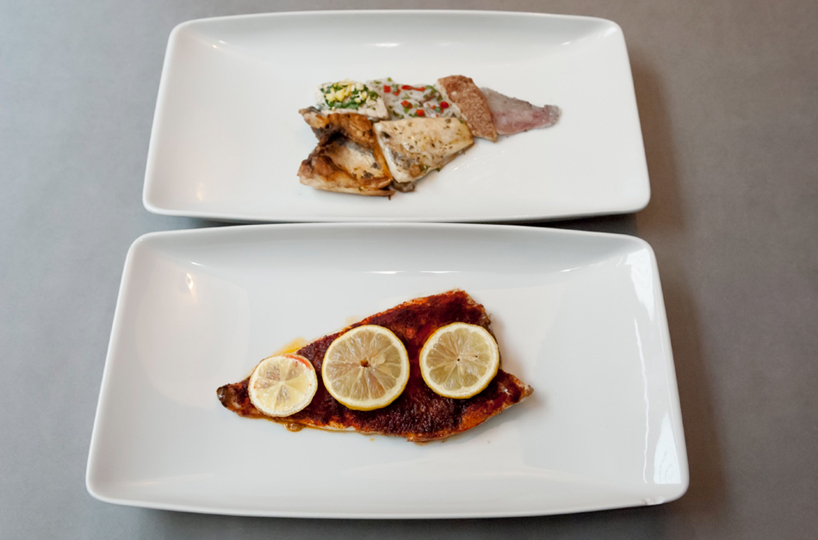
the top dish indicates the six countries most favored by young spaniards to emigrate to, while the bottom plating represents spain
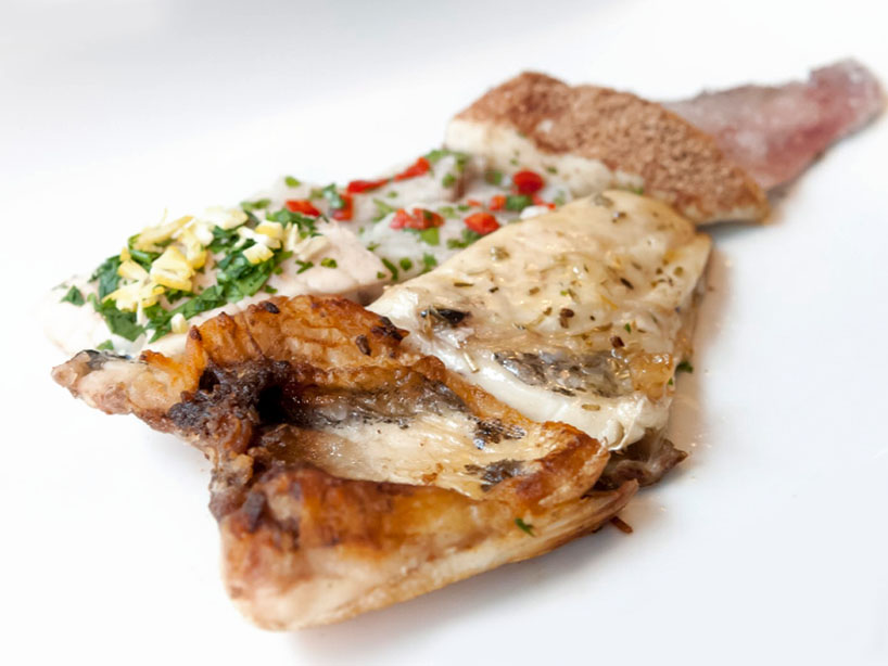
each of the six pieces of fish are cooked in a method that is tradition to the country which it symbolizes
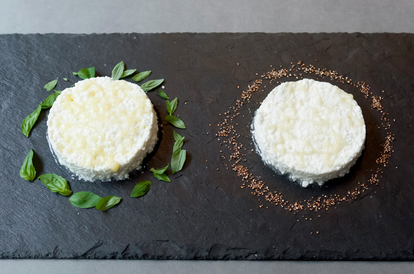
‘xarxes de mel i mató’ by wladimir albuja burgos
wladimir albuja burgos asks, ‘doesn’t the internet make everything sweeter?’. he renders his findings in a dish that showcase internet usage with honey. only 27.6% of people in the age bracket of 65-74 use the web in spain, in contrast to the 99% of 16-24 year olds that do. burgos used a food printer to render a network graphic in honey on top of each portion of mató (similar to cottage cheese) to display these percentages.
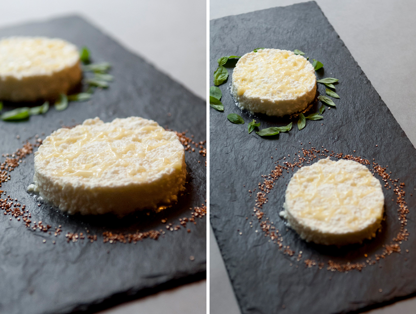
honey is used to display internet usage in spain amongst two distinct age groups
h/t fastco. design
FOOD ART (218)
 Dec 04, 2023
 Nov 10, 2023
 Sep 24, 2023
 May 21, 2023
 Apr 18, 2023
INFOGRAPHICS (19)
 Aug 06, 2020
 May 02, 2019
 May 07, 2018
 Apr 10, 2016
 Sep 08, 2015
PRODUCT LIBRARY
 Apr 15, 2024
 Apr 15, 2024
 Apr 12, 2024
 Apr 04, 2024