
graphic designers reimagine the elderly people road sign
top image by allan dye
NB, together with spring chicken and michael wolff, collective courage launched a competition to redesign the british ‘elderly people’ road sign. you probably know the one – it’s a depressing silhouette of a stooping elderly couple with a walking stick (shown below).
the competition was organized because, the organisers felt that the current sign is a derogatory and out-of-touch impression of older people that implies both frailty and disability. so, they asked some leading designers from around the world to create a new warning sign – a new icon – to make it easier for drivers to see that older adults may be crossing. and one that paints a more positive image of britain’s older community. submissions include those from andy altman (why not associates), bob gill, bryan edmondson, frost* collective among others.
the ambition for the project is to lobby the UK’s department for transport into changing the sign and to raise further awareness of the issue. plans are also underway for an exhibition, publication and promotion of all the designs. updates on the project can be found here.
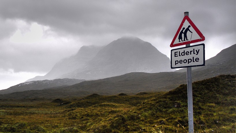
the current british warning sign for ‘elderly people’ – is used in areas where older people might be likely to be crossing the road slowly

by bob gill
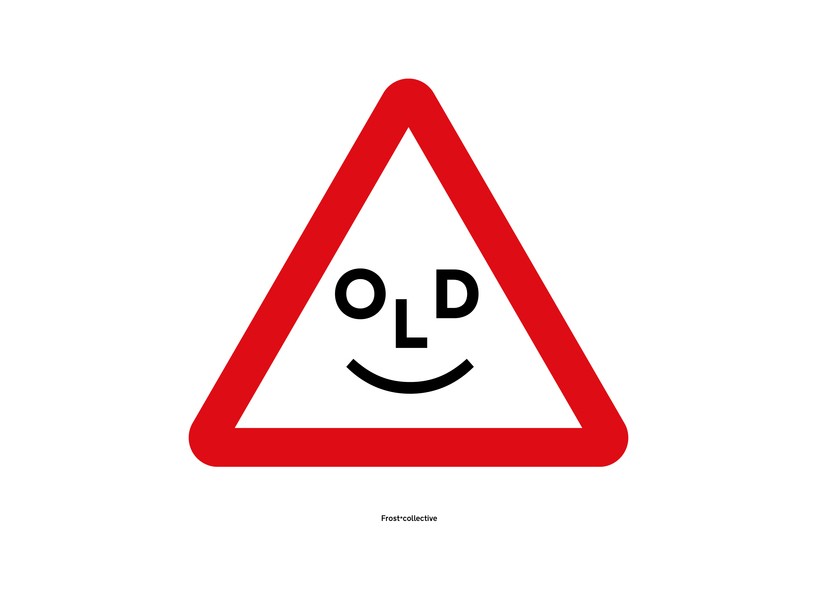
by frost* collective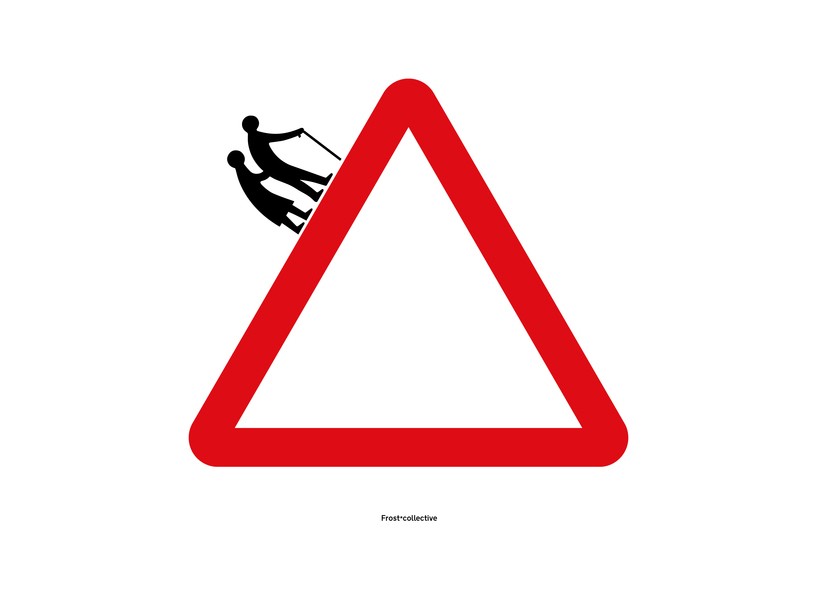
by frost* collective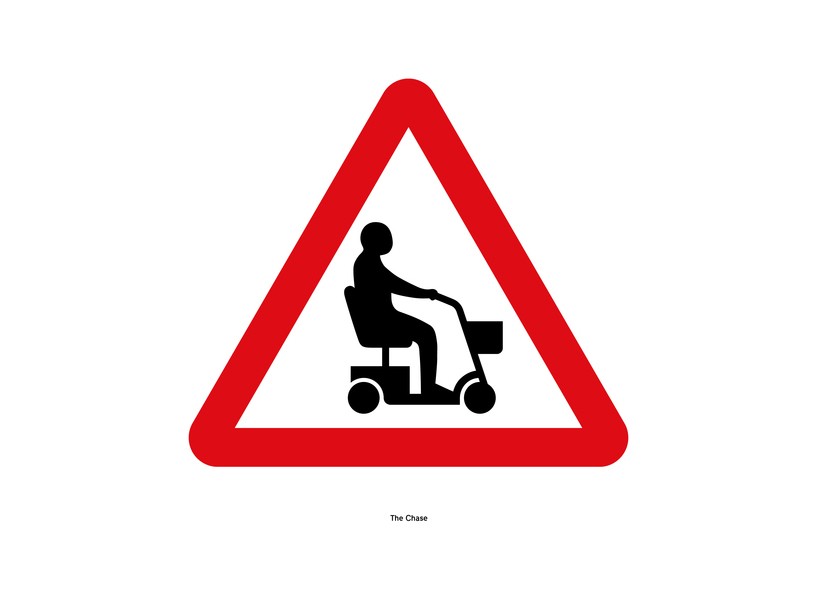
by the chase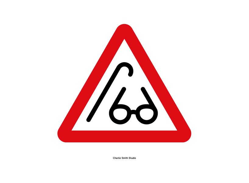
by charlie smith studio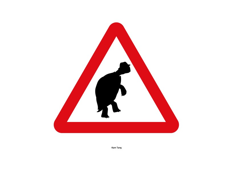
by kam tang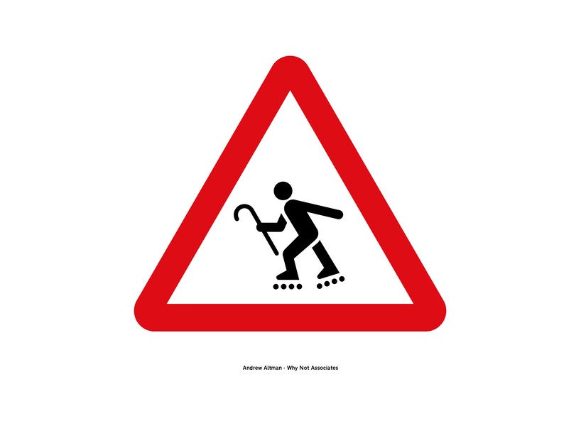
by andrew altman of the why not associates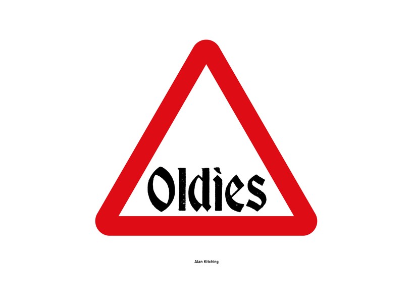
by alan kitching
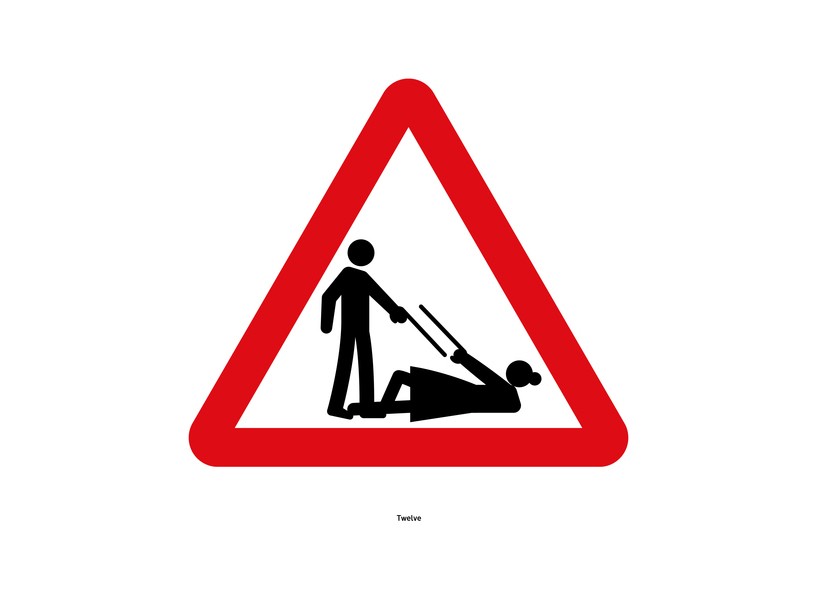
by twelve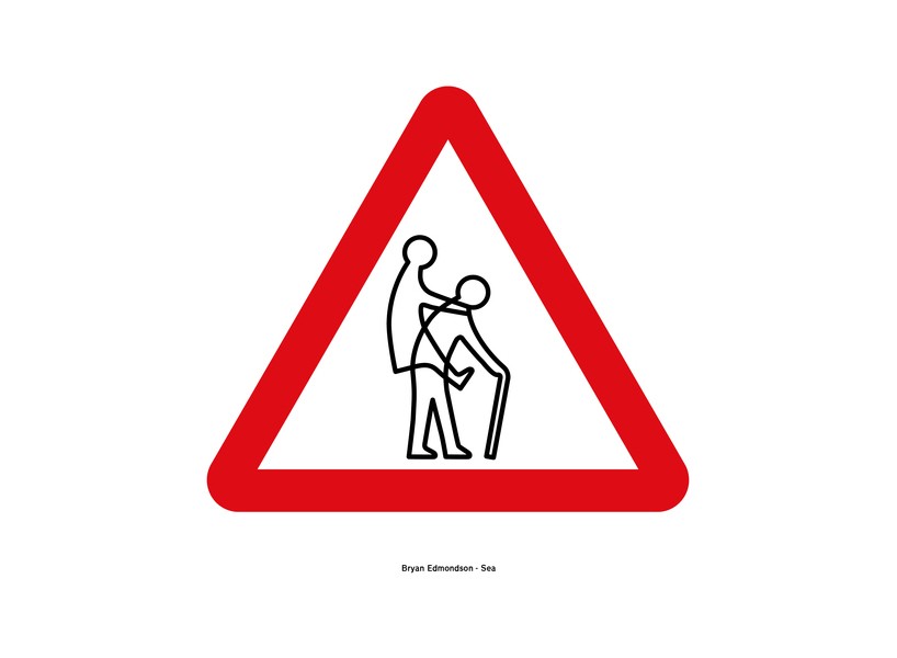
by bryan edmonson of SEA
–
via it’s nice that
PRODUCT LIBRARY
 Apr 15, 2024
 Apr 15, 2024
 Apr 12, 2024
 Apr 04, 2024