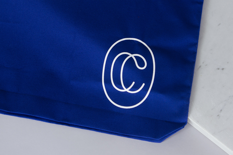
fivethousand fingers conceives minimalist aesthetic for collected coffee
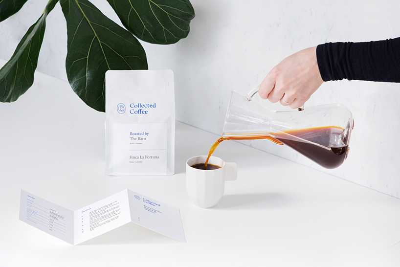
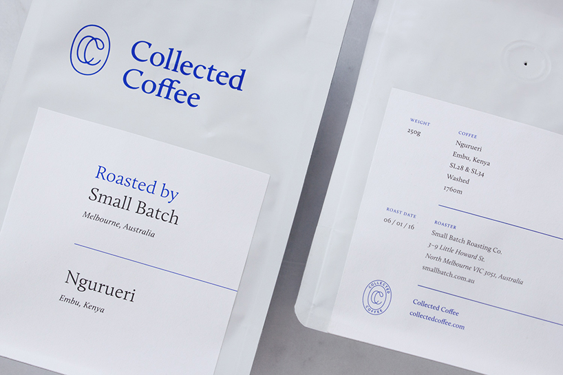
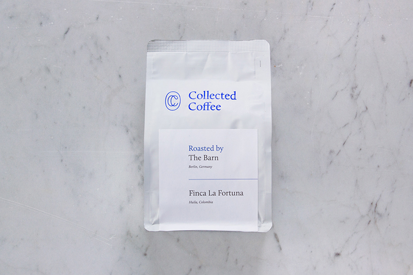
fivethousand fingers design studio has recently completed the branding and packaging for collected coffee. the new york-based beverage brand seeks out the world’s finest growers and specialty roasters to deliver curated coffee experience to the doorsteps of subscribers across the globe.
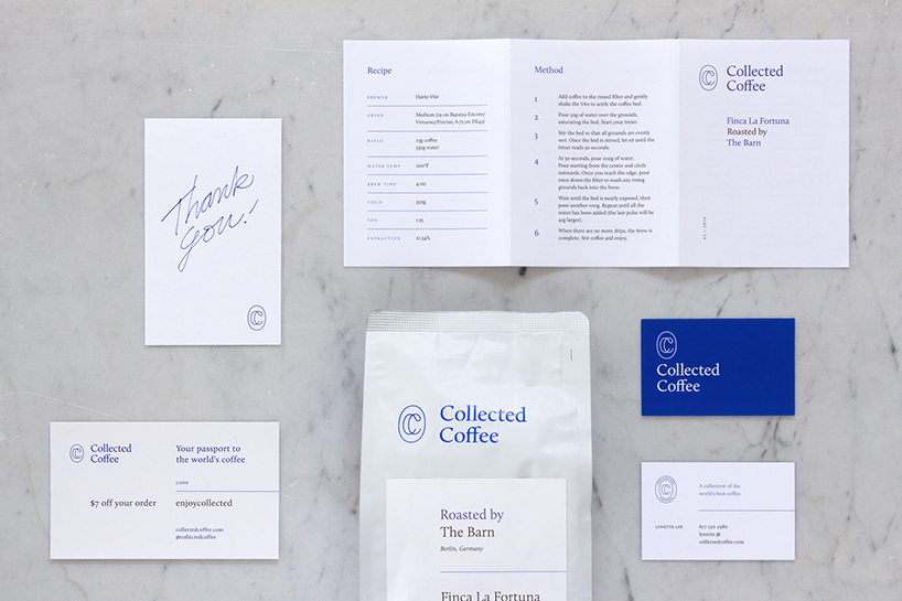
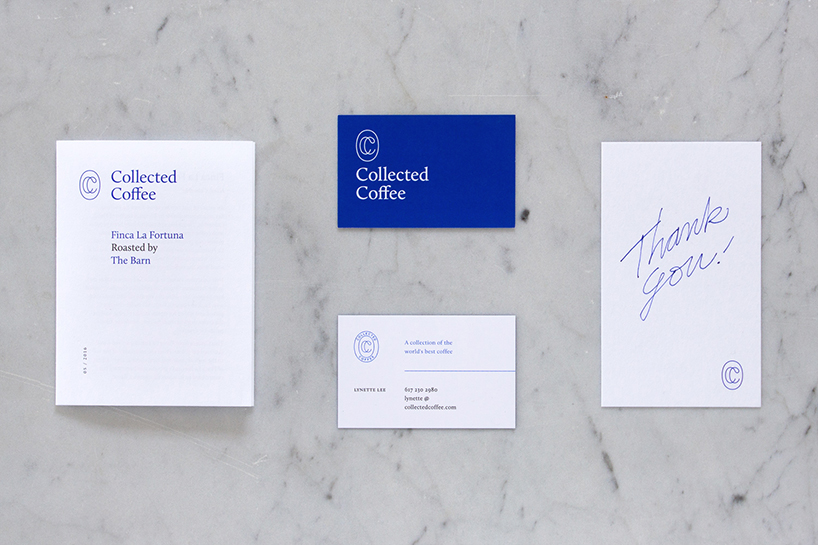
fivethousand fingers has realized a smart, cultured, and curious brand identity designed to appeal to the increasingly-sophisticated coffee enthusiast. from packaging and printed material, to a website that serves as both a reference for aficionados and a window into the wider world of coffee culture, the studio pairs a minimalist aesthetic with a serious dose of substance.
designboom spoke with the team at fivethousand fingers about their collaboration with collected coffee, the vision for the brand, and their favorite aspects of the new identity.
designboom: what was the initial brief given to you by collected coffee?
fivethousand fingers: collected coffee was about to start partnerships with the world’s best specialty roasters to offer their customers a novel coffee experience highlighted by diversity and informed by expertise. lynette lee approached us to create a brand for this new monthly coffee subscription service. their new brand needed to successfully address coffee connoisseurs as well as curious enthusiasts willing to invest more in their coffee routine for higher quality product and an elevated experience.
DB: what objectives did you set out for yourselves and how did you go about achieving them?
FF: we set out to create a smart, and intriguing brand which would intuitively communicate the team’s knowledge and care for the product, and investment in the wholistic experience of it. because of the nature of the subscription we also considered the product as fixture in the customers home hoping to create a point of interest which they would keep visible on their counters.
we concluded that we needed to make design decisions that were:
1. essentialist (form following function)
2. sophisticated (strong attention to details and use of restraint)
3. quirky (surprising design elements to balance with the previous points)
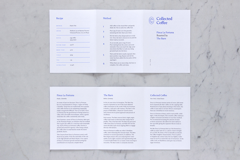
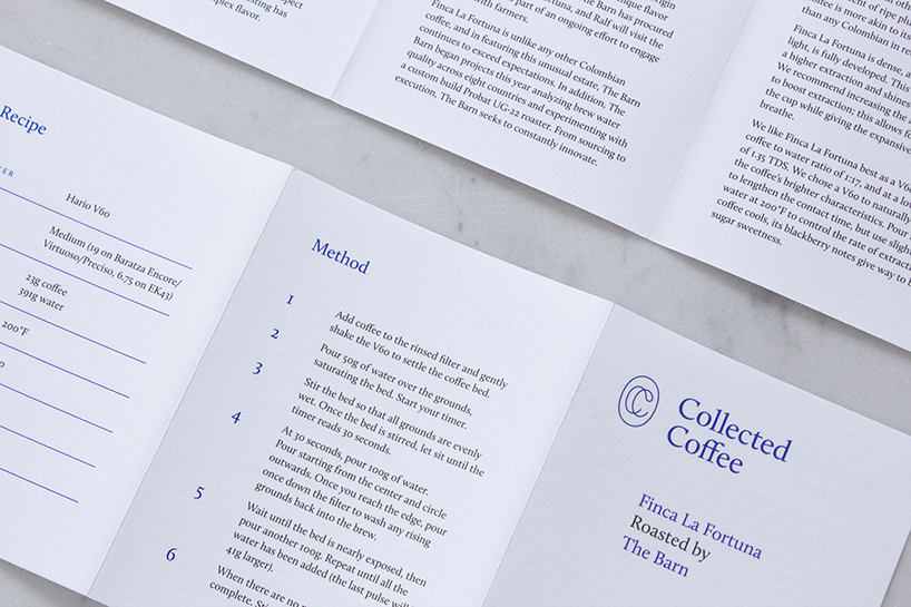
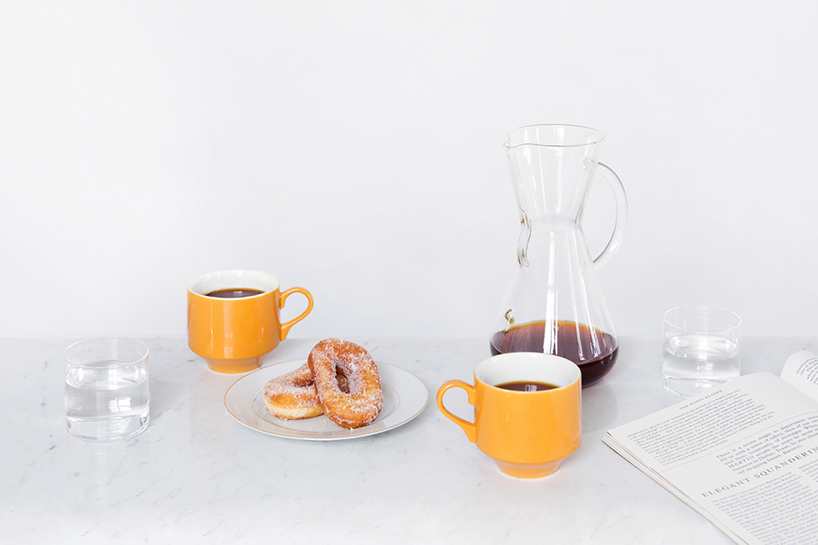
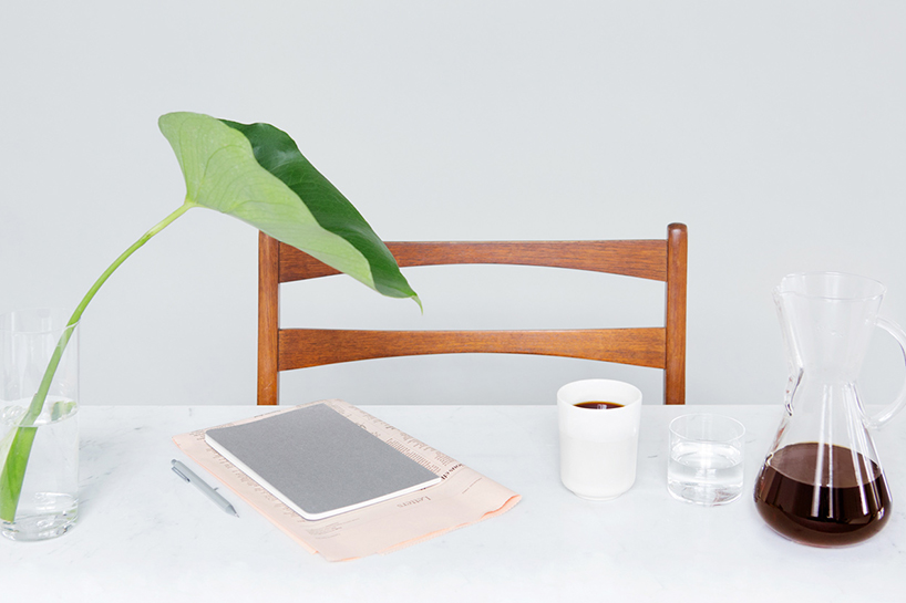
(continued) a booklet accompanies the coffee bags offering information about the origin of the coffee, the story of the roaster, collected’s take on each coffee and precise brewing instructions. finally a hand signed thank you card comes in each package. in addition to the product, we designed a content-focused site including information about the coffees, brewing guides, and a journal that sets to cover much of the coffee culture. we worked with the photographer cindy boyce to create images that followed collected’s minimal and intentional aesthetic.
DB: what aspects of the design were the most difficult to resolve? why?
FF: the biggest challenge was to achieve printing quality for relatively low quantity recurring orders, and in a production geography we weren’t previously familiar with. through research, many tests and collaboration with the client and printers we managed to achieve what we wanted.
DB: which aspects of the solution are you happiest with and why?
FF: we love the images that came out of our collaboration with cindy boyce. it was fun to use the principals of our initial brand process to create a world around the product. we are excited to start receiving the new coffees each month and tasting the product at the core of the brand.
PACKAGING DESIGN (100)
 Feb 14, 2024
 Nov 13, 2023
 Nov 10, 2023
 Oct 16, 2023
 Oct 13, 2023
PRODUCT LIBRARY
 Apr 15, 2024
 Apr 15, 2024
 Apr 12, 2024
 Apr 04, 2024