interview with fuel design group
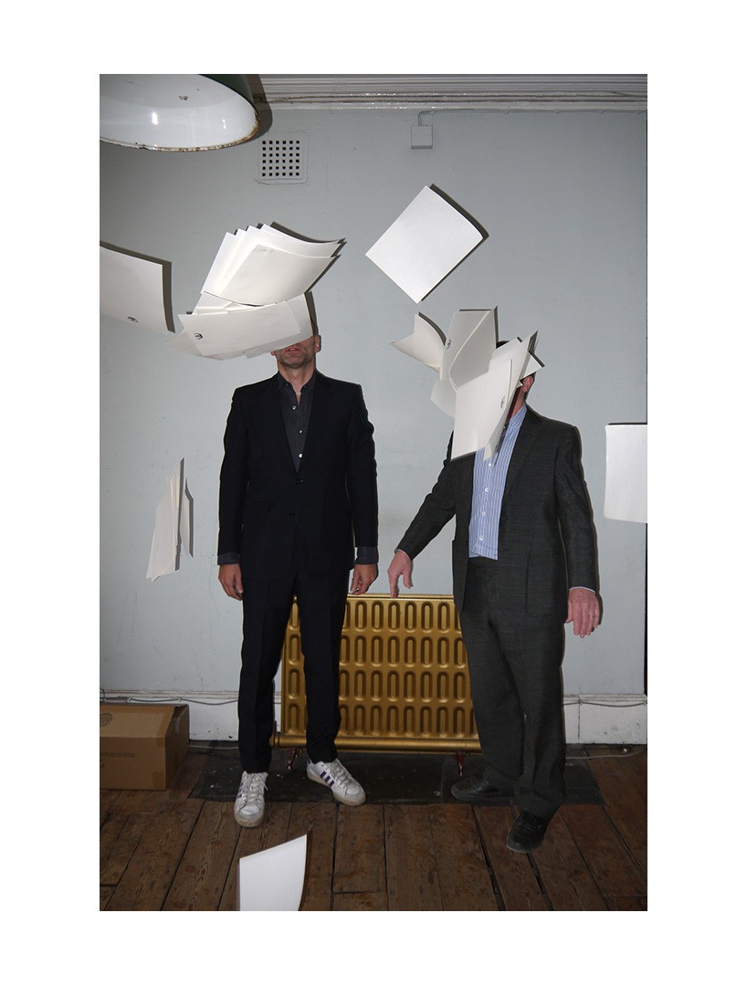
left: damon murray, right: stephen sorrell
FUEL design group was founded in 1991 by damon murray & stephen sorrell. it is best known for its work designing and publishing books but the studio has also produced and directed short films, idents, film titles and TV commercials. in 2005 FUEL Publishing was formed within the group. FUEL books are often initiated and compiled by damon and stephen, or made in close collaboration with artists and authors.
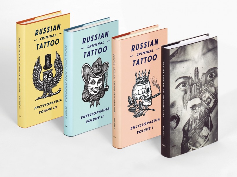
the russian criminal tattoo encyclopaedia volumes I-III, danzig baldaev and sergei vasiliev,and russian criminal tattoo police files, arkady bronnikov (fuel publishing, 2004, 2006, 2008, and 2014)
designboom: can you remember the first images or events that made you both think about becoming a graphic designers?
stephen: I just remember from quite an early age being into graphic ephemera, things like badges, stamps, postcards – stuff you collect. then of course as a teenager it was record sleeves and book covers. I knew I wanted to go to art college to study graphic design from about the age of 15.
damon: as far back as I can remember I was always interested in all types of design (although I didn’t know or understand the term). when I was very young I couldn’t articulate what drew me to certain objects or images. it was only when I was a little older, after design and graphics had been explained to me, I realized the link between these varied items. in some ways it was a disappointment – something i’d reasoned and visualized in my head was lost.
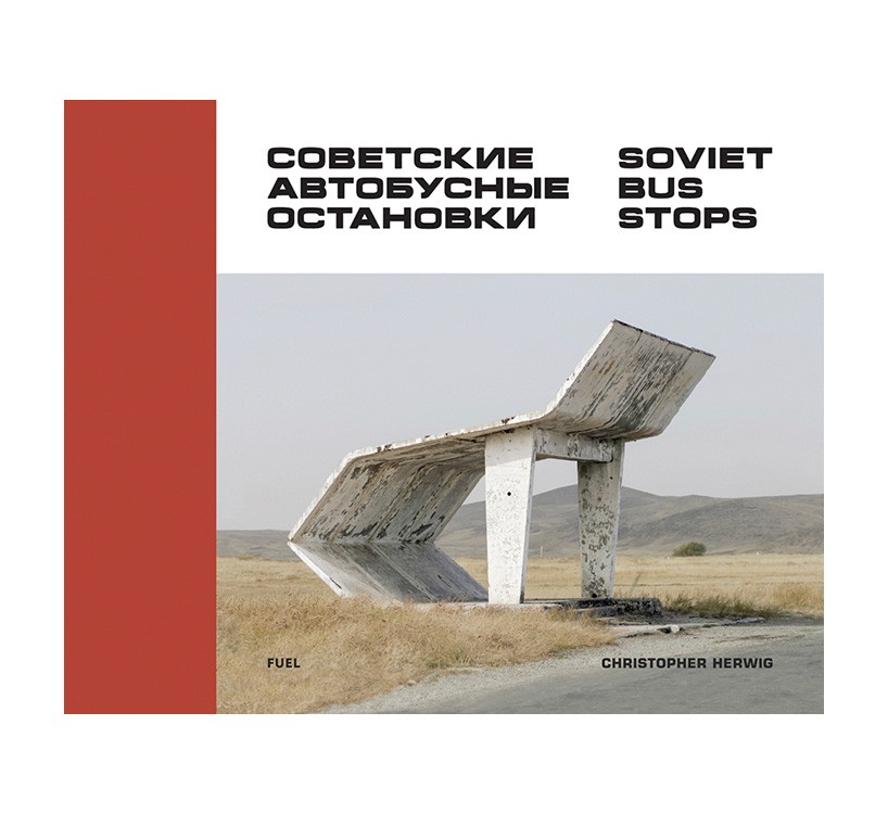
soviet bus stops, chris herwig (fuel publishing, 2015)
DB: how did you meet and what made you want to work together?
damon: we first met in 1987 at central st. martins doing our BA graphic design, but it wasn’t until 1990 at the royal college of art on the MA course that we began to work together. to us the course could only be described as ‘traditional’ and we soon became bored of the set projects. many of the ideas we were excited by baffled our co-students and tutors. we decided to produce a magazine called FUEL. bold and uncompromising – it felt like we were working in a different realm. the magazine was a vehicle to express ourselves in content and form, a means of reaching a broad audience, not just within graphic design.
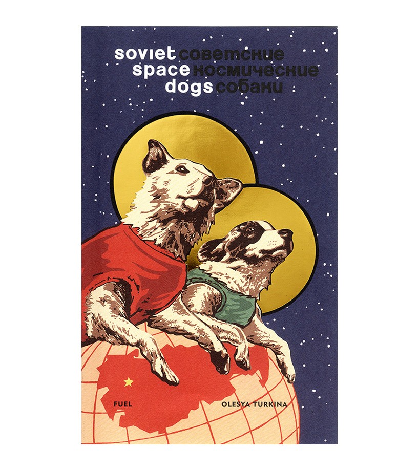
soviet space dogs, olesya turkina (fuel publishing, 2014)
DB: during the early days of FUEL what were some of your goals?
stephen: initially we were focused on survival. when we graduated there were very few people setting up directly from college. from our perspective, graphic design appeared to be a self-satisfied, corporate industry, consisting of established firms producing predictable work. design education was viewed as a platform to a job at one of these companies. for us this was never an option. not only did we work as a team, but our version of graphic design was very different – threatening in a way – to that establishment. as a result, we had no option but to set up on our own, during a period of major economic decline. this decision was not a conscious one, more of a natural realization with the progression of our work.
the most crucial ambition we shared was to continue creating compelling and engaging graphic design. considering a target audience is secondary to the need to make work that is interesting to us. in this sense we are the audience: if it works for us, hopefully it will work for others. I think this is something that has always been present, something that we could not have continued without.
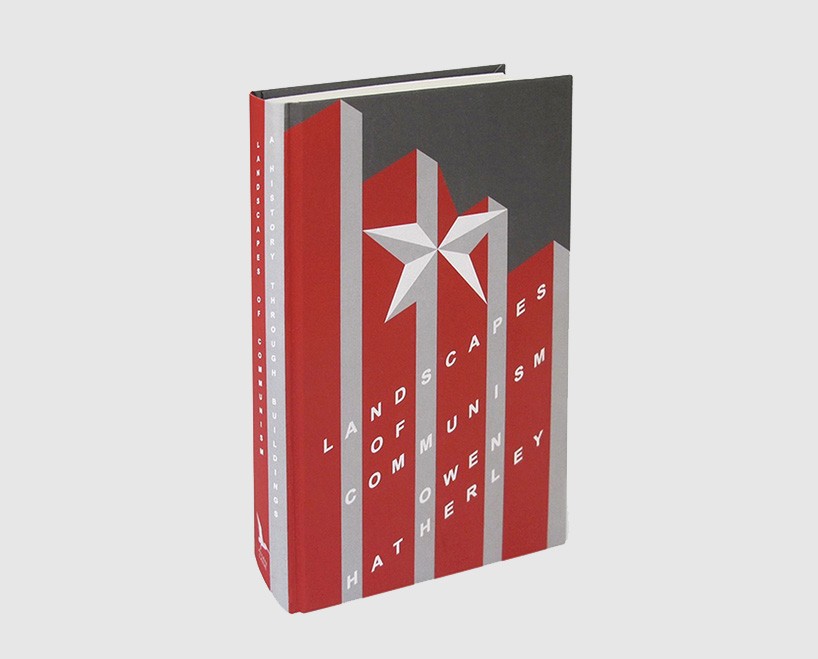
landscapes of communism, owen hatherley (penguin, 2015)
DB: how has FUEL evolved over the years?
damon: there is surprisingly little difference. it was never an ambition to become a big design agency. partly because we’ve never worked for anyone else, we’ve avoided the preconceived structures of typical design groups, developing our own particular methods of working. we work from the same studio in spitalfields that we found in 1992 just after leaving the RCA, the main change over that period has been the size and price of our computers – bigger and cheaper.
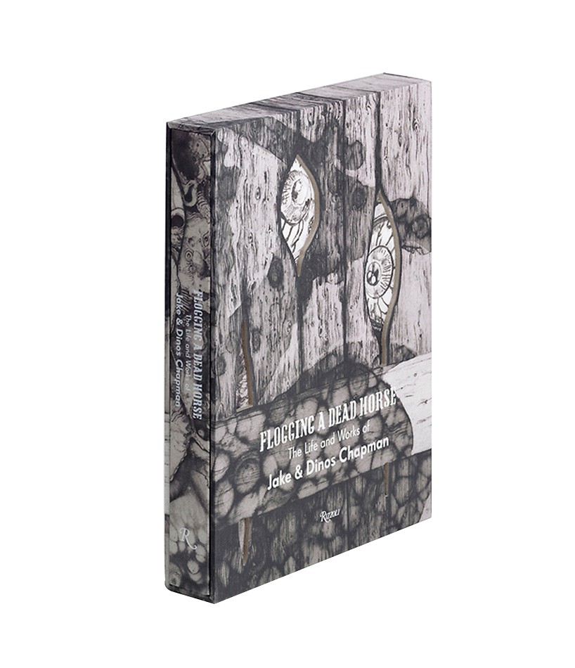
flogging a dead horse, jake & dinos chapman (complete book with slipcase, rizolli, 2011)
DB: how do you describe what you do to people outside of the design industry?
stephen: we tend play down what we do, partly because it’s not straightforward to explain – our approach to design often requires the application of different skills depending on the project. this might mean anything from discussing content with artists and authors, to editing and retouching images.
graphic design has developed and disseminated into many different areas and specialisms. in this respect the label ‘graphic designer’ has to some extent become vague. how you describe yourself or what you do is not critical, but significant work is essential. having an elusive job description isn’t something we worry about. most of our work comes from recommendation or people we know, so the awkward situation of having to explain ourselves only arises when meeting relatives at christmas.
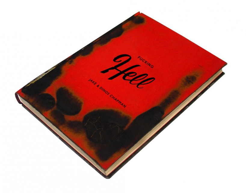
fucking hell, jake & dinos chapman (catalogue, white cube, 2008)
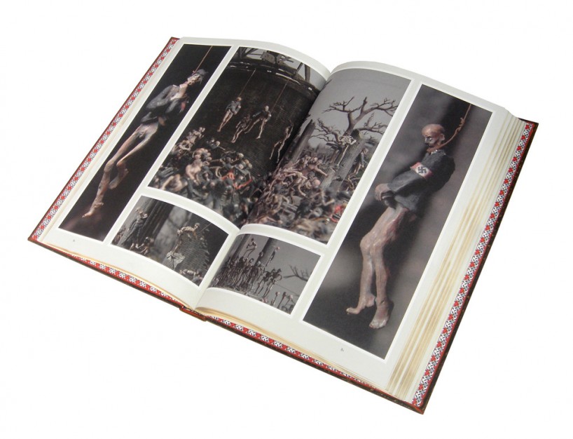
fucking hell, jake & dinos chapman (interior spread from catalogue, white cube, 2008)
DB: what would be your ideal project at this stage of your careers?
damon: in a way we are already working on it – our publishing is really the ideal project for us. although we’ve never sat down and made a plan for what we want to do, or where we want to be, in many respects it feels like the point we’ve been working towards over the last 24 years.
it allows us a level of control over our own destiny. we are able to create great books on subjects we’ve chosen. it’s a perfect combination of research, editing, designing and publishing – all elements that we view as strands of our graphic design work. оur time is divided fairly equally between working on our own projects and designing for others. this position allows us to apply the knowledge we’ve acquired through our own undertaking, and produce books that other publishers might not have envisaged. we’ve reached a point where we are not viewed simply as part of a service industry. with the majority of our commissions we are expected to contribute something of ourselves, combining the commercial and personal.
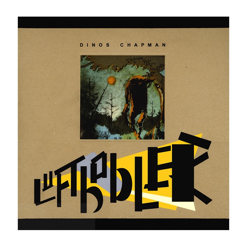
luftbobler, dinos chapman (cover of album, vinyl factory, 2013)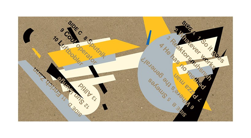
luftbobler, dinos chapman (interior gatefold of album, vinyl factory, 2013)
DB: what part of the design process gives you the most satisfaction?
stephen: the beginning and end. thinking of the early ideas that formulate a project is almost as exciting as seeing the finished product. the middle bit where we produce the work isn’t so bad either. the evolution of disparate parts into a complete whole is an enjoyable process, as it gains momentum each project find its own character, forming a singular end result.
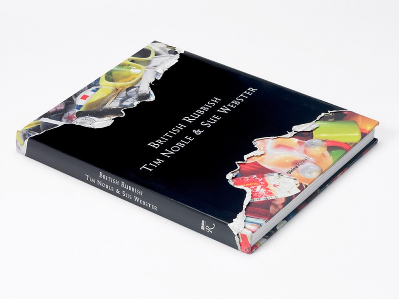
british rubbish, tim noble & sue webster (complete book, rizolli, 2011)
DB: how do your individual skills compliment or contrast with the others?
stephen: over the years our individual skills have blended between the two of us. they are so integrated now that it is difficult trace where one input stops and the other starts. whatever either individual produces will be viewed and commented on by the other, so nothing leaves the studio without it being jointly authored.
people are often surprised that FUEL is just the two of us (we’ve never employed assistants or interns), but we’ve found a way of working that is efficient. every project we undertake receives the best of our combined skills.
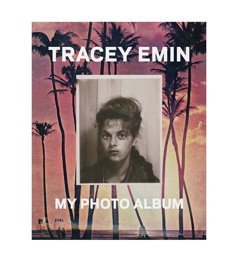
my photo album, tracey emin (fuel publishing, 2013)
DB: how did you become involved with publishing and what do you enjoy most about designing and producing books?
damon: from the start we’ve worked within the medium of publishing, beginning at the RCA with our magazines. the first book we designed was our own – pure FUEL in 1996. since then we’ve worked for a number of other publishers as well as starting our own publishing company in 2005.
we’ve always been interested in content over style and finding unique subject matter has always been important to us. we began to approach publishers with ideas for books. there came a point where we were doing everything: from the concept to commissioning texts, editing, sourcing material, designing and print handling. the only thing missing was publishing, ultimately it was a logical step.
stephen: we’re perhaps most well-known for the books we’ve published on russia, including our bestselling ‘russian criminal tattoo encyclopaedia’ series. we first visited moscow in 1992, and as graphic designers the former USSR exerted a great influence on us. at that time, the soviet union had just collapsed and the country was experiencing extreme hardships. we were amazed by the stoical way the population continued with their lives through such a turbulent period. our publishing company gave us a platform to chronicle the country using visually diverse material, describing an alternate history. the books have had a huge impact, particularly in the creative industries. their influence can be seen everywhere from film to fiction to fashion. the tattoo series has become a standard text for the subject, and our ‘drawings from the gulag’ was recognized as historically accurate by the centre for holocaust & genocide studies in the nederlands. subjects like this are important to us because they show the possibilities graphic designers have to use their skills to produce, design and edit notable products – not just in terms of design, but as meaningful documents in their own right.
damon: оur latest book in the russian series is called ‘soviet bus stops’. it presents images of architecturally stunning bus stops from across the former USSR, photographed by chris herwig. designed by fledgling architects given free reign to express their ideas, the structures range from expressive and flamboyant to brutalist and conceptual. these minor monuments to experimentation, scattered across the former socialist republics in various states of decay, are testament to a creativity and individuality we commonly assume to have been suffocated by the power of the soviet regime.
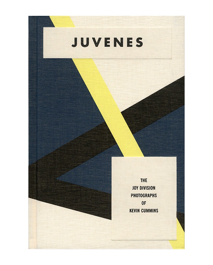
juvenes: the joy division photographs of kevin cummins, kevin cummins (complete book, to hell with publishing, 2007)
DB: what’s the best piece of advice you have ever been given?
stephen: we never really listened to advice, we advise others not to do the same.
book man (poster, fuel, 2005)
DB: what’s FUEL’s motto?
damon: bad taste is designing with good taste in mind.
graphic studio interviews (193)
 Nov 21, 2022
 Feb 10, 2019
 Jun 21, 2018
 May 17, 2018
 Oct 04, 2017
PRODUCT LIBRARY
 Apr 17, 2024
 Apr 15, 2024
 Apr 15, 2024
 Apr 12, 2024