
fuseproject gives 500 capp street foundation new brand identity
internationally recognized artist david ireland was a long-term resident of the mission district in san francisco. known for creating innovative site-specific works, his home at 500 capp street is the zenith of his work. today, the 500 capp street foundation aims at not only preserving his former dwelling as the city’s first artist home, but will present curatorial programs, special events, open houses and tours, along with an artist-in-residency program. the brand team at fuseproject was commissioned to collaborate with the organization in order to develop a identity that would express the activities of 500 capp street, and mark it as a new and unique arts and culture institution in the bay area.
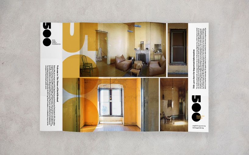
500 capp street foundation visitor brochure
the house is a place where chairs become wall fixtures, coat hangers become the foundation for suspended sculptures, and windows become the platform for an alternate reality. ‘david’s work is dynamic, transforming every element of his home into an artistic wonderment. we gave the institution’s identity an unpretentious and intimate touch by creating custom bold letterforms that resemble his famous ‘dumballs’ paired with a charming yet substantial, domaine,’ says kristine arth, our director of brand at fuseproject.
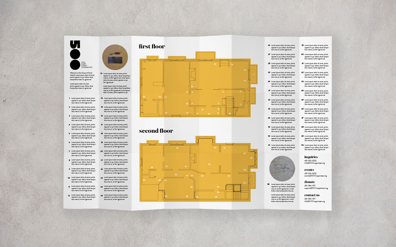
500 capp street foundation brochure with visitor map fold-out
in developing the look for the foundation, fuseproject surveyed how the logo would eventually translate into other branch touch points, and they kept returning to the ‘500’ as the fulcrum – ‘500 ways to see david ireland’, ‘500 reasons to be grateful’, ‘500 reasons to celebrate’. thus, this became the tool and image used to interact with the brand, creating the dialogue and an intimacy that is as integral as an art institution. fuseproject realized a range of products employing the identity — from business cards to letterheads, invitations to brochures — that have been designed to play with one another, merging life and art in the same way that david did so with his home. the particular colors chosen were taken directly from ireland’s house, with the use of the high-gloss polyurethane varnish as the hero color. additionally, maps drawing on the same theme, start out as an uninteresting take-away card, magically unfolding into a full-size map.
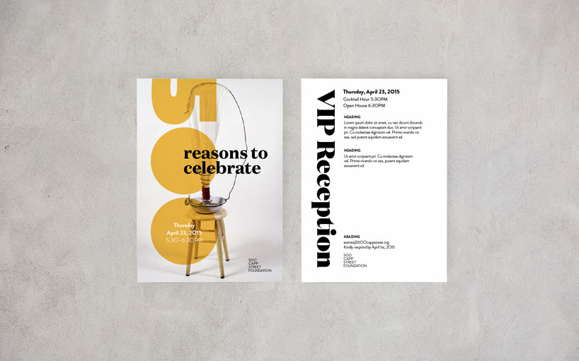
500 capp street foundation special event mock-up
the new brand identity for 500 capp street foundation has been envisioned as a total visual narrative of the initiative, representing the mission and vision of the company. fuseproject have put forth a product that is centered around art – inviting questions, imitating live and inspiring dialogue within the community. the house’s public opening is january 2016, and the hope is to get the brand out into the world, reiterating and re-imagining itself in the same manner that the artist himself did during his lifetime.
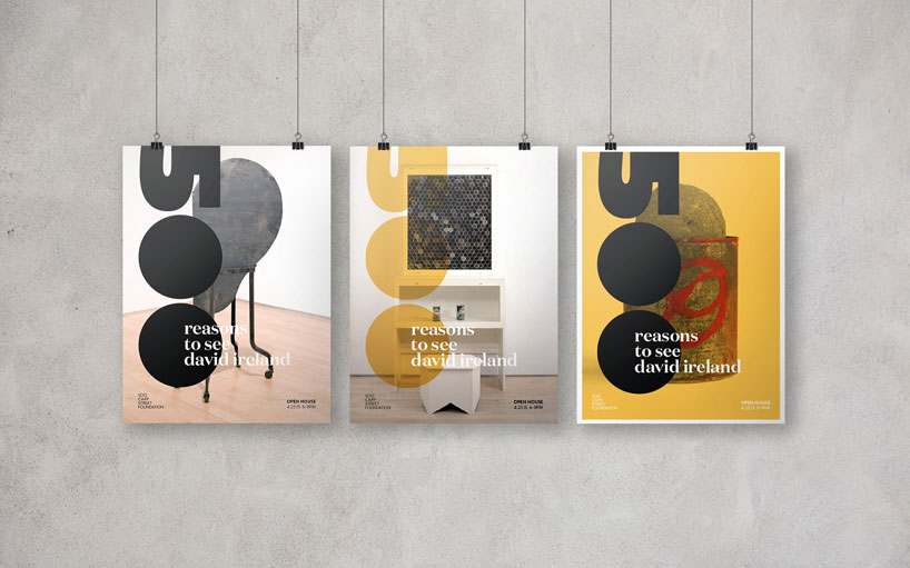 500 capp street poster mock-up
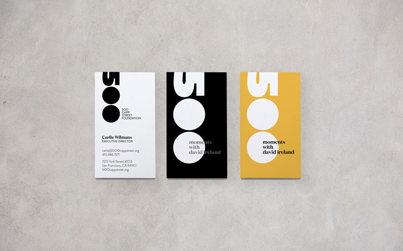
500 capp street foundation business cards
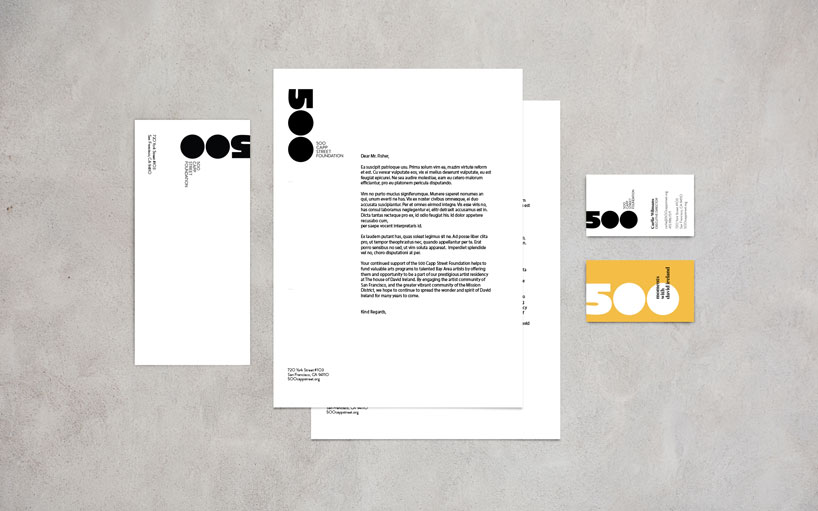
500 capp street foundation stationery 
500 capp street foundation thank you card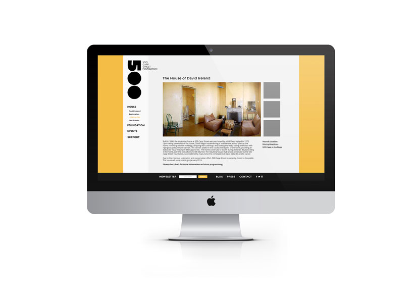
500 capp street web desktop mock-up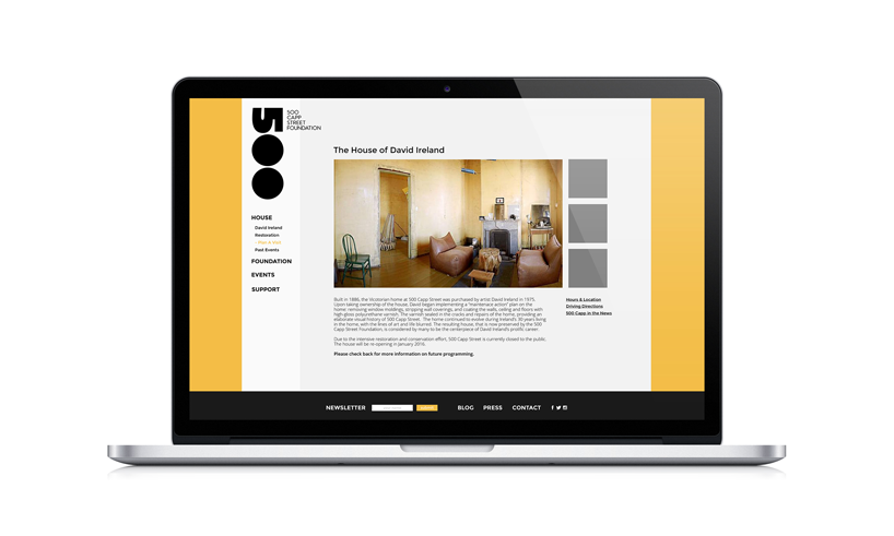
500 capp street web laptop mock-up 
500 capp street foundation logo
500 capp street foundation logo
 Dec 17, 2025
 Dec 04, 2025
 Dec 03, 2025
 Nov 19, 2025