american airlines have unveiled a new brand image that will roll out from today
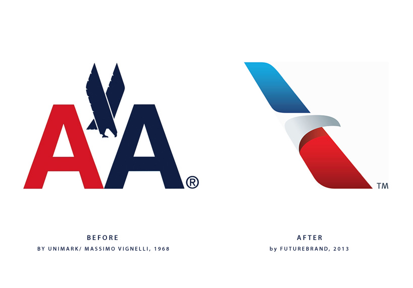
futurebrand have rebranded american airlines, their new ‘flight symbol’ will replace the celebrated 1968 massimo vignelli design.

evolution of the american airlines logo
the evolution of a true american iconamerican airlines is one of but a handful of brands considered true american icons. strong and proud, its silverbirds are fixtures in the sky, and its namesake sense of possibility inspires deep loyalty. today, the company’s also invested in that most american of ideals: progress.
american recognized it was time for a new look to better reflect the progress of its multi-year journey towards modernizing the airline and its customer experience.
the new look, the next step in american’s overarching transformation is inspired by the company’s heritage and incorporates colors and symbols universally associated with american. a reimagined logo, called the ‘flight symbol’ evokes the star, ‘A’, and iconic eagle of american’s past, all brought to life in refreshed shades of red, white and blue. together, they reflect a more modern, vibrant and welcoming spirit.
the logo also debuts alongside a boldly reimagined livery. with proud stripes and a timeless silver body, the livery expresses american’s origins but also the spirit of modern america: innovative, progressive and open to the world.
 the new wordmark with the ‘flight symbol’
 the ‘flight symbol’
 3D model of the the ‘flight symbol’
 the new AA livery sees the logo removed from the tail and red and blue stripes introduced
 how the old tail (left) compares with the new design (right)
 new logo applied to the famous silver planes of AA
FUTUREBRAND (2)
 Jul 23, 2012
LOGO DESIGN (244)
 Aug 14, 2023
 Aug 02, 2023
PRODUCT LIBRARY
 Apr 15, 2024
 Apr 15, 2024
 Apr 12, 2024
 Apr 04, 2024