giorgia lupi interview
we talked to accurat‘s design director giorgia lupi about the studio’s work.
DB: please could you tell us about your background?
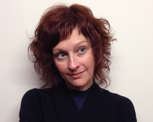
GL: I studied architecture at university but I have never built or designed any houses! during my studies I became very interested in the representation of information, and tried to push all my architectural and urban projects towards working with information and mapping systems. from 2006-2010 I collaborated with different interaction design firms in italy focusing my contributions on visual documentation and representation, mapping and information architecture.
it wasn’t’ until lately that I started working specifically with data visualization. it came naturally to me to progressively focus more and more on the quantitative side within information design field, and when i got to understand the true potential of working visually with structured data to convey information about phenomena or contexts, I simply fell in love with this world and the possibilities it opens. in 2011 I both co-founded my own information design company, accurat, and started a PHD in communication design within densitydesign lab at milan politecnico.
at accurat we rely on building multidisciplinary teams to work on our projects. our team is composed of designers, developers, data analysts, interaction designers, and also interestingly one of my partners simone is a sociologist. I coordinate the design teams with a focus on representation.
I have played a lot of piano, and done contemporary dance for 20 years, which I think this is kind of influences my design work in some way. I should also tell you who I am not: I cannot code, and I am not inclined towards it, sometimes I think ‘I could learn, I should learn, I’ll do it…’ but no, at the end of the day I’ve never applied myself to do it and probably never will!
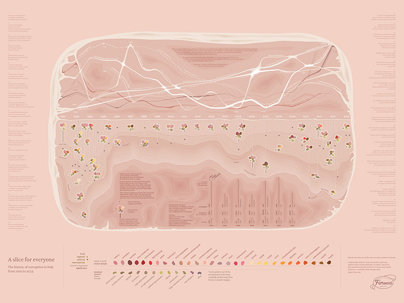
a slice for everyone – the history of corruption in italy from 1992 – 2012 – bigger image
designed and produced for mccann world group / fiorucci
DB: how would you describe your work to someone who hasn’t seen your work before?
GL: I see the focus of my personal work with accurat on designing pleasant aesthetics that tell data-stories; I like to describe my approach and our work as an attempt to compose aesthetically beautiful and multilayered images with data. of course, the accuracy of information representation principles should be followed, and we try to do it while always pushing a little bit farther the boundaries of what we can produce, visually speaking. a pure and beautiful visual can become a trigger to get people curious and want to explore its contents. I like the idea of making people say ‘oh that’s beautiful! I want to know what this is about!’. I think that being italian plays its role on this idea of ‘making things not only functional but beautiful’ – or so people have told us.
DB: what has influenced your work the most?
GL: my architectural background and the very fact that I’ve been spent almost five years of my life designing, ‘composing’ and manually drawing architectural and urban plans shaped my mind and my visual aesthetics a lot. moreover, I’ve always been very fascinated by the geometrical feel and balance of abstract art compositions and also by the repetitive aesthetic of musical scores. from the data-visualization and data-art field, references would be the work of moritz stefaner, aaron koblin and jer thorpe, three outstanding professionals whose work I recommend everybody to check out.
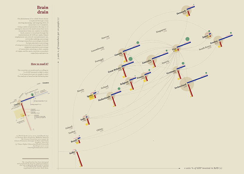
data analysis and visualisations originally published in italian for la lettura during 2012 and 2013
the above image looks at why scientists might leave their native countries to pursue research abroad
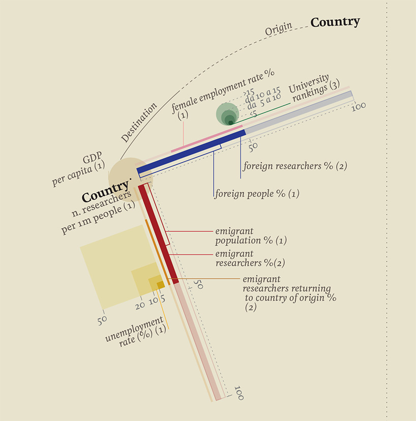
detail
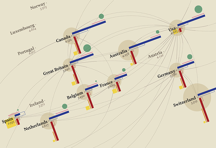
detail
DB: please could you tell us a bit about the process of designing a typical infographic?
GL: for us a data visualization project can start either from a ‘visually driven’ or ‘data driven’ approach. sometimes data visualizations can even come from a fascination or a visual intuition we might have in mind without any data at hand: ‘why don’t we visualize this….. like that….?’ we might not have the data yet, but we know or suppose we can find it: the visual metaphor here is the lead element driving our design choices. other times, of course, this intuition doesn’t happen and it’s the way data behaves that drives us towards the definition of the visual models that better display the patterns we find. once the general organization of the piece becomes clear, we proceed to shape the details and build layers of additional information to provide correlation, depth and richness. I described the process in detail on a scientific paper i published for the parsons journal for information mapping, that can be found here – of course the processes are slightly different if you are to visualize data for a static piece (for print or as a digital image) or if you are to produce an interactive or dynamic data visualization where users or readers are meant to find their path to explore the datasets.
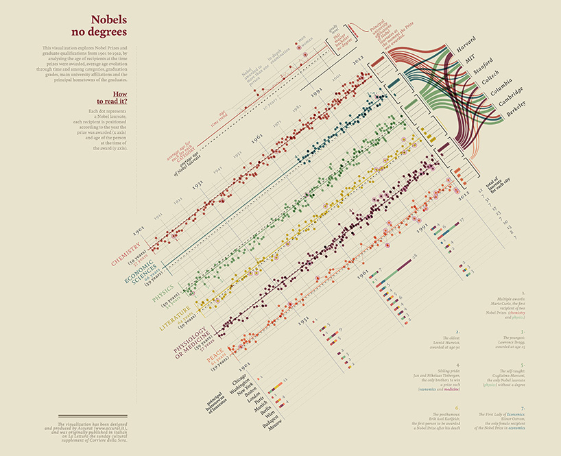
nobel prize winners, their qualifications and age when they received their award – bigger image
DB: infographics are enjoying a new wave of popularity, why do you think this is?
GL: the popularity of infographics and data-visualizations is happening for many reasons. to begin with, nowadays people are exposed to an increasing stream of contents from many sources, thus their attention span is limited. to this regard, bright and catchy images such as infographics fit perfectly into this media diet, playing with hierarchies to provide multiple levels of possible readings within a single piece, engaging people with the topics.
most of the online infographics are very easy to be shared and linked (and people love to do that!) of course then the proliferation of a number of easy-to-use and free tools have made also the creation of infographics available to a large segment of the population.
I think now it’s a right time to talk about the very terms ‘infographics’ and ‘data-visualization’ – the boundary is in a way fuzzy, they both are visual representation of information that can be static, dynamic or interactive. from my point of view, a data-visualization is a visual representation of one or more data-sets, where everything that is on the page (whether it’s printed or digital) should be directly connected to a parameter parameter or value: from how the elements are positioned within the main layout to all of the singular features (colors, dimensions, shape…) each element assumes.
‘infographics’ to me is a broader concept that implies the use of iconography, basic data charts such as bar-charts pie-charts or spark-lines, numbers, caption and graphic elements to illustrate the many quantitative and qualitative contents or a story or fact.
if you look at the kantar ‘information is beautiful awards’ long-lists entries are grouped the into data visualizations and infographics.
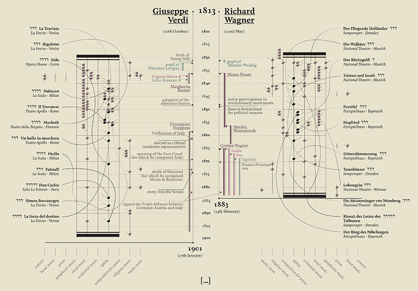
verdi compared to wagner – bigger image
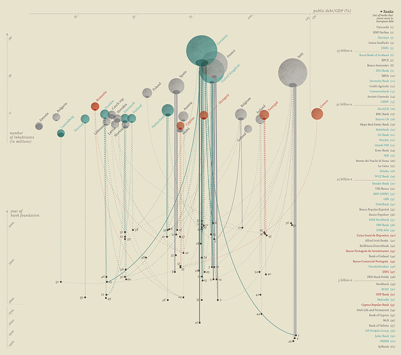
european banks and governement debts – see bigger image
DB: what type of information is the most difficult to translate into a graphic?
GL: the most difficult information to include in a data visualization are the most ‘qualitative’ ones. much of the information we encounter every day is hard to be conceptualized and translated into abstract symbols or quantitative elements. in those cases, we try to start categorizing and grouping these qualitative data in order to be able to get an abstract representation of them, or we find a graphic and visual way to do it. as an example, in the ‘visualizing painters‘ lives’ series, where we built a visual anthology of ten abstract painters’ lives, isolating pictorial elements from those painters’ styles and using them to tell the story of their life and artistic production through a series of comparable diagrams. we depicted a timeline for each painter, illustrating his artistic production within his main periods, his awards, trainings, connections and influences and further information about his life such as health related issues, habits, love affairs, travels, and important events; and thus representing qualitative information in a quantifiable way.
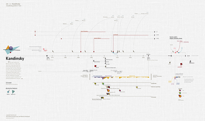
painters lives series – bigger image
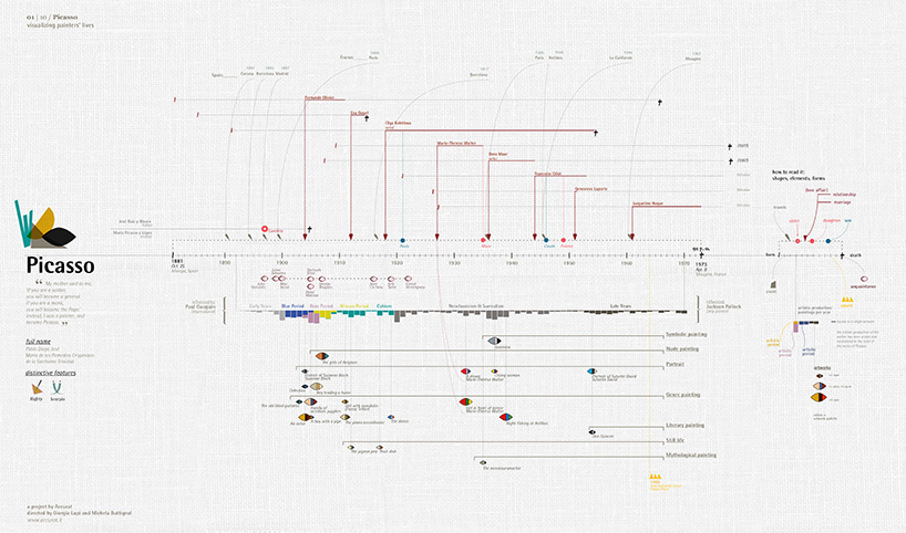
painters lives series – bigger image
DB: what advice would you give to someone designing a infographic or diagram?
GL: it is very important to keep a curious and critical eye on everything that strikes one’s attention, because the main resource for a designer is understanding where and how to get inspiration from. I try very hard not to look for visual inspiration from existing data-visualizations; I feel we really need to look somewhere else if we want to be ‘innovative’ in a way, and ‘fish’ for visual clues in unusual contexts, as an attempt to ‘analyze’ or discover the aesthetic qualities of all the things that we naturally like, in order to be able to abstract them and introduce them in our designs. we can be inspired by abstract art or architectural drawings, as I was touching on before, but also from other forms of visual arts, moving images or anything made by nature or men in the physical world. crucial here is training ourselves to ‘see’, questioning ourselves about what we are seeing, what we are appreciating and why. it is then very important to track records of the things we like, to build our own visual collections of references, and nowadays we have many many ways to do it. as an example I use pinterest as a digital way to record my ‘likes’ and save them for the moments I need to get ideas and I am encouraging everybody in the office to do the same!
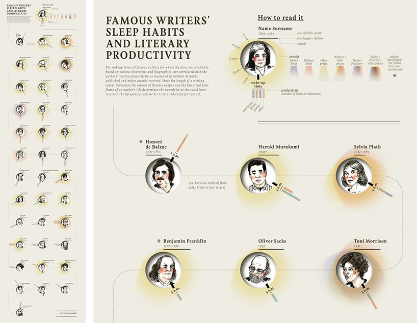
visualizing writers’ sleep habits and literary productivity
in collaboration with maria popova and wendy macnaughton
more info
DB: do you think it’s important for a designer to be able to draw?
GL: speaking for myself, I draw a lot, and I use drawing as a primary form of understanding reality and expressing thoughts and ideas. this is also very related to what I just said in relation to the previous question: the very act of drawing, of reproducing reality and thus focusing on the things we like and notice definitely helps to introduce what I would call ‘a level of abstraction’ that helps to translate the things we like into clues for our designs.
since drawing can mediate between perception and reflection, it plays a constitutive role in the production and communication of knowledge, and from my perspective, the genesis of ideas is often directly connected with graphical thinking. of course, drawing is also a very important tool to quickly sketch out the first ideas we might have for an info graphic or data visualization layout, and thus being able to communicate it with clients, or our team-mates, and facilitate the communication processes.
ultimately this is very personal. I know lots of amazing designers who use digital tools or even coding to sketch out their first ideas; or who rely on digital methods to capture design insights.
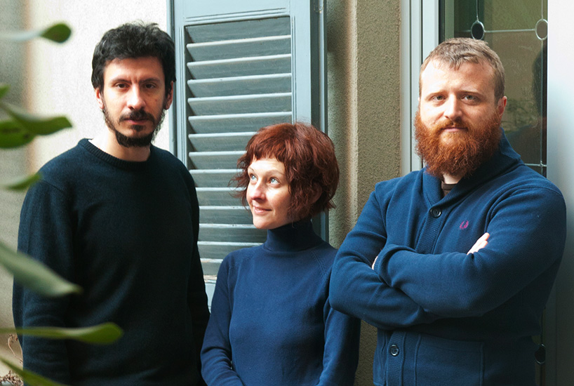
simone quadri, giorgia lupi, gabriele rossi – co-founders of accurat
DB: is there a certain type of project you would like to work on in the future or do more of?
GL: as accurat we are mostly known for our static data-visualizations for printed medium, and our first year of explorations of new visual languages for static data narratives was very important for us to define what we want to bring to the table. lately, we’ve been working a lot more with interactive projects and we are planning on doing it more and more during next year. for example, we enjoyed a lot working on the design of this interactive visual access to the crunchbase database highlighting the relationships between startups, venture capitalists and founders through time, and building a tool to let users find their paths and perform their researches on the data. I illustrated the process of this project in this blog post. lately we have been experimenting a lot with the design and development of interactive interfaces and visualizations, and we’re about to release some new ones early in 2014.
it’s of course impossible to be completely objective, but the more you can let users explore (and interact with) data, the more you are acting less a ‘curator’ and instead giving people tools and instruments to discover the topics independently, and this is very compelling and one of the main reasons we are willing to do more of these. we would also love to work more in the interactive exhibition field (I still am an architect somewhere deep inside!), we see lots of potential in using data visualizations to tell stories in physical spaces.
DB: besides design, what are you passionate about?
GL: that’s hard to say because I tend to trace everything that thrills me back to the design world. the thing that fulfills me the most, is crafting ideas and building tangible outputs whether they are a drawing, a data-visualization, a song or a choreography. as i see it, I am always ‘designing’ something, if by design we mean the act of conjuring inspiration into something that didn’t exist before or something that becomes tangible for people that are not in my head. I’m very passionate in any learning process, I would love to never stop learning new things, new languages and knowing new people and new worlds (physical places or new disciplines) to open my perspectives.
