
typographic chess set by hat-trick design
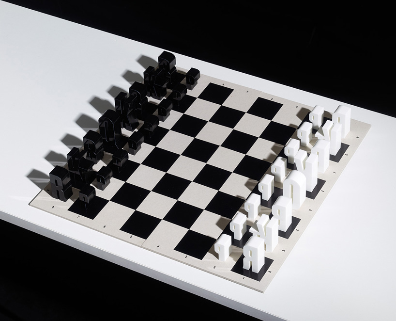
hat-trick have designed a typographic chess set based on chess notation, K for king etc. the forms are based on the typeface champion (lightweight) by hoefler frere jones.
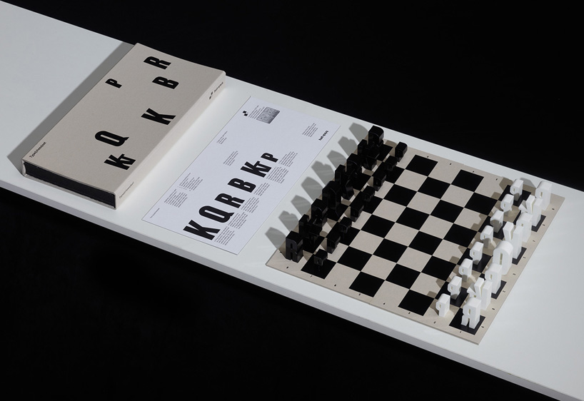
the limited edition of 50 sets are laser cut from 25mm acrylic. the king is 50mm tall, the pawn is 30mm. the board is made from two 2mm pieces of greyboard, and foiled in black. the whole set comes in a foam tray with a greyboard sleeve.
 typographic chess set by hat-trick design jim sutherland of hat-trick told us more about the set:
‘the original idea started on the same holiday that I started the typographic playing cards, in 2007. it’s been a long period of gestation and production testing.’
‘it was a really tricky production in order to get the fine detail and the counters sharp etc, plus making sure everything stood up properly for example the Q and P had to be redrawn for stability and the ‘Kt’ ligature for knight was redrawn.’
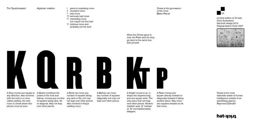
‘we added a couple of lovely quotes which I added to the info sheet in the packaging, which includes information about the moves and chess notation. there is also a small set of postcards, showing how each piece moves.’
‘chess is the most elaborate waste of human intelligence outside of an advertising agency. raymond chandler
I did a lot of research into chess art, graphics and products, so I’ve started a small tumblr site about the things I’ve found, which I’m adding to when I get time.’ – jim sutherland
 typographic chess set by hat-trick design
 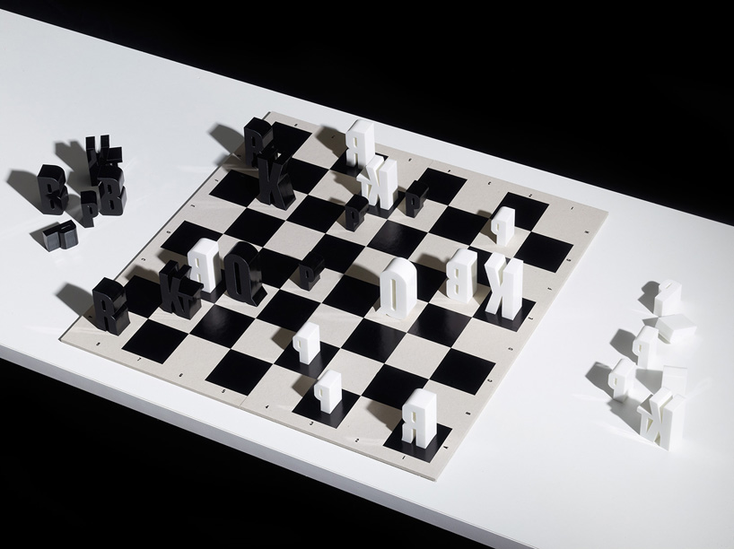 typographic chess set by hat-trick design
 typographic chess set by hat-trick design
 typographic chess set by hat-trick design
 typographic chess set box by hat-trick design
 guide to the pieces
 chess explained through typography
 jim sutherland’s sketch book

CHESS (9)
 Apr 05, 2018
 Oct 22, 2015
 Aug 28, 2013
 Aug 08, 2013
 Sep 13, 2010
HAT-TRICK DESIGN (6)
 Feb 09, 2014 Aug 08, 2013
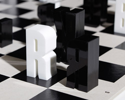 Apr 22, 2013
 Feb 27, 2013
 Jan 10, 2013
PRODUCT LIBRARY
 Apr 17, 2024
 Apr 15, 2024
 Apr 15, 2024
 Apr 12, 2024