HOOH studio & norbert mayer create J.21 anatomical typeface
the text draws influence from the human anatomy, and features three layers representing the skin, muscle, and bone.
HOOH studio & norbert mayer create J.21 anatomical typeface
all images courtesy of norbert mayer, HOOH studio
‘J.21’ is a modular, geometrical typeface by HOOH studio and norbert mayer. the text draws influence from the human anatomy, and features three layers representing the skin, muscle, and bone. in total, there are 62 characters including the upper and lower cases, and numbers.
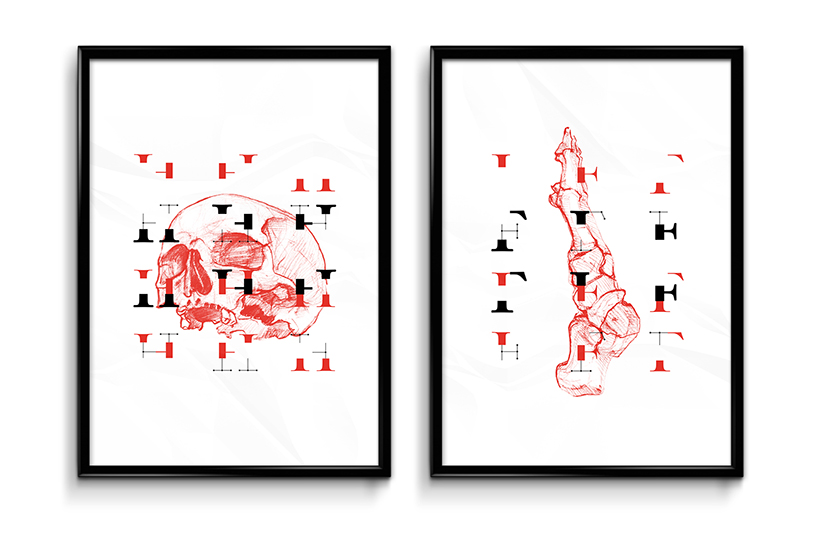
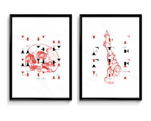
‘J.21’ posters
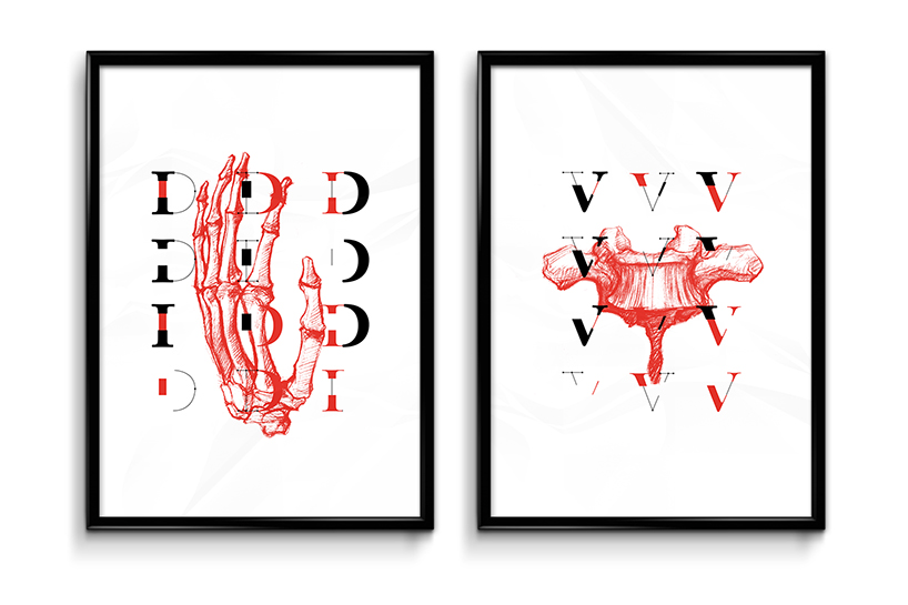
each letter and number are split into three independent versions
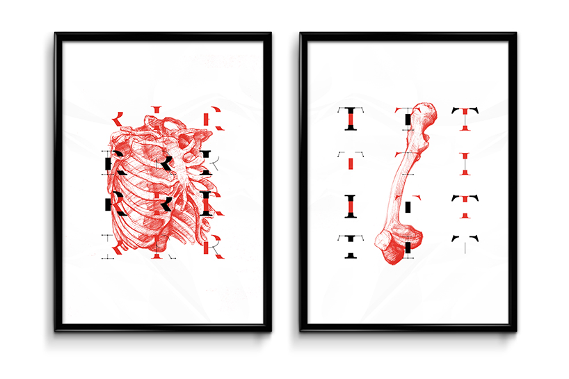
the typeface is derived from anatomy
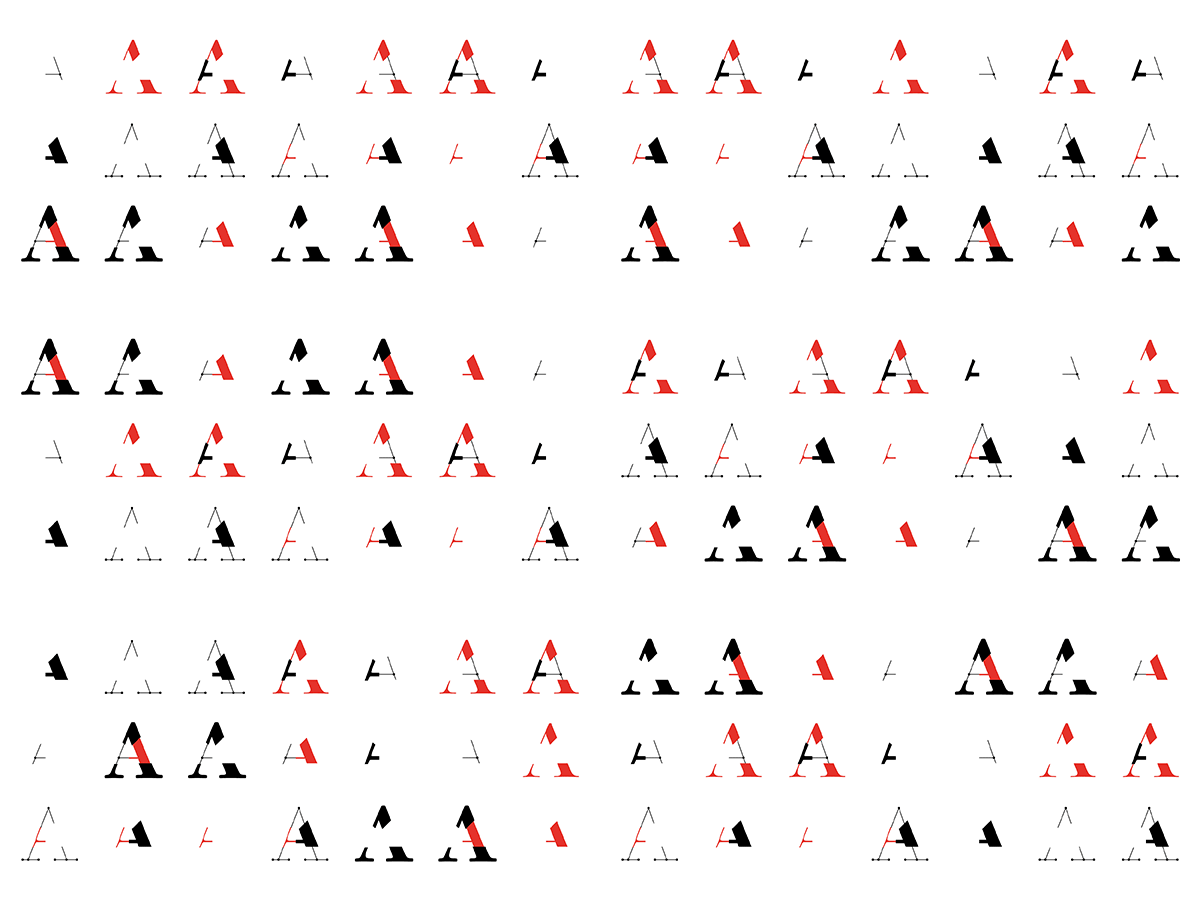
A-gif
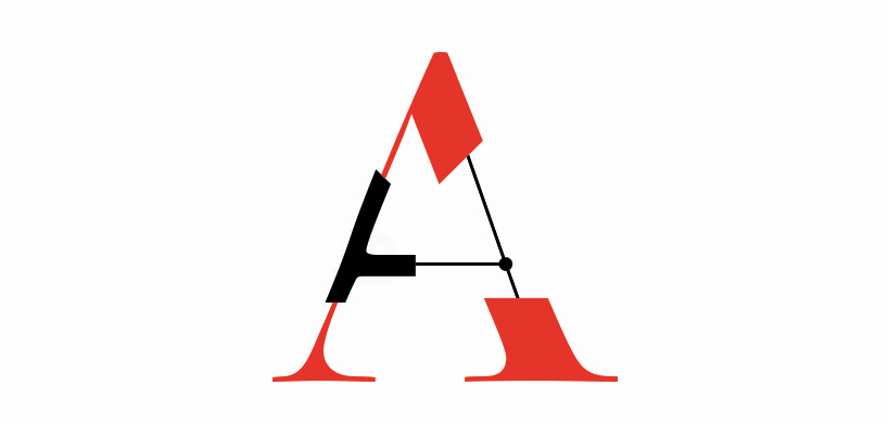
‘J.21’ A
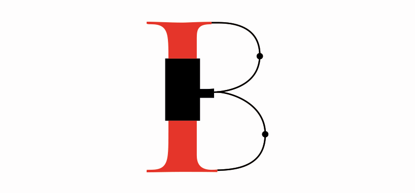
‘J.21’ B
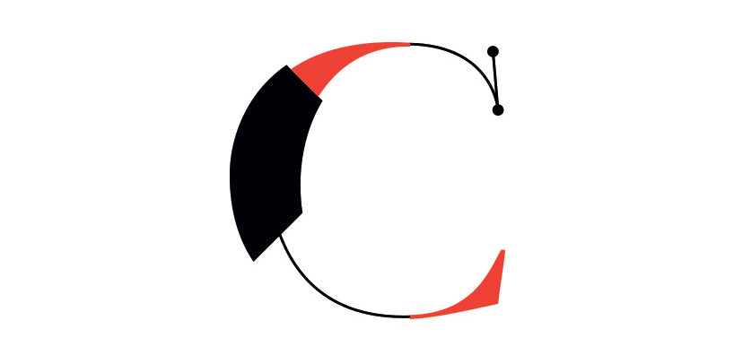
‘J.21’ C
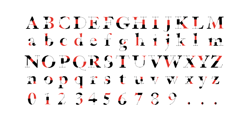
cases and numbers
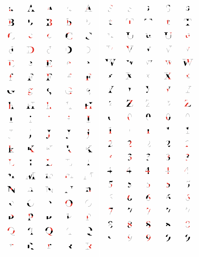
full breakdown
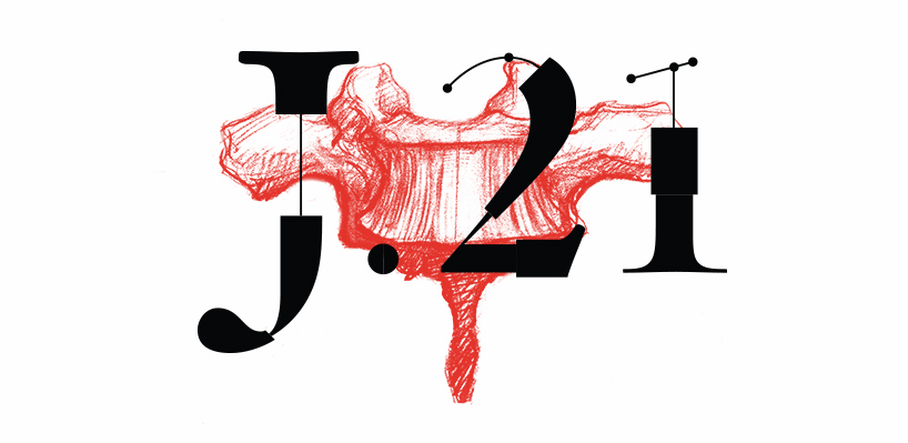
‘J.21’ logo
designboom has received this project from our ‘DIY submissions‘ feature, where we welcome our readers to submit their own work for publication. see more project submissions from our readers here.
shop
your own online design shop — no sales commission collected