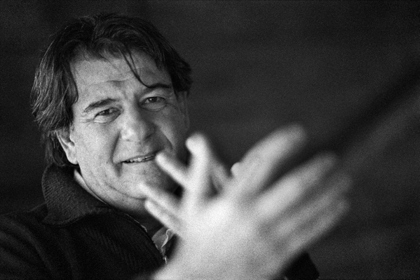
top image: ruedi baur photographed by c.scholz
designboom recently spoke to ruedi baur, founder of intégral ruedi baur, a graphic design studio in paris that specializes in identity and wayfinding projects for the cultural sector.
DB: please could you tell us about your background and how you came to be a graphic designer?
RB: I was born in paris [1956], I grew up in in france and then went to study design in zurich, switzerland under michael baviera, while I was studying me and my classmate, lars müller worked together on some projects. I graduated in 1979 and shortly after I moved back to france, where I set up my studio in lyon [1980]. the studio focused on cultural projects, principally for museums, galleries and with architects as I has some friends working in these areas. steadily we got bigger and bigger projects and the studio moved to paris, where most of our work was. we worked with the picasso museum, the louvre and the pompidou center. over time the projects have gradually become more focused on wayfinding, signage and identity.
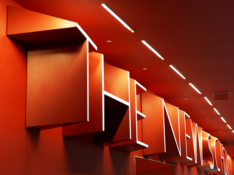
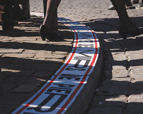
the new school, new york – referencing the facade of the new school building designed by SOM architects, intégral ruedi baur developed a 3D font that is used throughout the building as a wayfinding system and also for environmental graphics.
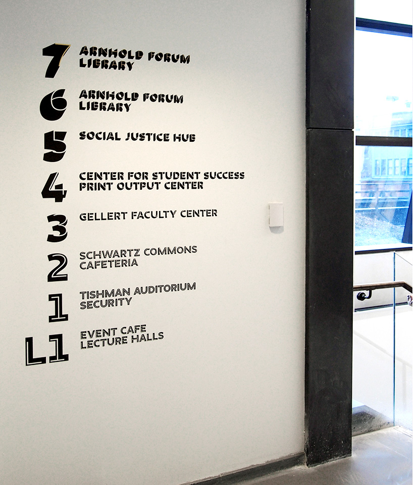
3D letters, created on the base of peter bilak’s font irma, are designed to work in superposition (irma light on irma black), to play with perspective in a way that indicates a direction or floor level within the building.
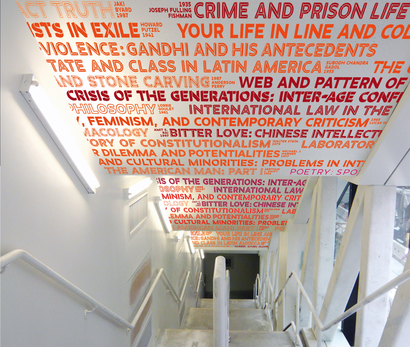
beyond the functional signage system, a typographic intervention, consisting of the titles of the classes taught at the new school since 1919, is installed on the ceiling of the exit stairs, which is visible from the outside.
DB: what do you like the most about designing identities?
RB: the construction of an identity over time. it’s nice to bring together elements in a way that are recognizable but I’m not one for designing an icon and saying that it should always represent something, I prefer to develop a visual language that is recognizable and appealing to an institution’s audience, but also allows the people who need to use the language feel expressive. that’s not to say that rigid systems don’t work for rigid institutions; governments or very corporate businesses – but for the cultural sector I think an identity needs to work as a language, one that can be spoken in different and relevant ways.
DB: does your experience make it easier to design identities now than when you started out?
RB: the big change has been the clients and what they want, what they trust the designer with. when I started my studio more than thirty years ago my clients had a different attitude, they trusted the designer and their solutions more easily. today clients review and analyze design proposals in much more detail, they measure them against statistics and testing. for me this reduces experimentation a great deal, and you can see this especially with young designers over the last fifteen years or so. they are not disruptive, they take their lead from the corporate world. for the most part, there’s less courage to try something new, something that might not have mass appeal. now there is a lot more work for graphic designers than there was thirty years ago, because the world is much more corporate and image driven – there is a demand for a certain level of design even for small businesses that did not exist before. but on the other hand design today is much more controlled.
DB: what advice would you give to a young designer working on and identity project?
RB: start with an idea, an attitude – something tangible and stimulating that can evolve with what it represents. don’t create an identity that strangles the client. don’t think your design will be timeless – I really don’t like that some designers think their identity will be around for a hundred years. I also, find it a pity that many young designers want to design like they are in the middle ages, creating a blazon for each institution and are happy to repeat this same exercise for every project. the audience can do better than that. they recognize a language in many ways, so don’t be afraid to use different cues to form an identity. an identity can work in the same way that different messages and stories are encoded into art. that’s the way we have to think about corporate identity I believe. I often say graphic designers have to think of themselves as ‘urbanists for the social landscape’.
DB: have you consciously chosen to work mostly with cultural institutions?
RB: it’s really a case of specialization, some designers work better with information and some designers work better with seduction. I’m more comfortable working with information – trying to make it memorable, useful and add value to necessary experiences.

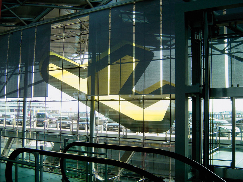
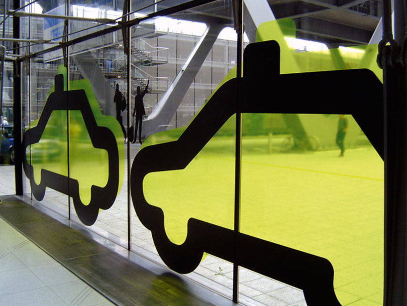
identity for köln bonn airport, 2004
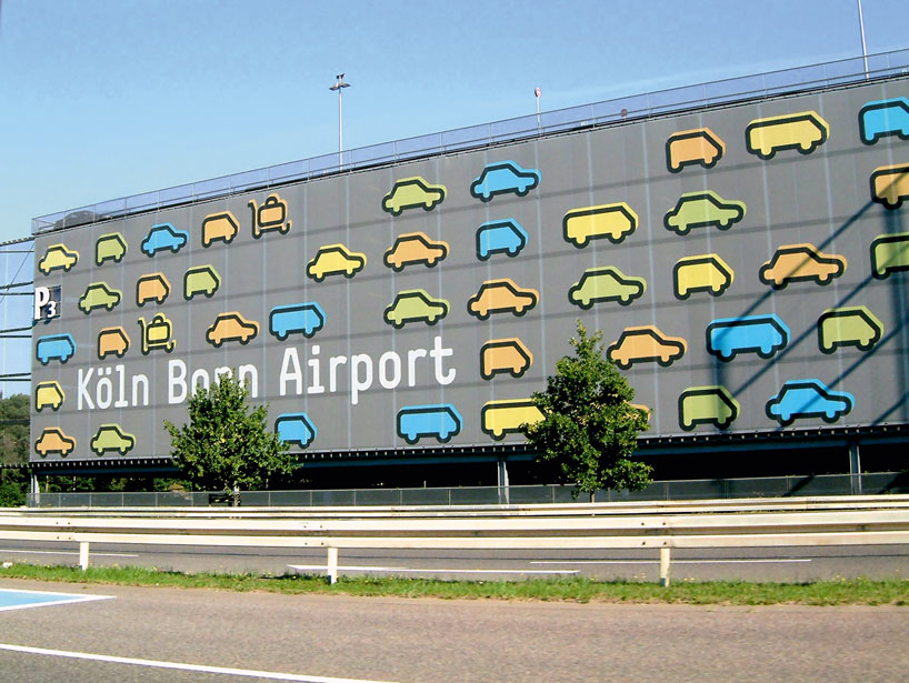
identifying features are inspired by the ‘simple’ typeface designed by the typographers of norm studio – this typeface was chosen because it enabled us to build a parallel typology of pictograms. together, pictograms and lettering form a family of identifying signs for the airport. they are designed using similar constructive principles and have the same thickness of line.
the identifying colors of the airport aim at being luminous and aerial but are not limited to blue, as is so often the case in airports. by mixing them together a clearer identification range is obtained. black and white are also used for more functional elements. living creatures are not represented in geometrical pictogram form.
by their presence, the ideogram starts moving and acting. a clear contrast makes for immediate differentiation between the two complementary graphic approaches. these silhouettes are part of the airport’s identifying vocabulary but are not used systematically.
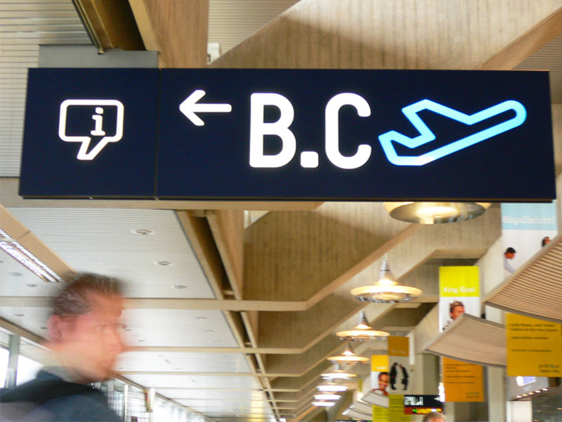
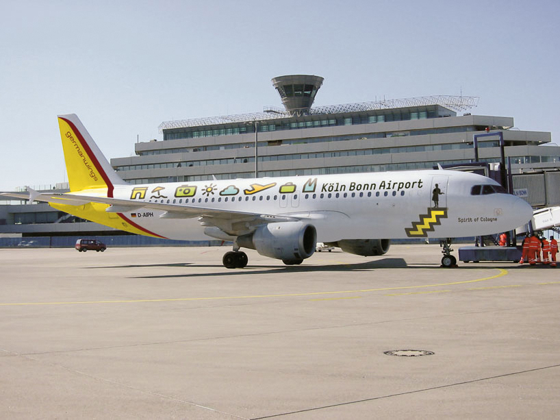
köln bonn airport signage
DB: what things do you prioritize when designing a signage system?
RB: context; how can you design something that works for the space in which it will live. I like our solutions to be very specific in that they relate to the space, we can’t and won’t lift a solution from one project and apply it to the next project, to another context. function; who will use the signage, how will they use it. expression; which is not always common in modern signage, but I feel that a signage system can add to the experience of a place if it helps set the scene. the challenge is to get the balance right between all three of these factors.
DB: when signage relies on immediacy of understanding is there less room for expression?
RB: you have the aspect of engineering, putting the right information in the right place – this is very serious and has to be solved with priority given to function. with that resolved you have to ask yourself how you think the signage should look. personally I like to be playful when I can be, not just for the sake of it but because adding character to a signage system helps people feel better when they are in a moment where they could potentially be lost and anxious.
context is everything. you have to be realistic about how people will respond to the situation they’re in. inside a building you can be more playful and experimental than in a city but that doesn’t mean you can’t experiment at all and should simply follow the status quo. I’m interested in trying to be democratic in a field that is usually very dictatorial.
DB: when is the best time to start collaborating with an architect on a signage project?
RB: as early as possible. you don’t have to work with them for the full duration of a project, financially that’s quite impossible given the differences in architecture and graphic design budgets. the best, and most common way of working is to meet with the architect at important milestones during the project to give your input and see the developments. this gives you time to invest in thinking about possible solutions at the start and then you can build momentum and execute your ideas as the project nears completion. in some cases you might not have the luxury of time but try to see that as a blessing rather than a curse, because it will force you to be spontaneous and to follow your instincts.
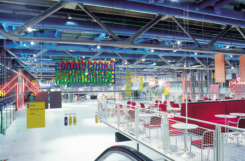
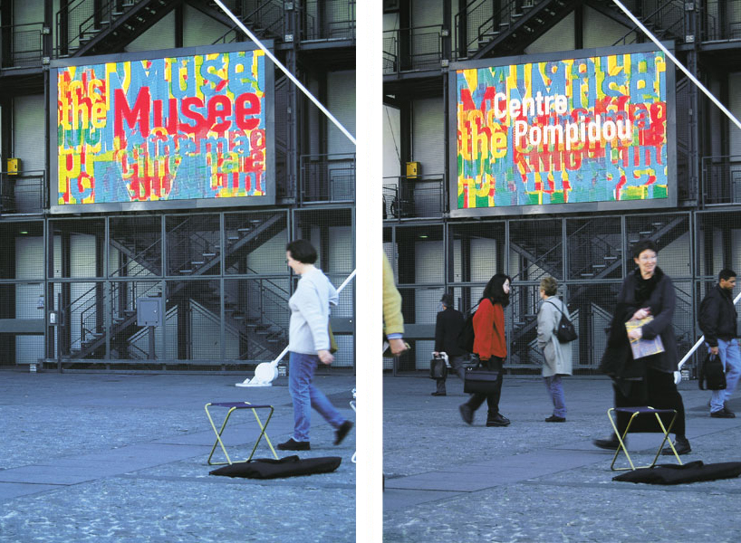
wayfinding system centre pompidou, 2001
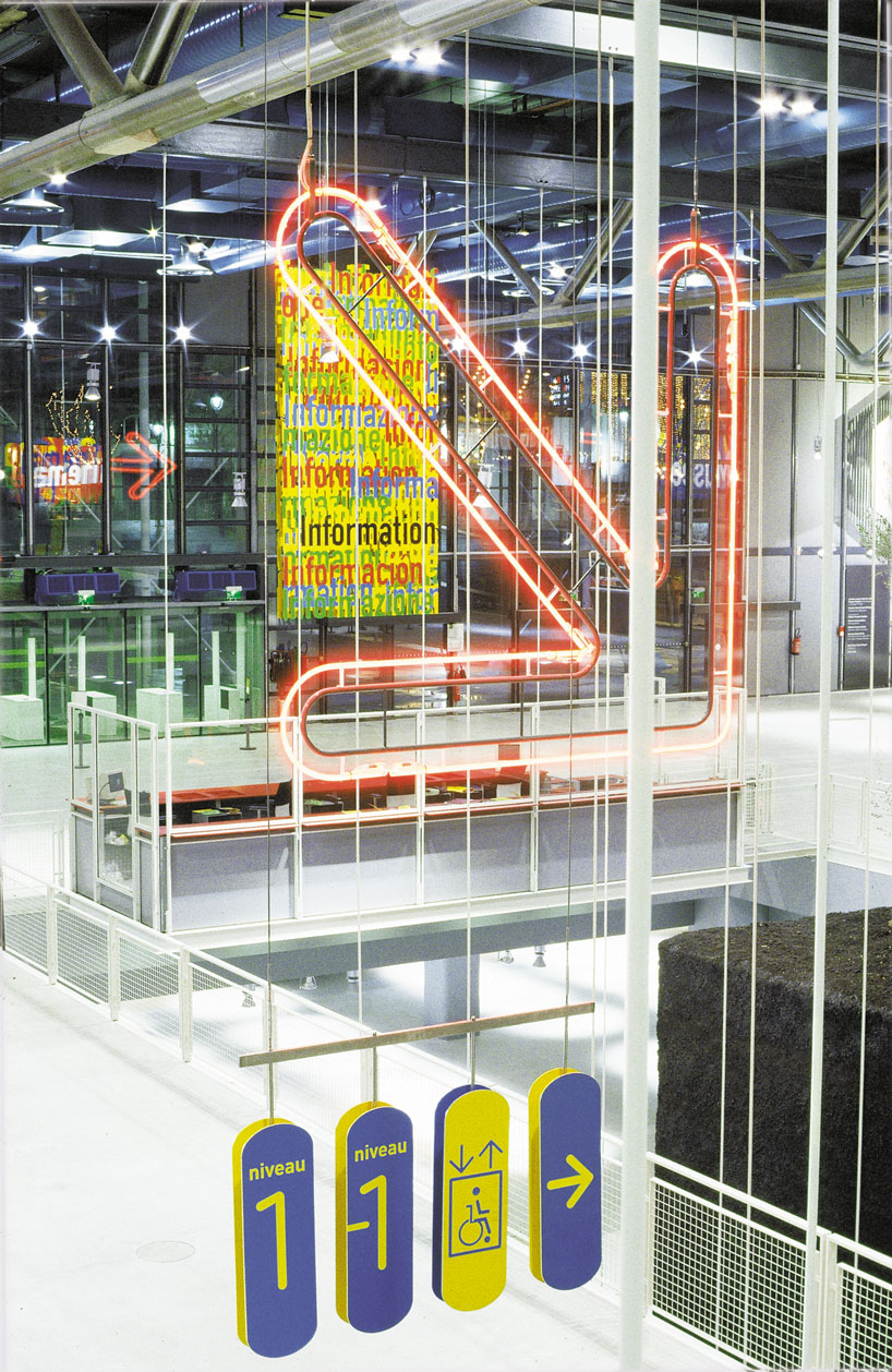
for the modernization of the centre, renzo piano, who designed the centre pompidou with richard rogers, was asked to renovate the public spaces. he wanted to reinforce the public square aspect of the ground floor foyer. he spoke of a ‘flight of butterflies’ when describing his vision of the information panels that would give visitors an overall sense of the center’s activities.
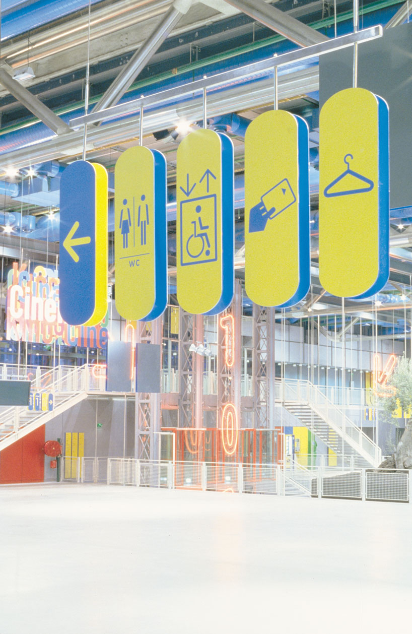
after much trial and error, a specific signage system gradually emerged. it is founded, for one thing, on the spatial dispersion of the signage itself, and also on the concern to make visible not only information but also the ‘signage object’ as such. this mise-en-scène is underpinned by the care taken in the treatment of the light and the relation between architectural container and graphic contents. it resulted from a close collaboration with the architects.
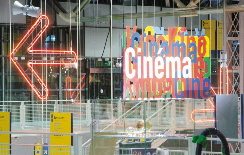
the breaking up of the traditional signage structures is conductive to a clear hierarchy of the information. on entering, visitors see the terms ‘museum’, ‘exhibitions’, ‘library’, ‘cinema’ and ‘performances’, translated into a number of languages, and thus have an immediate perception of the center’s main activities. this information is backed by up on other levels by large neon arrows, and by a series of media on which the temporary activities are announced either by posters or by digital message boards.
exterior signage
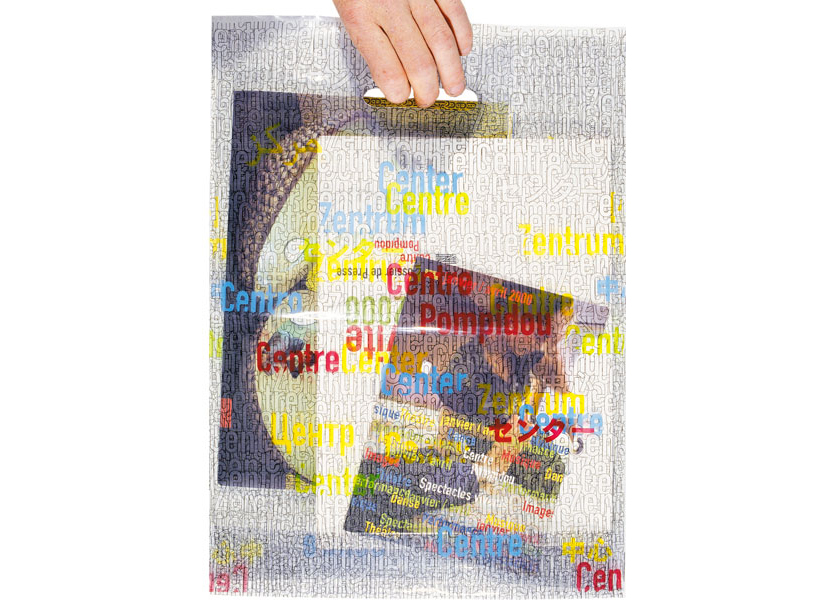
carrier bag
DB: how do you ensure you get valuable feedback from a client?
RB: if possible don’t allow the conversation to deviate to the client’s needs and tastes. it’s hard sometimes but always try to think about the user and design for them. in some cases your client will never be in contact with what you design, but a user might be everyday. the user’s needs will certainly not change as quickly as the client’s mind. consider how you present your ideas. don’t present an idea very quickly, in case it’s undercooked. use your powers of perception to understand the project well before you even think visually, if you can. then, when you feel convinced start with the formal dimension. this approach might not work for everyone but that’s my methodology.
DB: do you ever present clients with multiple design solutions?
RB: no, never. a designer has to be convinced about his proposal, if you show different solutions you bring in doubts and indecision. you have to assure the client of your position as designer, your expertise is part of the reason they are hiring you.
DB: which projects have left the biggest impression on you?
RB: a very enjoyable experience was to win a competition pitch with our proposal for köln bonn airport. that project was a pleasure to work on from the start to the finish because the clients and ourselves were all on the same wavelength and everyone believed in the solution 100%.
DB: do you draw very often and do you think it’s important for designers to be able to draw?
RB: I sketch to get ideas out of my head and onto paper and to communicate an idea quickly in a meeting but not in many other circumstances. I think each designer has their own way of doing this, so maybe drawing is not as important as it once was for graphic designers.
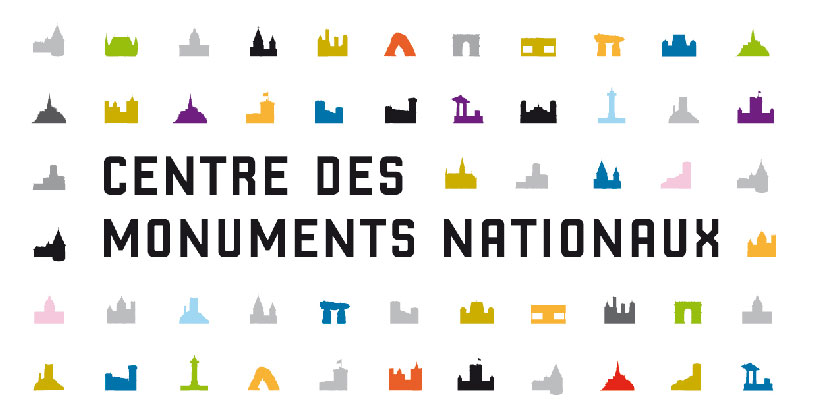
visual language for the centre des monuments nationaux, 2007 – the states’ office responsible for managing the french national monuments. around one hundred edifices like the mont saint-michel, the arc de triomphe or the villa savoye are in its care.
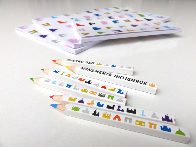
the visual language consists of representing the monuments as small silhouettes, articulated in different grid systems around the name of the institution. each monument is thus unique and exceptional and at the same time part of a bigger network.
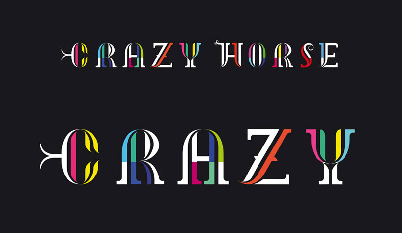
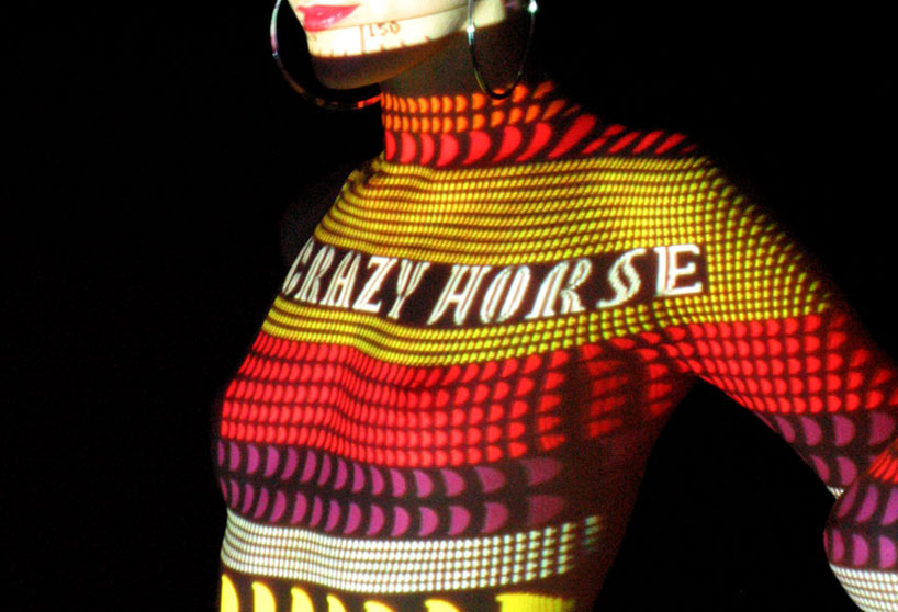
visual language for the crazy horse cabaret, 2006
DB: what are you passionate about outside of your work?
RB: lots of things interest me and I read many, many books; classics, poetry, philosophy, politics… I often talk about politics and society with my wife who is a sociologist. I like to think that design can still bring a lot more positives to society and everyday life. I have five children which give me a lot of joy but are also a lot of work! I love skiing and to be in the mountains.
DB: do you have any superstitious beliefs or rules that you live by?
RB: I’m not superstitious but I grew up in the mountains and that has shaped my thoughts and emotions in specific ways. on a mountainside you have to be aware of every action you make because you can easily fall, get hurt or become stranded. you have to concentrate on the present but also be highly intuitive of what’s next. it’s hard to explain this feeling exactly but in some way it’s a mix of danger, adrenaline, attentiveness, precision – I try to find those experiences in the way I work and the way I live because it’s something I need.
DB: what would you like to do in 2014 that you have never done before?
RB: I’m hoping that an influential politician understands what I can offer him, what design can offer him. I want to see design implemented on a big complex scale to help society. I’m ready for some extra responsibility.
GRAPHIC STUDIO INTERVIEWS (193)
 Nov 21, 2022
 Feb 10, 2019
 Jun 21, 2018
 May 17, 2018
 Oct 04, 2017
INTEGRAL RUEDI BAUR (3)
 May 01, 2015
 Mar 21, 2014
PRODUCT LIBRARY
 Apr 15, 2024
 Apr 15, 2024
 Apr 12, 2024
 Apr 04, 2024