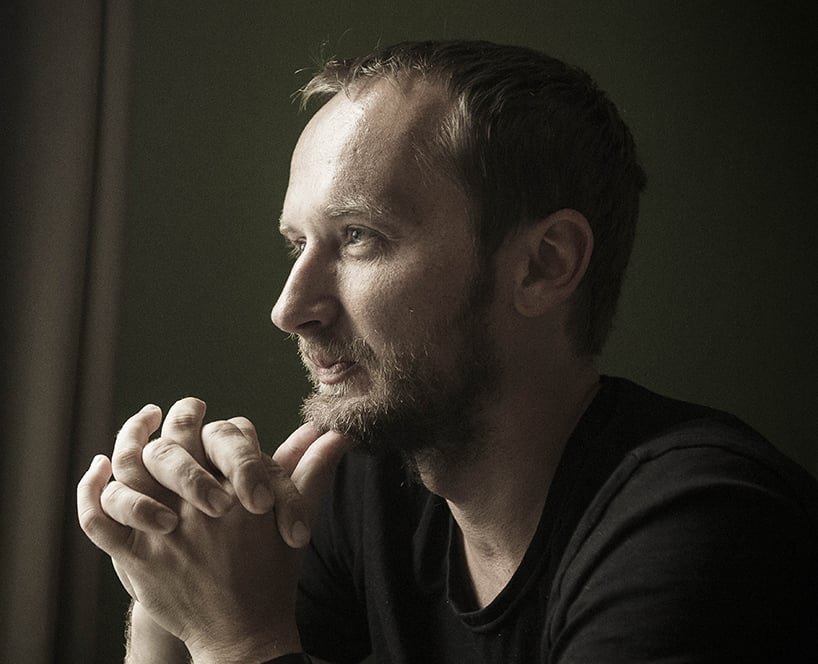
peter bilak photographed by mano strauch
peter bilak was born in czechoslovakia although he’s called the netherlands home for well over a decade. he first worked at studio dumbar, before leaving to start his studio in the hague. his work covers editorial, graphic and type design and he also teaches part time at the royal academy of arts in the hague. he founded typotheque in 1999, dot dot dot magazine in 2000, indian type foundry in 2009, and most recently the excellent works that work magazine in 2012 – where he’s editor.
designboom: what sparked your interest in design and typography?
peter bilak: I’ve been always interested in text — writing for various magazines, published two books, running a magazine ‘works that work’, where I am not the designer, but publisher and editor.
text is obviously a carrier of information, and I am excited about its possibilities, how it may trigger reactions from readers. at the same time, I am also interested in the formal aspects of text, such as the shapes of letters and so on. it is something so omnipresent, that most people never pay attention to it. people don’t consider letters to be designed, yet, someone needs to formalize these shapes, make them functional, and inject a character into them. a typeface is comparable to a voice; it colors the content, and a designer can influence a message by their choice of type.
I enjoy looking at text from these perspectives; from the inside and how it is constructed, and from outside and how reader interacts with it.
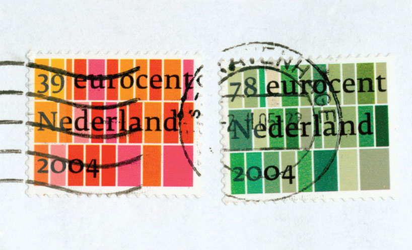
dutch standard postage stamps, 2003 (for the royal dutch post)
the design of these standard postage stamps was inspired by the well-known view of geometric dutch fields from the air, the first view of the country offered to any visitor landing at schiphol.
DB: how do you justify the time and cost of designing a new typeface to the client?
PB: I have never tried to convince someone that they need a new font. at typotheque we design fonts for retail, and general use. occasionally we are asked to make a custom typeface for a client, and in those situations I actually try to make client look for a suitable existing typeface. only when we consider all options, and find that none are fitting, we decide to design a new one.
type design is very time consuming, which makes the process costly. yet, there are situations, where even though there are hundreds or thousands of fonts available, none of them are the right fit. imagine you are developing an identity for a TV station in the middle east. firstly, you need to find a typeface that supports both latin and arabic. there are a few dozen already out there. then you narrow it down to those that work on the low resolution screens and you find that there are only one or two – and if your competitor is already using those, or they don’t have suitable characteristics, there is nothing left to do but design one from scratch, specifically for the purpose.
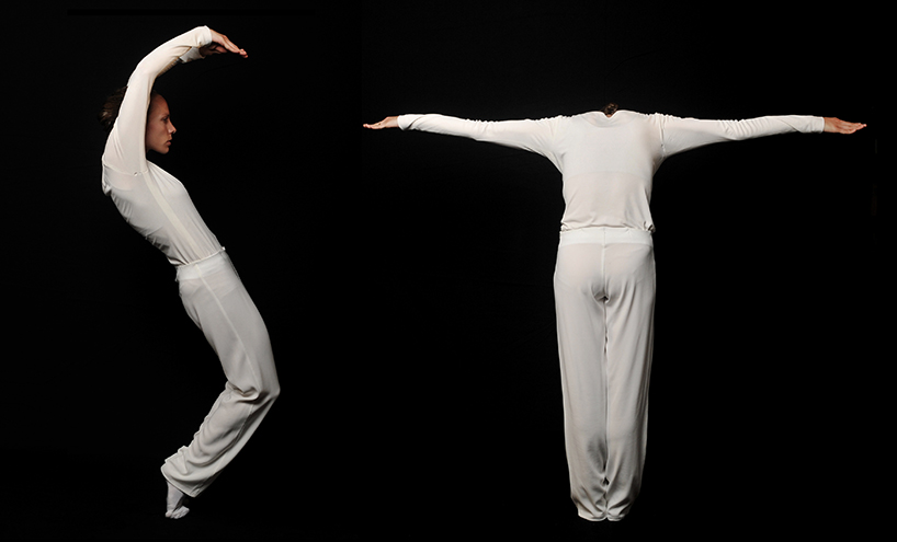
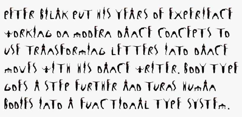
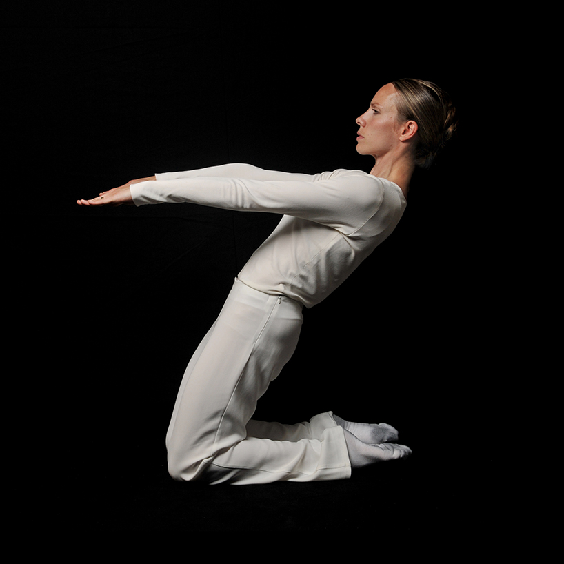
body type, 2011
peter’s years of experience working in modern dance inspired this typeface based on the human body.
body type, 2011
body type, 2011
DB: what’s the biggest influence on your work – trends or tradition?
PB: we easily spend years working on a new type release for typotheque. I worked on greta sans for 4 years. if I based my work on current trends, by the time I completed a project, it would be out of fashion. instead, we look at type from a more long term perspective — they have a potential to remain usable for decades – even longer. in fact many of the fonts which we use right now were created by people who have passed away long, long time ago. in our own collection, one of our bestseller is fedra sans, which was designed back in 2001, but only recently became used widely. while type design certainly builds on history, we try to adapt to the contemporary requirements and anticipate how type might be used today. fedra sans was designed to be used on screen and paper, from the start, instead of adapting a print font for screens, which is why it’s flexible and used often still today.
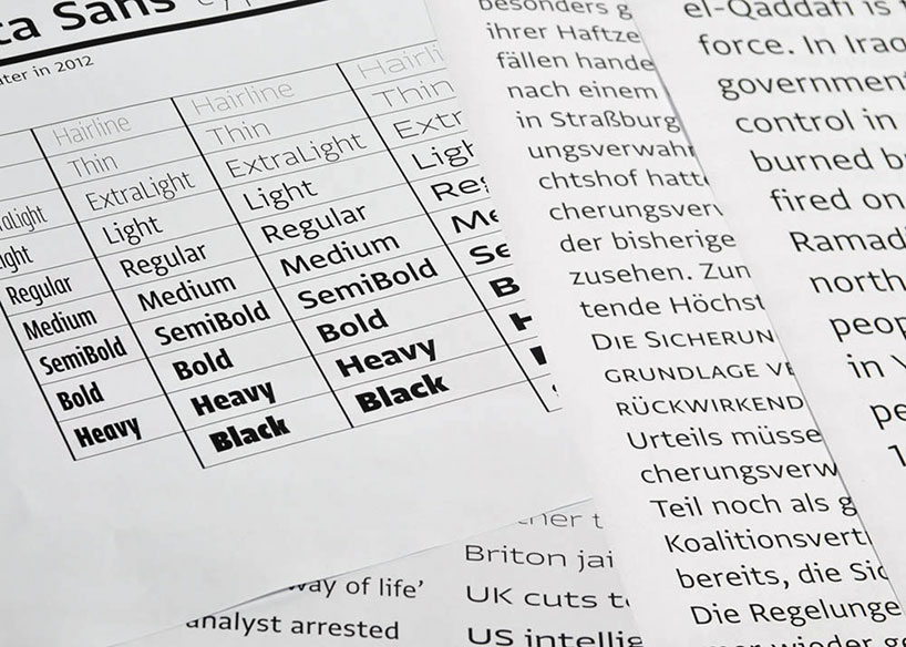
greta typeface specimens, 2012
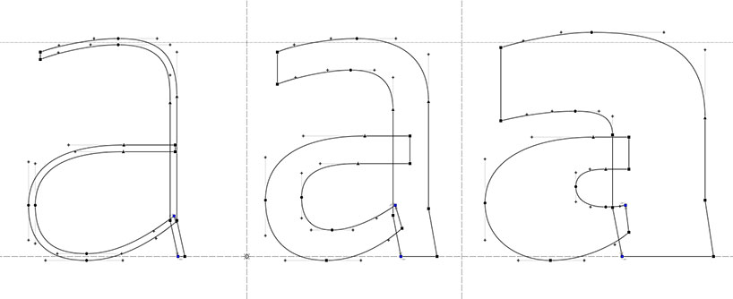
greta typeface fontlab drawings
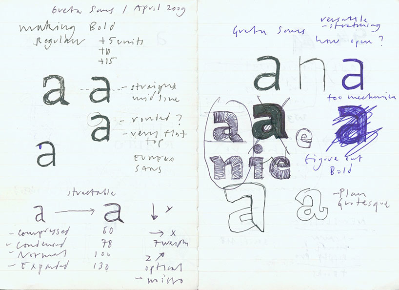
greta typeface sketches
DB: what ‘traps’ should someone avoid when designing a new typeface?
PB: people get impatient — they want instant recognition and success, while the most interesting thing in type design is the fact that it works outside of the fashion cycles. type design combines specific design skills, but also knowledge of language and technology, which explains why it is not easy to master the discipline. many young people don’t realize that it is nearly impossible that their first typeface will be suitable for publishing. they will most likely lack skills, be too easily influenced by their favorite designs or designers, and haven’t yet developed a critical eye. their second, and third typeface will be better and so on – it is important to persevere.
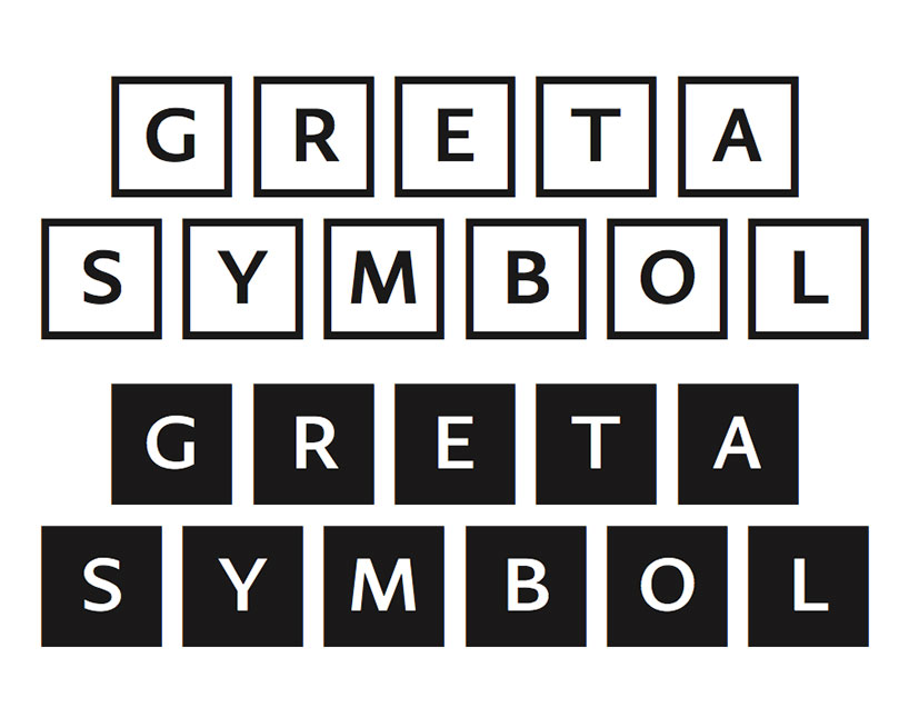
greta symbol typeface, 2013
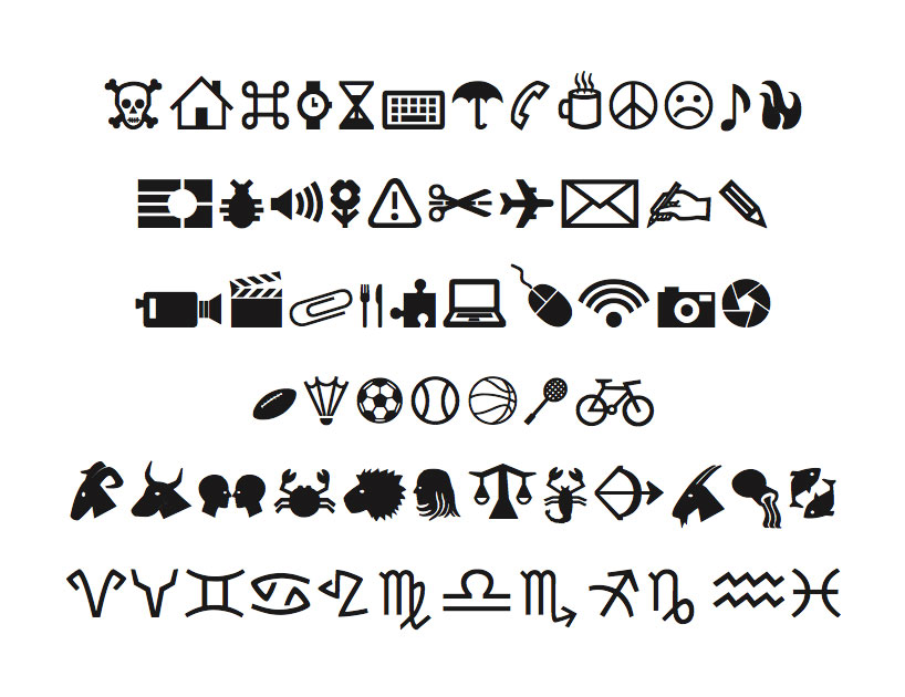
greta symbol typeface – selection of symbols
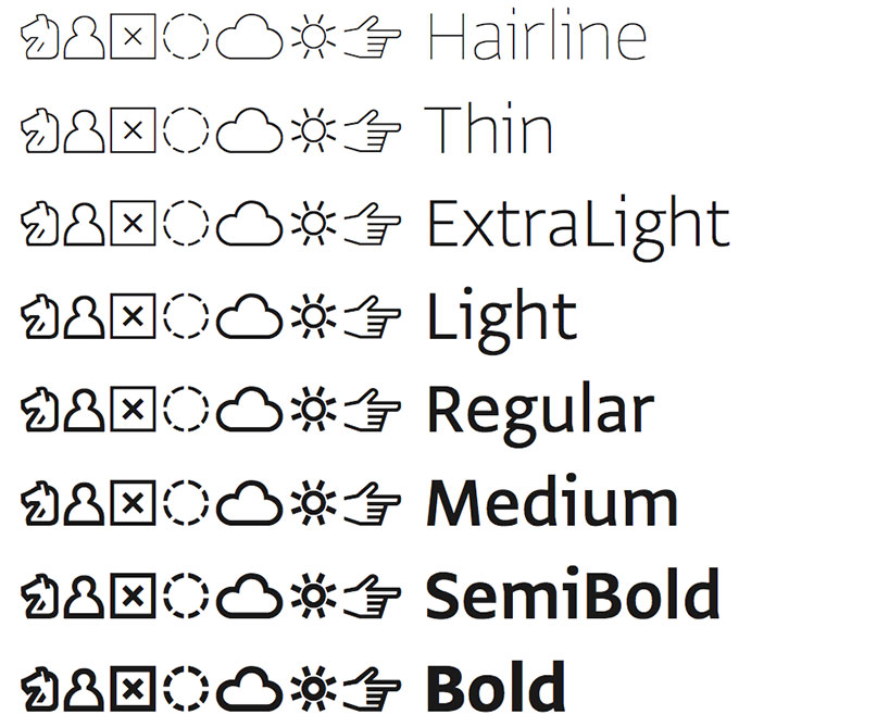
greta symbol typeface – weights
DB: have you ever been impressed or upset with how somebody has used one of your typefaces?
PB: the type designer creates a semi-product, a font is not complete until someone puts it in context, and uses it. knowing that there is this separation, and I am rarely responsible how the final reader sees our typefaces and this makes me more detached from seeing the typefaces in use and having a strong feeling about it.
there is always an element of surprise, one never know how the fonts will be used. we collect examples of our fonts in use — have a gallery of hundreds of samples, and seeing the real life applications helps us to design fonts better. I especially like to see the diverse ways in which our fonts have been used by the governments, by subculture magazines, in bibles, in cutting edge apps and websites.
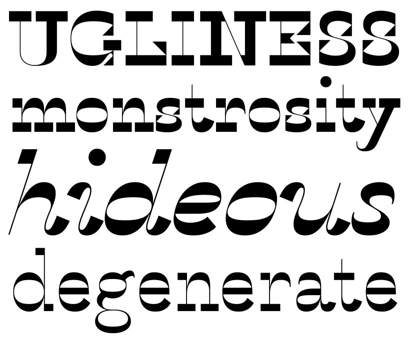
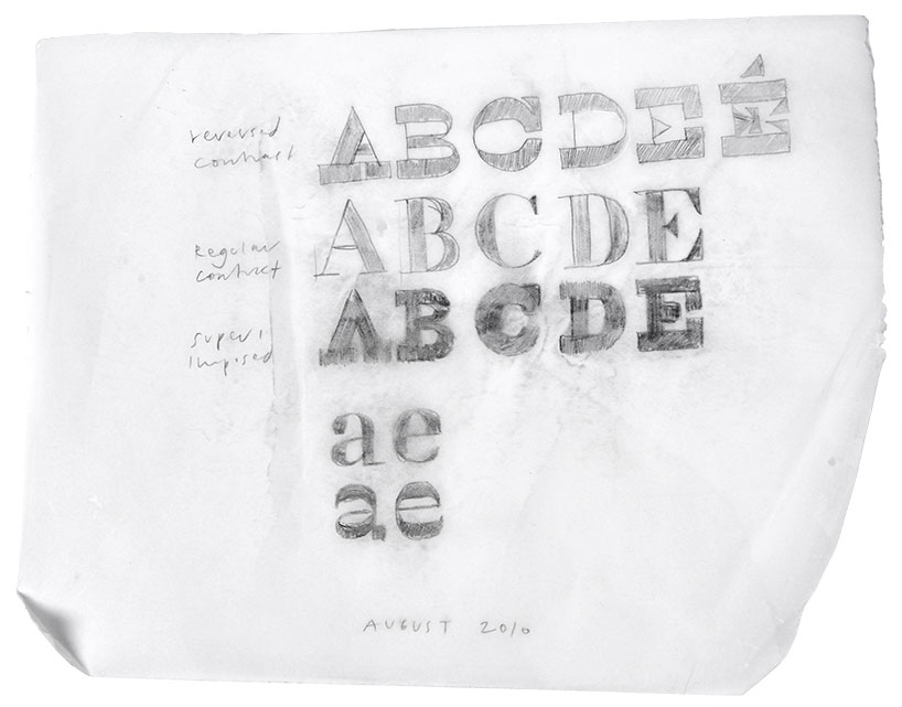
history typeface, 2008
based on a skeleton of roman inscriptional capitals, history includes 21 layers inspired by the evolution of typography. these 21 independent typefaces share widths and other metric information so that they can be recombined. thus history has the potential to generate thousands of different unique styles. history is available as a collection of 21 opentype fonts that can be used just as any other fonts, and also as part of the layering software history remixer.
history typeface in use
history typeface in use
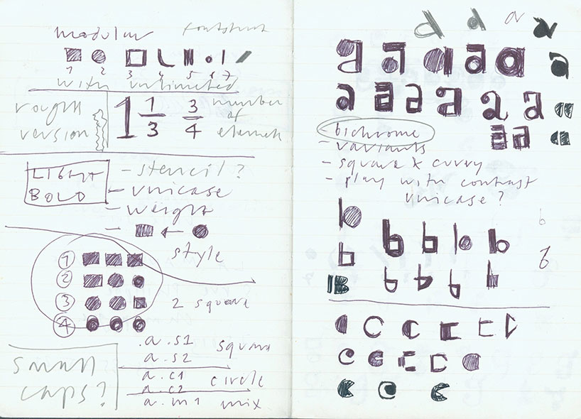
DB: which letters do you typically draw first when you’re designing a new typeface?
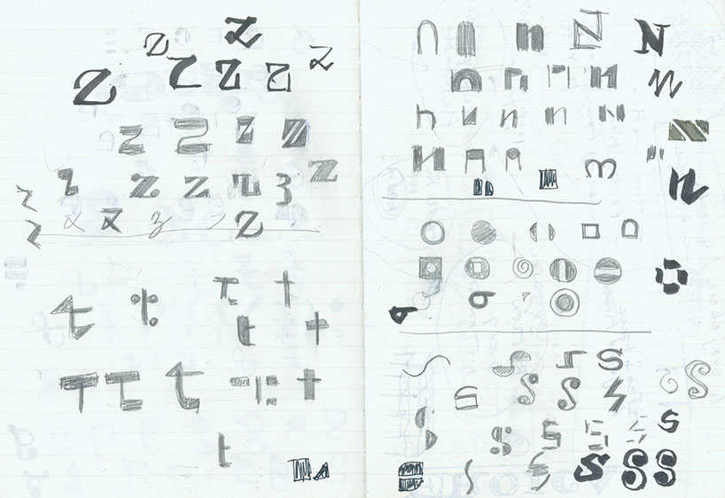
PB: I usually start with the lower case ‘a’, not because it is the first letter of the alphabet, but because it is one of the most complex ones, and it can quickly show the character of the new font. I then move to letters that have the most basic forms, ‘n’, ‘o’, so I can evaluate the rhythm and relationships of shapes. the very tricky characters are those with diagonals, ‘z’, ‘y’, which are deceptively simple because it’s hard to balance the shapes which are predominately based on focus on vertical stems.
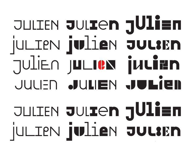
julien typeface, 2011
julien typeface in use
julien typeface sketches
julien typeface sketches
DB: what methods have you learned over the years to inject personality into your typefaces?
PB: the key is not to focus on single shape, but to work with the whole set. type design is not about designing letters, but designing text. it is like solving a complex puzzle, or conducting a philharmonic orchestra – each shape is unique, but needs to work with the rest, otherwise it gets too much attention and fails to work as an ensemble.
karloff typeface, 2012
karloff typeface sketch
DB: what do you see as some of the most interesting developments in your field?
PB: type design reacts to technological development, and reading more on screen means we could use properties native to digital media. I imagine we may see some adaptive typography that reacts to the reader, or time-based typography, something which hasn’t been explored much.
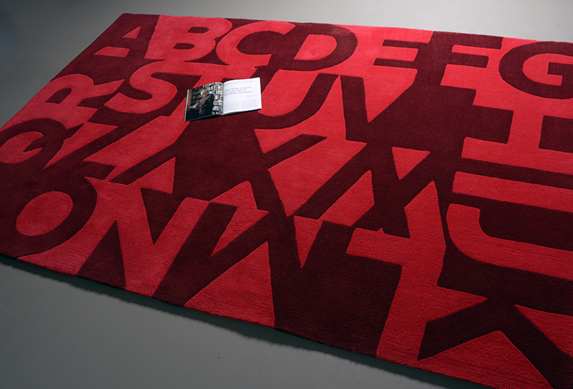
type rug, 2012
DB: what are you passionate about besides design?
PB: my work is rather hybrid, I work as the editor of a magazine, and enjoy researching articles and collaborating with world-class photographers, writers and researchers. I also work with modern dance, and together with choreographer lukas timulak create new concepts for ballet performances for various theaters.
all three areas of work; type, the magazine, and live performance, overlap with each other. there is a story to be told, there is context, there is an audience, and I look for the best way to tell that story.
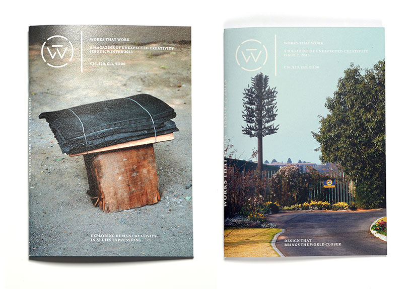
works that work magazine – issues 1 and 2
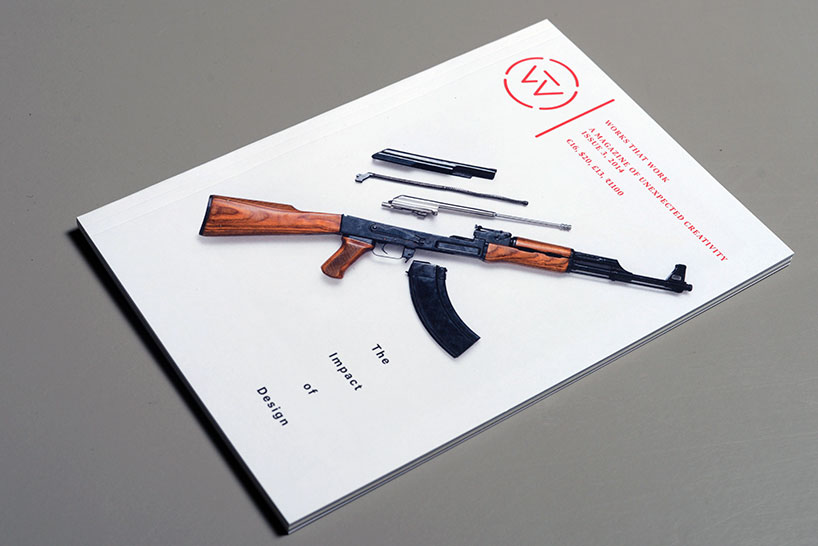
works that work magazine – issues 1 and 2
DB: do you have any superstitious beliefs?
PB: not really but I always try to focus on the moment, as it creates my future.
DB: what do you know now that you wish you knew at 21?
PB: I think it is good to be little naive, not too professional, to not know everything. many people would agree that their best time, most exciting projects, were when they were students, when they did something for the first time. the danger is thinking that you’ve figured everything out – when one runs on auto-pilot, and stops reacting to possibilities that present themselves.
contrary to the question — I wish to preserve the attitude of a 21 year old, even though I am now 41. to be curious and excited about every single project, constantly learning new things and always open to every possibility. this is why I work on a number of projects, and instead of specializing in a niche, I embrace the breadth of creative expression.
DB: what’s your personal motto?
PB: I don’t have one, and if I had, it would likely not be valid by the time this interview is published.
GRAPHIC STUDIO INTERVIEWS (193)
 Nov 21, 2022
 Feb 10, 2019
 Jun 21, 2018
 May 17, 2018
 Oct 04, 2017
TYPOGRAPHY DESIGN (133)
 Sep 13, 2023
 Feb 23, 2023
 Jan 24, 2023
 Jan 19, 2023
PRODUCT LIBRARY
 Apr 17, 2024
 Apr 15, 2024
 Apr 15, 2024
 Apr 12, 2024