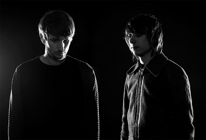
rob gonzalez and jonathan quainton of sawdust
rob gonzalez and jonathan quainton are the founders of london-based studio sawdust. the duo focus on bespoke typography, image-making and visual identity for a wide range of clients. designboom recently spoke to them about their work…
designboom: how did the two of you meet and decide to start your own studio?
rob gonzalez: jonathan and I met whilst studying national diploma graphic design prior to university. it wasn’t long before we became good friends and found ourselves working on more and more projects together throughout the two year course.
for some reason it was second nature for us to combine ideas, processes and executions during our studies — we didn’t think much of it at the time but looking back it was the beginning of what would become an almost innate understanding of each others work.
we affirmed during that time how we would one day work for ourselves and produce beautiful work on our own terms, of course this was without any real understanding of the blood, sweat, tears and in truth, soul searching that lay ahead.
jonathan quainton: in hindsight it was somewhat crazy to have branched out on our own with such little experience. however, we more than made up for that with drive and enthusiasm, both ingredients are important with anything you do but not something you can totally rely on completely. avoiding some of the more traditional career paths has proved to be a blessing for us because our personal growth as designers is untainted.
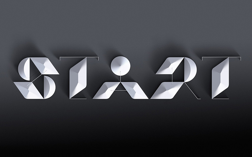
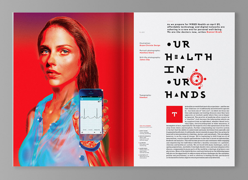
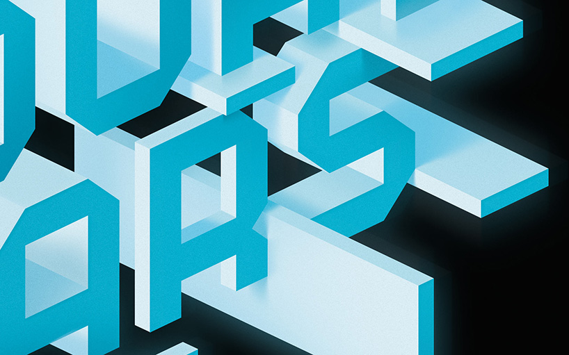
bespoke typographic headers as part of the wired UK redesign
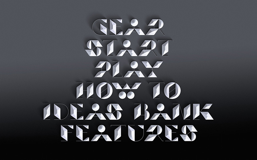
creative direction by andrew diprose (of wired UK) design consultation from matt willey and additional typography by henrik kubel of A2/SW/HK
DB: how do you split and share the work you do?
RG: we both give our undivided attention to every project during the early stages. then as it develops either jonathan or I will take lead based on who’s skill set is more suited. that said, no job leaves the studio unless it gets four thumbs up.
JQ: work will be reviewed a number of times before we’re both happy, it’s rare to get a hole-in-one because we like to question everything, continuously.
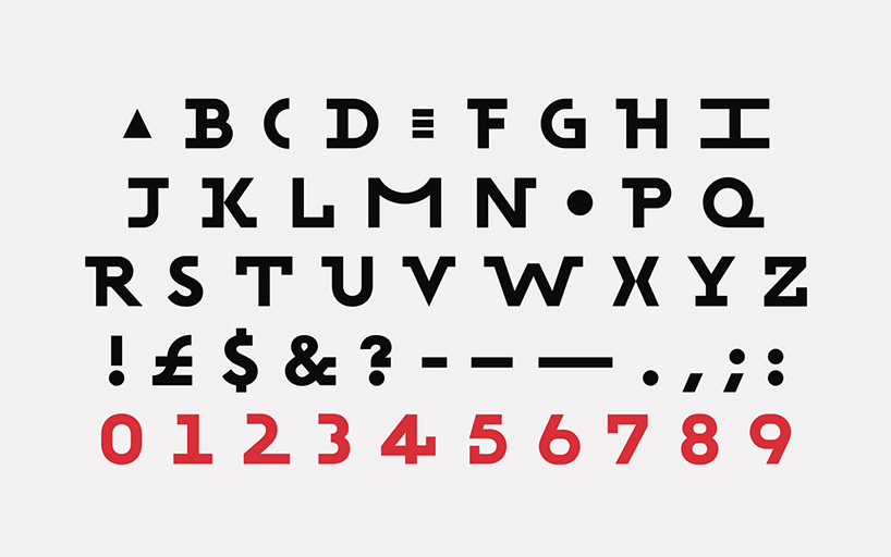
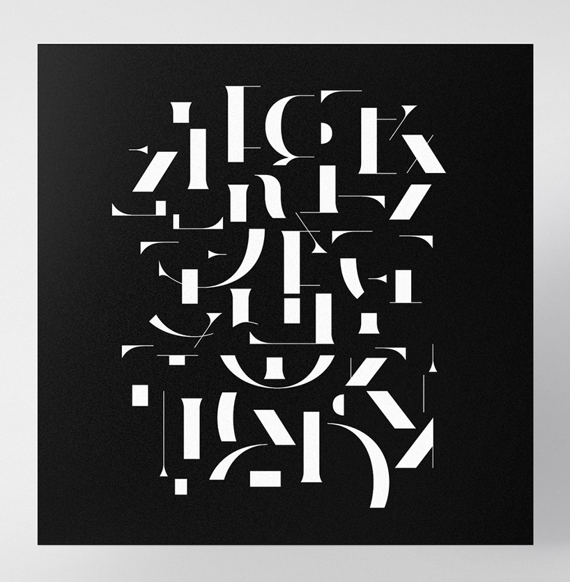
bespoke typeface for wired magazine, may 2014
bespoke typeface for wired magazine, may 2014
DB: how do your skill sets differ?
RG: we have skill sets that define us as individuals but it’s certainly not black and white because they cross over often, which is ultimately what makes sawdust tick. a summarized description would be; jonathan is interested in type design and letterforms, typically more progressive than traditional. whilst I am drawn to visual culture and its application to typography for both commercial use and artistic expression. it is that intersection which most interests us.
unequivocal ambiguity — prints & t-shirts
secret 7″ — music artwork
DB: what type of brief or project do you usually enjoy working on the most?
JQ: for me the most satisfying projects are the ones that start small then take on a life of their own, expanding out and inspiring other new works entirely. it is the smaller jobs that help keep the diversity in our work.
RG: I enjoy projects that afford a degree of visual exploration, but they are often the most challenging — ‘here is a blank canvas, make something brilliant’ — some people may call this a poisoned chalice but it doesn’t need to be. it’s an opportunity to explore ideas that have branched off from previous projects or ideas that were cast to the unused pile.
this is also why we feel strongly about doing non-client based projects where possible — this is critical to the development of our work. sometimes you shouldn’t need a reason to try something, you should just explore without purpose like when you were a young kid. if you truly enjoy what you do, this should be the easiest thing in the world.
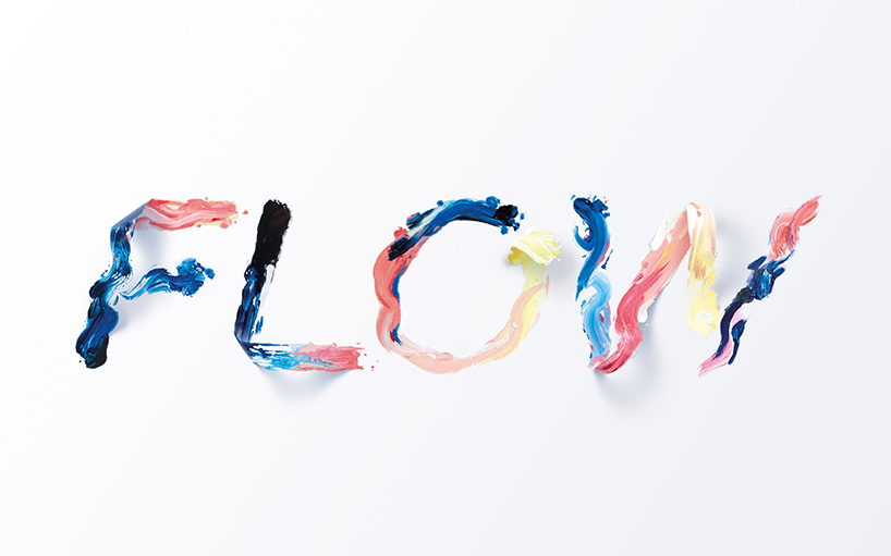
flow — typographic illustration
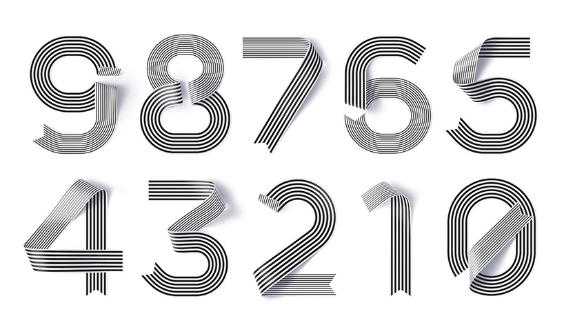
shanghai ranking numerals — illustration
DB: which projects have had the biggest impact on the studio so far and why?
RG: it is difficult to answer this kind of question looking at it from the inside-out but we know that the shanghai numerals (top 200) and recent work for wired UK attracted a lot of attention from the press. I would identify those as having a positive impact, certainly.
JQ: I agree with rob, the shanghai numerals have generated a lot of industry attention for us. I think they have a universal appeal that seems to resonate with people.
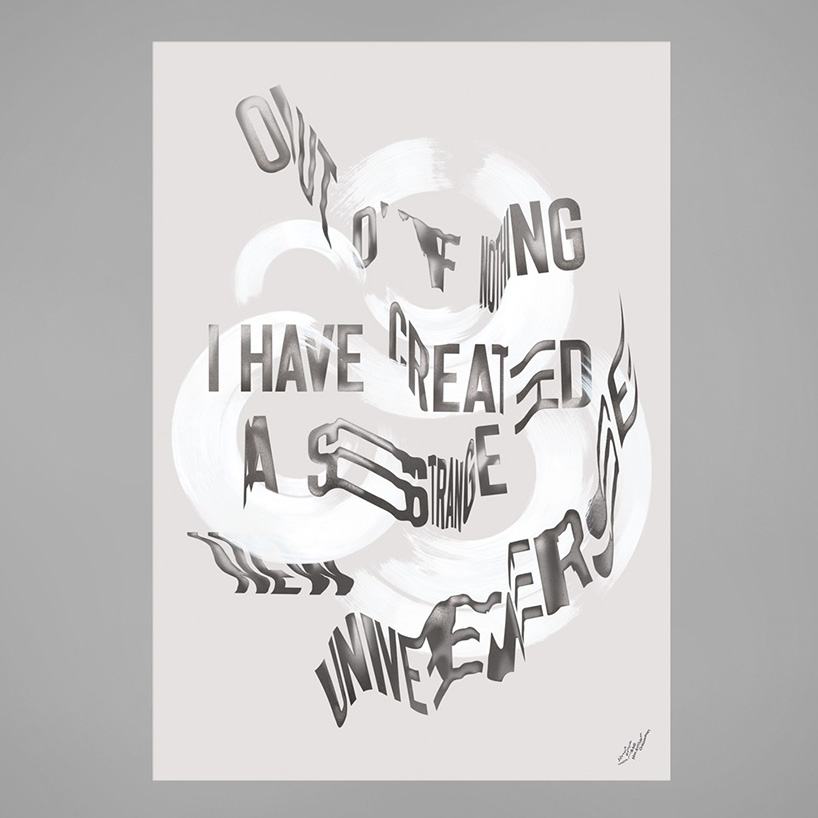
this is now — poster
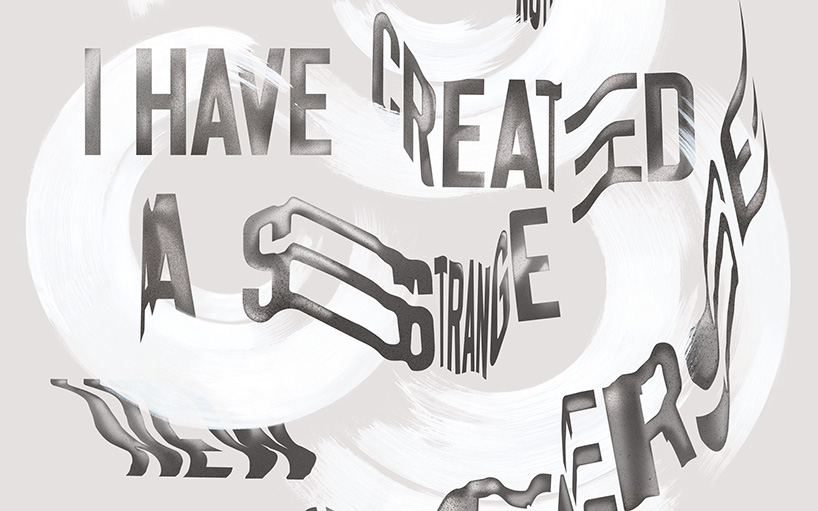
this is now — poster (detail)
DB: how do you think online design resources have influenced the graphic design being produced today?
RG: it would be difficult to argue against blogs, tutorials, forums and in broader terms, the internet not contributing greatly to graphic design and more niche skills within that sector.
the internet makes information accessible on a mass scale. this gives people the opportunity to self-teach, study on their own terms and become better at a skill more quickly and efficiently than what might have previously been possible. if an individual who does not have the means to study utilizes the internet well, it can give them a channel to be heard or seen on a global scale. a positive influence.
JQ: the amount of exposure that new artists / designers gain through online resources is staggering, they have altered the world’s perception of graphic design today and have also increased competition, which ultimately is healthy for progression.
RG: trends come and go in our industry so if something is particularly hot the internet opens it out to the world, after which it catches fire influencing a wave of creators who end up doing the same thing. not so great.
it’s important not to get too caught up in what other people are doing. keep one eye on things but try to stop looking and start doing.
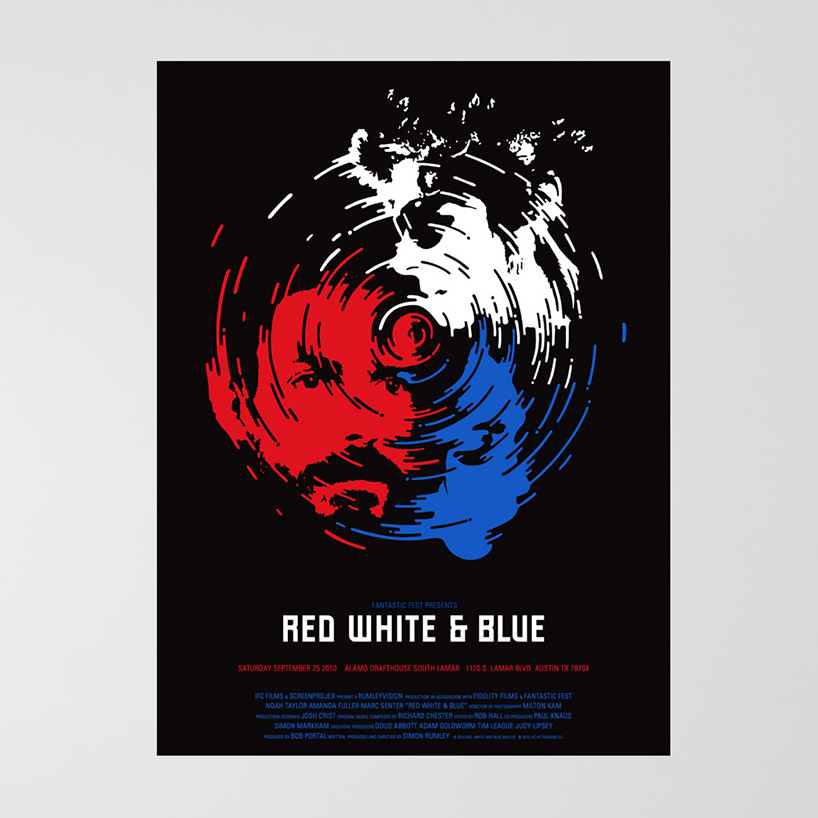
red white & blue — poster
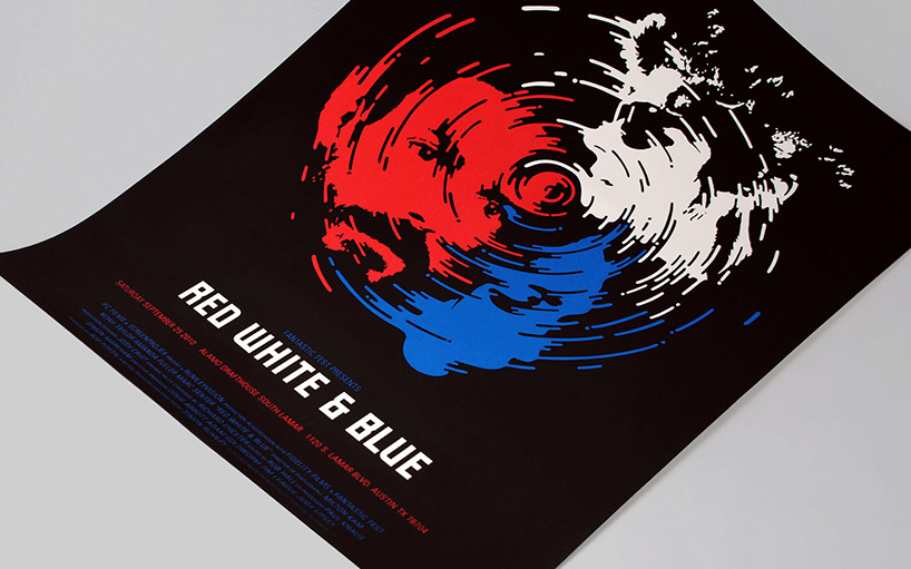
red white & blue — poster
DB: do you think drawing is an important skill for a designer to have in this day and age?
JQ: I draw often when sketching ideas for typefaces or compositional layouts but I quickly move to the computer / wacom tablet to refine things or explore them further.
RG: being able to draw is a very useful skill to have. that doesn’t mean it has to be pretty, it just needs to visualize what is in your mind. nor does it have to be pencil and paper — drawing digitally or straight onto screen via a tablet can be equally useful.
drawing allows you to get a rough idea of composition and balance that is loose and noncommittal. perfect for when you are exploring visual ideas.
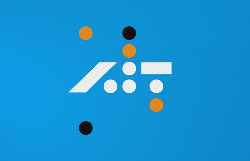
art is techno — identity
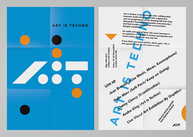
art is techno — poster
DB: what do you both share a passion for besides your work?
RG: football. in fact, whenever we need a work-based analogy, football is almost always the topic of choice.
JQ: we’ve joked about making a ‘football analogy’ book as we have so many.
typographic illustration for esquire magazine
typographic illustration for esquire magazine (detail)
art direction by stravinski pierre & sawdust
DB: do either of you have any superstitious beliefs or rules that you live by?
JQ: I’m not superstitious – isn’t it just common sense not to walk under a ladder?
RG: I think that sums it up. I’m not particularly superstitious but I fear I’m developing a mild case of OCD. I also like the idea of karma.
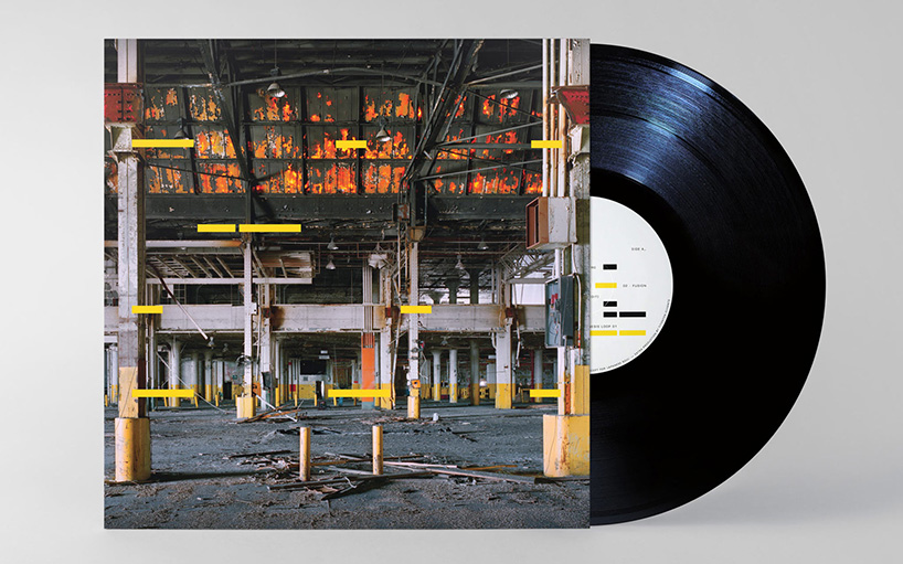
fabrice lig — album packaging
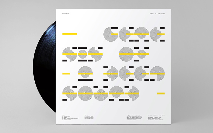
fabrice lig — album packaging
DB: what’s the best piece of advice you have heard?
RG: ‘do good work’ — milton glaser. bright chap.
JQ: ‘do not be scared of failure’.
DB: what is sawdust’s motto?
RG: something along the lines of ‘can you read it yet?’
JQ: I didn’t know we had a motto!
GRAPHIC STUDIO INTERVIEWS (193)
 Nov 21, 2022
 Feb 10, 2019
 Jun 21, 2018
 May 17, 2018
 Oct 04, 2017
POSTERS (78)
 Mar 28, 2024
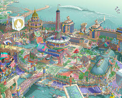 Mar 06, 2024
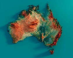 Jul 29, 2022
 May 26, 2022
SAWDUST (2)
TYPOGRAPHY DESIGN (133)
 Sep 13, 2023
 Feb 23, 2023
 Jan 24, 2023
 Jan 19, 2023
PRODUCT LIBRARY
 Apr 17, 2024
 Apr 15, 2024
 Apr 15, 2024
 Apr 12, 2024