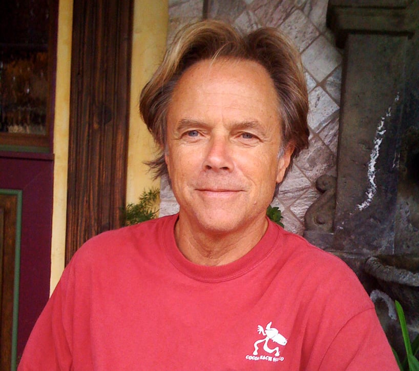
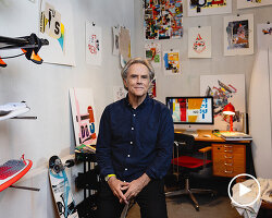
david carson is a graphic designer, art director and surfer. his work for the magazines beach culture and ray gun in the 1990s brought a new approach to type and page design breaking with traditional layout systems. he continues to explore the possibilities of graphic design, particularly typography as a form of expression across print and video for both commercial and cultural clients. designboom spoke to david about his work and influences. (‘dad’ photograph, above, by luke carson)
designboom (DB): what originally made you want to become an graphic designer?
david carson (DC): I wasn’t really looking to become a graphic designer and in fact I wasn’t – until the ripe old age of 26! graphic design is a second career for me, I have a degree in sociology, and taught that for a few years, then somewhat by chance, I took a two-week summer workshop at the university of arizona – about this thing called ‘graphic design’. it changed everything. I hadn’t even known the term graphic design before then. a great instructor, and good friend to this day, jackson boelts – helped me take the first steps on this fantastic journey – one I could have never imagined.
I feel I’m the most fortunate designer on the planet. as a result of this career choice, well passion really, I had no choice once I had discovered it! over twenty five years later I’ve visited and lectured all over the world, had numerous exhibitions, books and received notable awards, and all because I found something I was passionate about, and pursued it, without ever looking back. I found something that never felt like work. I’ve always said I make my living from my hobby.
just this year I’ve received the AIGA (American Institute of Graphic Arts) gold medal, and was named as one of apple’s 30 most innovative designers in their 30 year history – only 2 graphic designers were chosen, the other being april grieman. they called us ‘pioneers with profound impact’ – I’m really proud of that one.
the past few years have been some of my most productive yet. later this fall I’m lecturing in spain, portugal, lithuania, bangkok and australia. I’m a little amazed, that after all these years, the speaking and interview requests, jobs and fan mail, keep coming in from all over the world – it’s very humbling.
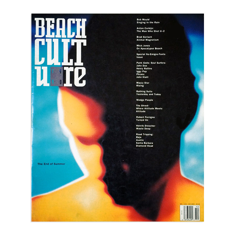
beach culture magazine october 1990 – this is some of photographer anton corbin’s first color work. we were running a photo spread of his work, and when I saw the editor neil fineman’s theme for this issue ‘the end of summer’ I thought this image was perfect. it has the mood of summer’s end, even though it was not commissioned as such.
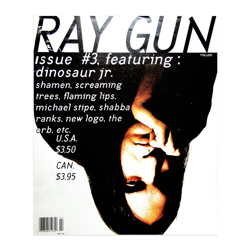
ray gun magazine february 1993 – the interview subject for this cover story, j. mascis of dinosour jr., talked about how much he hated the press, magazines, media, etc. – this was my reaction to his comments, to use the publicity photo the record company sent, upside down. it’s funny to see it reproduced in articles and in stores the wrong side up!
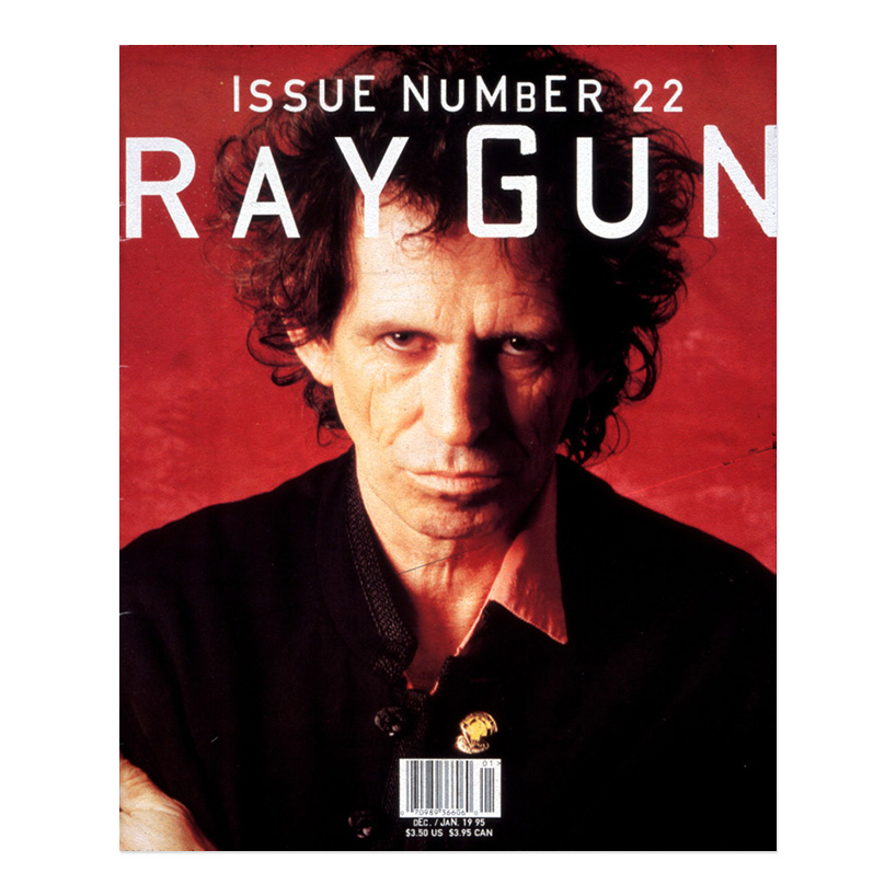
ray gun magazine january 1995 – ray gun had no grid, formula or format, letting the music and individual articles dictate the direction of the design and layout. every page was an entirely new design assignment, making it a lot more work than most magazines, but also a lot more fun, and I believe with more effective results . with this cover the editor had given me a few cover lines including one about keith richards coming clean about sex, drugs, rock and roll etc. I looked at this portrait and realized you really didn’t need to say anything else, the landscape of his face said it all. often a hotly debated topic of editors, many believing a menu of everything in the issue on the cover is best, others have rules about where the cover lines NEED to be. it turned out this cover, with NO cover lines, was our biggest selling issue – funny, we thought keith looked ancient THEN.
DB: how would you describe your approach to design?
DC: experimental, intuitive and personal. I have no formal training, which I’m sure helped a lot as I never learned all the things I’m not supposed to do, I just did what made sense to me. I think my interest in sociology helped lead me initially to editorial design, because I was working with real stories, about real people and events, sometimes music.
since I knew nothing about girds, formulas, schools of thought, etc. I just did what felt right. my starting point was and and is, always to first read the brief, article or whatever it is I’m given. that sends me off in a direction design-wise. I try to reinforce visually whats written, spoken or sung. I want the work to connect with people on an emotional level, which is where I feel it’s most effective and lasting.
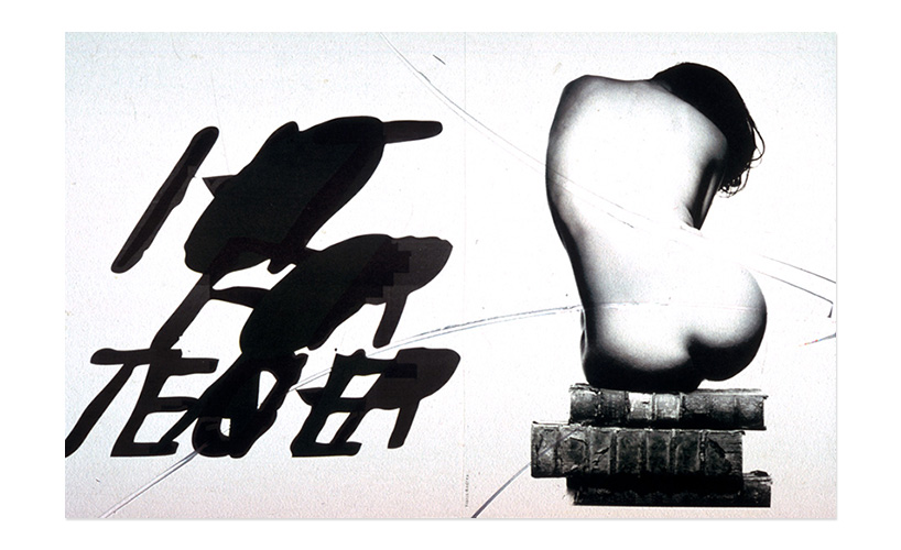
different rock stars talked about teachers they had lusted after in school in this beach culture article ‘hot for teacher’. I loved this image of a ‘teacher’ sitting on some books, and the way the type lustfully leans toward her.
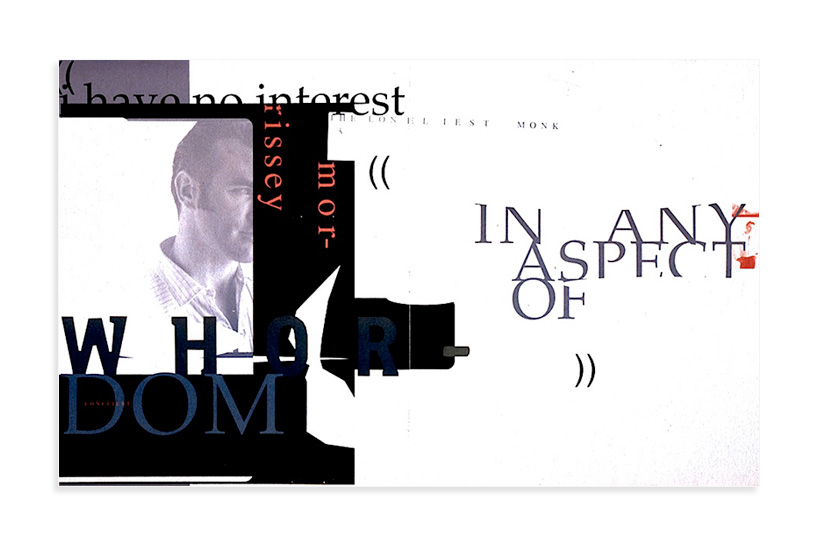
ray gun magazine – one of my favorites, an opener for a long article and interview with singer songwriter morrissey. reading through the article I found this great quote ‘I have no interest whatsoever in any aspect of whordom’. I chose to use this large in the opener and cropped him a bit – as he was a bit mysterious in this interview – and in general at that time.
DB: who or what has been the biggest single influence on your approach to design?
DC: again, probably my lack of formal training, combined with my overall life experience. growing up primarily in southern california I think gave me a somewhat more experimental, liberal and open minded approach to design and life.
also my early exposure, through a workshop in switzerland, to the experimental swiss designer hans rudolf lutz was hugely influential with my first job, only months after first discovering the field of graphic design, I was designing a skateboard magazine, and basically that became my schooling. I had to figure out everything from spec’ing type , writing instructions on tissue over art boards for printers, how hand held waxers worked, and of course – designing.
nowadays I usually work on numerous ideas at once for the same topic or project, getting progressively more experimental as I go along. then I go back and fine tuning the ones that feel the most effective.
ray gun magazine – experimenting with columns of type, space, or the lack of it between them, and changing fonts in title and body copy. the first issue of ray gun it seemed as if I used a zillion new custom typefaces that people were sending me from all over the world, and for the 2nd issue I self imposed the restriction on myself to use only the 5 fonts my rented computer came with. an interesting challenge and I think the results still stand up pretty well, though I abandoned this idea on the third issue. my font choices lately have returned to slightly tweaked, but are still somewhat basic.
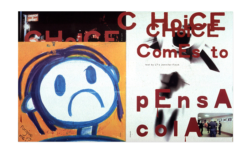
opening spread for the ray gun story ‘choice comes to pensacola’ – an abortion clinic in florida had been attacked and a dr killed, the day before the band L7 arrived to give a concert. the article talked of the strangeness of the situation they found upon arriving in pensacola, with police, FBI, media, murder, and fanatics on both sides of the issue.
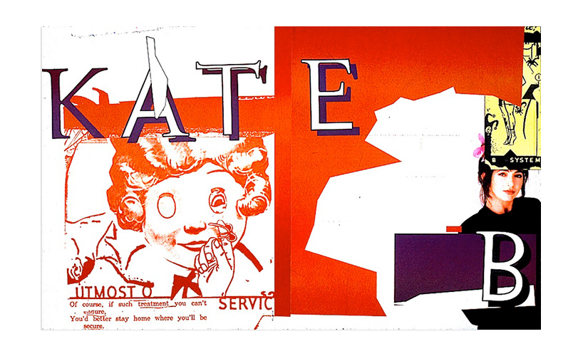
opening spread for article on singer kate bush in ray gun – I listened to the new album, read the interview, and this is where it sent me. I’ve not used any of the actual article in the opening spread, so the following spread needed a lot of copy on it, but I feel the trade off is worthwhile sometimes – to get a better opening that has a bigger impact – one that hopefully promises an interesting article. communication begins, as always, way before anyone actually starts reading.
DB: what type of brief or project do you enjoy working on the most?
DC: anything I haven’t tried before, any new challenge. I had great 2 month working experience on microsoft for example, and it was fascinating learning experience. but so was working with a new fashion line from vietnam… like most designers I enjoy anything that gives me a lot of creative freedom, but when they don’t, it’s just a different type of challenge, it’s like ‘hmmmm, THAT’S a lot of restrictions, how can I still do something that works for them – but that I’m still happy with as a designer?’. I also love working with great creative teams, where we all can learn form each other, grow professionally and creatively and push each other.
having had my own small studio all these years, I’m really at a stage now where I’m looking to join a great creative team, mentor and hopefully motivate some younger designers, while still learning and growing professionally.
ray gun spread – we had a new writer from a much bigger music mag, and I was really excited to read this article when it came in. but I was really disappointed to find it was like sooo many others: the writer had been given 10 minutes before the performer went on stage to do his entire interview, and as such he reported the typical stuff like what the singer was wearing, what was in the room etc. boring stuff I’d read so many times before. I started going through my fonts, finding nothing that felt right, then came across dingbat. which would have been the last one on my very extensive list, as it’s known by the designers name zapf dingbats. I’m sure I chuckled a bit, then thought, well, why not? it was a really boring article. so the entire article was set in zapf dingbat.
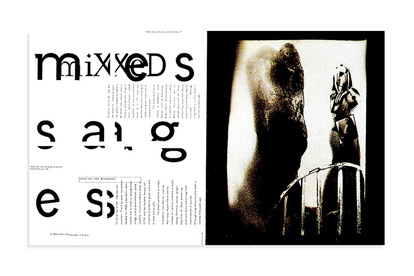
‘mixed messages’ from beach culture magazine. my starting point in my editorial work is always to read the article. sometimes just the title was interpreted, as is the case here. I felt the title mixed messages should be mixed up. this was a result from printing out the title page in 4 pages, as it was the largest I could get on my printer at that time, then laying them out to cut and tape them together. but stopping midway through the process, I realized there was something nice happening with the 4 single pages laying on my studio floor, as they were – so I used them in that way.
DB: what would you say is your strongest skill?
DC: the ability to speak visually and emotionally to a wide variety of audiences and topics.
I’ve worked for numerous clients, from auto makers, airlines, fashion companies, surf companies, to hi-tech companies and bands like nine inch nails. it’s a very diverse group and I think they come to me because I’m able to speak to their specific audiences or demographics, visually.
a strong concept and or great writing, combined with great design is when the most effective communication occurs, and where the best work happens. as my life experience changes and grows, so does the work. but I feel the basic approach of me interpreting subject matter visually, remains similar. just the other day got an e-mail that I felt expressed what I hope my posters do:
‘dear david, I kind of blame you for taking up graphic design. whilst studying film making in bristol a poster of yours’ caught my eye, announcing that you were giving a lecture on graphic design (never even thought of graphic design before that point having been kicked out of art class aged 14). I was so intrigued by the poster I went along (around 1999). from then on I ditched filming-making, finishing the degree and never picked up a video camera again. instead I taught myself graphic design. collecting as many copies of ray gun as I could. I’d just like to thank-you for the journey you sent me on, I’ve loved it.’
I’d say that poster was very effective communication. you have to love what you do, you have to enjoy going to work. I say in my talks, find that thing you would do even if you were independently wealthy. that’s a good job. or as marshall mcluhan said in our book PROBES ‘if your totally immersed in something, it is no longer work, it’s play or leisure.’

NIKE air challenge advertisement – a turning point in my career, after a couple years of doing mostly editorial work, NIKE contacted me, via agency weiden +kennedy to do a huge series of ads, billboards and more, world wide, in numerous languages and formats, focusing largely on the type. I kept portraits small, and used a lot of white space. my work uses very few software tricks, or even color. it’s about font choice, cropping and basic, often intuitive design decisions, ones that are appropriate for the client, audience, and myself. worldwide agencies started calling me soon after these broke.
DB: what are your thoughts on specialization vs generalization?
DC: generalization tends to make you more employable, especially in small shops, or on very unexciting projects. but also the old saying seems to hold true ‘knowledge in all areas, master of none’. so, I would lean more toward some sort of specialization, now more than ever, as anyone can buy the same software and do reasonable, work. professional and forgettable. I believe strongly the more one can bring personal uniqueness into the work, the better the work becomes. you enjoy it more and you also do your best work. it has the most impact if you can put some of yourself into each project. otherwise we don’t really need designers, anyone can buy the same software and do reasonable work. I think overall designers today have gotten lazy, and let the programs and computers make too many decisions for them.
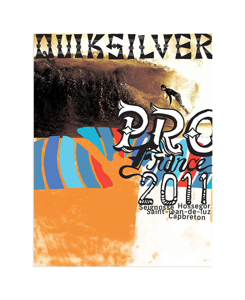
quicksilver poster explorations for pro surfing event in france, 2011 – this was a collaboration using elements drawn by illustrator george bates and photographs by steve sherman (the surfer shown here is dane reynolds).
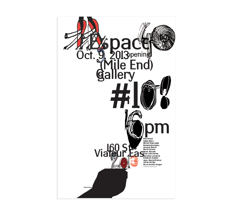
poster for art exhibition opening in montreal, 2013 – if you liked the poster you probably would have enjoyed the opening and the artists that were featured. hopefully it at least perked your interest and you attended, finding a few gems that really spoke to you – a wide range of work was on show. the illustrated elements in the poster are by ola carson.
DB: how do you think online design resources have influenced the graphic design being produced today?
DC: it’s made everything less experimental, less memorable, less unique and less effective. its homogenized the work overall and made it easier to forget, with less impact.
DB: what are you currently fascinated by and how is it feeding into your work?
DC: I’m most fascinated about how social media can work with good design to produce desired and effective results. I still think it’s largely an untapped area. I’m always following world events, news, scanning everything really. life in all its details continues to fascinate me endlessly. I’m watching the various eco movements, politics, new products, and constantly wondering how design can play a bigger, more effective and more important role in all of this.
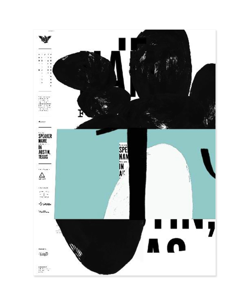
poster for a A.I.G.A. (Austin Institute for Graphic Awesomeness) spring 2014 conference – there are a very few rules one simply does not break. ever. one does not change another designer’s work. ever. especially without any discussion with them. I was invited to speak, spring 2014 for the A.I.G.A. in austin, hosted by its founder, armin vit. I was not paid for the speaking event (although the elvis impersonator that opened for me was) but that’s fine, I was getting to design the poster and had been given total freedom to do ‘whatever I wanted’. I designed two posters that I really liked, and asked mr vit if we could print two posters for my event. he emailed ‘yes, no problem. no reason we cant print two’. but when mr vit received my two posters, he said in a post that this poster was ‘lazy and not up to par’ so, he had added his own design, placing large type, OVER the top of the poster, never saying a word to me, even before and up to the start of the event, only telling me the posters ‘hadn’t arrived from the printer, but would probably show up after my talk in times for signing’. it doesn’t matter if it’s me, a student, or whoever the designer is , you simply don’t change or alter someones else’s work without discussing it with them, and, in this case, hiding what you are doing. indefensible.
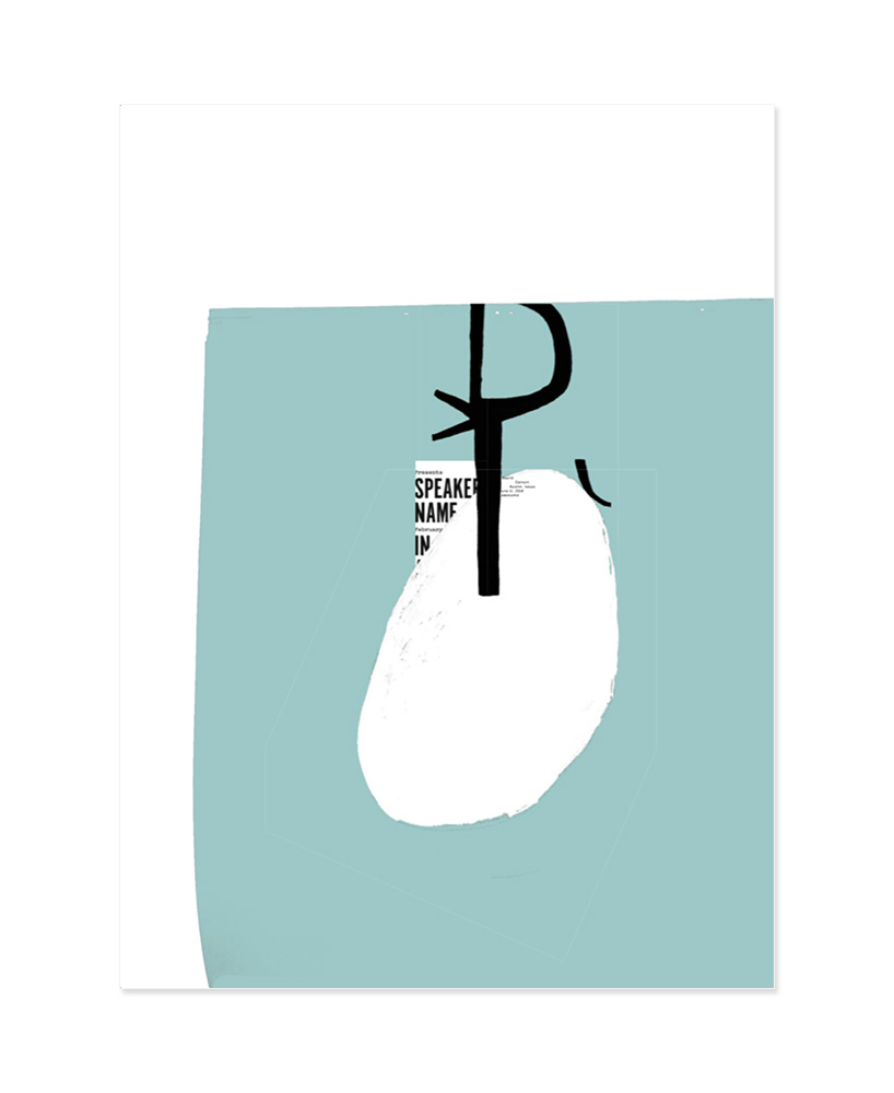
here is my 2nd poster for the A.I.G.A. talk – which, mr vit had agreed to print. upon seeing it, he deemed it unfit for printing, again not up to his standards, and told me when I asked what happened to the second poster, that ‘the printer didn’t have time’. I liked the idea of one poster being simpler and the other more complex. by the way these posters were not given out, or shown anywhere until after the event, so they were not used as promotional tools. though they certainly could, and should have been (in their original form). the poster done with vit’s redesign was available as part of the admission price, a souvenir of the event. I feel that if you liked the poster you probably would have enjoyed the lecture and if you didn’t like the poster, well, you still might have enjoyed the talk!
DB: what are you passionate about besides your work?
DC: family, surfing, music…
DB: do you have any superstitious beliefs or rules that you live by?
DC: I try not to tell family or friends about POSSIBLE new work, especially new exciting projects, as I’m afraid I’ll jinx them and not get the job. over the years it feels like I’ve lost a few projects this way…
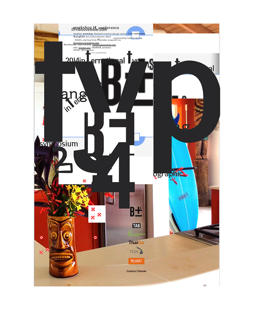
bangkok international type symposium 2014 poster – given the subject manner and audience, I believe this to be an effective tool for raising interest, and attendance in such a specialized event that is now on its way to selling out with attendees coming from all over the world. there are MANY ways to communicate – I like the emotional ones.
DB: what’s the best piece of advice you have heard?
DC: my dad once told me that whatever the experience – ‘if you’d either laughed or learned something, it was probably worthwhile’.
saul bass once told me ‘just keep doing what you do, don’t care or follow the critics.’ – which I thought was great advice and still try to follow to this day.
years ago an anonymous fax arrived congratulating me on a front page feature story that the NY times had published about me. the fax said that they ‘hoped I was saving money, because once they build you up, they love to tear you down’ – I probably shoulda taken more notice of that one!
DB: what’s your personal motto?
DC: why not?
david carson (2)
graphic studio interviews (193)
 Nov 21, 2022
 Feb 10, 2019
 Jun 21, 2018
 May 17, 2018
 Oct 04, 2017
posters (78)
 Mar 28, 2024
 Mar 06, 2024
 Jul 29, 2022
 May 26, 2022
 Mar 10, 2026
 Mar 08, 2026
 Mar 04, 2026
 Feb 24, 2026