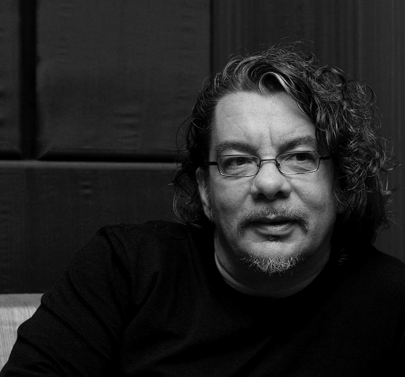
neville brody is the founder of brody associates – a globally renowned, innovative, creative agency specializing in digital, typography and identity. brody is internationally recognized as a pioneer in the fields of graphic design, art direction and brand strategy having established his reputation working with record labels (stiff records), magazines (the face and arena) and a range of other international clients (samsung, yamaha, LVMH, NIKE, the BBC and the times london among them).
designboom: when you were growing up did you always want to become a graphic designer?
neville brody: I feel like I was always going to be an artist or a designer – I was never going to be a train driver or a fireman. I was drawing before I could even walk, so the only decision I had to make really was whether I wanted to become a fine artist or a designer. the reason I entered into design is because I thought that fine art was fairly dishonest as an industry. it pretends to be about culture but it’s really about money. design is much more honest about it’s commercial context and can also reach a lot more people than fine art.
I have always been very interested in how advertising and design can manipulate the way that people think and in the early years I wanted to lean those tools in order to turn them around, to reveal the truth rather than conceal it.
something else worth mentioning is that when I was about seven or eight I designed a complete identity system for an imaginary postal service – which is quite sad when you think about it! the fact that I wanted sit at home doing that while my friends were out playing football!
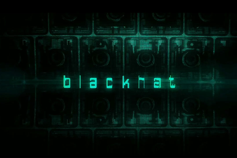
blackhat 2014 – brody associates remixed ff gothic to create the main title, location and end cards for michael mann’s new film
DB: do those aspects of graphic design still interest you the most today?
NB: the thing that excites me about graphic design is not really graphic design itself, but communication. the process of language, understanding language, encoding language. this is something that constantly needs managing because it’s always changing. as soon as anything becomes a fixed in a pattern we tend to slip into not thinking about it critically. I’ve always been trying to challenge, rethink, or disrupt through graphic design. I’ve never wanted to find a comfortable place in all of this.
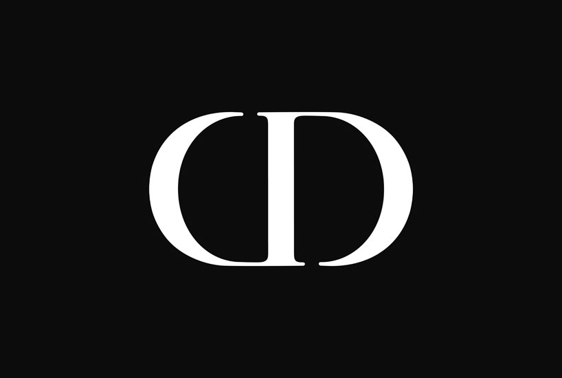
christian dior identity, 2014 – working closely with the dior house and parent company LVMH, brody associates evolved the iconic CD marque
DB: how do you avoid having a formulaic approach?
NB: sometimes, inevitably that happens but the starting point for every project is about trying to be fresh. you never want to pursue a style but occasionally your way of thinking can be detected in the work you produce.
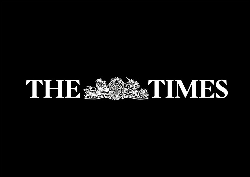
the times london, 2006 – a complete redesign of the times london in its transition from broad sheet to tabloid format
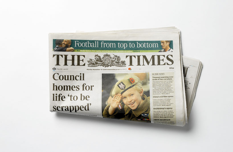
the times newspaper masthead – the redesign included the creation of a new typeface ‘times modern’ designed by brody and luke prowse
DB: how do you keep yourself fresh?
NB: I’ve never insulated myself with just graphics or any single field for that matter. I’ve always worked across the board: branding, print, digital, environmental design… the context is society. it’s always been about being as creative as possible within a paying market.
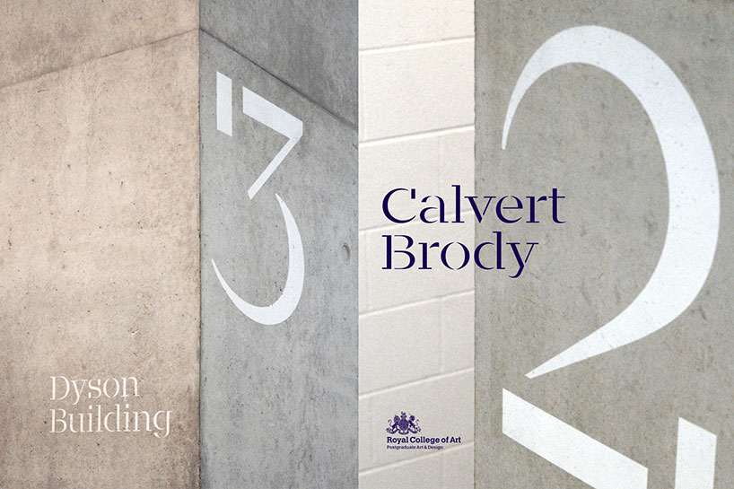
calvert brody font, 2013 – brody collaborated with fellow typographer margaret calvert to create a typeface remix for the RCA (shown above in use for wayfinding signs at the college)
calvert brody is a unique element within the RCA brand toolkit
DB: what made you want to start your own studio right from the beginning of your career?
NB: apart from a brief stint at a studio after college I’ve always had my own studio. for me having the freedom to experiment is very important so it was always highly unlikely that I’d work for someone else.
I was fortunate to become involved with graphic design for music practically straight after leaving college. the music industry is very commercial but still has that exploratory edge to it. it also ripples out into a lot of other industries, so it became a natural step to start working with magazines, fashion labels and then media and eventually cultural institutions.
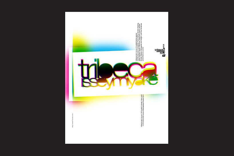
issey miyake identity, 2002 – a unique identity for issey miyake’s tribeca store, the first location to showcase all miyake’s collections in one retail space.
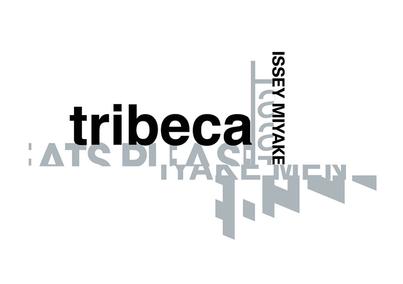
issey miyake identity, 2002
DB: how has your studio evolved over the years and are you still very much hands on as a designer?
NB: we now have hubs in london, berlin, tokyo and seoul – but we work at a human scale. we’ve never had masses of people working for us in any of the offices. the london office had 20 people working in it at one time but we’ve since scaled down. our thought has always been ‘if you can’t all go to lunch together then there’s too many of you’. you need personal contact and familiarity with your colleagues.
you’ll find that the majority of the work in very big agencies is mostly on the production side. we, on the other hand have always been more interested in the creative and strategic side of things rather than mass production – that has never changed. it’s this approach that has allowed me to be very hands on with our clients up until today.
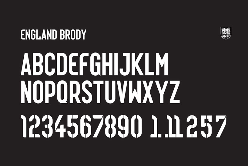
england brody font, 2014 – commissioned by NIKE, brody associates produced two typefaces, one for naming and one for numbers, to be applied to the england squad’s world cup shirts
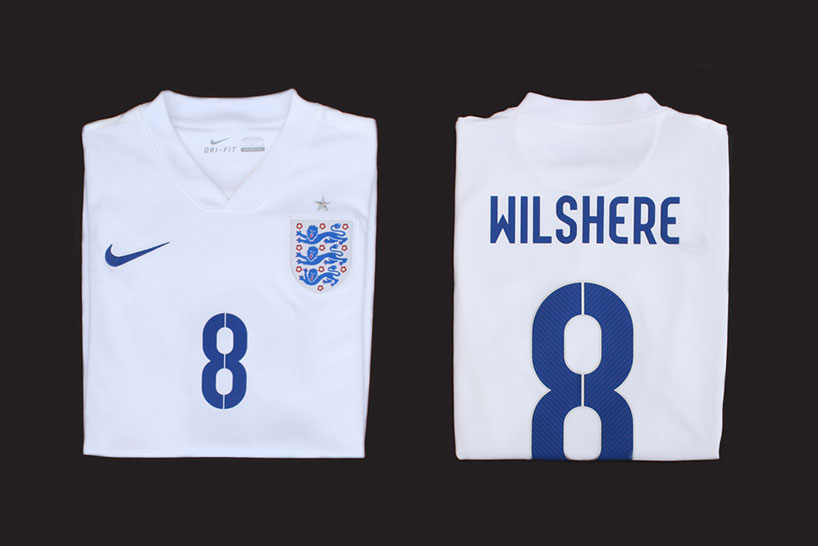
the core inspiration was to focus on the intersection between flair and workmanlike reliability. small touches emphasize the idea of innovation, invention and surprise, built around a more geometric structure. the industrialized suggestion of a stencil was simultaneously based on a pinstripe motif, combining style with no-frills efficiency. see all of the NIKE world cup 2014 fonts »
DB: you recently rebranded your office from research studios to brody associates…
NB: neville brody studios was my first studio and that was basically me and a small team of people. then we decided to form research studios so that other designers could rise up within the studio and be recognized for the work – that was also when we decided to expand into a network across europe, USA, and asia. now we have moved onto the third model, which is a much more agile one . now we are building teams based on the specific requirements of a project, collaborating with outside specialists rather doing everything in house.
each of our hubs will essentially be a small core team of designers who collaborate with different specialists on each project. this allows individuals more flexibility to find the work that they really want to be doing rather than waiting around in a studio for work to come in. furthermore, it brings a fresh approach to all the projects and is a much better business model.
supreme capsule collection, 2013/14 – font and graphic materials inspired by the brody archives
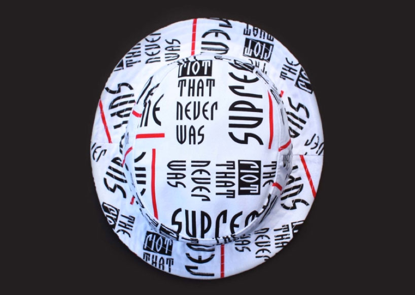
typographic hat from the supreme capsule collection
DB: which part of the design process do you enjoy the most?
NB: I enjoy working with language and strategy. I also love to get stuck into a one-off poster or book jacket – projects where you can just get very deep into the experimentation.
today everything seems to be about design and I like that too. I know it’s not a particularly new concept but it’s more and more noticeable. you hear government, education and other aspects of society talked about as ‘a design process’ and that’s what they are, almost everything is… for example my job as dean of the RCA is a design process.
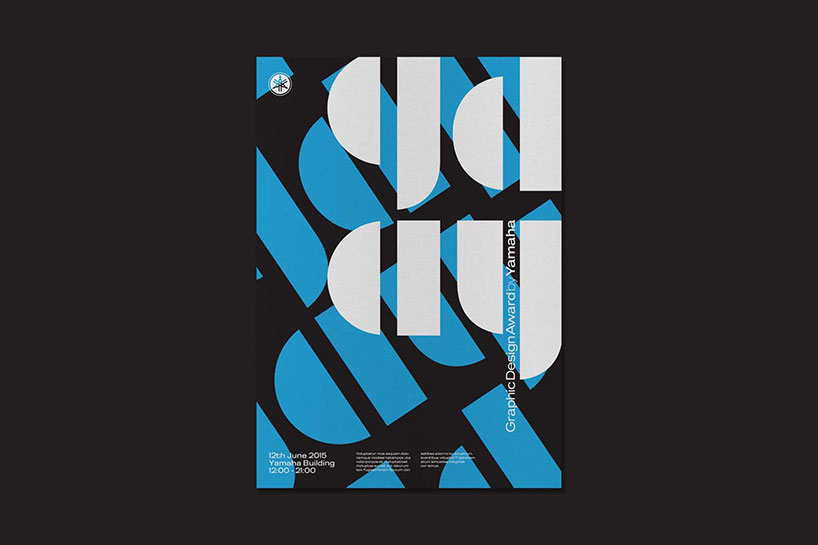
graphic design award by yamaha 2014 identity, 2014 – brody associates were commissioned to create a unique visual marque and identity system for a global competition graphic design award by yamaha
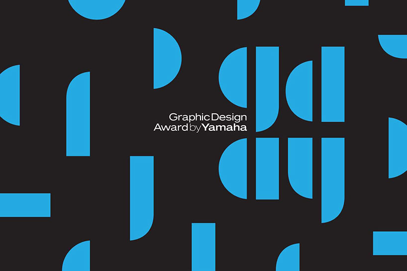
graphic design award by yamaha 2014 identity
DB: which recent projects have given you the most satisfaction?
NB: I absolutely loved the capsule collection we worked on with supreme. my son who’s 17 was very impressed by the work – so that was a feather in my cap! working with NIKE on the font for the england kits was enjoyable too. to be honest we try to approach every project in a way that makes it satisfying for us.
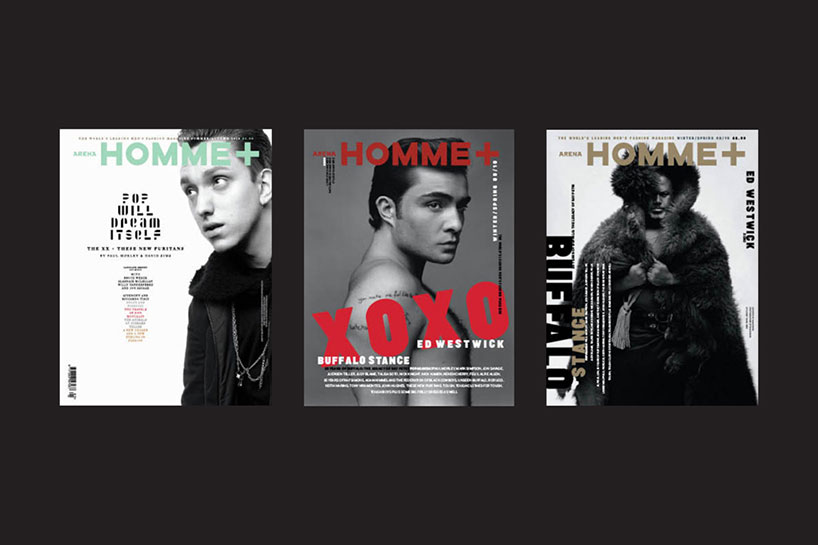
arena homme +, 2010/11 – alongside editor in chief jo-ann furniss, brody was art direction on issues 32,33 and 34 of the biannual men’s fashion bible
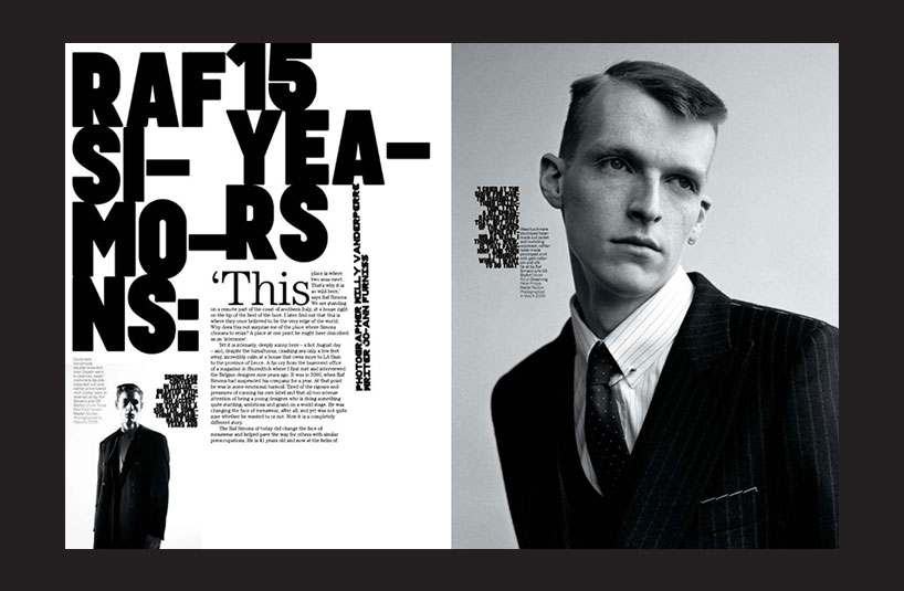
spread from arena homme +
DB: given all of the online resources available to train oneself as a designer, do you think that it’s still important to study design at an institution?
NB: it’s never been necessary to go to university to become a professional designer. you train yourself by doing and understand what you can as your paid work allows you to. what you get from undertaking a bachelors or masters degree at an institution is an opportunity to experiment and develop your own language as a designer. there’s also an important social element to being among like-minded people, who are also there experimenting. it’s hard to find time to do all of that in a professional setting because you’re chasing money and surviving most of the time – you’re ruled by meetings, production times and deadlines. design school gives you the chance to develop your thinking, to explore and to fail – something you can’t do much of in the professional realm. so the short answer is: you don’t need to go to school in order to have a career as a designer but it can be very valuable for your development as a thinker.
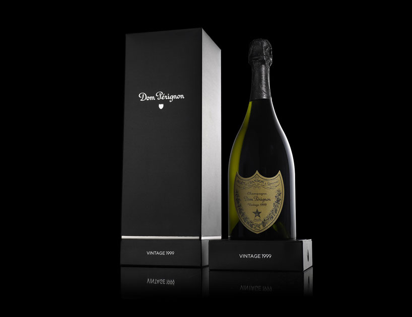
dom peringnon, 2007 – brand strategy, visual identity and repositioning of its vintage collection
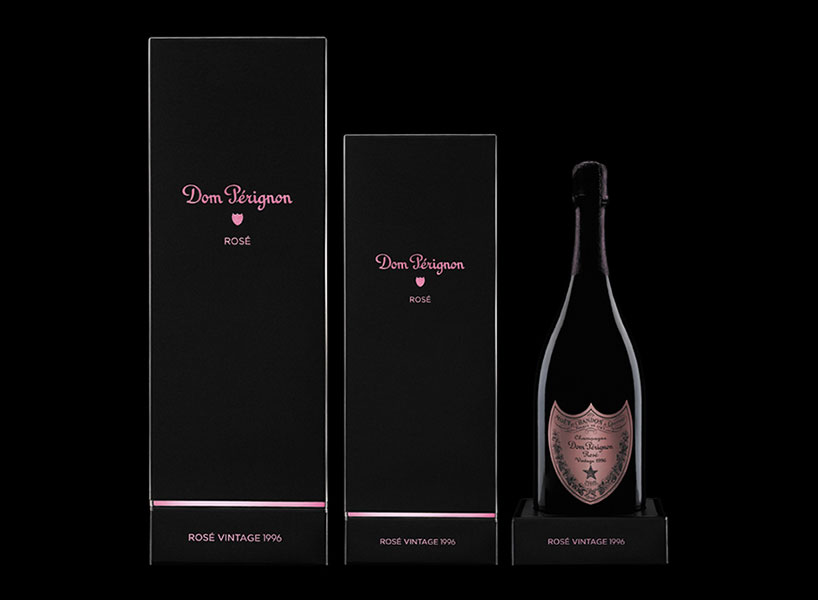
dom peringnon rosé packaging
DB: how has teaching broadened your own thinking?
NB: I’ve been at the RCA for almost four years now and I’ve thoroughly enjoyed learning from the experience. there’s still lots of scope to do new things in teaching and new ways that you can structure courses so that they deliver innovative thinking. there was a time when design courses were always geared towards creating precious end objects – like a book or a piece of packaging. but what we’ve managed to do now is shift the focus onto the process and thinking – to give the students valuable tools so that the end product is now their mind, their way of thinking. the outcome of what we do, is to develop skilled, dangerous minds. I don’t see the point in teaching for any other reason.
blur typeface, 1992
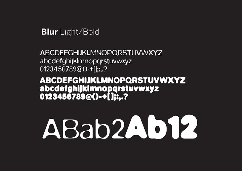
the blur typeface was recently selected by the museum of modern art new york (MoMA) as part of its permanent collection
DB: you recently mentioned that designers should take more risks and help draw attention to social issues – what advice would you give to young designers who want to do this?
NB: well, I would never give young designers or students any specific advice with regards to politics – everyone has to find their own feet. what we do at the RCA is give context and get students to engage with the idea that everything they do will somehow effect the society that they live in. the point I was making in that interview is that it’s more about being a conscious designer than anything else. some designers don’t think about the consequence of their work, they are just motivated by money and making things look ‘nice’. then there’s others who are only interested in designing for other designers. designers are quite responsible figures in society so I think that it’s very important that they understand the context in which they work.
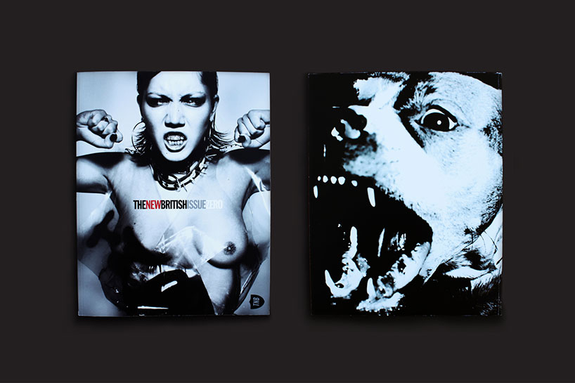
the new british, 2013 – alongside editor in chief kez glozier, brody is the art director on the new british
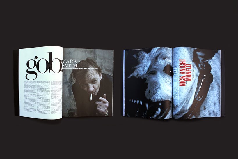
spreads from the new british magazine
DB: what are your thoughts on the graphic design industry today and its current output?
NB: it’s very much like the second law of general dynamics…
you might have a few hundred local coffee shops in a city that all promote themselves and their products in slightly different ways, they all have their own character to a certain degree. then you have one big, global brand like starbucks that uses the same limited DNA for its communication all over the world. that insular model has been very effective for a long, long time because it was seen as convenient but now people seem to be fed up with this approach.
just this week I read a piece about ‘the end of the supermarket’ in the guardian. that tells you a lot about what’s going on – people are moving away from mass produced, generic experiences and going back to more intimate, personal experiences. people are starting to look for difference again rather than uniformity.
in many ways the same can be said of graphic design and I think a big reason for this has been the economic downturn. for a time graphic design had lost its relevance – many designers and most students stopped experimenting and became quite comfortable simply conforming. these were competent designers, don’t get me wrong, but the work was a usually a case of style over substance, nothing was dangerous new, or provocative. all of that changed when the economy crashed. now people are taking more risks with their work again and there’s a lot of good stuff out there, things seem to be on the up again.
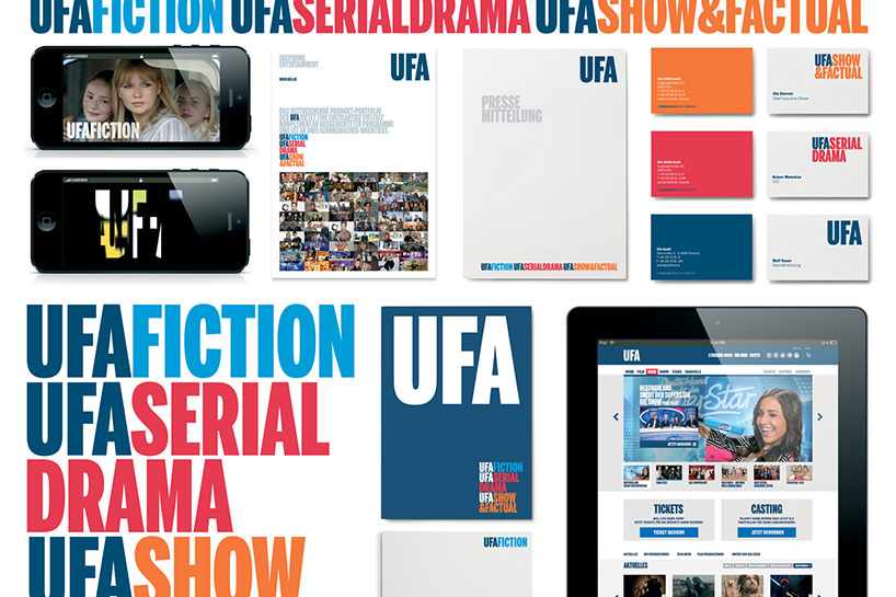
UFA identity, 2013/14 – a dramatic rebrand that refreshed not just the master logo but created an underlying strategy, visual language system and application guidelines.
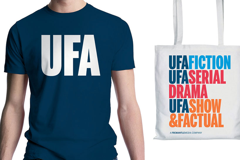
UFA identity, 2013/14
DB: what are you currently fascinated by and how is it filtering into your work?
NB: I’m fascinated by language, code, identity – human identity. I’m still extremely enthusiastic about graphic design in every way. I’m excited by the work many architects are doing right now. for example in london – there’s lots of interesting architectural work and urban design going on, some beautiful some less so – but most of it fascinating nevertheless. cities are embracing new ideas and are transforming before our eyes.
all that said, I’m a bit disappointed that digital is starting to become treated a lot like a utility now. for instance, twenty years ago when people first started thinking about the potential of the internet I would have expected much more innovation and experimentation by now. who knows maybe stuff will bubble-up and take a turn for the better again – like graphics has.
DB: what is neville brody’s motto?
NB: ‘no motto’ would be my personal motto and my mantra is: ‘be conscious’.
graphic studio interviews (193)
 Nov 21, 2022
 Feb 10, 2019
 Jun 21, 2018
 May 17, 2018
 Oct 04, 2017
logo design (244)
 Aug 14, 2023
 Aug 02, 2023
posters (78)
 Mar 28, 2024
 Mar 06, 2024
 Jul 29, 2022
 May 26, 2022
PRODUCT LIBRARY
 Apr 17, 2024
 Apr 15, 2024
 Apr 15, 2024
 Apr 12, 2024