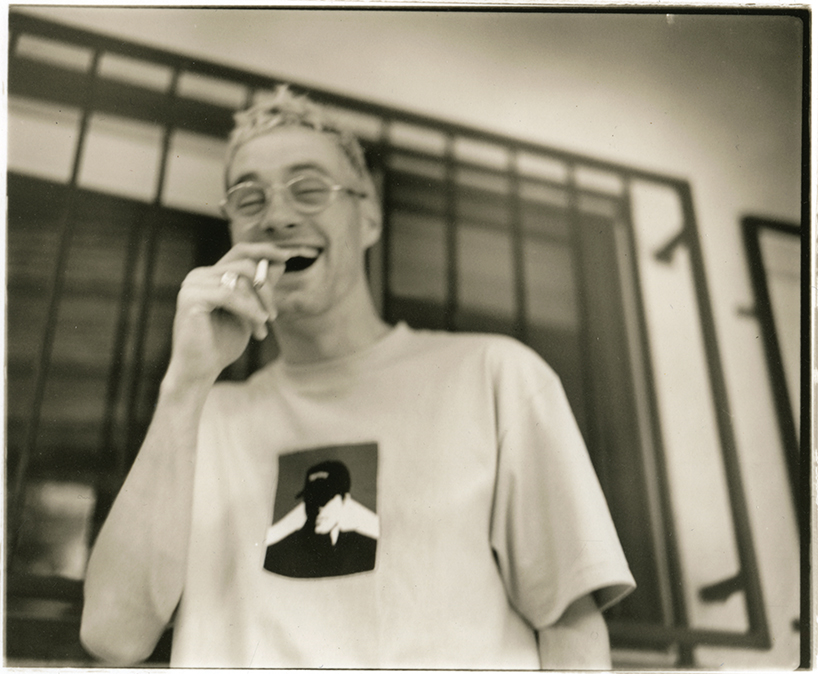
james lavelle in LA, 1995
photo by will bankhead
all images courtesy of mo’wax
‘urban archaeology: 21 years of mo’wax
at the southbank center, london
level 2 foyer / royal festival hall
now open until sunday, june 22, 2014
10am – 11pm
DJ, producer and recording artist james lavelle founded the record label mo’wax in 1993. taking its name from the title of a column he wrote in a music magazine – mo’wax went on to become an icon of independent music, a pioneer of new genres, and the epicenter of a movement in popular culture throughout the 1990s and early 2000s.
mo’wax’s output, from its roster of groundbreaking musicians to the creative artists behind the record covers, videos, and packaging formed a strong international countercultural identity. influential acts such as UNKLE, DJ shadow, DJ krush, la funk mob, nigo, mike D and money mark of the beastie boys, air, thom yorke, ian brown, and richard ashcroft all contributed to its original sound. meanwhile a strong visual identity was forged by graffiti legends futura and stash, graphic designers ben drury, swifty, 3D (robert del naja) and will bankhead.
by exploring the idea that the cross-pollination of cultures and genres could yield amazing and progressive results mo’wax pioneered the concept of collaboration between music culture and high-end brands, creating unique products ranging from vinyl toys to artists’ books and collectible sneakers with partners including NIKE, medicom, and a bathing ape.
urban archaeology identity
design by ben drury
2014 marks the 21st anniversary of mo’wax and over a decade since the last release. this landmark has been commemorated with the ‘urban archaeology’ exhibition that opened this week at the southbank center in london and will run until sunday, june 22, 2014.
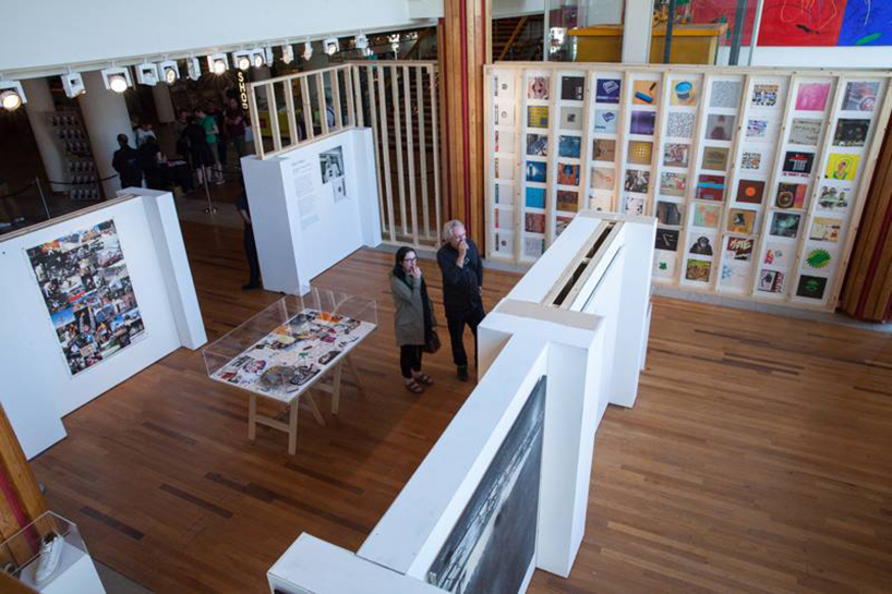
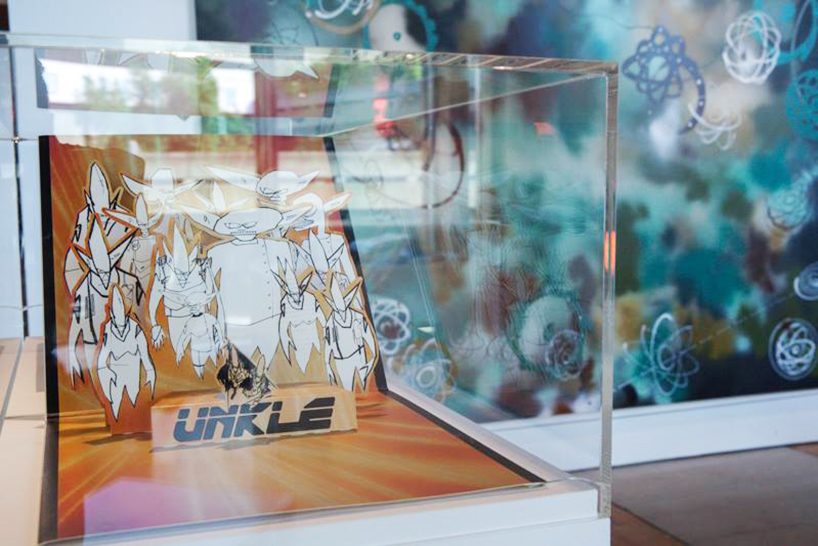
view of the urban archaeology: twenty-one years of mo’wax exhibition at the southbank center, london
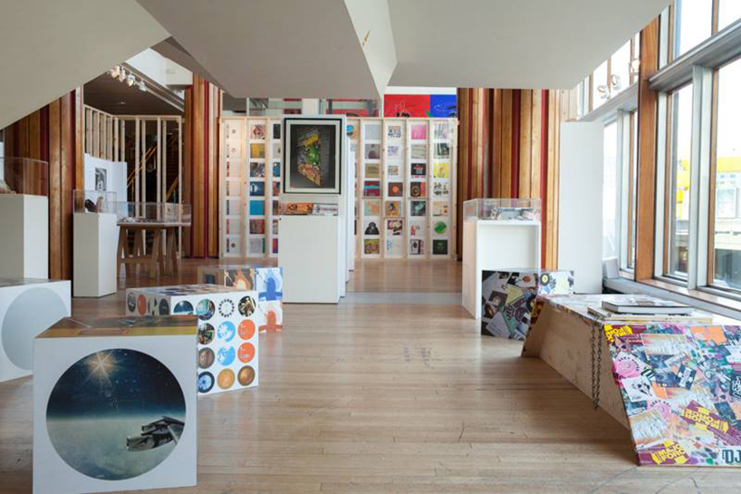
view of the urban archaeology: the exhibition features mo’wax artwork, photos, letters, toys, merchandise and much more
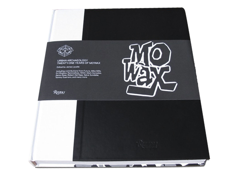 urban archaeology: twenty-one years of mo’wax, 2014
edited by james lavelle
designed by ben drury
published by rizzoli
for those who can’t make it to the exhibition there’s also a new book from rizzoli, designed by ben drury. ‘urban archaeology: twenty-one years of mo’wax‘ is a lavishly produced hardback packed with material from the exhibition accompanied by contributions from many of the seminal musicians that mo’wax represented, as well as the artists responsible for its aesthetic.
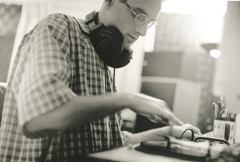
james lavelle in LA, 1995
photo by will bankhead
mo’wax founder james lavelle told designboom more about the urban archaeology exhibition and book…
designboom: what were your hopes and ambitions when you started the mo’wax label?
james lavelle: I just wanted put out good records, have my own label and have exclusive records for myself to DJ! I didn’t really aspire for it to be anything more than a platform but very quickly it became a way to accommodate the creative world around me and my social environment. at that time there were so many great records and artists that didn’t have a home until mo’wax was formed and it brought that music to a wider audience.
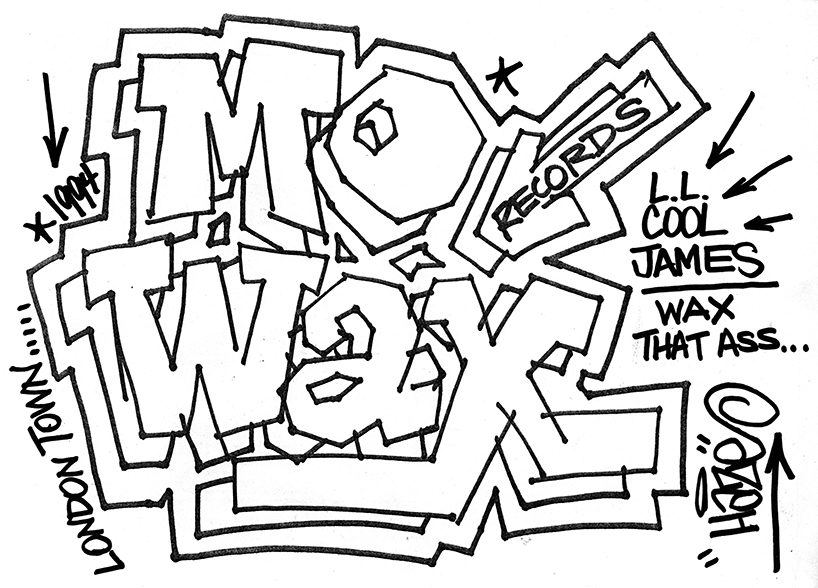
faxed flyer design by eric haze, 1994
(original mo’wax logo designed by swifty)
DB: did you always imagine that the visual identity should be a strong component of the label?
JL: yes it was always very important to me – all the things that had inspired me growing up were very visually lead so I wanted the label to have a style, a certain look that was ours. when we started I was working with my friend swifty, at that time he was already an accomplished designer who had worked with neville broody on the design of the face magazine. I knew with his talent that we could create a strong visual identity.
DB: your music often references cinema, was that also a big influence on the visuals?
JL: definitely, I love film and it was a massive influence on what we were doing. I’ve always felt like I see music a lot of the time.
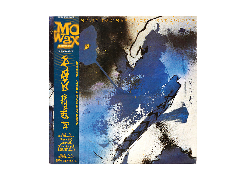
DJ shadow / DJ krush lost & found (S.F.L.) / kemuri, 1994
12 x 12” album sleeve
artwork by futura
design by swifty
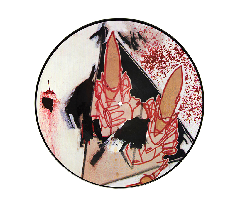
U.N.K.L.E. time has come EP, 1994
12 x 12” picture disc artwork by futura
design by swifty
DB: how important was it to continually work with the same group of artists?
JL: that continuity turned out to be crucial to the image of the label. to have a style helped in terms of recognition and working with the same artists helped the look and feel evolve naturally. having a distinct style also helped create a social environment that people felt they could be part of, that was very important to me. in this respect I was inspired by what def jam, warp, blue note had done in terms of forming an unmistakable sound and image for their labels.
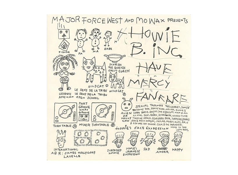
howie B have mercy EP, 1994
12 x 12” record sleeve
artwork by toshio nakanishi
ink on paper
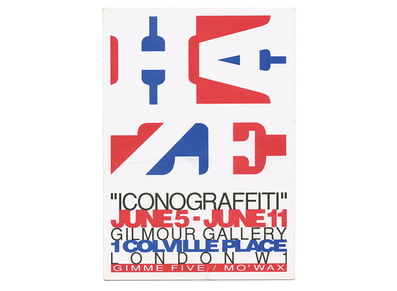
iconograffiti UK exhibition flyer, 1994
design by eric haze
DB: were you ever ‘hands on’ with the design side of things?
JL: I was always involved in the direction of the artwork and the concepts, so I was hands on in that sense but not the actual rendering of the art work no, I never picked up a paintbrush or anything like that – that was always done by the different artists and designers we worked with.
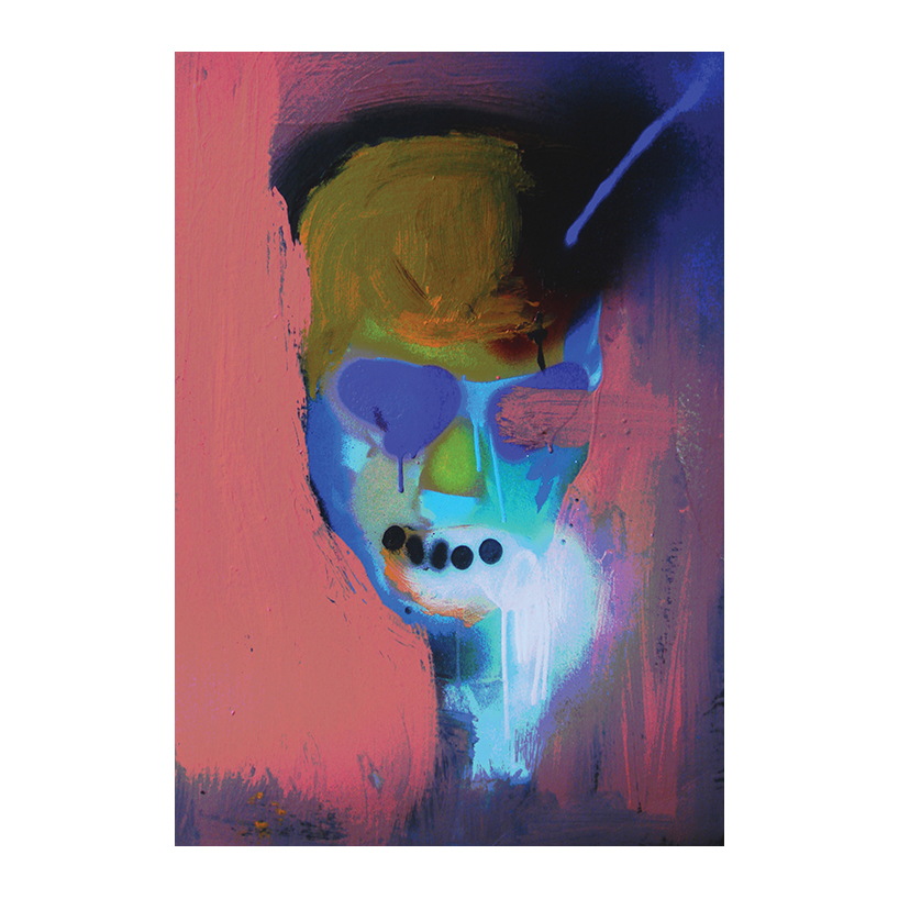
james
by 3D (robert del naja)
spray-paint and household emulsion on board
headz 2A, 1996
12 x 14” record sleeve
artwork by 3D
design by ben drury and will bankhead
DB: what criteria did you work to when producing the packaging for mo’wax?
JL: we did things for ourselves at first but as the label grew things changed a bit, we had a bigger audience, a bit more budget and we became interested in different things. but it always felt natural, as though ourselves, our work and our audience were evolving in synch with each other.
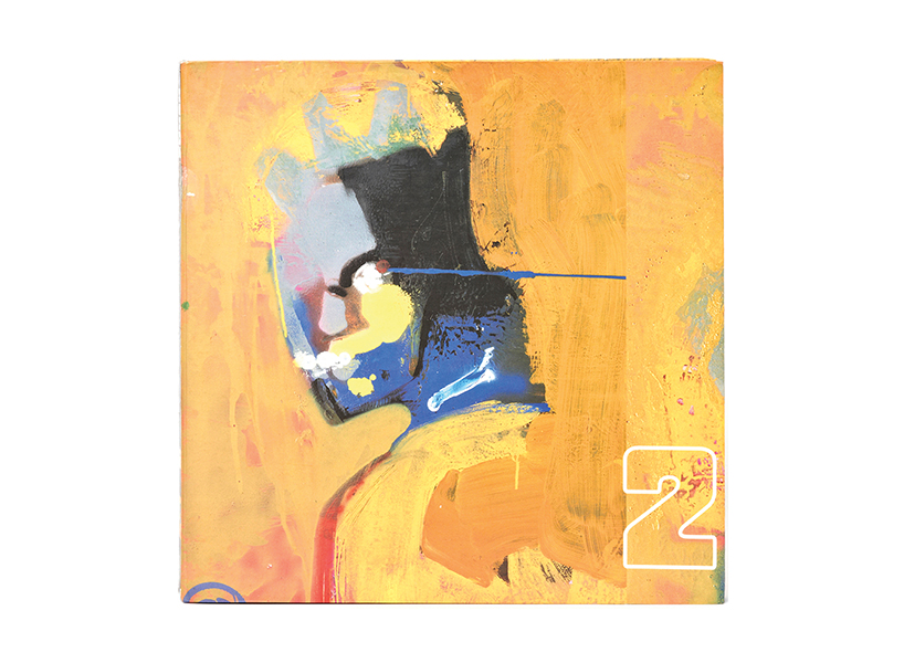
psyence fiction original artwork, 1998
by futura
collage and enamel spray-paint on canvas
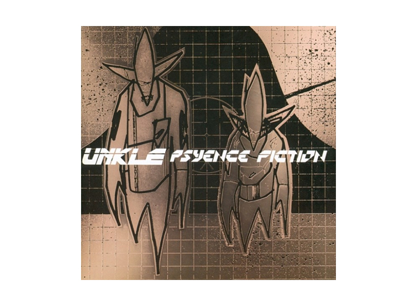
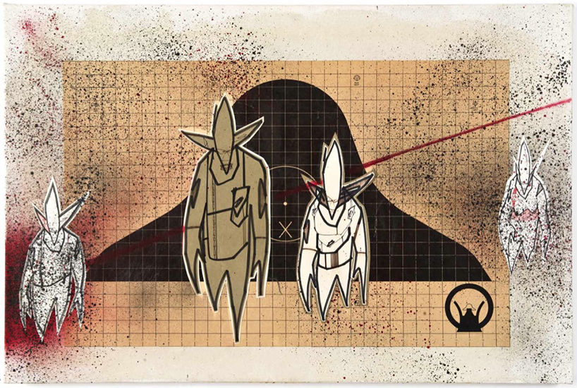
psyence fiction, 1998
12 x 12” record sleeve
artwork by futura
design by ben drury
DB: was there a typical process behind the design and packaging?
JL: it was always the result of a conversation between myself and whoever was working on the project; swifty in the beginning or ben drury and will bankhead – who I still work with today. generally one of us would have a reference; a painting or an image that we felt suited the music and then we’d discuss how to develop that into a piece of packaging.
we’d always think about what we could do to make the packaging special. we were obsessive over materials, formats, layouts, printing techniques any details that would make it desirable. generally speaking I didn’t like to have a lot of text on the packaging, so in some cases the text would be on stickers that could be taken off and the sleeve would feel like a painting. I wanted each record to feel like an artwork – for the music and the packaging to feel like a piece of art in its entirety.
psyence fiction, 1998
artwork by futura
design by ben drury
psyence fiction DJ survival kit
limited edition pop-up gatefold 12 x 12” record sleeve
artwork by futura
design by ben drury
DB: did the packaging ever loose you money?
JL: not exactly but the packaging was usually expensive compared to what most people were producing. so we didn’t make as much money as we could have maybe but that never really bothered me. I took a lot of pride in the packaging… and a lot of flak for it!
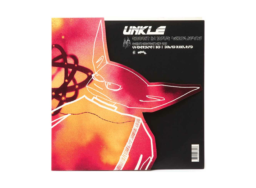
UNKLE rabbit in your headlights (single), 1998
12 x 12” record sleeve
artwork by futura
design by ben drury
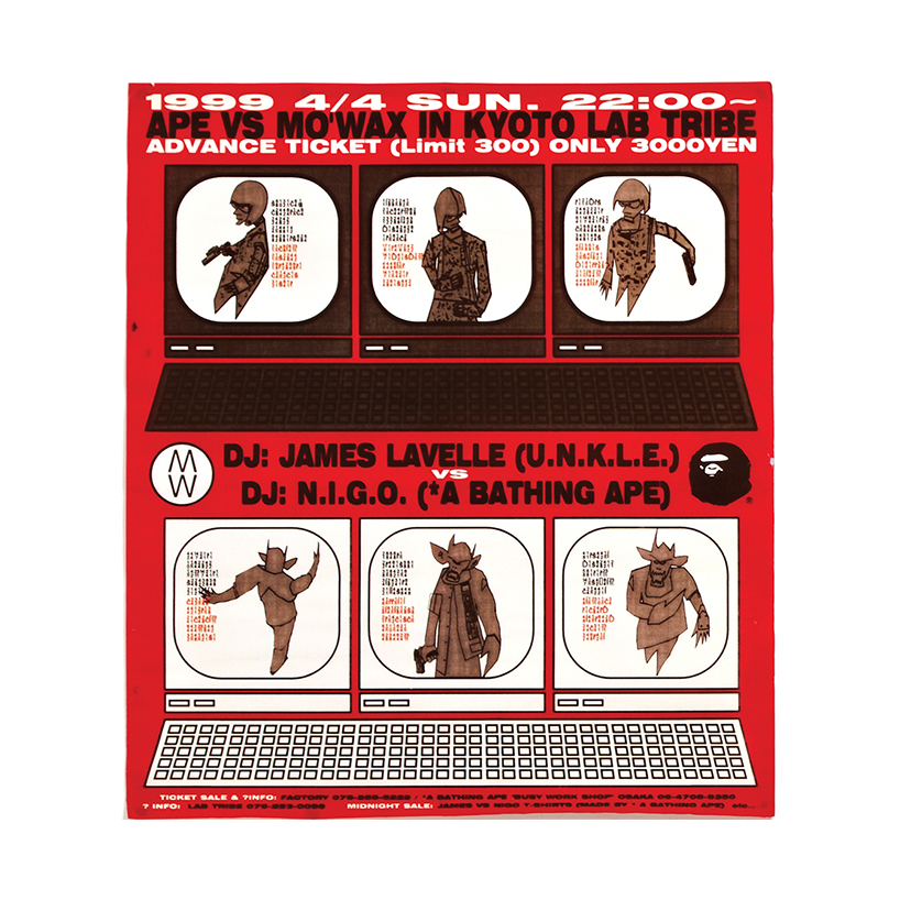
ape vs mo’wax DJ set flyer, 1999
design by ben drury
DB: how do you feel that much of today’s music is never released in a physical format?
JL: I find it sad. but record packaging has come full circle now. ironically, it’s taken the digital era to make music packaging good again. if you look at examples of packaging for gramophone records from the 1940s and 50s they were really beautiful objects, excellently produced and made with high quality materials. after that packaging for music on the whole decreased in quality. it’s only now that it’s is becoming interesting again. now we have limited editions box sets and vinyl packaging that’s made with more attention to detail, which makes people feel like they are buying something of significant value – that is what mo’wax and a few others were doing 20 years ago.
UNKLE pointman toy
by medicom
artwork by futura
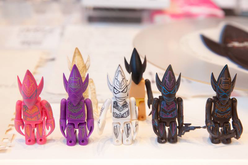
UNKLE pointman toys
by medicom
artwork by futura
DB: how did the connection between japan and mo’wax come about?
JL: I was particularly interested in asian culture from a young age having studied martial arts. as a teenager I was fascinated by japanese culture on the whole but particularly their street culture and underground music scene. I was a very big fan of a japanese record label called major force; their aesthetic and attention to detail with their packaging. when the chance to go there, and work with japanese artists came about it was something I could’t resist. it was the start of a very natural love affair for me. we helped develop the whole designer toys scene and we worked with japanese fashion brands like a bathing ape on clothing. it was the beginning of something that eventually became very popular so it was great to be part of it.
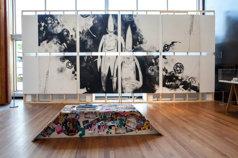
view of the urban archaeology exhibition at the southbank center, london
seen here is the original artwork by futura for the 2003 UNKLE album never neverland
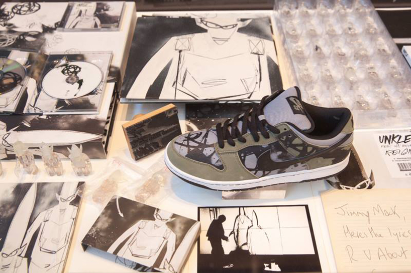
UNKLE never neverland DVD and CD box-set and limited edition NIKE dunk, 2003
artwork by futura
design by ben drury
DB: what can visitors to the 21st anniversary exhibition at the southbank center expect to see?
JL: original paintings, personal photos of the people who worked with mo’wax, print proofs, mock-ups, alternative designs for releases, letters, toys, merchandise, record sleeves – lots of things our which they might not have seen before.
DB: will the exhibition travel to other locations?
JL: we hope so. we are talking to some people at the moment but there’s nothing confirmed as of yet. we’d love to take the show to japan, australia and the states if we can in the future.
the video that helped start it all – james managed to fund the urban archaeology exhibition through kickstarter
DB: which items from the mo’wax archive have brought back the best memories for you?
JL: rather than any one piece it’s been more satisfying to see everything together in one place. after having some years to distance myself from it, to now look back at what we accomplished in such a short period of time has been an amazing experience. I feel very proud of what was done during the mo’wax years and what it’s helped me and the people involved to achieve since.
more
urban archaeology: 21 years of mo’wax exhibition at the southbank center runs until 11pm, sunday, june 22, 2014.
the urban archaeology book published by rizzoli costs $60 is available to buy online (and in select book stores) as of now.
PRODUCT LIBRARY
 Apr 17, 2024
 Apr 15, 2024
 Apr 15, 2024
 Apr 12, 2024