lance wyman working on the graphics for the chrysler pavilion
all images courtesy of lance wyman
lance wyman – urban icons exhibition
at MUAC – UNAM
mexico city, mexico
october 18, 2014 – february 22, 2015
see our photo report of the exhibition
lance wyman was born in newark, new jersey in 1937. he graduated from pratt institute, brooklyn, new york in 1960 with a degree in industrial design. early in his career he worked at general motors before moving to william schmidt and then onto the office of george nelson. he moved to mexico city in 1967 to design the graphics for the 1968 olympic games and subsequently the identities for mexico city metro and the 1970 world cup. upon returning to new york in 1971 he opened an office together with bill cannan (wyman & cannan) before establishing his own studio, lance wyman ltd. in 1979. lance also teaches corporate and wayfinding design at parsons school of design in new york and has done so since 1973. designboom recently caught up with him to discuss his specialist subjects, wayfinding and logo design.
designboom: besides design, what are you passionate about and how does it feed into your work?
lance wyman: I love to travel and get a sense of different towns and cities. I like nature but at heart I’m a city boy – human nature. these types of observations give me a broader context when developing wayfinding systems. I also collect ritual masks, antique glass, odd rocks, picture frames and posters.

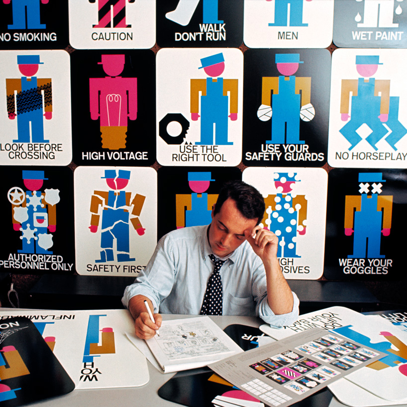
lance’s safety poster designs were developed into a product line for howard miller
DB: what is the attraction of designing logos for you?
LW: the challenge of communicating layered messages through minimal form. a logo can be visual poetry.
DB: given your experience – are you able to finalize a logo design much quicker than you used to?
LW: logo refinements took longer when working by hand because comparative variation studies were usually a collection of individual drawings. computer imaging allows variation studies to be accurately and easily imaged directly on the monitor desktop.
DB: what mistakes or ‘traps’ should a young designer avoid when working on a logo design?
LW: don’t overlook the obvious. designers too often neglect exploring ideas because they seem to obvious, trite, corny, etc. when the obvious is transformed into a new image it can be powerful and easily understood.

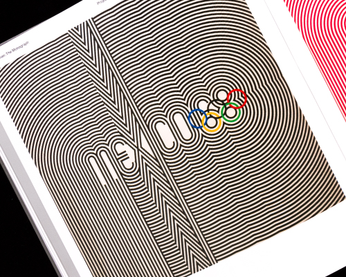
compass sketch for the 1968 mexico olympics logo

mexico 68 logo (with mexico 68 design team) – the starting point was the mandatory five-ring logo that identifies the modern olympic games. it was the realization that the geometry of the five rings could be expanded to generate the number ’68′, the year of the games and with the addition of the word ‘mexico’ the logotype was created.

color studies for the mexico 68 logo – more images
DB: you have worked on two of the most important graphic design projects in mexico city’s history, (mexico olympics 68 and mexico city metro). please can you tell us a bit more about how you came to work on those projects and some of your memories from the time that you lived in mexico?
LW: my first opportunity to work in mexico came from participating in a competition to develop graphics for the 1968 olympic games held in mexico city and acapulco. I went to mexico city with fellow designer peter murdoch for a two week trial period and during that time designed the mexico68 logotype. I became director of graphic design (logotypes, pictograms, publication formats, posters, stamps, etc.) and peter became director of special projects (signage system, exhibit structures, design of the torch, etc.) after the olympics peter returned to london to attend to other commitments and I stayed in mexico to design the metro graphics. designing olympic logos and pictograms for an international event gave me the experience, ability and insight to design and apply that type of communication to more permanent urban programs. I fell in love with mexico and still go back often.

branding and signage for camino real hotels, 1968 (with peter murdoch)the logo is based on forms found at the pre-hispanic site of tula, mexico (right)

camino real signage

mexico city metro identity and station identifiers, 1969 the city square or zócalo is the symbolic center of the city, the logo was designed by cutting three lines of an ‘M’ into a square representing the lines of the metro as they cut through the city. the logo is filled with orange since
this is the color of the metro cars.

each station is identified by a name and color coded icon (stations at intersections use two or three colors). the station icons represent an important landmark or activity associated with the neighborhood in which the station is located. these icons were an integral part of the wayfinding system on maps and signs helping passengers who are illiterate or do not speak spanish navigate the subway system – more images

la moderna (pasta company) logo, 1970 (with ernesto lehfeld)
DB: how have the emergence of new media platforms changed your approach to designing wayfinding schemes?
LW: I try to develop imagery that can be easily coordinated with new media platforms. the technology is ever changing but well conceived representative images have longevity and can adapt easily to new media platforms as well as to standard formats such as static signs and maps.
DB: you teach corporate and wayfinding design, what are the main ‘rules of thumb’ you tell your students to remember?
LW: don’t have attitude – be open minded and understand what’s really going on in a given environment, don’t make it up.

WCVB branding and signage 1972 (with bill cannan)

national zoological park washington branding and signage, 1973 (with bill cannan) – more images

jeddah international airport logo, 1977 (with bill cannan)

jeddah international airport signage, 1977 (with bill cannan)

minesota zoo branding and signage, 1984 – more images


jurica branding and signage, 1981 – jurica was to be a new city designed by ricardo legorreta north of mexico city, the patterning of the logo and pictograms is based on colonial tile work. we were planning on making large tile graphics an important part of the architecture. unfortunately the project wasn’t carried out because of the economy at the time.
DB: which has been the most challenging wayfinding project you have worked on and why?
LW: I think one of the most challenging wayfinding projects was the +15 in downtown calgary, alberta, canada. the +15 is a six mile of pedestrian walkway that runs through buildings connected by bridges across the downtown streets (15 feet above grade – thus the name). people got lost very easily because there were very few opportunities to see outside for visual reference. I branded the +15 with a logo to identify entrances from the street and developed pictograms of recognizable north, east, south and west landmarks as key elements on maps and signs. it was designed in 1985 and is still going strong.

calgary +15 skywalk branding, signage and wayfinding design, 1985

calgary +15 skywalk map

LG arts center seoul, branding and signage, 1999

plaza kinta monterrey logo, 1993

lincoln stationers logo, 1994
left: the initial design integrated the lincoln center plaza fountain into the point of a fountain pen..
right: feeling this was too representative wyman opted to place the LS script within the same silhouette.

wayfinding study for the State of new jersey, 2008
![]()
mexicorama logo, 2012
based on quetzalcoatl the logo was designed for a initiative to raise awareness of authentic mexican culture to londoners ahead of the olympic games.
DB: do you think it’s important for a graphic designer to be able to draw?
LW: I think it is important for a graphic designer to be sensitive to the images he or she creates. drawing is one means and technology offers other means for creating sensitive images.
DB: how do you make sure you are able to get useful and insightful feedback on a project?
LW: a great deal of useful and insightful feedback happens when the design process is transparent. not all feedback is useful so it is important to know the difference.
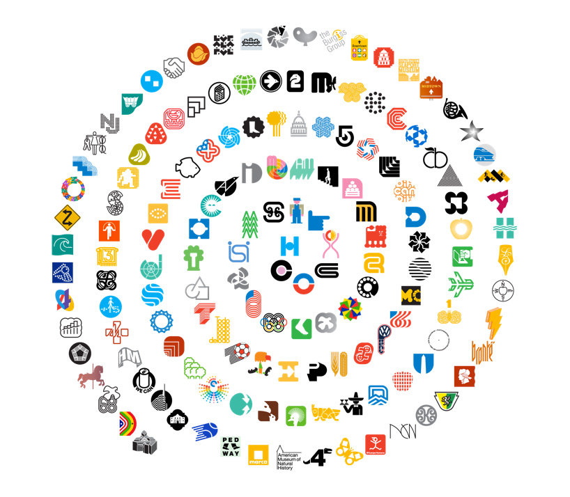
spiral representing all of wyman’s projects from 1960 until today

lance wyman ltd. logo
DB: what lessons have you learned from a project that has changed your outlook on life?
LW: nine months after the 9/11 attack on the world trade center I was asked to design a temporary memorial for the city of hoboken, a small city directly across the hudson river from the 9/11 site. hoboken lost 56 commuters when the towers went down, more per capita than any other city. I was designing a hoboken map at the time and the mayor asked if I could design a temporary memorial for an end of the first year ceremony. it was an unusually powerful emotional experience – I was able to work with and help people who had suffered terrible losses. I was touched by everyone I collaborated with who worked so hard to get everything right in the short time we had before the ceremony. the experience was fragile, it was strong, it made me appreciate life in a different way, I no longer take anything for granted.

lance wyman at work in his new york studio
more
lance wyman – urban icons exhibition
at MUAC – UNAM
mexico city, mexico
october 18, 2014 – february 22, 2015
graphic studio interviews (193)
 Nov 21, 2022
 Feb 10, 2019
 Jun 21, 2018
 May 17, 2018
 Oct 04, 2017
lance wyman (5)
 Sep 10, 2015
 Oct 25, 2014
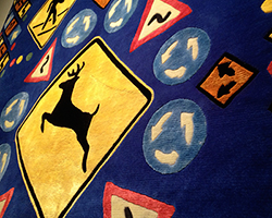 Oct 24, 2013
 May 16, 2013
logo design (244)
 Aug 14, 2023
 Aug 02, 2023
PRODUCT LIBRARY
 Apr 17, 2024
 Apr 15, 2024
 Apr 15, 2024
 Apr 12, 2024