sawdust conceives lebron james typeface for NIKE basketball
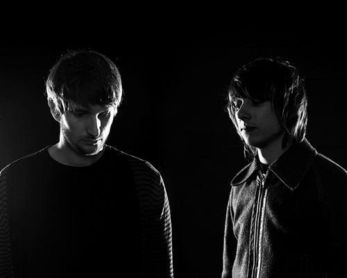
sawdust is the creative partnership of rob gonzalez and jonathan quainton. specializing in bespoke and innovative typography, the london-based duo has previously collaborated with NIKE basketball to design typefaces for kobe bryant and kevin durant; and they continue their work for the american corporation with the development of a lebron james typeface. designboom spoke to rob gonzalez and jonathan quainton about the new font and the creative challenges they faced during its conception.
designboom: how did you become involved in this project?
rob gonzalez: NIKE basketball contacted us with an interesting challenge – they wanted a bespoke typeface that was to be exclusive to one of their signature players. as it transpired, this turned out to be kevin durant.
jon quainton: following the success of kevin durant’s brand typeface we were later commissioned to design further typefaces for kobe bryant and lebron james. 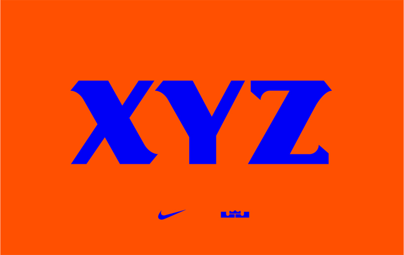
DB: what was the brief you were given by NIKE?
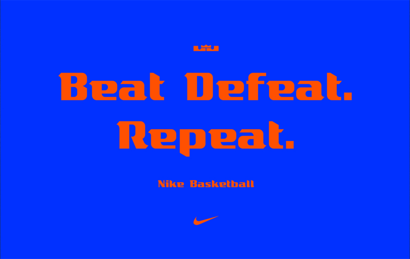
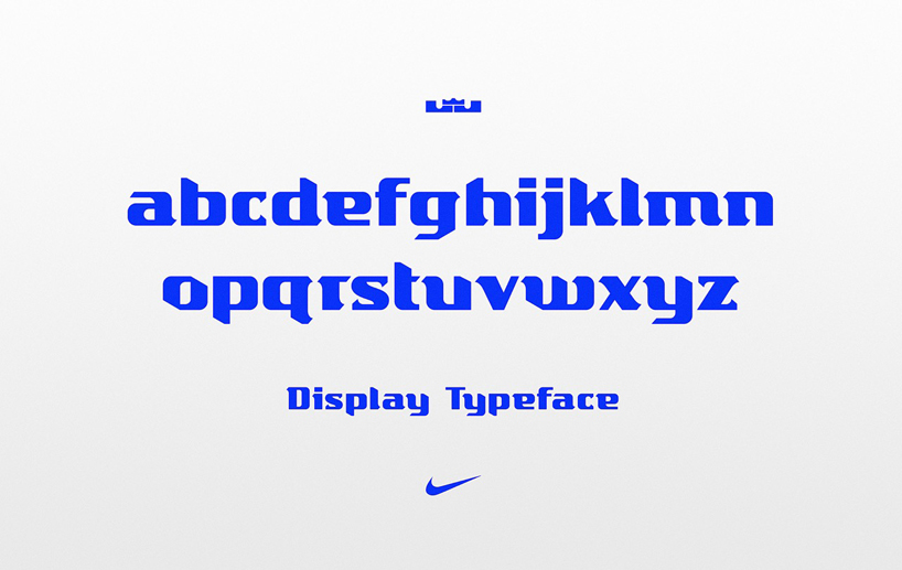
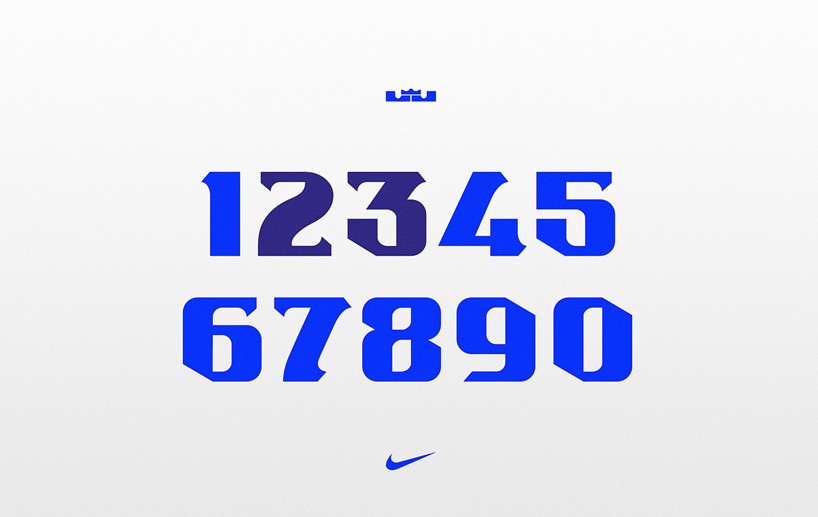
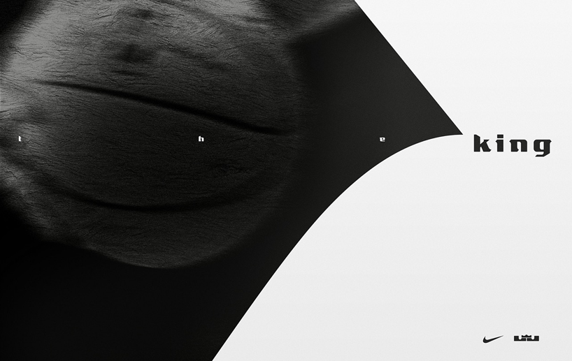
JQ: the brief was consistent across all three players — the typeface needed to be an extension of their existing brand. it was important for the two things not to clash because they would ultimately exist in the same space. lebron’s existing logo-mark is a monogram consisting of an ‘L’ and ‘J’. also incorporated is a crown, which refers to his media nicknames such as king james or the king.
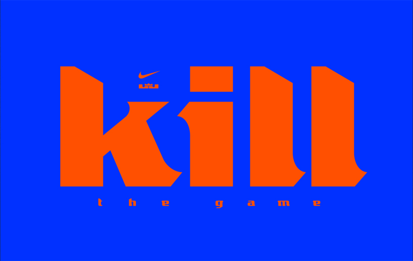
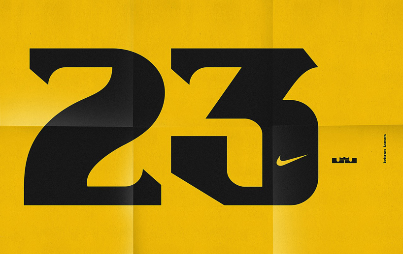
RG: the ‘L’ and ‘J’ letterforms used within the logo are effective when used for that purpose, but were too simplistic for us to entertain as part of the actual overall design. however, they did provide us with a good base, namely having a low x-height, and being super wide and extra bold. 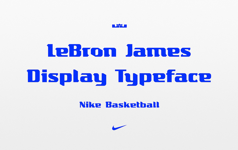
DB: what’s the main purpose of the new font?
RG: it was an initiative conceived by NIKE to use the font across products during a specific season, which we believe was 2015—16.
JQ: the idea was to create something exclusive for lebron, that could appear alongside his logo-mark.
DB: what characteristics did you agree the font needed to embody?
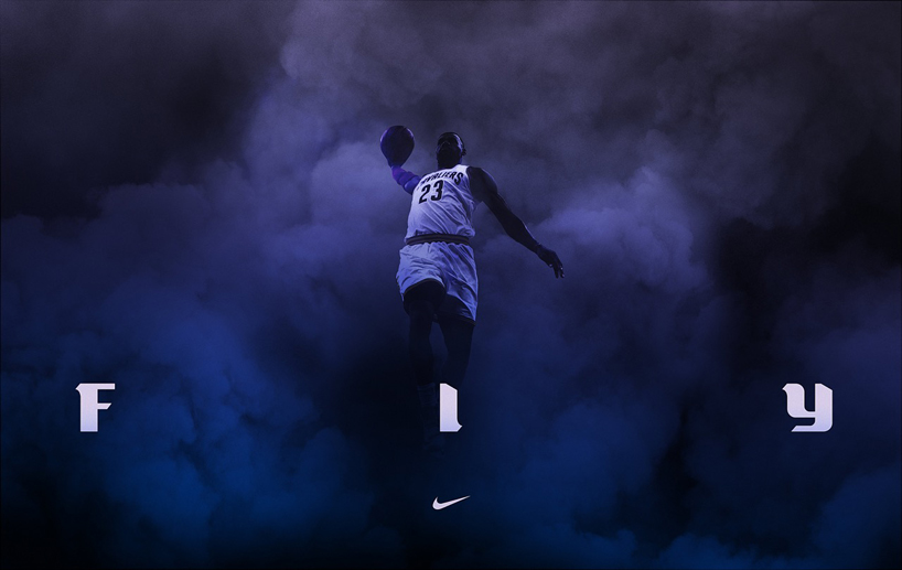
RG: above all we wanted it to have a sense of ‘kingliness’ — fierce sweeping serifs, bold, powerful, sharp yet graceful, with a refined regal edge. 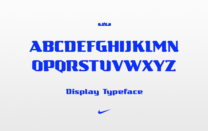
DB: what aspects of the project were most challenging?
JQ: one of the most challenging aspects was to create something that not only complements the current logo-mark, but also becomes identifiable with the brand.
RG: we wanted the design to merge modern and classic elements, a difficult task at the best of times. retaining contemporary qualities whilst adding a classic edge was certainly a challenge.
DB: which part of the project has given you the most satisfaction?
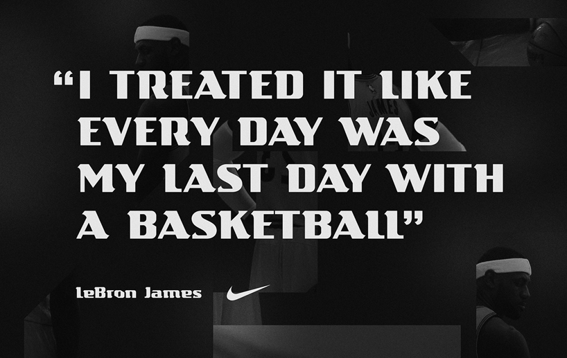
RG: it’s always a pleasure to see a typeface that you’ve designed in use. I’m always amazed at how two different designs using the same typeface can look so dramatically different simply through composition, scale and positioning.
JQ: the most satisfying part is always at the end, where you can see it come to life through its application. 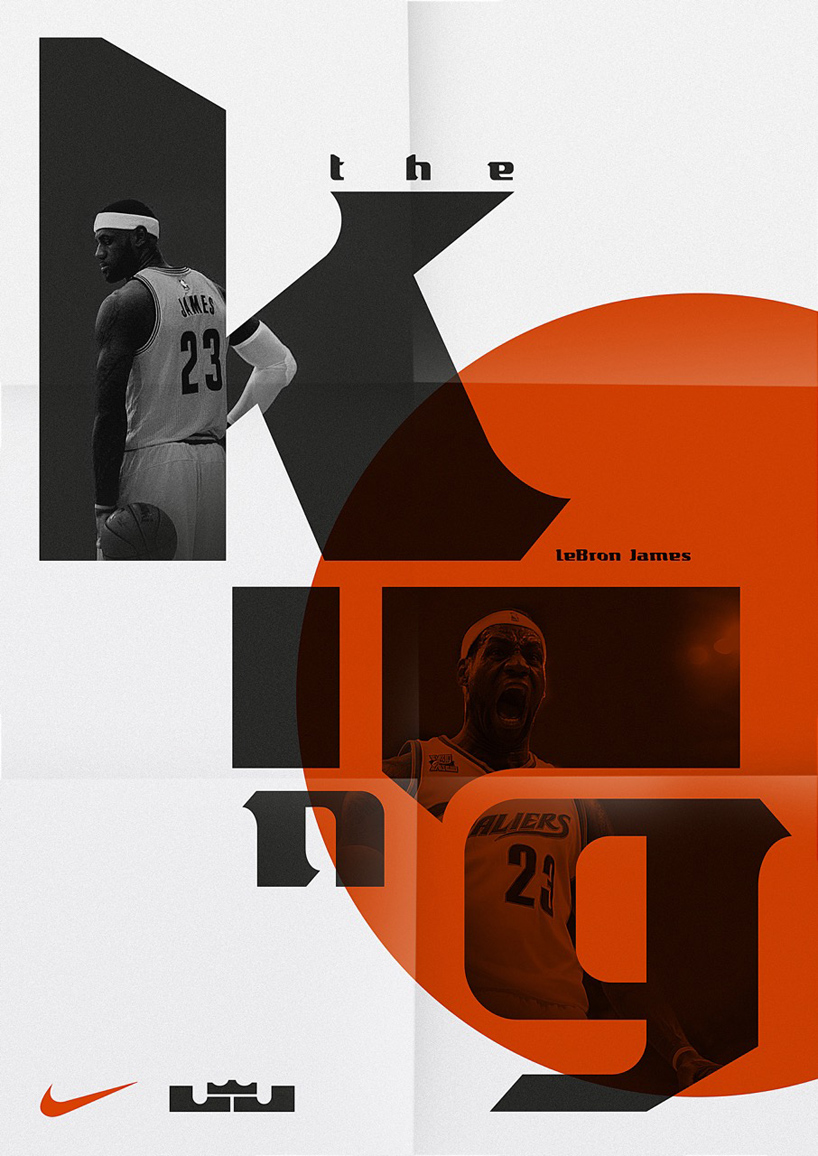
BASKETBALL (49)
 Feb 14, 2024
 Jan 10, 2024
 Dec 07, 2023
 Sep 18, 2023
 Mar 06, 2023
NIKE (217)
 Apr 13, 2024
 Feb 01, 2024
 Oct 24, 2023
 Sep 26, 2023 Sep 18, 2023
SAWDUST (2)
 Oct 07, 2014
PRODUCT LIBRARY
 Apr 15, 2024
 Apr 15, 2024
 Apr 12, 2024
 Apr 04, 2024