louvre abu dhabi logo by studio philippe apeloig
studio philippe apeloig have designed the visual identity for the new louvre abu dhabi (LAD) designed by architect jean nouvel. apeloig chose to symbolize the building’s spiritual dimension and recreate its very particular climate. the challenge was to evoke the mysterious whiteness and lightness of this exceptional space, including the region’s warm temperatures.
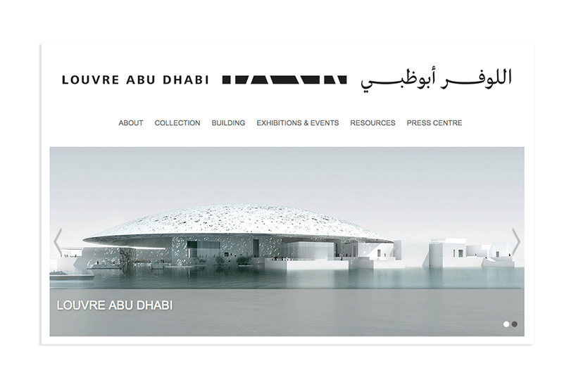
the LAD homepage featuring the new logo design and the building that informed it.
see our article on the louvre abu dhabi building designed by jean nouvel »
for the museum’s logo, philippe apeloig chose to symbolize the building’s spiritual dimension and recreate its very particular climate. the challenge was to evoke the mysterious whiteness and lightness of this exceptional space, including the region’s warm temperatures.
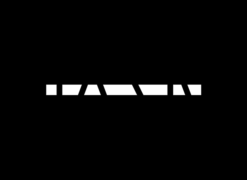
the logo’s flat outline alludes, in an abstract fashion, to the horizontal nature of the building’s architecture, which is accentuated by its proximity to the sea. a thick straight line, like a hyphen between two cultures (east and west), hatched with black lines in different directions it illustrates the kinetic effects of light.

sketch by philippe apeloig
the rays of light which penetrate the building, were the starting point for the mark, which is paired with both latin and arabic fonts in different lock-ups. the typography combines frutiger, a modern font widely used for signage, and LAD arabic, a classical-looking naskh-style font with its pronounced calligraphy, which kristyan sarkis designed.
the logo will be used on all internal and external museum communications, including an extensive wayfinding program which studio philippe apeloig have also designed.

sketch by philippe apeloig
philippe apeloig told designboom more about the design process…
designboom: how did you become involved in the project?
philippe apeloig: hala wardé, from ateliers jean nouvel, approached me in may 2012 about developing the ‘mediation’ or overall graphics program for the louvre abu dhabi. at that time, jean nouvel already had very precise ideas of what he wanted for the museum signage – that it should have a monumental scale to reflect the idea of luminosity. so with these starting points, I set about understanding the architectural vision and finding graphic solutions that met all the expectations.

sketch by philippe apeloig
DB: what were the biggest challenges you had to overcome during the design process?
PA: the primary one was to respect and retain the integrity of nouvel’s design concept, which combines a number of specific references. chief among them are the iconography of traditional arabic architecture — particularly the features of royal palaces — and the museum’s spectacular waterfront location that is surrounded by a vast desert environment. he imagines the museum as a city emerging from the sea, as an assemblage of structural elements that are both connected and separate. I had to first grasp this concept, then apply a graphic sensibility and logic that would support and reveal this approach.
the first step was to identify what typeface to use. one of the most important considerations was the historical and global reach of the LAD collection, which represents many different civilizations. ultimately, I decided upon a new version of the frutiger latin font, a typographic masterpiece that symbolizes modernity. the new rendition, an original redesign by adrian frutiger himself, is called ‘frutiger lt pro’. it was intended to be used for signage and has specific qualities for this. frutiger also added a number of international glyphs that are very helpful when you have to deal with many different languages.
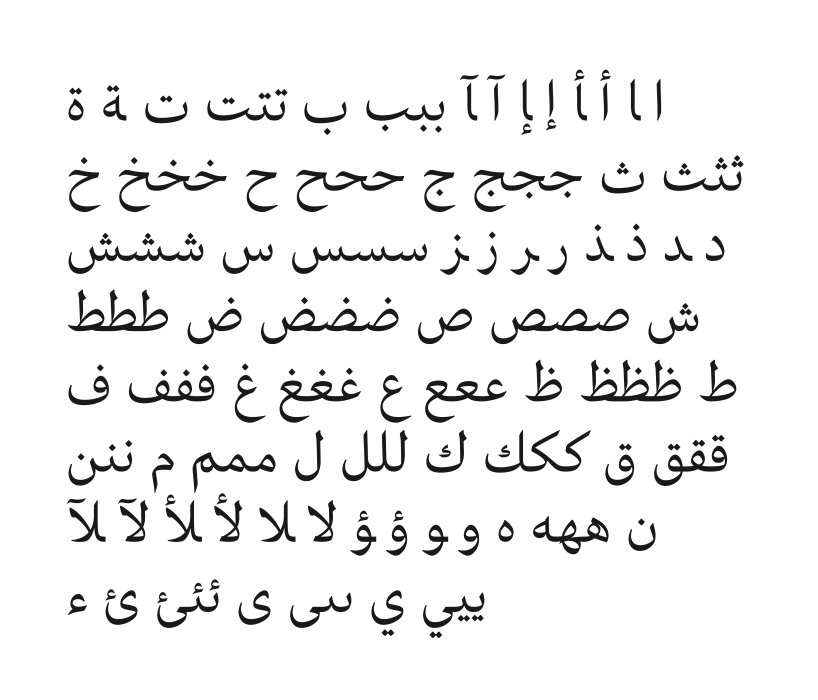
LAD arabic basic character set designed by kristyan sarkis
for the arabic typeface, which became part of the logo we needed another solution. I imagined one based on garamond, a latin font that epitomizes typographic history. I wanted a new font that echoed the harmonious shapes and counter-shapes of garamond, but with the rhythmic gestures, ligatures, and wave-like qualities of arabic script. I asked a young lebanese typographer, kristyan sarkis, to develop an exclusive type family for the project. his solution was ‘LAD arabic’ a typeface derived from another of his designs, colvert. kristyan developed three variants of LAD arabic for use with the identity and signage.
my discussions with jean and hala in the initial stages of the planning and project were very interesting and immensely helpful. my early sketches were classical and somehow standard—off-base, really. I had to rethink the entire design. so I began to focus on the architectural features of the project, mostly the magnificent dome that covers the museum compound. designed as a gigantic mashrabiya, (a projecting, upper-story bay window covered with latticework), it filters the rays of the sun and bathes the interior space in a shower of constantly shifting light. by considering the shapes created by the light, I discovered an abstract geometric vocabulary that I used to construct the pictographic system. in this way I built a formal graphic language inspired by the building’s effects. all of this work preceded the design of the logo, which came logically from that research and initial questioning.

DB: which applications did you consider most when designing the logo?
PA: for the logo I chose to symbolize the building’s spiritual dimension and to recreate its very particular micro-system and climate. the challenge was to evoke the mysterious whiteness and lightness of this exceptional space, and to take into account the area’s extreme heat. the flat outline of the design alludes abstractly to the horizontality of the architecture, echoed and reinforced by the waterline. a thick, straight line perforated with hatchwork creates a series of hyphens of different widths that scatter in different directions, embodying not only the dynamic link between world cultures but illustrating and giving form to the kinetic effects of light. this concept, in turn, provided the foundation for the pictographic system. the logo consists not only of the broken line but a line of arabic script. the two are meant to be read non-hierarchically.

stacked version of the LAD logo
DB: what aspects of the final design are you most satisfied with?
PA: it’s simplicity and elegance—these qualities align with the sublime architectural vision. and the logo, I think, far from a mere schematic representation, rises to the level of a universal symbol, evoking not only the architecture but the louvre abu dhabi mission of uniting east and west, north and south – I am extremely pleased with this.

DB: what is next in terms of the visual identity for LAD?
PA: after developing the global signage system, my team will continue to work in tandem with the architectural team, and the LAD administration and curators to complete the corporate identity. we have to codify the graphic charter so that all museum communication supports and reinforces the LAD identity.

horizontal version of the LAD logo
more
read our extensive interview with philippe apeloig from 2012 »
LOGO DESIGN (244)
 Aug 14, 2023
 Aug 02, 2023
PHILIPPE APELOIG (3)
 Dec 06, 2013
PRODUCT LIBRARY
 Apr 15, 2024
 Apr 15, 2024
 Apr 12, 2024
 Apr 04, 2024