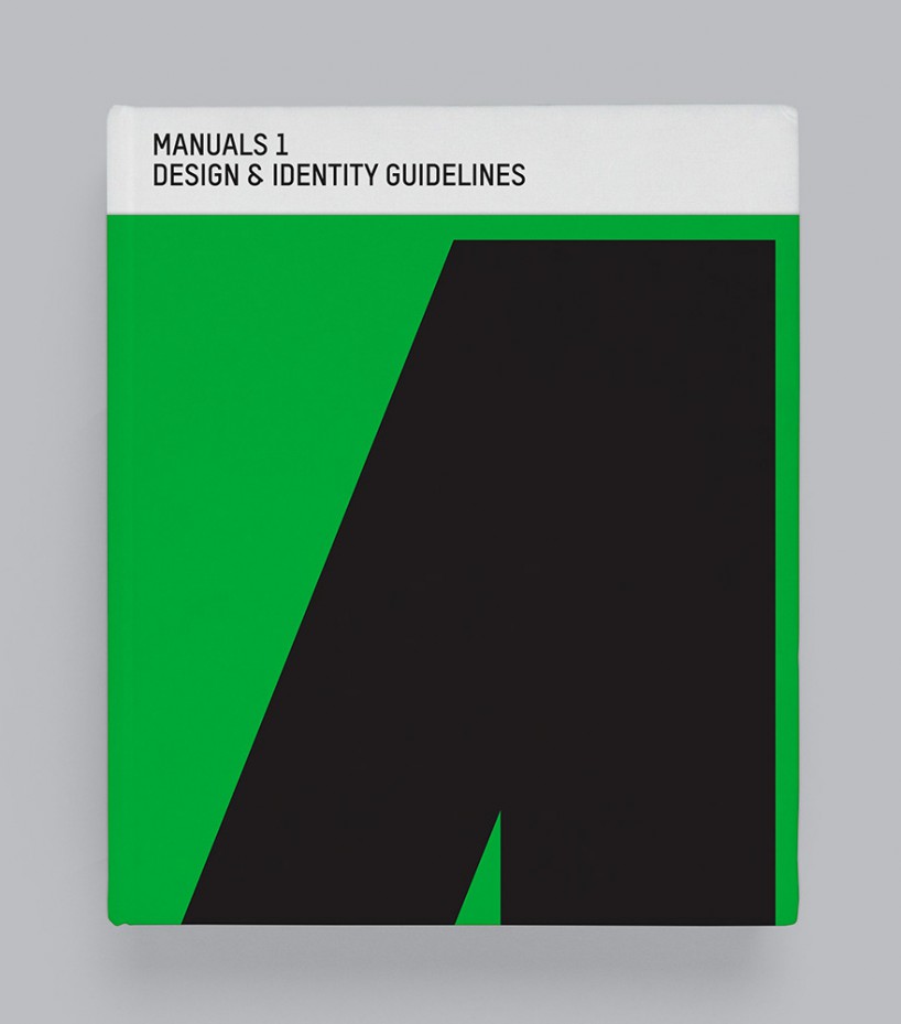
manuals 1: design & identity guidelines
editors: tony brook, sarah schrauwen, adrian shaughnessy
publisher: unit editions
design: spin
pages: 432
size: 260 × 310mm
format: hardback with wrap
language: english
ISBN: 978-0-9575114-4-6
price: £65 (pre-order) £75 (RRP) from unit editions
________________________________________________________________________________________
designboom rating: ![]()
![]()
![]() (very good)
(very good)
________________________________________________________________________________________
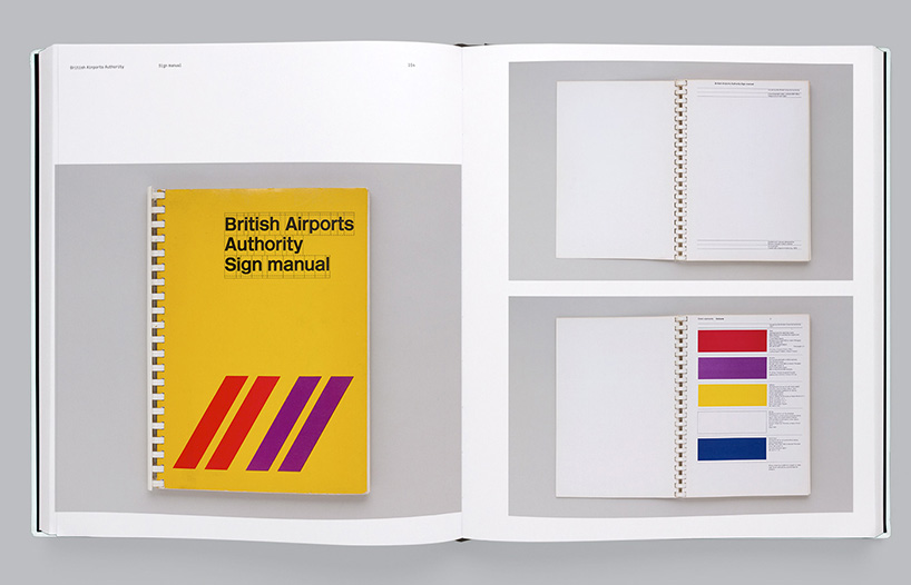
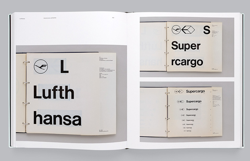
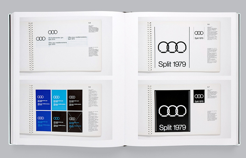
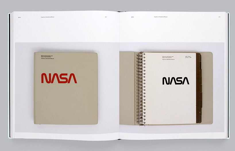
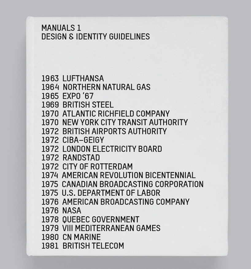
unit editions newest book ‘manuals 1: design & identity guidelines’ is the first comprehensive study of corporate identity design manuals, and features 21 examples from the 1960s to early 1980s – the golden era of identity design. it includes manuals created for institutions and corporations such as NASA, lufthansa and british steel.
sarah schrauwen, one of the book’s editors told designboom more about the publication.
designboom: how would you describe design and identity guidelines to someone unfamiliar with them?
sarah schrauwen: design and identity guidelines are clear and functional sets of printed rules that graphic designers define on behalf of their clients to safeguard and maintain the implementation of a corporate or brand identity. design manuals grew out of the need that the early large corporations had for control of their public image.
DB: what makes them an important tool in the branding and communication process?
SS: if the visual manifestation of a business is not maintained with rigor and discipline, it risks losing recognition. an identity manual makes sure that everyone involved implements the identity correctly; it aids consistency of expression and enhances cohesion.
legendary designer massimo vignelli notes in the foreword to manuals 1: ‘the purpose of a manual is to teach people a language. when you design an identity for a company you are really creating a language. and that language has to be learned—not re-invented every time it is used.’
british graphic designer john lloyd says that a corporate identity guide should be ‘simple, utterly clear and practically useful’.
without a clear usage manual, an organization or business risks chaos.
DB: what made unit editions decide to compile and write a book on this topic?
SS: tony brook recognized the potential for a book on design manuals when he visited the total design archive in amsterdam—the dutch studio’s manuals for pam, rotterdam, de gruyer and randstad fascinated him. and now, three years later, the book is here.
we all thought that identity manuals from the 1960s to early 1980s would be a niche subject for a book, desired only by a certain kind of graphic design studio involved in identity design, and hardcore identity enthusiasts. instead, manuals 1 has turned out to be unit editions’ best selling publication so far!
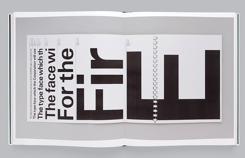
a quote from adrian shaughnessy’s introductory essay to the book might shed light on one of the reasons for this general interest: ‘to modern eyes blinded by the glare of the pixel-sharp computer screens, printed manuals are revealed as beautifully crafted objects.’ but these dusty manuals are not only pretty to the eyes, they also represent a time before branding supplanted identity design as one of the main occupations of graphic designers; a time when the designer was in charge, instead of strategists and marketeers. today everything is about ‘brand refreshes’ or ‘image revamps’, while the identities shown in our book were built to last. furthermore, they are amongst the best examples of pure information design in graphic design.
DB: what criteria was used to select the manuals featured in the book?
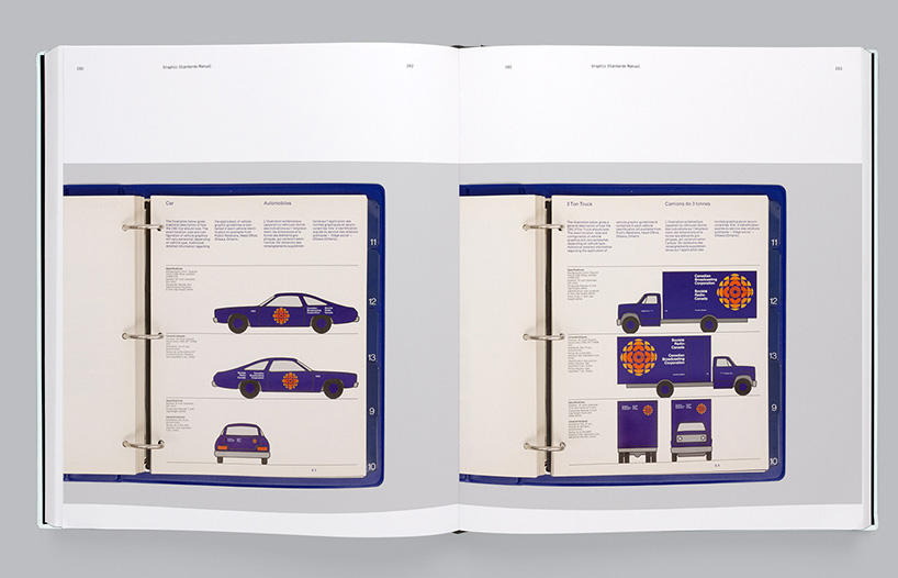
SS: we had a fairly good idea from the start which identities we wanted to include. we sounded out some designers who we knew had worked on great manuals: david gentleman (british steel), ben bos (randstad), burton kramer (canadian broadcasting corporation), richard danne (NASA)… we also contacted design collectors display and it turned out they had nearly a dozen identity manuals that they were more than happy to send to us. some manuals were shot in design archives, and lots of people came forward with their collection once we announced plans to do this book.
we aimed to get a good mix of manuals from different industries: aviation, sports, governmental, pharmaceutical—but we wanted to restrict them to the ‘golden age’ of corporate identity design: the 1960s to early 1980s.
DB: did any of the manuals feature any particularly useful guidelines or instructions that are not typically included?
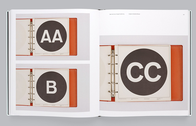
SS: the new york transit authority manual by unimark international includes instructions for language use, which is not exactly commonplace in design guidelines from this time. it is also very generous with space: every color, letter and glyph are given a full page, where most other manuals tend to be a bit more stingy. the visual guide to letter spacing is a masterclass in how to deliver typographic accuracy in signage. this was a manual created to be used by non-designers (sign-makers, craftspeople, manufacturers, etc.), which explains the clarity and purposefulness of the document.
DB: did any of the formats strike you as better than others – in terms of how they had been produced?
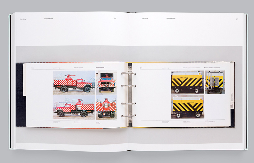
SS: the manuals in this book come in all shapes and sizes, from massive 200-page square ring binders to 16-page saddle-stitched leaflets. on the one hand big manuals risk not being used—ignored on a shelf or locked in somebody’s desk drawer—but on the other hand, they are very useful because they can contain actual-size templates for things such as letterheads. small manuals are easier to handle but rely on the user being able to translate the scaled instructions and templates to actual-size documents. there isn’t really a ‘best format’ for any manual—it all depends on who is going to use it (designers or non-designers?) and to what end (print reproduction or artwork guidelines?).
DB: all these manuals were designed pre-internet. today with the numerous types of media to consider, short project time frames and notable decrease in attention spans – do you think that manuals as comprehensive as these are somewhat redundant? have these factors also lead to less complicated identities as well?
SS: in the pre-digital era, manuals were used. literally. the pages were removed and placed under process cameras or PMT machines to make exact copies of typefaces, logos and graphic elements. the color swatches were used for referencing, and often actual-size templates were included.
today most guidelines are online. we talked to american graphic designer and writer armin vit—co-founder of underconsideration and brandnew —about the differences between printed manuals and online guidelines: ‘a printed manual demanded attention and respect. someone paid to have this thing made and have the rules set in stone. a PDF seems so ephemeral, it’s harder to take seriously, especially when it is labeled on the cover as ‘version 1.0’ or ‘version 1.5’… what’s the point in following this if it might just change next month?’
in some respects creating and maintaining an identity has become more complex because of the multitude of platforms and applications, but in some ways it has become easier because everything can be set up as a downloadable template.
DB: which type of identity guidelines work best in your opinion: tightly regulated and rigid ones where the creators have thought about every possible scenario or more relaxed and playful ones where designers are able to work with basic ingredients and add to them as they see fit?
SS: this is a great paradox in design manuals. who are they intended for? the psychology and attitude of a designer faced with implementing an identity is always crucial. can they make good decisions? or do they need constant guidance? good designers can bend the rules while still arriving at a great-looking solution that works in the identity scheme. but poor designers might make bad decisions that affect the company’s reputation.
british graphic designer sean perkins, founder of design studio north and creator of identities for the barbican and RAC, notes in the book: ‘[manuals] are not meant to strangle the designer or restrict creativity. they are there mainly to help the less able designer to do a good and appropriate piece of work at a higher standard than they might normally be capable of.’ he also makes the point that badly created manuals ‘kill all creativity at birth’. I would say that designing clearly structured, accurate and easy-to-use manuals is an art form in itself.
a lot of contemporary graphic identities evolve around the idea of flexibility, for instance where the wordmark remains the same but the graphic elements change place or form. the identity that experimental jetset created for the whitney museum is a great example of this.
DB: what publications can we look forward to from unit editions in the near future?
SS: we’ve all been blown away by the response to manuals 1, and we’re scheduling the release of manuals 2 by the end of this year, which will pick up where this book left off – featuring some more recent identities. there will also be some other books released before then – people can subscribe to our newsletter for regular updates.
_______________________________________________________________________
designboom book report ratings:
![]() ……………………. interesting
……………………. interesting![]()
![]() ………………. good read, worth a look
………………. good read, worth a look![]()
![]()
![]() …………. very good
…………. very good![]()
![]()
![]()
![]() ……. excellent, recommended
……. excellent, recommended![]()
![]()
![]()
![]()
![]() . must have
. must have
_______________________________________________________________________
DESIGNBOOM BOOK REPORTS (189)
 Apr 09, 2024
 Mar 31, 2024
 Mar 28, 2024
 Mar 28, 2024
 Feb 27, 2024
UNIT EDITIONS (10)
 Sep 10, 2015
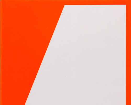 Dec 05, 2014
 Sep 09, 2014
 May 15, 2014
 Jan 02, 2014
PRODUCT LIBRARY
 Apr 17, 2024
 Apr 15, 2024
 Apr 15, 2024
 Apr 12, 2024