pet shop boys ‘format’ music packaging
designboom (DB) spoke to graphic designer mark farrow (MF) about his studio and recent projects.
DB: what did you do before you founded farrow?MF: I studied design for a very short period but I left and worked in various design and advertising agencies in manchester, UK where I’m from. at the same time my love of music meant that I worked in a small but very cool record store on a saturday. this is where I began to form my factory records alliances as it was where everyone went for their music. eventually some of the kids in there formed a band (stockholm monsters) and asked me to design their first single cover, and that was how it started. from then on I designed for factory and the hacienda on a freelance basis. eventually I had to move to london in order to do this kind of work as a career. at the first studio I worked in I was asked to design a remix single for pet shop boys and that is a creative alliance that is still in place.
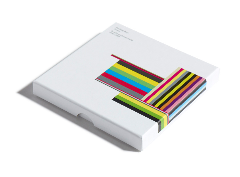
 a collection of the band’s b-sides and bonus tracks. the design is based on the spine shapes and colours of the various formats on which the songs were originally released.
 pet shop boys, ‘yes’ limited edition vinyl music packaging
DB: how many people work at your studio and how do you share the workload?MF: people are often surprised by the fact that the studio is small, in terms of personnel, probably because we are quite prolific, I guess. right now there are three of us. gary who has worked with me for a long time, he’s a design partner and as important to the studio as I am. and there is fred, a very talented younger designer. we have people we can call on, if required, when we need to expand the studio, for bigger projects but it has never been bigger than seven people.
the advantage of keeping the studio small is that everybody is involved in every project to some degree or another. each project usually ends up on one designer’s computer but there is input from everyone along the way, if needed.
 manic street preachers ‘lifeblood’ music packaging
DB: which have been your most significant and satisfying projects to date?MF: that’s difficult to answer really. the most significant projects tend to be the ones you are working on right now as that’s where your efforts are going. but obviously something like the camper boat is a significant project not least because it was so far removed from anything we had done before. it involved a massive learning curve, and those kind of challenges are kind of what it’s all about really.
 spiritualized ‘ladies and gentlemen we are floating in space’ music packagingthe pill style trays were packed under strict pharmaceutical manufacturing conditions. each blister contained a 3″CD featuring one of twelve tracks which had to be popped through foil in order to be played. all credits were printed onto a medicine information sheet and contained warnings on the possible side effects of listening to the band.
 the album was later reissued, and a new limited edition black version.
 spiritualized ‘let it come down’ music packagingthe cover features a bas-relief ‘yoko’, which sculptor don brown created. the image appears to be convex when in reality it is concave.
DB: have any projects taught you lessons you’ve then applied to everyday life? MF: ha ha, there are life lessons in almost every project you work on, or at least there should be. I’m not sure they are life affecting but you should be taking something from every new project you are involved in and the experiences it comes with it.
though, being told a month before the race start, that the sails we had designed for camper were too heavy due to the amount of paint on them was quite a life lesson! the designs had all been approved and signed off but on her first sea trials they realised that they were carrying more weight than the other boats in the race; not our fault but it had to be fixed none the less. this involved 24 hours of intense work and a lot more maths than is normally involved in graphic design but you get there, and it all adds to the experience.
 camper ‘volvo ocean race’ graphics for sailboat and crew


DB: you work across several fields of graphic design, what is your favorite type of project?MF: it’s quite deliberate that we work in lots of different areas, we like that, it keeps things interesting and keeps the studio on its toes. to be working on an unusual piece of music packaging one minute and a great big corporate commercial project the next is really healthy, we are never fixed in one place or defined by it, for that matter. a new project in a new area is always a cause for excitement, new clients, new experiences, new problems to solve. long may it be so. we have just designed a new fashion label, called kin, for the department store john lewis, who are a client i have always wanted to work with. it has been really well received. we are also currently rebranding a major record company, EMI america which has been renamed the ‘capitol music group’, and is a really interesting multi-layered project. I guess it’s also interesting that everything started with record sleeves and we are now working for a record company on a seriously corporate level.
 capitol music group logo

kin logo
 identity for publisher fiell
DB: your projects a tremendous sense of color and simplicity,which artists or designers would you say influence(d) you the most in this respect?MF: our work was described not so long ago as ‘minimalism in colour’, which I really quite like. one obviously takes influences and inspiration from everywhere and everything, be it art, fashion, architecture, though not especially graphic design oddly enough. but we have been at this a long time now and I’d like to think that the aesthetic is the studio’s own at this point, though you should never stop looking at what is around you.
also, we have been lucky enough to work with some fantastic industrial designers, as clients, jasper morrison, marc newson, terence woodgate and ross lovegrove, and it’s inspirational to work with people who’s work you really admire, you learn a lot from how these people work and think.
 ‘peyton and byrne’ identity
 from the name through to the identity, packaging and signage, farrow created everything for oliver peyton’s modern british bakery brand.
 ‘peyton and byrne’ paper cups
 ‘peyton and byrne’ chocolate packaging
 three clocks for SCP – ‘notime’, ‘nightime’ and ‘finetime’
 packaging for SCP clocks
 chan restaurant logo
 chan restaurant, farrow worked with architects andy martin studios to create the graphic patterns for the lighting scheme

DB: besides your professional work what are you passionate about?MF: cycling, which I have come to in the last couple of years and really enjoy. I’m not exactly doing sportifs quite yet but it won’t be long.
DB: what is the best piece of advice you have ever been given?MF: I tended to ignore a lot of the advice I was given ‘though I wouldn’t necessarily recommend that as a career path! I’m being slightly flippant but I do actually struggle to think of any single piece of advice that has served me well. though at given points I have clearly been given advice from people older and wiser than I am.
DB: what advice would you give to young designers?MF: in terms of giving advice, as I mentioned earlier, one should never stop looking and taking in every experience you can especially outside of the areas you work in. and fight your corner, if you believe your ideas are good and correct then let your client know. sometimes you will lose but at least you will know you didn’t just roll over, and if you win, you will have made something look better, and that’s your job.
LOGO DESIGN (244)
 Aug 14, 2023
 Aug 02, 2023
PRODUCT LIBRARY
 Apr 17, 2024
 Apr 15, 2024
 Apr 15, 2024
 Apr 12, 2024