
michael bierut photographed by jake chessum
earlier this month graphic designer and pentagram partner, michael bierut was named as the recipient of the school of visual arts’ 27th annual masters series award. to mark the occasion there is a comprehensive retrospective of the designer’s work on show at the SVA’s chelsea gallery in new york, which will run until november 7th.
the exhibition also coincides with the launch of bierut’s latest book, ‘how to use graphic design to sell things, explain things, make things look better, make people laugh, make people cry, and (every once in a while) change the world’ (thames & hudson and harper design, 2015).
michael spoke to designboom about this milestone moment in his career…
designboom: how did the exhibition come about – how long has it been in the works?
michael bierut: I learned that I’d be the 27th person honored in the school of visual arts’ masters series in march 2014. this honor involves a public presentation, which I was not that worried about, and an exhibition, which I found very intimidating. I had about a year and a half to prepare for the exhibition. of course, as usually happens, the real work began about six months before. I am fortunate that pentagram has great archivists who made gathering and documenting the material easier than it might have been otherwise.
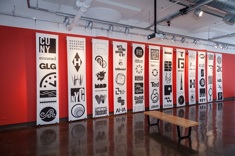
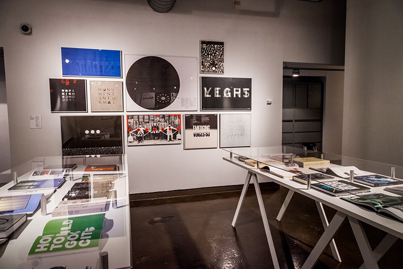
view of the exhibition – logos and marks designed by michael bierut
photo by jacqueline iannacone
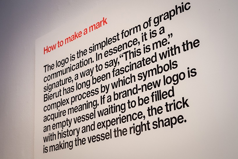
how to make a mark – bierut on logo design
photo by jacqueline iannacone
DB: what criteria did you use to curate the pieces shown in the exhibition?
MB: one goal of the SVA masters series is to expose the world of design to people outside that world. so I tried to select things that I thought might be interesting to people who knew nothing about design or the process by which designed objects come into being, things that range from parking regulation signs to department store shopping bags.
view of the exhibition
photo by jacqueline iannacone
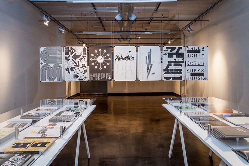
posters for yale university school of architecture
photo by jacqueline iannacone
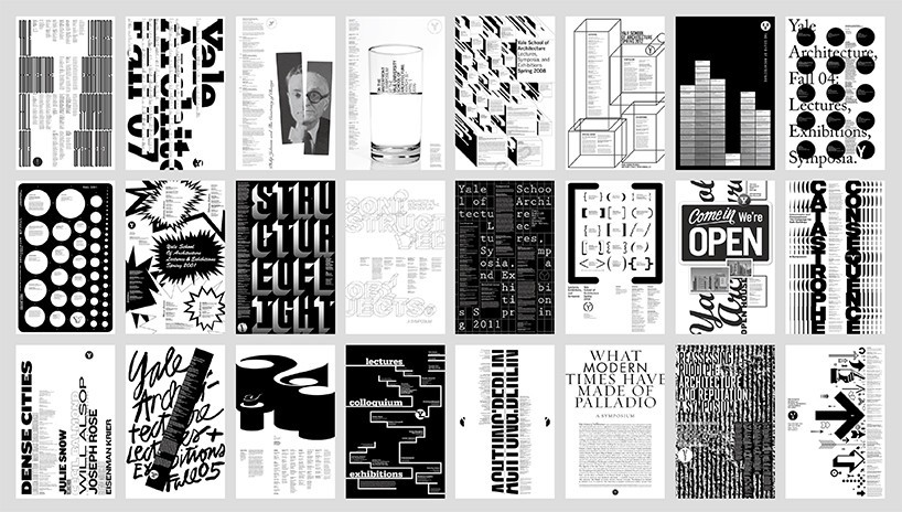
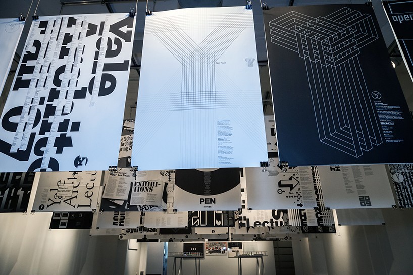
posters for yale university school of architecture
image courtesy of thames & hudson and harper design
DB: what’s the concept behind the way the content is exhibited and grouped?
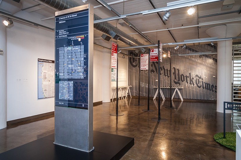
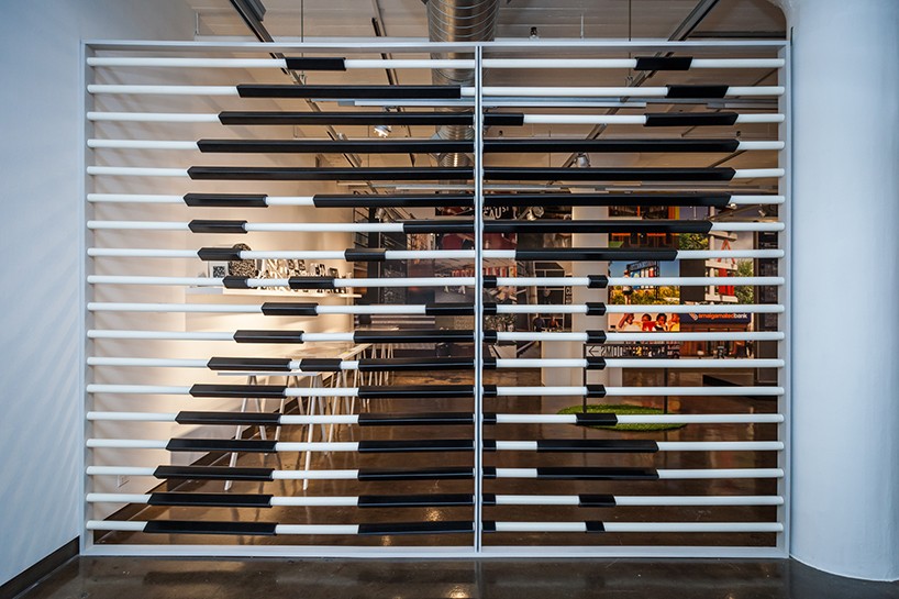
MB: the SVA chelsea gallery has four rooms, the layout and orientation of which helped shape the way I conceived the exhibition. the first room is the largest, and is dedicated to work I’ve done in new york. we were lucky to obtain a lot of full sized objects, including an example of a large urban wayfinding sign that we’ve did for the NYC department of transportation. we also managed to create replicas of a fragment of the enormous sign we created for the new york times building as well as the signs at the brooklyn academy of music opera house, again in actual size.
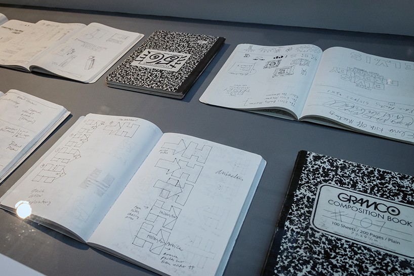
the second room is about the sign process, and on show there, for the first time anywhere, are the notebooks I’ve been compiling for more than thirty years. together they document the process that precedes the public display of the work. many people say the drawings in these books are their favorite part of the show.
the third room is about work I’ve done for and with architects, and includes examples of two of my most longstanding engagements: the work I’ve done for the architectural league of new york, which goes back to 1982, and the posters I’ve been doing for the yale school of architecture for over 15 years. there are more than 80 yale posters on display, together for the first time anywhere. the fourth and last room is about brand identity, and juxtaposes logos I’ve designed with examples of how those logos are used in real life.
view of the exhibition
photo by jacqueline iannacone
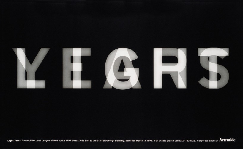
light years poster for artemide
DB: how does the publication of your new book tie in with the exhibition?
MB: I have been thinking of doing a book for a long time but I’ve always deferred it in favor of client work. when I learned I’d been invited to create this exhibition, it gave me the deadline for the book I was looking for. I worked with thames & hudson and harper design to time the publication of the book to the opening of the exhibition. some of the content overlaps, but some does not.
view of the exhibition
photo by jacqueline iannacone
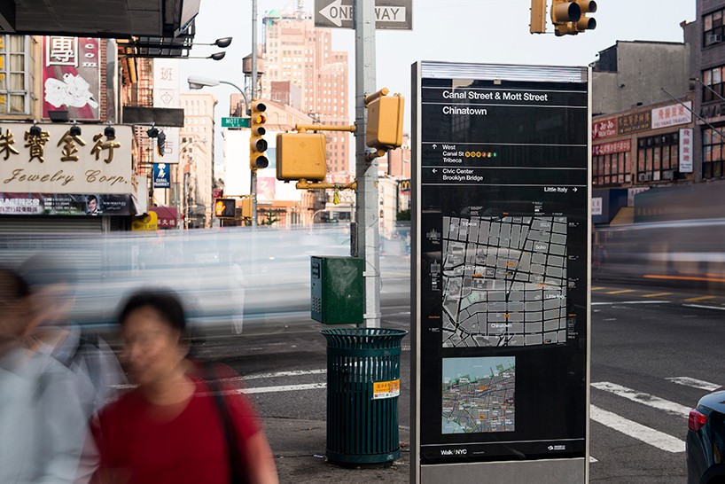
walkNYC DOT identity and maps
DB: how does this book build on themes you have written about in the past?
MB: I’ve written a lot about design, but seldom about my own work. in how to, I try to give an honest — and, I hope, interesting — account of the thinking and process behind about three dozen projects. I chose projects specifically because they have interesting stories behind them that I hope other designers and even non-designers will find relevant. my goal was to impart some larger lessons about how designers work, and what design can do, using the example of my own experience.
sketches for hillary clinton’s presidential campaign logo
photo by jacqueline iannacone

hillary clinton presidential campaign logo
DB: what’s been the most rewarding part of putting together both the book and exhibit?
MB: I’ve been pleased to see how much of my work has been with the same people over the years. in design school, you are led to believe that design is a solitary activity: after all, you’re the one getting the grades and the diploma. but in the real world you learn that the only way to see your ideas realized is to work with other people. those other people — clients, bosses, colleagues, collaborators, many of whom I’ve been working with for decades — are the only reason this book and exhibition exist at all. working with great people has been its own reward.
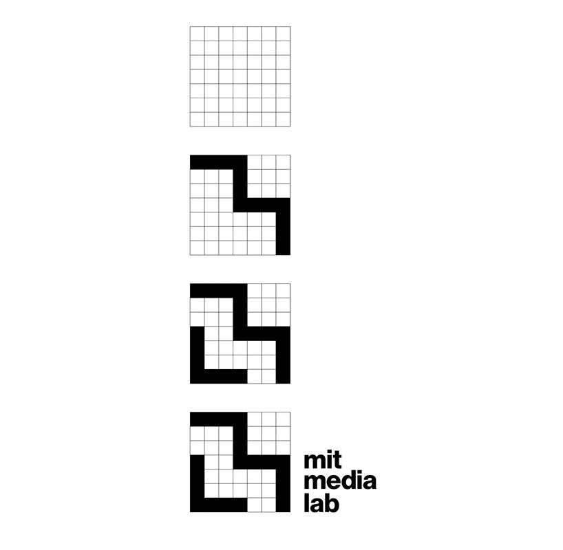
development of the MIT media lab’s ML monograph
image courtesy of thames and hudson
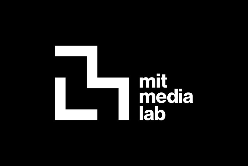
the MIT media lab logo
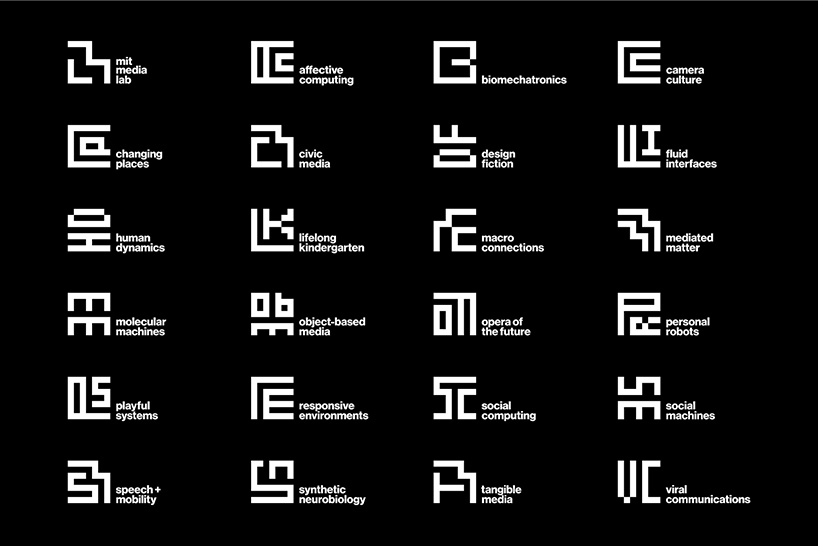
the ML monograph and the 23 research group logos
DB: looking through all your work in this way – what aspects of have evolved significantly and what’s remained more or less the same?
MB: I find shocking stylistic consistencies in work from the 1970s to the work i’m doing today. I guess one’s handwriting is truly hard to disguise. what has changed is the thinking behind the work. the form making aspects of the process are easier for me now, plus the designers on my team have gotten more and more talented over the years. this has freed me to focus on higher level strategy as well as kerning.
section of the new york times building signage at the SVA gallery
photo by jacqueline iannacone

the new york times building signage
DB: having seen all your accomplishments on show – what challenges have you set yourself for the near future?
MB: I sense that gathering all the work up like this is also a great way to put it aside and to start all over again from scratch. I have no idea if this is even possible, but I would love to try. it is a scary and exciting prospect.
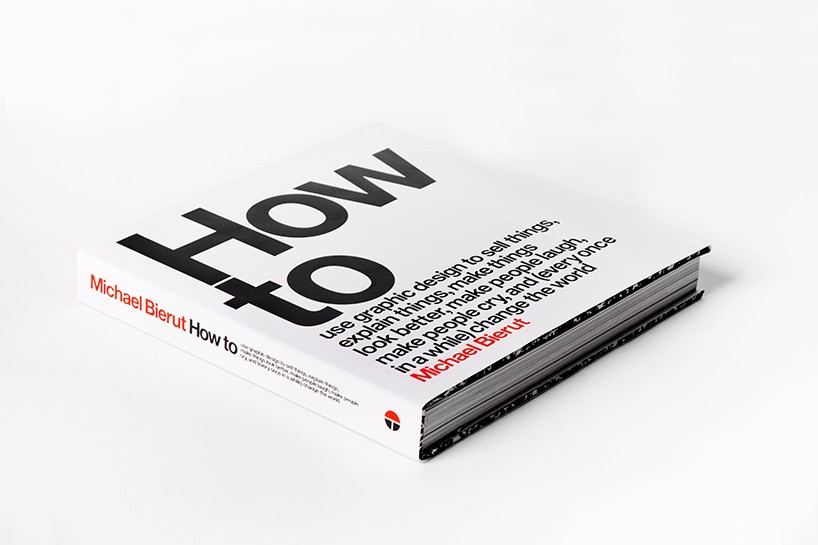
bierut’s new book: ‘how to use graphic design to sell things, explain things, make things look better, make people laugh, make people cry, and (every once in a while) change the world’ published by thames & hudson and harper design, 2015 – available early november
more
on october 22nd, michael will be leading a lively conversation on the importance of design, offering insights into his own creative process, at the harpercollins booklab, a pop-up retail and events space in the seaport culture district. details here »
PENTAGRAM (43)
 Mar 14, 2022
 Mar 04, 2022
 Aug 25, 2020
 Jul 22, 2020
PRODUCT LIBRARY
 Apr 15, 2024
 Apr 15, 2024
 Apr 12, 2024
 Apr 04, 2024