
monocoque brings colors into the third dimension in chromaticity installation
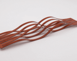
(above) covering the full 360 degrees of the colour wheel, one gets to experience colours spatially
all images courtesy of monocoque
‘chromaticity’ started out as casual lunchtime banter in monocoque‘s office on how colors are terribly misrepresented from screen to print. having to deal with them on a daily basis, this unapologetically led to a full-blown discussion of why colors are well, the way they are.
‘chromaticity’ is an installation where hues are arranged naturally in a linear array across a room. saturation or color richness are tiled with increasing value from bottom up. this recreates a recognisable hue palette creatives use in their daily color work. to introduce a third dimension, hand-folded tetrahedrals were incorporated to form the base element for this tessellation. light sources interacting with the differing facets each receive variations of light intensity. this creates color’s third dimension, commonly known as ‘value’, indicating the quantity of light reflected. at first glance, it may appear that each triangle consists of three distinct colors, but in truth it is nothing more than a simple play of lights and shadows.

consisting of 1440 uniquely coloured tetrahedral shapes, the ‘tessellation’ forms a smooth connected gradient

triangles appear to have three different colors when in reality they are the same

a strong lighting source casts a shadow for the missing blacks

chromaticity raises the notion of how our eyes perceive colour in our everyday lives
designboom has received this project from our ‘DIY submissions‘ feature, where we welcome our readers to submit their own work for publication. see more project submissions from our readers here.
edited by: juliana neira | designboom
PAPER DESIGN (225)
 Feb 27, 2024
 Oct 21, 2023
 Oct 13, 2023
 Oct 11, 2023
 Oct 09, 2023
PRODUCT LIBRARY
 Apr 15, 2024
 Apr 15, 2024
 Apr 12, 2024
 Apr 04, 2024