
johnson banks seals mr cooper ice cream identity with typographic kiss
all images courtesy of johnson banks
london-based design consultancy johnson banks have recently developed the graphic branding for mr cooper ice cream. the frozen desserts start-up is aimed at an older audience, specializing in unique gourmet and alcoholic flavors. with this unconventional aspect to the company, a distinctive identity has been created to match the company’s playful tone.
the ice-cream startup develops flavors aimed for grown ups
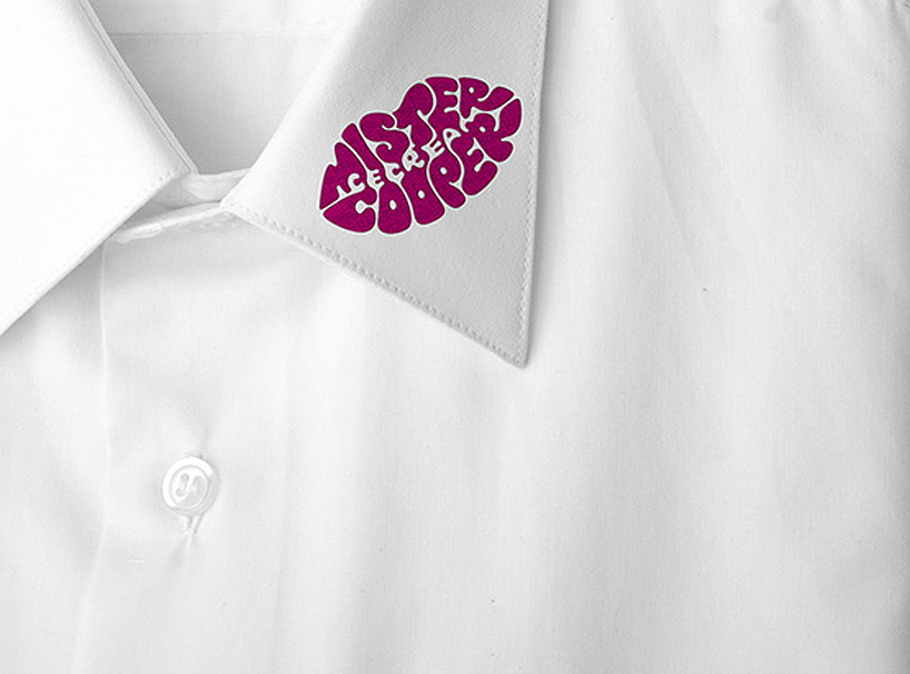
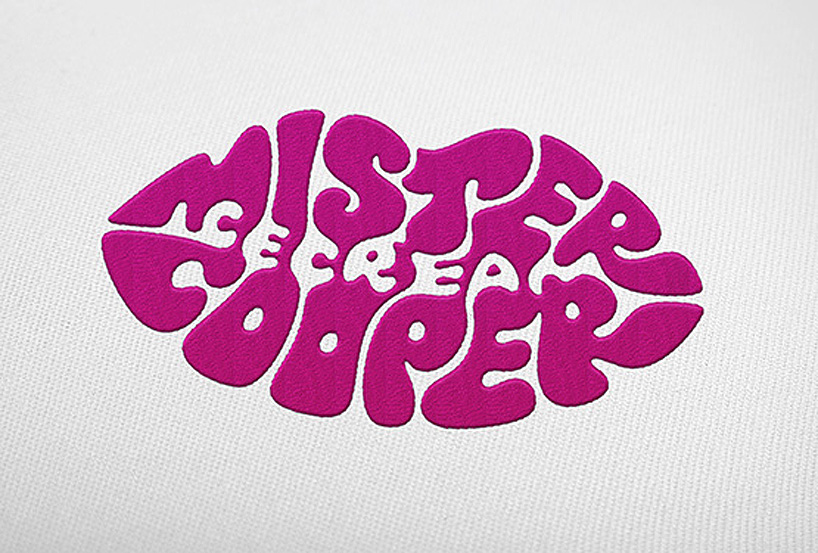
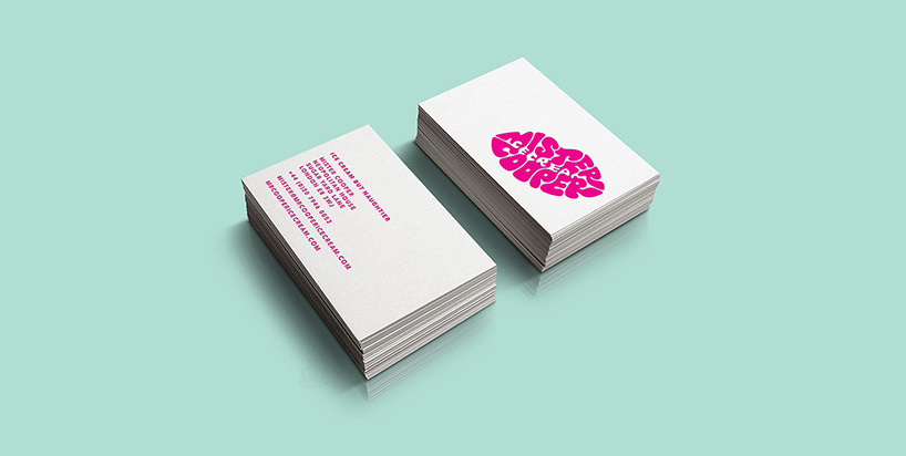
referencing the verbal side of the company, with copy lines such as ‘ice-cream but naughtier’ and ‘never vanilla’, johnson banks have incorporated the letters of ‘mr cooper’ into a magenta lipstick mark. with this identity, stationary and products have been kissed with the logo which if observed closely, has the word ‘ice-cream’ subtly blended into it.

mr cooper himself covered with ‘kisses’
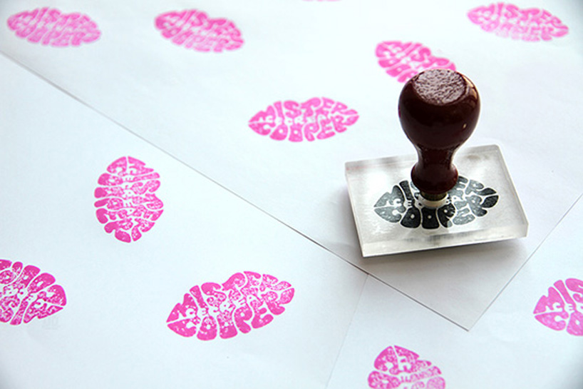
the logo can be rubber stamped directly onto white paper cups and napkins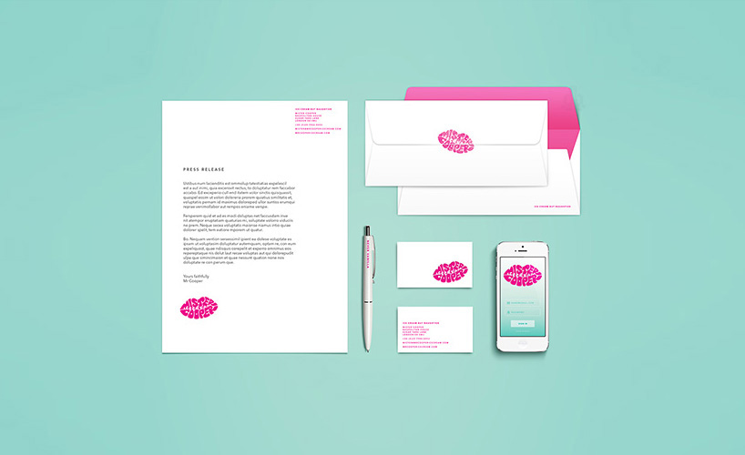
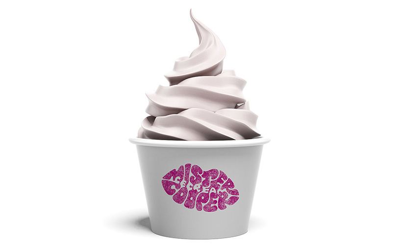
examples of different applications of the logo
the hand lettered mark spells out the brand name and the words ‘ice cream’ within the lip shape.
the final logo was worked firstly on paper, drawing and then traced by hand

the uniform

LOGO DESIGN (244)
 Aug 14, 2023
 Aug 02, 2023
PRODUCT LIBRARY
 Apr 15, 2024
 Apr 15, 2024
 Apr 12, 2024
 Apr 04, 2024