
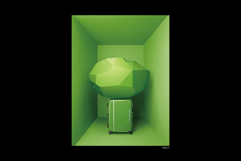
to celebrate their 10th anniversary japanese suitcase company proteca commissioned nendo to develop not just a new product, but also refresh their graphic identity and realize their flagship store in tokyo.
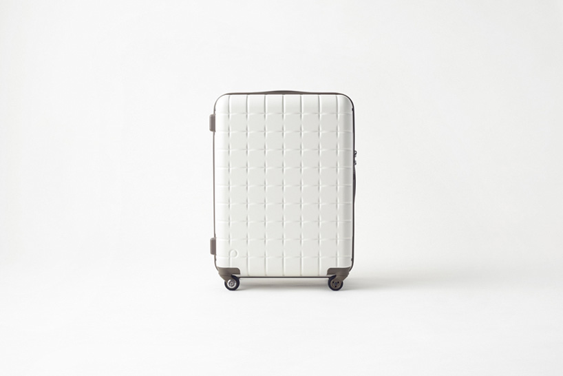
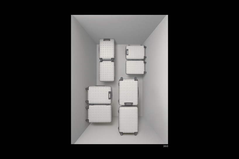
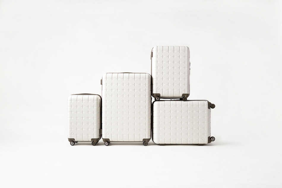
the white proteca 360
suitcase images by akihiro yoshida
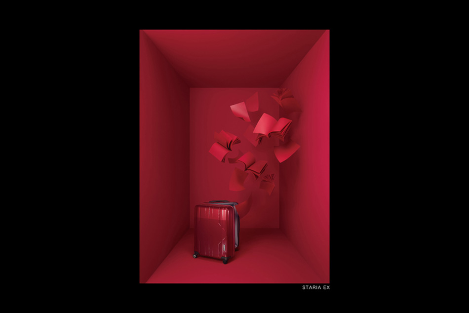
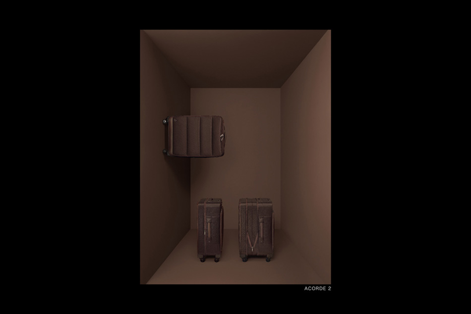
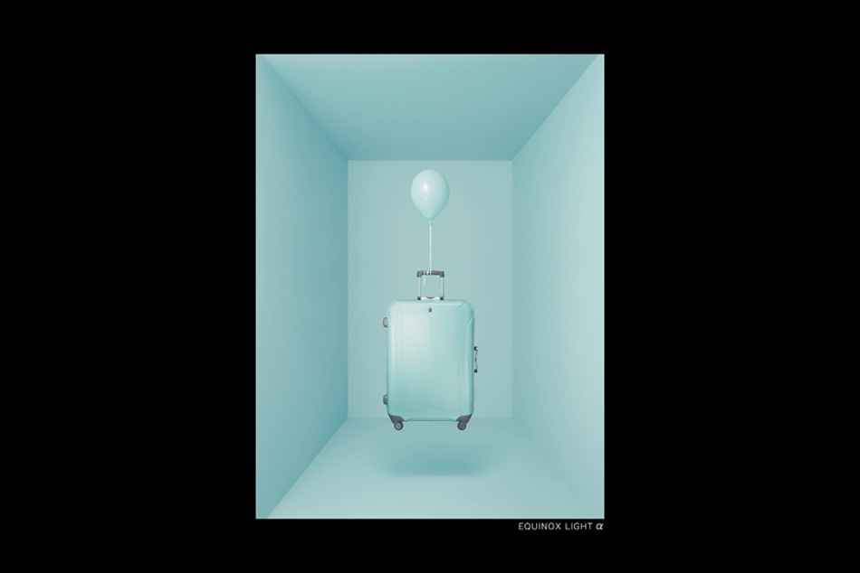
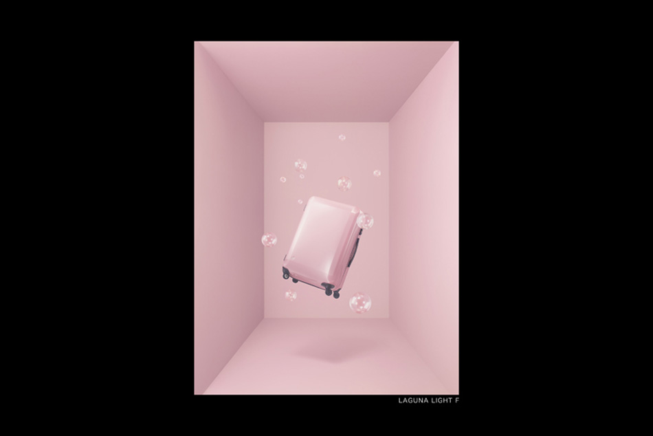
protected by its polycarbonate shell, the ‘proteca 360’ is the proteca’s latest model by nendo, which is defined by features such as a zip fastener running all the way around the raised frame. this not only keeps the zip opening protected from the rain but gives the user access from any direction. available in six colors and four different sizes, the center-split organization and array of separators and pockets allow ample storage space.
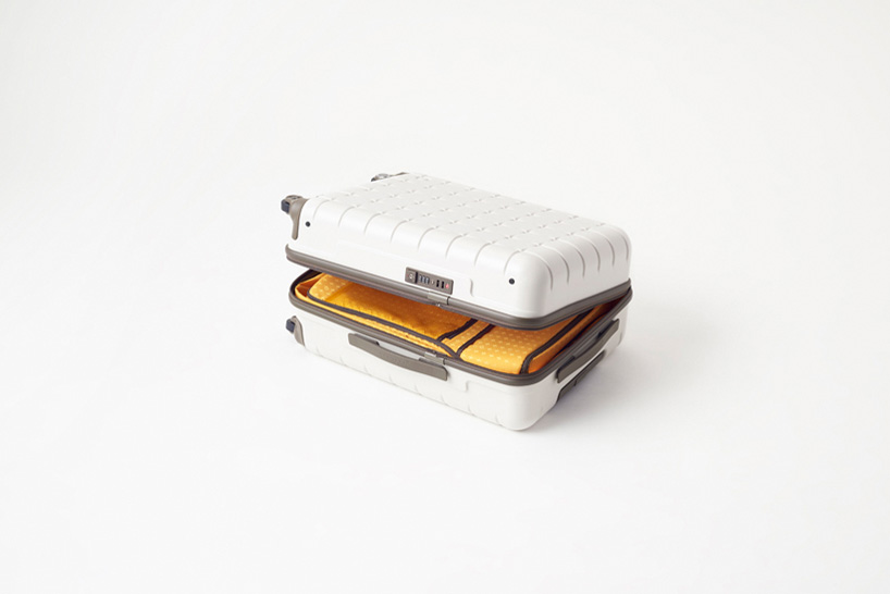
the separator highlighted in orange provides more pocket space
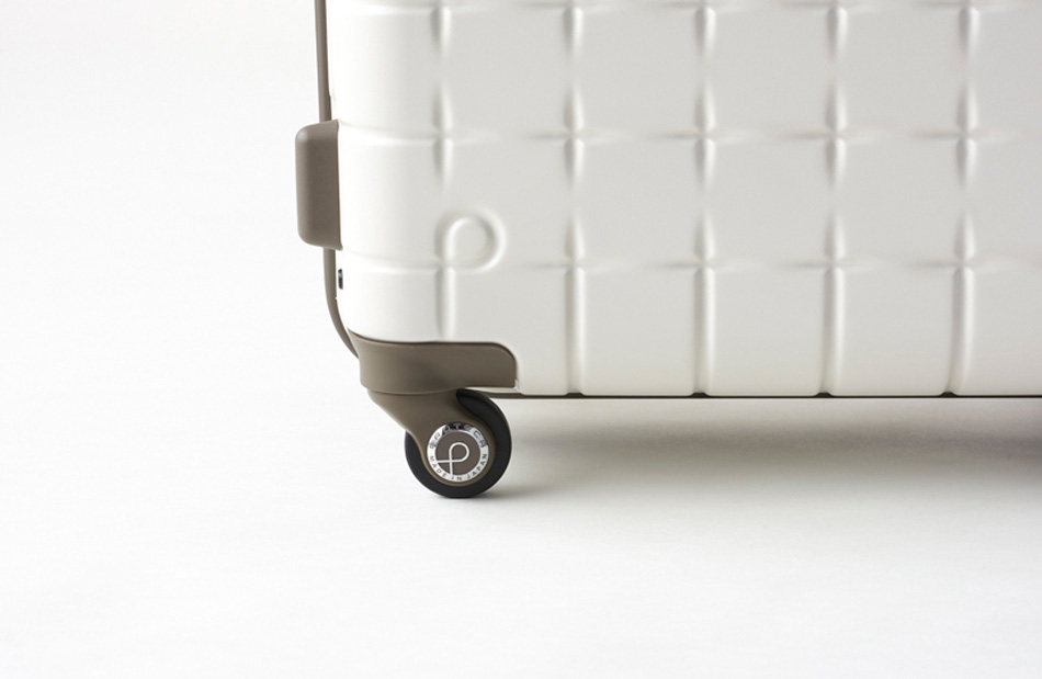
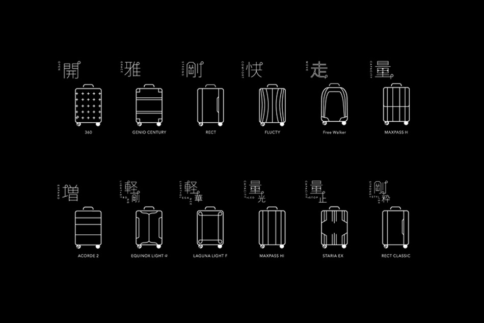
silent casters that reduce noise and a ribbed construction that ensures rigidity will be standard feature on all products. consistency was achieved in both function and design by implementing uniform interior and zips across all products, and by placing an aluminum ‘p’ logo on the lower left wheel of all suitcases.
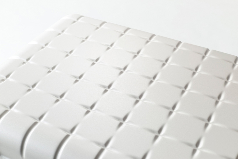
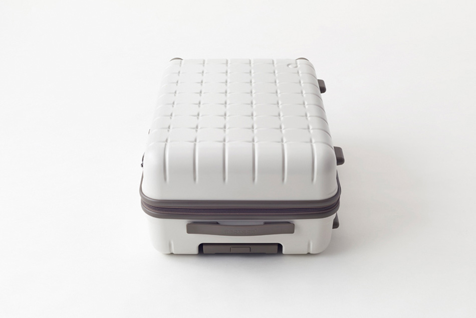
the distinctive patterned imprinted onto the exterior shell of each product
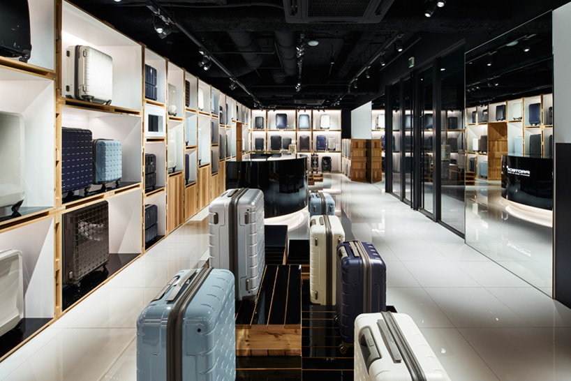
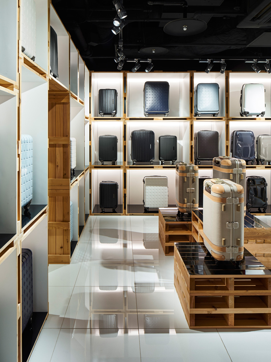
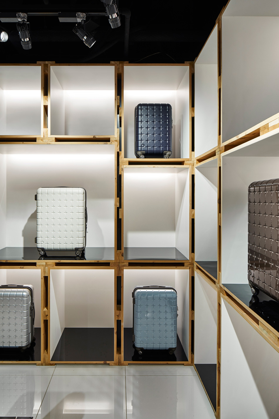
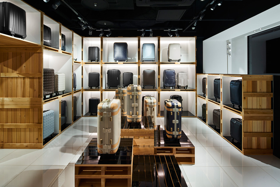
encompassed by stacked wooden palettes and boxes which features around the flagship store in tokyo; this was conceptualized by their prominent use in the transport industry. stored within the stacked components, a diverse catalog of proteca’s products line the walls while the shelving and fixtures have been crafted from wood and finished with a glossy black acrylic painting. the internal walls of the boxes have been painted in white to increase the luminosity, and highlight the product displayed inside.
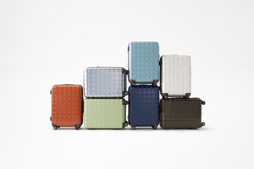
the suitcase comes in six colors and four sizes
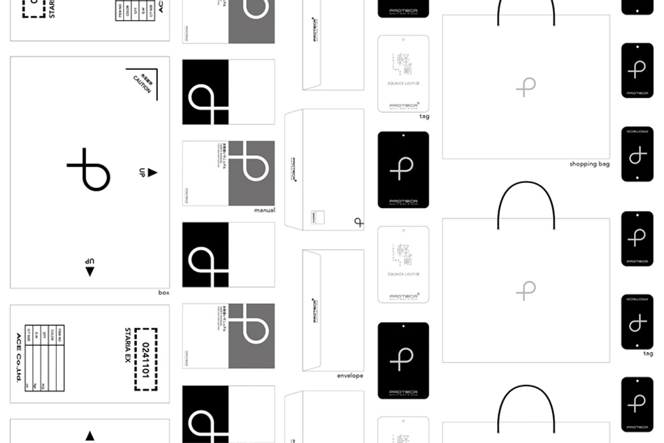
finally, proteca’s identity has been revitalized and presented on everything from the logo to graphics for in-shop display materials, catalogs, and the website. the detailed result will see it utilized on future and current products, as well as advertisements and tv commercials.
the idea behind the branding was to simplify the customer’s purchasing experience by expressing each of the product’s unique and extensive features with a single word. using a simple shape resembling a ‘p’ drawn in a single stroke, the brand logo now instills: an image of two arms carefully safeguarding what is packed inside and the smooth transitioning in which the suitcases move.
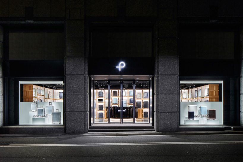
the external façade of the flagship in tokyo
images by masaya yoshimura
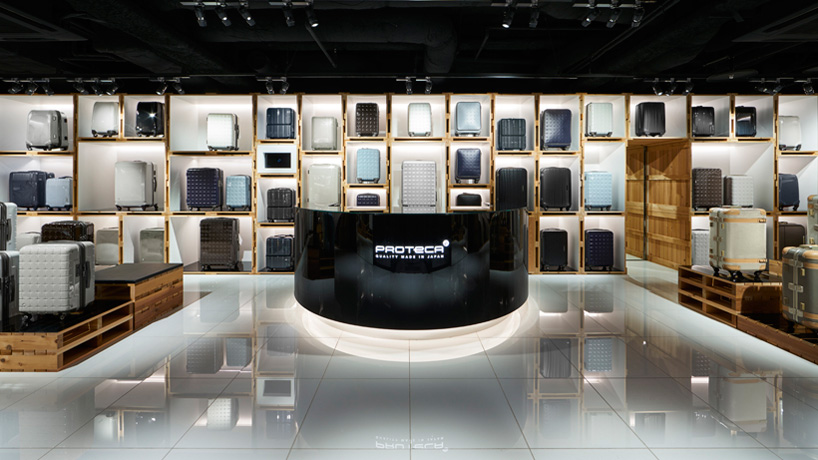
stacked palettes line the walls, reflected by the glossy floor
the a consistent branding has been created for use in products to tv commercials
the world of Proteca as expressed by oki sato (nendo)- proteca’s creative director
NENDO (270)
 Apr 15, 2024
 Apr 05, 2024
 Feb 01, 2024
 Jun 23, 2023
PRODUCT LIBRARY
 Apr 17, 2024
 Apr 15, 2024
 Apr 15, 2024
 Apr 12, 2024