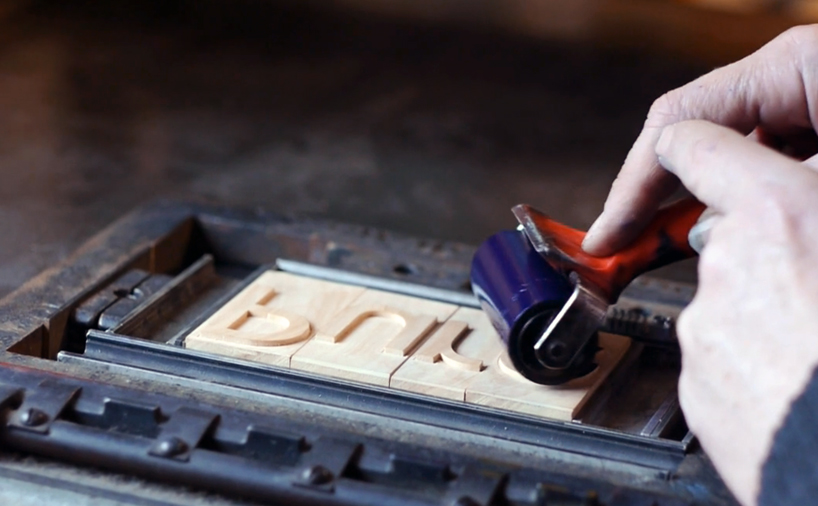
in ‘pure reversal’ nokia documents the creation of woodblock version of its new ‘pure’ typeface, designed by bruno maag
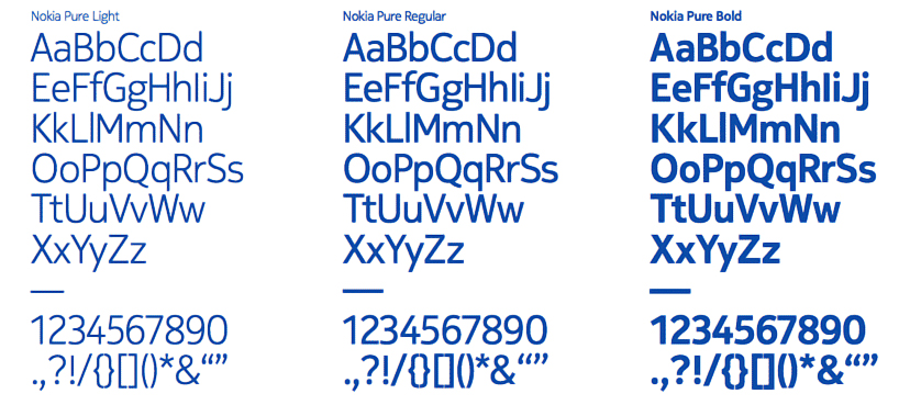
nokia has just unveiled its new typeface, ‘nokia pure‘, designed for the company by swiss-born, london-based typography designer bruno maag of dalton maag. the font will come in three weights: light, regular, and bold.
citing the varied but expansive demands of smartphone usage as a design consideration, alongside the potentials opened by the clarity and sharpness of contemporary smartphone screens, nokia has worked with maag to develop a sans serif typeface that references the varying stroke weights and more rounded flow of handwriting, creating a more open effect than the classic ‘nokia sans’.
 the three weights of the new typeface
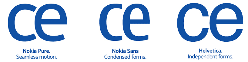 ‘nokia pure’ compared with ‘nokia sans’ and ‘helvetica’
‘for me,’ explains bruno maag, ‘ it’s the rhythm of the typeface and the relationship between characters that’s critical. after all, you still need to know that it’s nokia, and this is achieved by creating a recognizable rhythm.’ for nokia, this rhythm is one they define as ‘seamless, fluid motion’, creating a sense of harmony. the letters are designed to ‘flow into each other’ in a gentle, forward movement.
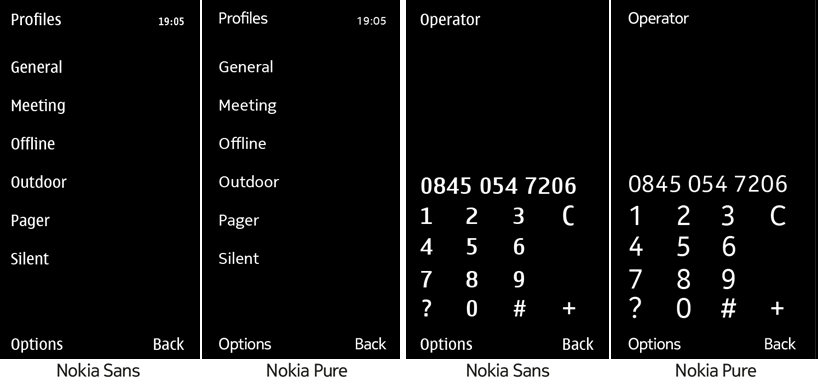 sample screen tests between ‘nokia sans’ and ‘nokia pure’
in an interesting return to analogue, nokia celebrates the release of the font with the commissioning of a woodblock version of the typeface. documented in the mini-film ‘pure reversal’, produced by build, the blocks were created and used for a limited-edition print run by matt mckenzie of the london-based paekakariki press.
designed specifically for digital and mobile devices, the ‘pure’ typeface is expected on nokia devices and in advertisements beginning this year.
the mini-film ‘pure reversal’ depicts the creation of a woodblock font of ‘nokia pure’
PRODUCT LIBRARY
 Apr 15, 2024
 Apr 15, 2024
 Apr 12, 2024
 Apr 04, 2024