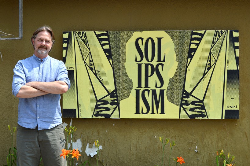
erik brandt with the ficciones typografika exhibition space at his home in minneapolis, minnesota.
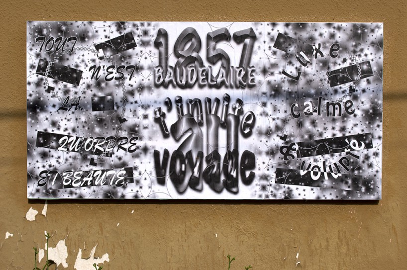
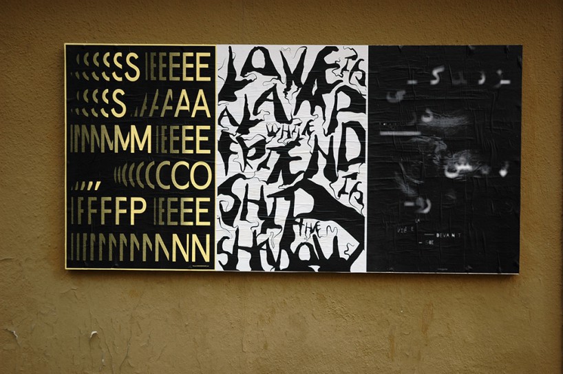
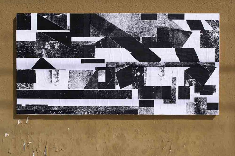
nick o’brien, ficciones typografika 589-591 (24”x36”) installed on july 30, 2014.
ficciones typografika is an ongoing typography exhibit curated by erik brandt that is dedicated to typographic exploration in a public space. the exhibition surface is a 72”x36”poster board on brandt’s garage which faces the street in his local neighborhood, minneapolis, minnesota.
designboom spoke to erik about some of the highlights and themes that have emerged one year since the project began…
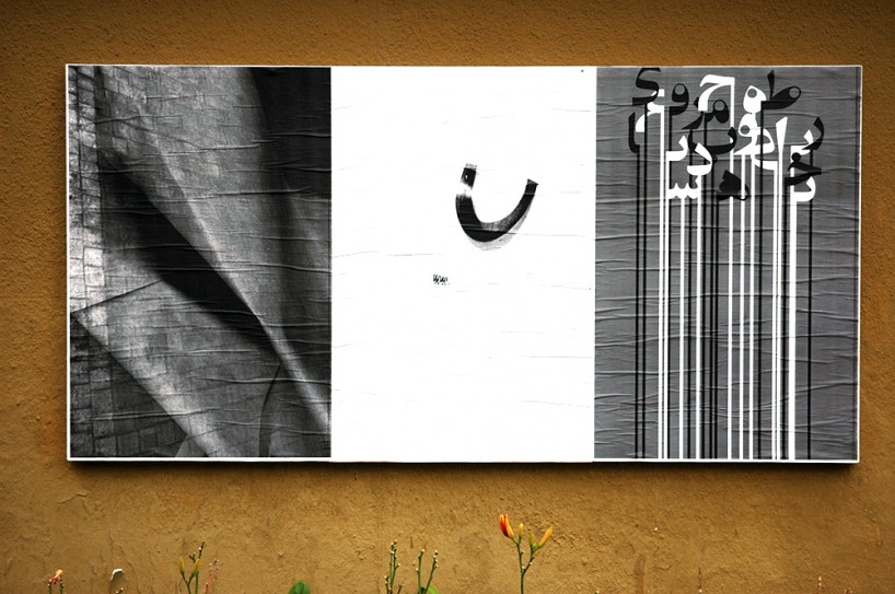
leo ravy, ficciones typografika 577-579 (24”x36”). installed on july 20, 2014.
designboom: please could you tell us how you came up with the idea for ficciones typografika?
erik brandt: I have been working in this vein both as a designer and as an educator for many years. At the beginning of this project, I was simply thinking of creating a space for personal work but that idea changed as I was actually building the exhibition board. It occurred to me that it would be similar to the blog I used to run (geotypografika), just much more dynamic and engaging. the notion that the space would exist in pubic as well as digitally was also attractive. I liked the idea of inviting digital fictions, and making them real. the first posters were some of my original ficciones typografika and I simply started writing to people who’s work I admired and asked them to contribute. thankfully, the response was really strong and the project started to gain momentum. the decision to open it up publicly came almost spontaneously, and the response has been immensely gratifying.
ficciones typografika 055-057 (24”x36”). installed on august 16, 2013.
from left to right; andreas kuhn (2013), bircan ak (2013), and reza abedini (2013).
erik brandt, ficciones typografika intermezzo eleven (2014).
DB: how do you decide which posters will go on display and how long are they displayed for?
EB: I suppose the only criteria is that I have to be intrigued by the work, but, as I am also an educator, I like to think I have a very broad appreciation for the various idiosyncrasies proposed. I also try to maintain a certain narrative, though this can sometimes mean contributors wait a long time, even months, for their work to go up. I’ve definitely hung work that I didn’t actually ‘like’, so to speak, but admired for a certain provocation, formally or otherwise. at the beginning the submissions were slower to arrive so I would hang once or twice a week. as the submissions have increased, there have been periods when I have hung new work every day. this was actually fueled by the interaction with passersby in my neighborhood. people started changing their walking, cycling, or running routes to see what was new and to stop and talk about the project. this, along with the interaction with the contributors, is probably the most enjoyable and gratifying part of the project.
there is a certain critical mass to the number of posters on the board at one time, and I noticed early on that weather conditions would cause a lifting and it was necessary to strip them down. that activity became really important to me as I could discover what I have called ‘remnants’ and I have actually refined the tear-downs to create paintings of a sort. there is a measure of chance but I’ve also been able to emulate a process many of my painter friends regularly employ to discover new possibilities in their work. I’ve also saved all the torn pieces and am planning some collages in the near future.
ficciones typografika 115-117 (24”x36”). installed on october 27, 2013.
from left to right; karen van de kraats (2013), xuancheng zhang (2013), and hoseyn a. zadeh (2012).
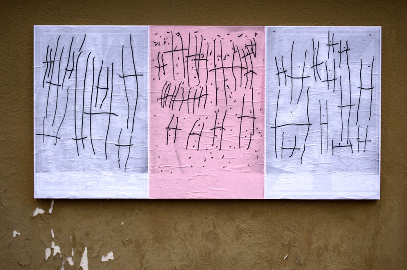
izzy berenson and sarah honeth, ficciones typografika 172-174 (24”x36”). installed on december 5, 2013.
DB: one year on, how has the response been to the project?
EB: the overall response has been overwhelming and I am nearing over six-hundred posters hung thus far. I’ve been grateful for well over four-hundred submissions and I believe every continent has been well represented. I’ve tried to encourage people to submit work in their native languages and am hoping for even more diversity in the future. Early on, most contributors sent single posters, but the triptych format has since become more popular. I actually miss trying to match the single submissions, however, and am trying to find ways to encourage more of those. It was exciting trying to find the right companions for a certain moment. I am considering building a companion board at A0 size.
kia tasbihgou, ficciones typografika 046-048 (24”x36”). installed on august 7, 2013.
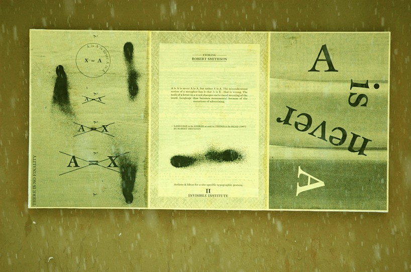
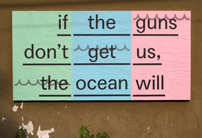
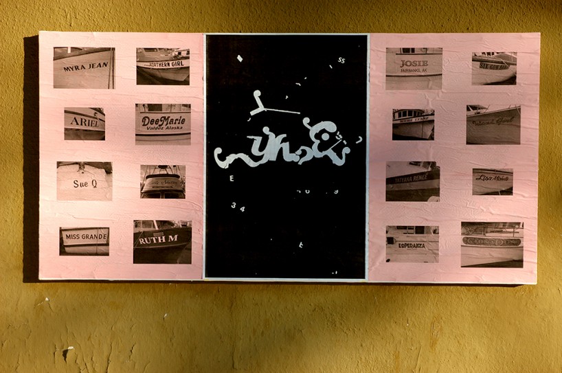
camille morehead, ficciones typografika 583-585 (24”x36”). installed on july 25, 2014.
DB: what have some of the personal highlights for yourself been as curator?
EB: the diversity and sheer number of submissions has been really inspiring. It is really delightful to begin a conversation with a contributor once their submission comes in and then discover new connections to other artists and designers. I am also quite proud to have made it through the winter here. we live in shockingly cold conditions that last many months and I wasn’t sure if I would be able to keep hanging the works in that period. even with hot wheatpaste fresh off my oven, I would start to see the stuff set off steam and then freeze right off the brush. a splash of windshield wiper fluid proved to be the right trick—it allowed a few precious extra seconds.
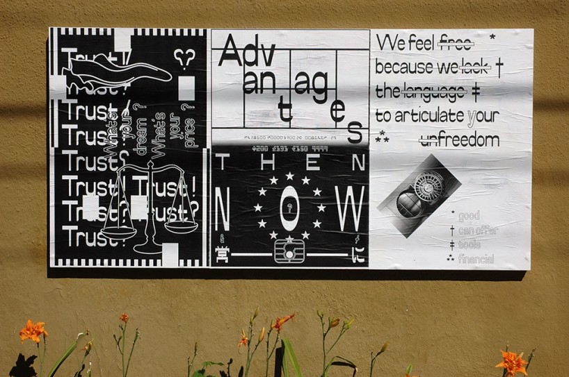
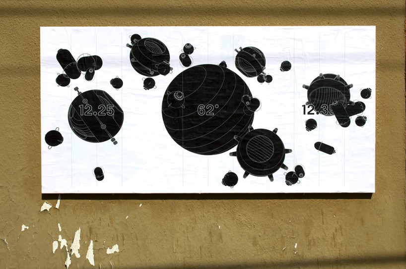
matthew rezac, ficciones typografika 559-561 (24”x36”). installed on july 10, 2014.
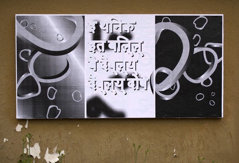
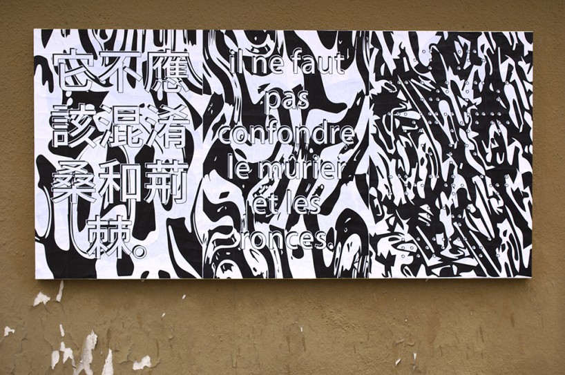
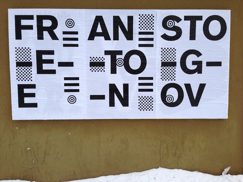
stijn jonckheere, ficciones typografika 474-476 (24”x36”). installed on may 30, 2014.
DB: have any particular themes emerged from the submissions you’ve received?
EB: there are some visual languages that many of the contributors ‘share’ or are engaged in conversation with, but I think the most common theme is an embrace of this idea of ‘fiction’ and the ‘freedom’ they enjoy in exploring some idiosyncratic idea.
vincent labas, ficciones typografika 450-452 (24”x36”). installed on may 16, 2014.
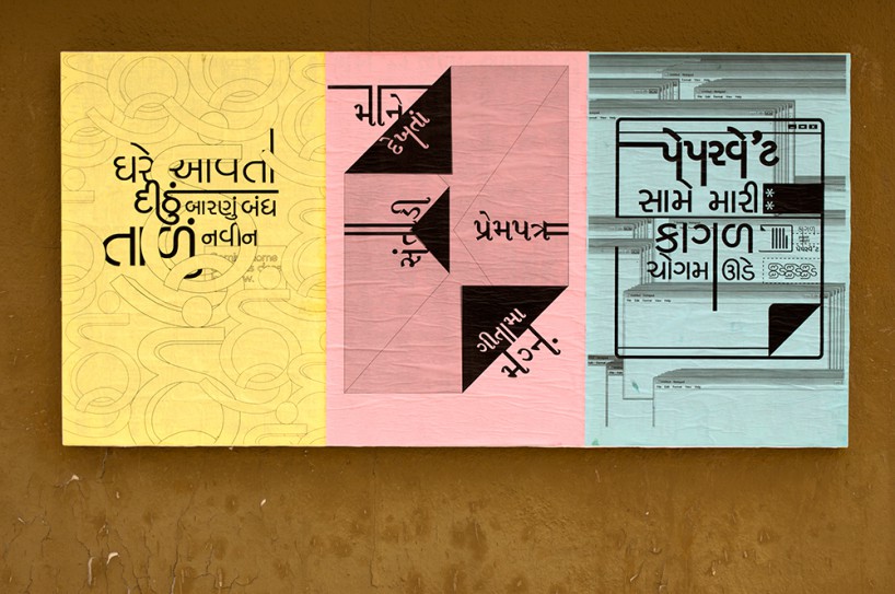
deval maniar, ficciones typografika 274-276 (24”x36”). installed on march 9, 2014.
DB: what’s next for the project and how do you see it evolving?
EB: the wonderful thing about ficciones is that they are continually evolving given the wide variety of contributions. in a sense, my curatorial role only plays a minimal part in the developing story line. I think it does capture moments of the contemporary and even the future, but, more importantly, I also feel that it has found a place in design culture that is fluid and open-ended.
polina kukushkina, ficciones typografika 349-351 (24”x36”). installed on april 5, 2014.
beatrix brandt, ficciones typografika 400-402 (24”x36”). installed on april 23, 2014.
ficciones typografika 178-180 (24”x36”). installed on december 16, 2013.
(on the left and right), hope finley, the girls (2013), and mimmo manes (2013).
erik brandt, ficciones typografika 222-224 (24”x36”). installed on february 3, 2014.
more
visit the online archive of ficciones typografika »
read our in-depth interview with erik from last year »
TYPOGRAPHY DESIGN (133)
 Sep 13, 2023
 Feb 23, 2023
 Jan 24, 2023
 Jan 19, 2023
PRODUCT LIBRARY
 Apr 17, 2024
 Apr 15, 2024
 Apr 15, 2024
 Apr 12, 2024