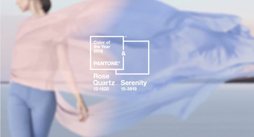
for 2016, pantone takes on a softer approach to the color of the year, combining for the first time, two shades – rose quartz (pantone 13-1520) and serenity (pantone 15-3919). the emblematic selection is a response to what has been taking place within our culture — consumers seeking well-being as an antidote to modern day stresses — and serves as an expression of a mood and attitude. ‘the two hues psychologically demonstrate an inherent balance between a warmer rose tone and a cooler tranquil blue which collectively fulfill our yearning for reassurance and security; offering a soothing sense of peace and order,’ says leatrice eiseman, executive director, pantone color institute®. rose quartz stands as a persuasive, yet gentle tone that conveys compassion and a sense of composure;s while serenity is weightless and airy, much like the blue sky above us, bringing feelings of rest and relaxation, even in turbulent times.
pantone color of the year 2016
video courtesy of pantone
the combination of rose quartz and serenity also challenges traditional perceptions of color association. many parts of the world have been experiencing a blur between genders in relation to fashion, subsequently impacting the color trends and tones used throughout other areas of design. the marriage of these rose quartz and serenity is a unilateral approach to color, one that coincides with society movements toward gender equality, and the consumer’s increased comfort with using color as a form of expression.

PANTONE (43)
 Dec 07, 2023
 May 07, 2023
 Dec 02, 2022
 Dec 09, 2021
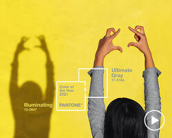 Dec 10, 2020
PRODUCT LIBRARY
 Apr 15, 2024
 Apr 12, 2024
 Apr 04, 2024
 Mar 21, 2024