
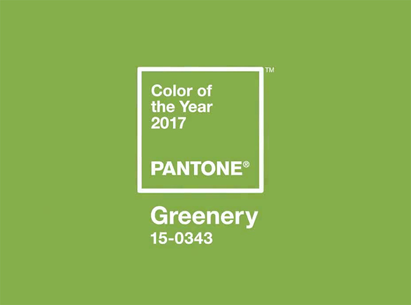
 every year, pantone experts choose ‘the color of the year’ and they’ve just announced their latest selection for 2017 — ‘greenery’. the zesty yellow-green shade elicits the feeling of the first days of spring, recalling the first signs of nature and botanical life. evocative of foliage and the great outdoors, ‘greenery’ subtly suggests a deep breath of fresh air and a reinvigoration for a new year.
‘greenery’ is a versatile shade that lends itself to a variety of color combinations. it can be paired with neutrals, brights, deeper shades, pastels, metallics and even the pantone color of the year 2016 — rose quartz and serenity.
pantone describes the pick: the more submerged people are in modern life, the greater their innate craving to immerse themselves in the physical beauty and inherent unity of the natural world. this shift is reflected by the proliferation of all things expressive of greenery in daily lives through urban planning, architecture, lifestyle and design choices globally. a constant on the periphery, greenery is now being pulled to the forefront – it is an omnipresent hue around the world.
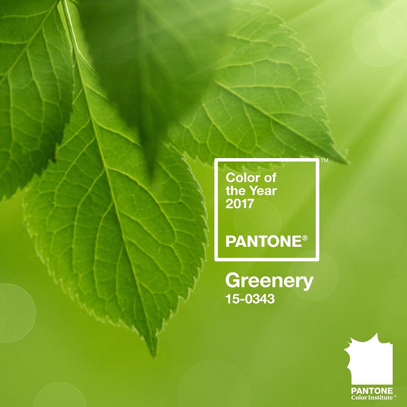
the zesty yellow-green shade elicits the feeling of the first days of spring
‘while serenity and rose quartz, the pantone color of the year 2016, expressed the need for harmony in a chaotic world,’ said leatrice eiseman, executive director of the pantone color institute ‘greenery bursts forth in 2017 to provide us with the hope we collectively yearn for amid a complex social and political landscape. satisfying our growing desire to rejuvenate, revitalize and unite, greenery symbolizes the reconnection we seek with nature, one another and a larger purpose.’
PANTONE (43)
 Dec 07, 2023
 May 07, 2023
 Dec 02, 2022
 Dec 09, 2021
 Dec 10, 2020
PRODUCT LIBRARY
 Apr 15, 2024
 Apr 15, 2024
 Apr 12, 2024
 Apr 04, 2024