
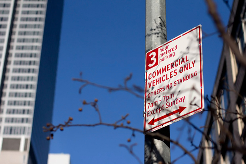
pentagram: new york city’s redesigned parking signs
the re-designed parking signs introduce a consistent, simplified layout that cuts back on the number of words and colors.
prefer designboom on google[FEATURED]
pentagram: new york city’s redesigned parking signs
working with the new york city department of transportation, pentagram‘s michael bierut and his team have created a new, simplified design for the city’s street parking signage that is more easily understood by drivers and residents.
the project introduces a consistent, simplified layout that cuts back on the number of words and colors and adds some much-needed white space, the design divides the signs into two sections, one for commercial vehicles (still in red), the other for passenger vehicles (in green) – with the number of parking hours allowed is prominently placed in a reversed-out box at the top left of the sign.
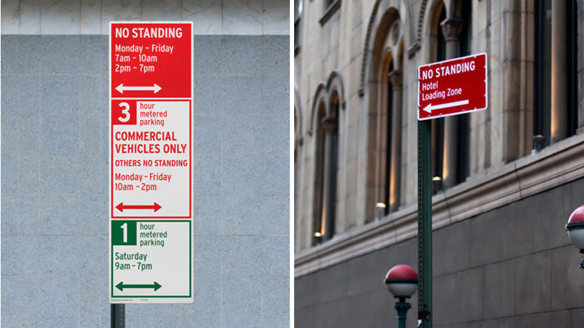
new york city’s redesigned parking signs
as the existing signs were densely packed with information that was wordy and hard to follow; typography was centered and set in all caps in various fonts and sizes, making it difficult for the eye to scan.
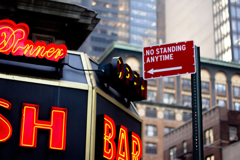
‘no standing anytime’ sign
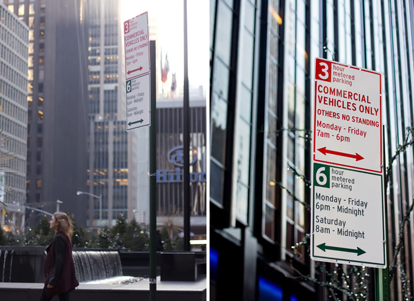
scale and context
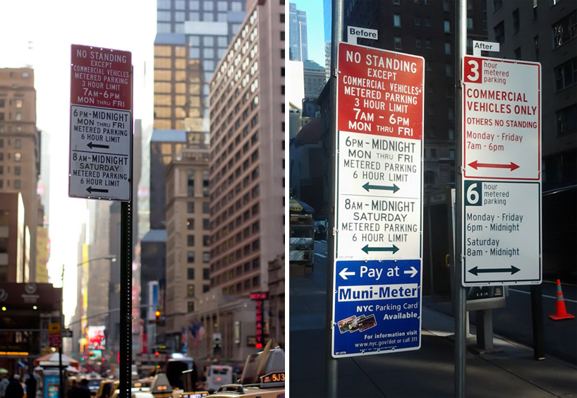
before and after
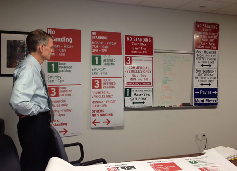
design process
shop
your own online design shop — no sales commission collected