pentagram gives indian tea company a vibrant new identity
all images by pentagram
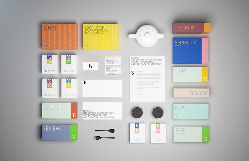
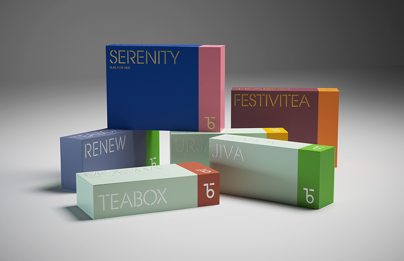
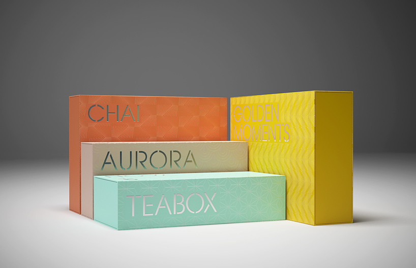
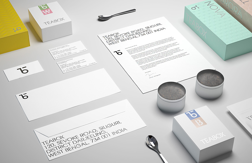
pentagram have recently refreshed the identity of teabox – an india-based tea-commerce company – that was founded only in 2012. the company raised $6 million in backing this year alone with the goal to revolutionize tea drinking, which still to this day is one of the most popular of beverages consumed around the world. led by natasha jen, the new identity has effectively given the tea-brand a minimal contemporary yet distinct essence, featuring brightly colored packaging, complemented by custom typography and an enhanced web platform.
the logo and type create an identity that straddles old and new, bringing fresh vibrancy to the brand
‘the tea business is an old industry and its visuals still thrive on common clichés,’ explains natasha jen. ‘we wanted to strike a different note that would convey teabox as a creative and premium brand that is rooted in tea tradition.’
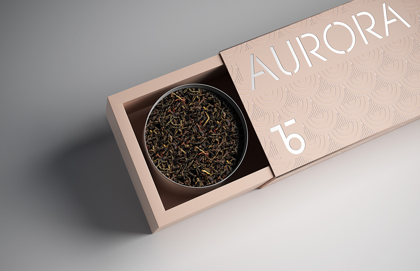
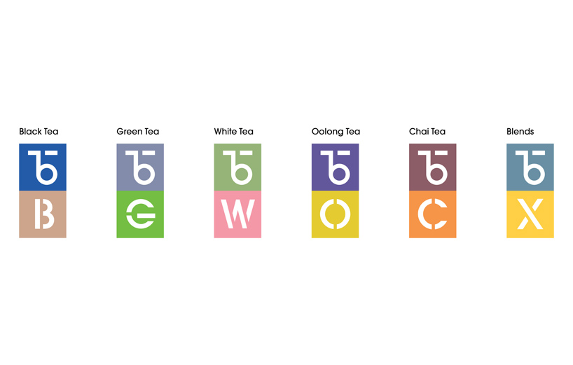
the designers developed a custom-made typeface called ‘teabox stencil’ influenced by traditional teacrates
a consistent aesthetic has been carried throughout. drawing influence from the long and rich visual history of tea production, a colonial-era typography that is still commonly used on tea crates has been adopted by the designers with a custom-made typeface called ‘teabox stencil’ that emulates the traditional aesthetic. overall the re-brand successfully encompasses a fresh vibrancy and elements of its roots in history, which in turn, gives teabox a contemporary versatility that will enable it to grow naturally over time.
read our interview with pentagram’s natasha jen where the graphic designer talks about her influences and approaches to design here.
since its launch, the startup has provided an estimated 25 million cups of tea to 100,000 users in 75 countries
the aim of the re-brand is to promote and establish teabox as a global brand
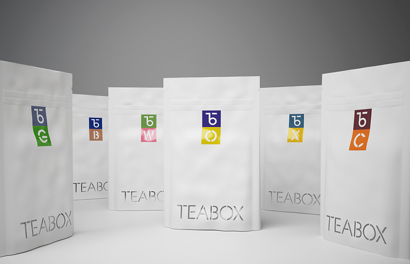
each packet features a thorough description, the packaging date, brewing instructions, and notes on the flavor profile
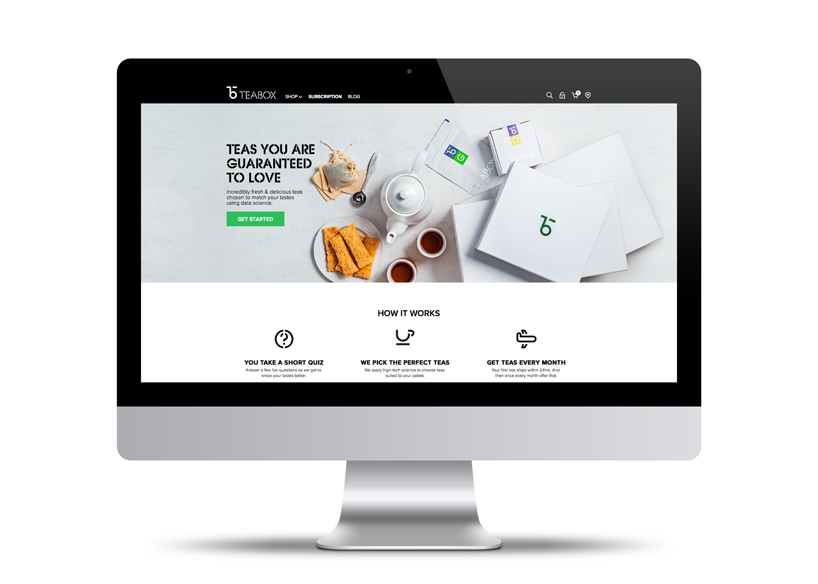
the easy-to-use format of the website engages audience through quick surface information about the range of teas 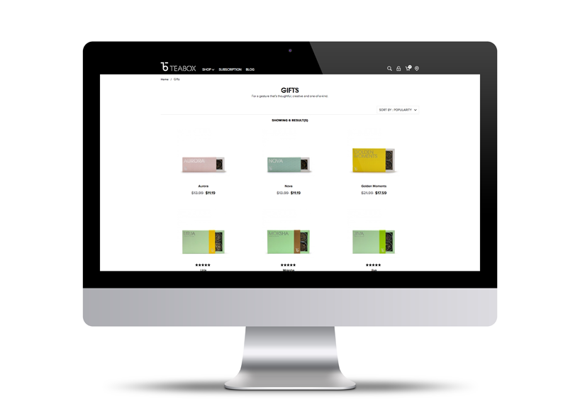
the designers have carried the elegant simplicity of the identity through to the website
the letters ‘t’ and ‘b’ form a distinctive monogram
PENTAGRAM (43)
 Mar 14, 2022
 Mar 04, 2022
 Aug 25, 2020
 Jul 22, 2020
PRODUCT LIBRARY
 Apr 17, 2024
 Apr 15, 2024
 Apr 15, 2024
 Apr 12, 2024