pinkeye designstudio defines the identity of manhattn’s burgers
the graphic style takes notes from the meatpacking district of new york city.
pinkeye design studio defines the identity of manhattn’s burgers
all images courtesy of pinkeye designstudio
‘manhattn’s‘ is a delicious hamburger restaurant bringing the taste of new york to brussels. the establishment didn’t only need to transfer cuisine across the world, but also an appearance that captures the heart of the city. fulfilling this need for a complete visual identity, including graphics, packaging, and interior design, the owners approached the award winning studio of pinkeye.
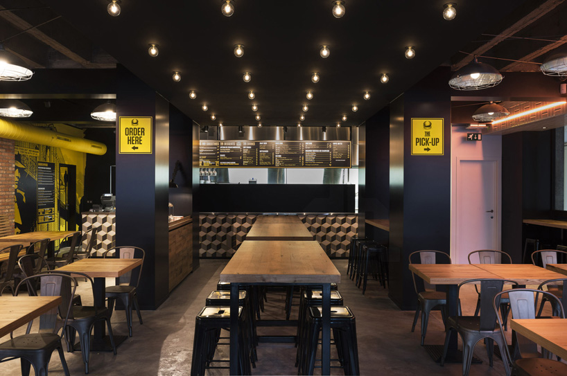
lowing towards the kitchen from the dining area
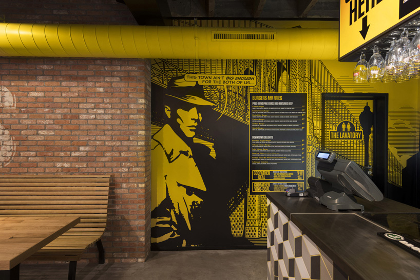
comic book graphics paint the walls
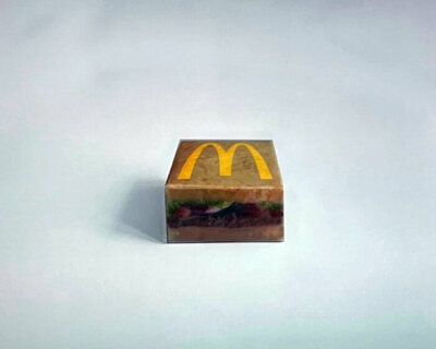
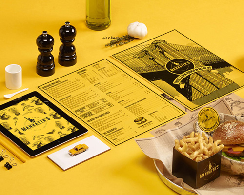
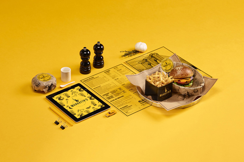
the creative agency found the basis of their approach in the streets of the american metropolis. the rigid, pragmatic typography of the brick accent wall refers to antique price signs from the NY meatpacking district, with taxi yellow as a leading color. the wrapping paper pays homage to ‘brown bags’ and adds a handmade touch. in order to underline the high quality of manhattn’s ingredients, playful label illustrations were added to the menus, napkins, and doorways in an appearance bordering comics and tattoo style.
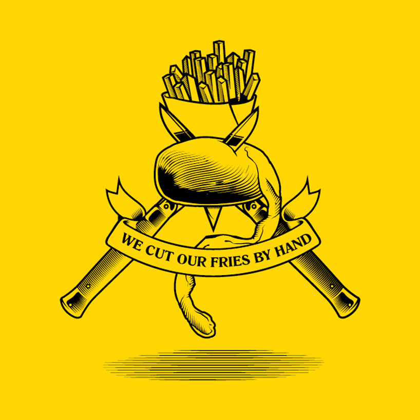
handcut fries icon
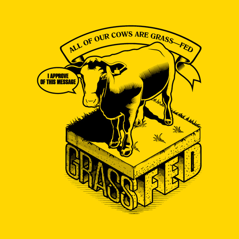
grasfed beef icon
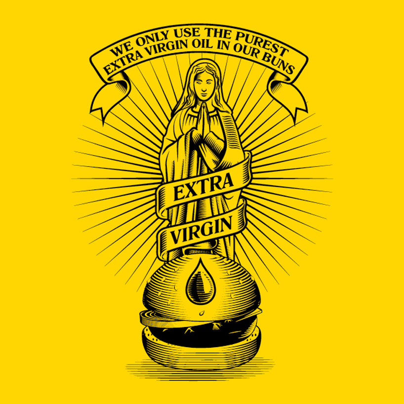
olive oil buns icon
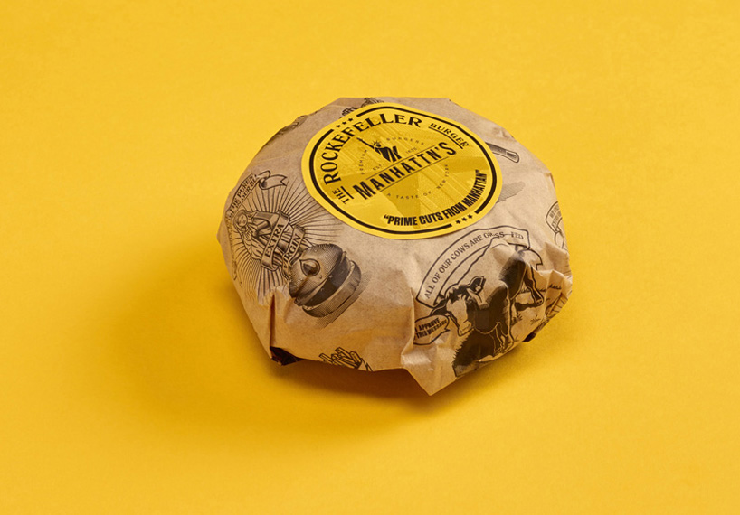
burger packaging
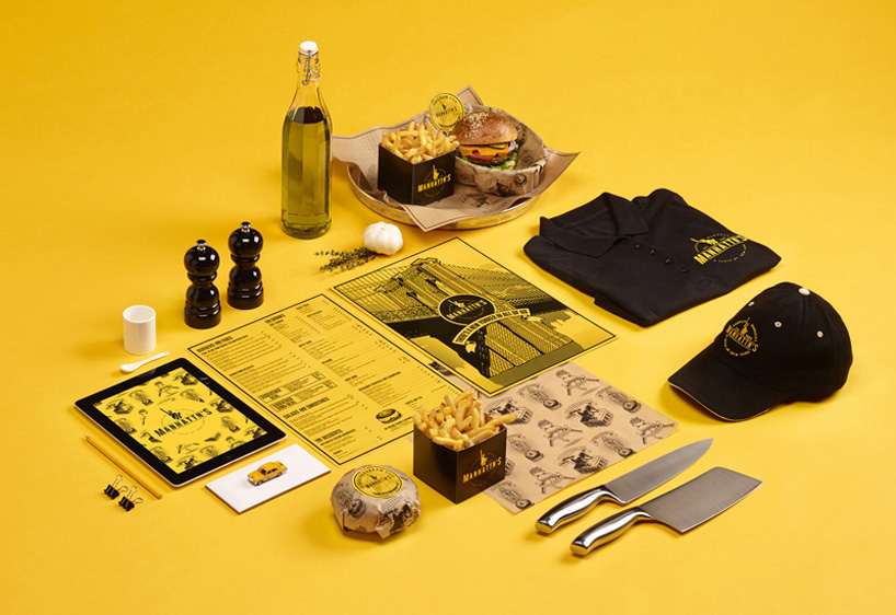
all of the graphics and illustrations on various manhattn’s products
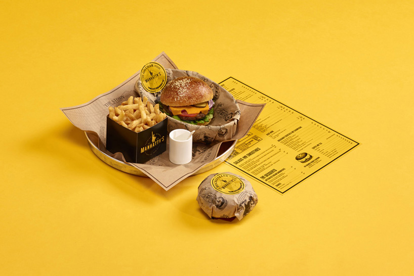
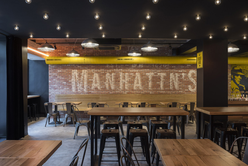
typography on the wall refers to the NY meatpacking district
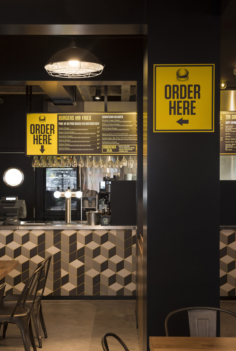
the order station
designboom has received this project from our ‘DIY submissions‘ feature, where we welcome our readers to submit their own work for publication. see more project submissions from our readers here.
shop
your own online design shop — no sales commission collected