snøhetta gives new look to back of norway’s banknotes
all images courtesy of snøhetta
following a competition held by the central bank of norway, designs have been selected for the country’s new banknotes, with the backs featuring graphics by snøhetta and the fronts by the metric system. the team and norges bank will be fine-tuning the schemes to incorporate security elements and refine motifs. the new currency is intended for initial issuance in 2017 at the earliest.
(above) the metric system’s proposal, to be featured on the front of the new banknotes
(below) snøhetta’s design will be featured on the back of the NOK notes
image courtesy of norges bank
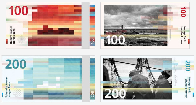
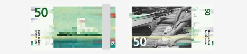
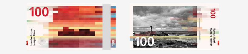
based on the theme of ‘the beauty of boundaries’, snøhetta conceived a graphic language referential to norway’s landscapes, and in particular their long coastline — ‘the transition between sea and land’. the design for the backs of the banknotes is organized as pixelated compositions, which dually represent digital and analog imagery. in abstract ways, the mosaic-like motifs allude to dynamic environmental forces such as wind and waves, while organizing themselves about legible horizon lines.
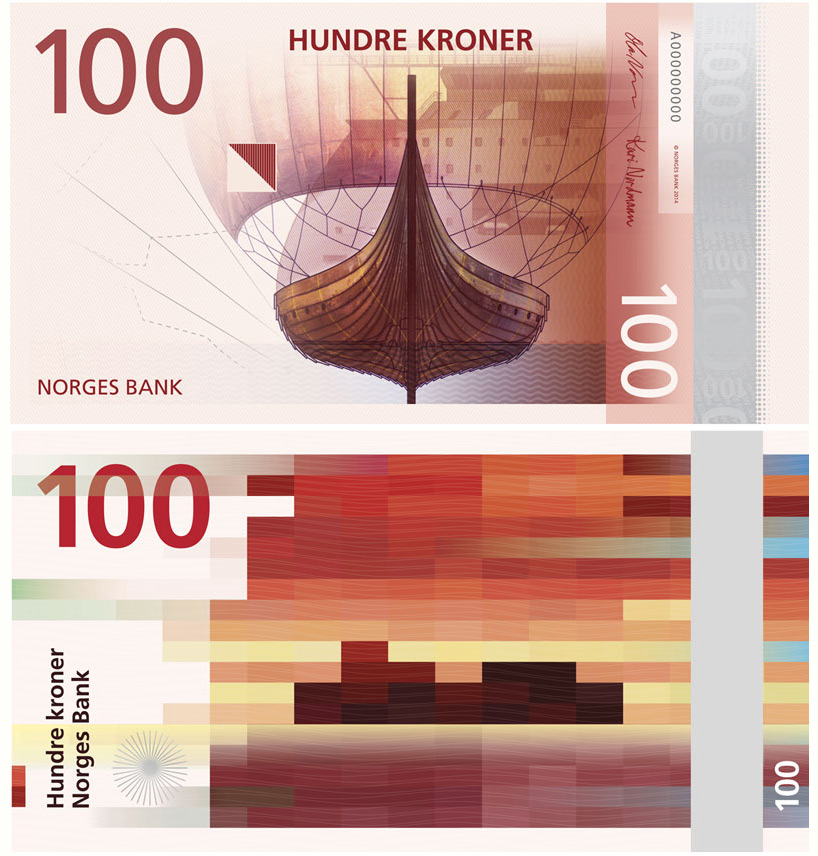
these cubical patterns will be complemented by the metric studio’s proposal, ‘norwegian living space’. the design utilizes typically nordic imagery, including a lighthouse, fishing boat, historical viking vessel, and other depictions of sea life.
each of the pixelated images features a legible horizon line
for the notes’ fronts, snøhetta proposed a series of black and white photographic images which portray the coutry’s coastline in various ways. the gray-scale tones contrast the vibrant colors of the pixelated compositions, and also, ‘complement the norwegian style and tone’. through their open ended nature, the images allow for various readings and allow for a diverse range of interpretations.
the black and white images contrast the vibrant coloration of the pixelated compositions
the design team expands upon the scheme’s intentions:
‘our organic pattern abstracts the sea. seen in connection with the rational cubical pattern, it emphasizes the differences between the soft and the hard. both patterns follow the beaufort scale, as an expression of wind force, affecting the waves of the sea. on the 50 NOK note the wind is gentle, represented by short, cubical shapes and long, tame waves in the organic pattern. on the 1000 NOK note the wind is strong, expressed through sharp long shapes on the cubes and short waves.’
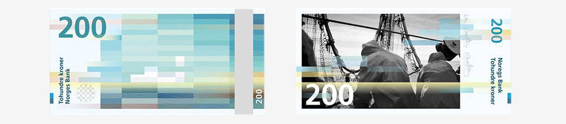
horizontal lines from the back side transition to the notes’ front
snøhetta introduces its proposal with the following basis:
‘human beings settle nearby rivers, mountain chains, mountain passes, and coasts. we settle near boundaries – near the boundary between one element and the other. the beauty of boundaries is about the transition between sea and land, where something meaningful and interesting happens. over time the sea becomes commonplace, just as land easily becomes so. however, where sea and land meet there is life. there is life in the same way as life on earth exists between sea and air, between land and air. where water meets earth, soft meets hard, wet meets dry, life is created.’
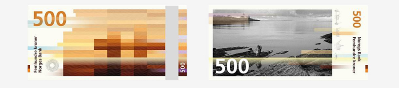
the 500 NOK note depicts an image of a parent and child at the norwegian sea’s edge
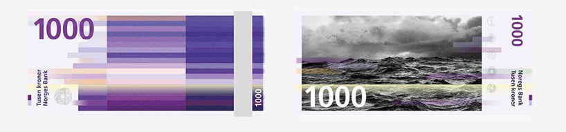
the 1000 NOK note takes a more purely horizontal composition
MONEY (64)
 Dec 15, 2023
 May 17, 2022
 Feb 11, 2022
 Sep 03, 2021
SNOHETTA (178)
 Feb 26, 2024
 Dec 17, 2023
 Nov 22, 2023
 Nov 01, 2023
 Oct 30, 2023
PRODUCT LIBRARY
 Apr 17, 2024
 Apr 15, 2024
 Apr 15, 2024
 Apr 12, 2024