
in poznań, poland, creative agency minima is working alongside TATTOO.PL to change the way tattoos — and the people behind them — are perceived. in a fresh rebranding, the aim of the design is to reflect the philosophy and artistry that tattooists and their subjects embrace and reflect in their every day work.

all images by michał świtalski
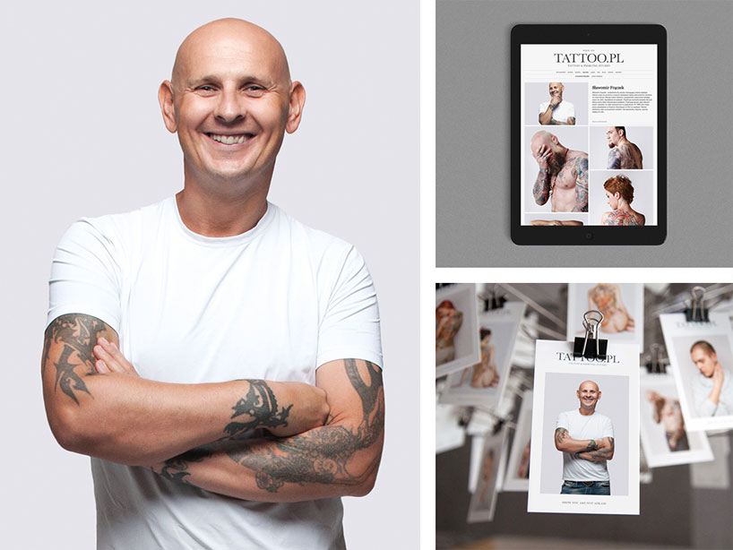
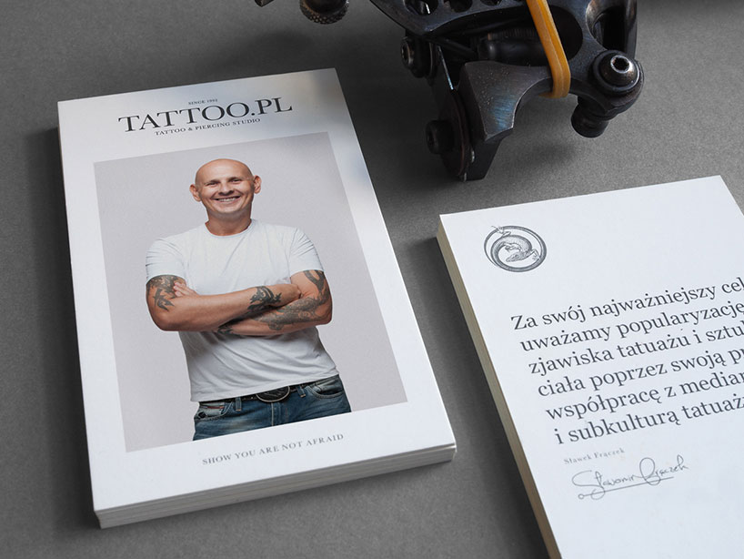
‘our main aim is to popularize tattoo and body art through our activity and cooperation with the members of the tattoo subculture,’ says sławomir frączek, owner of TATTOO.PL. the goal of the minima agency in turn was to express the salon’s cultural mission and philosophy, and was responsible for designing the communication strategy, key visual, CI, BTL marketing materials and the studio website.
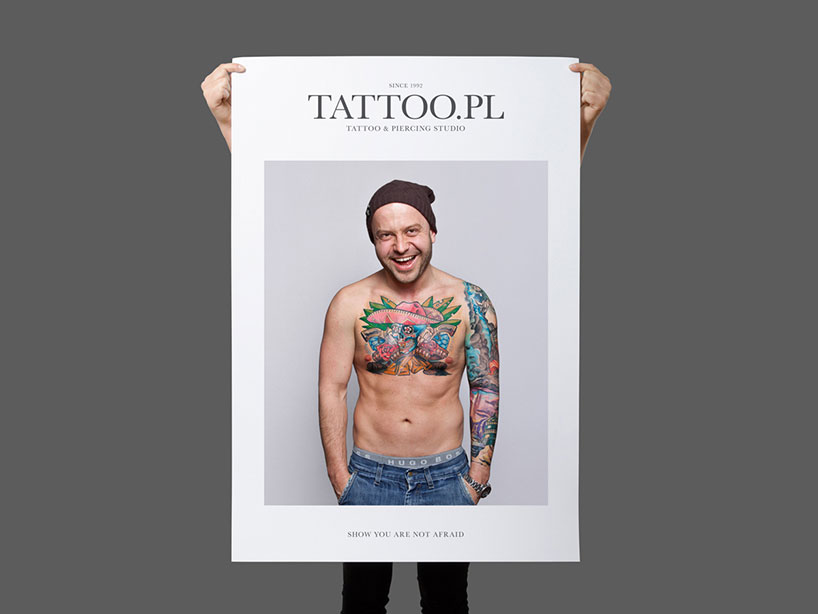
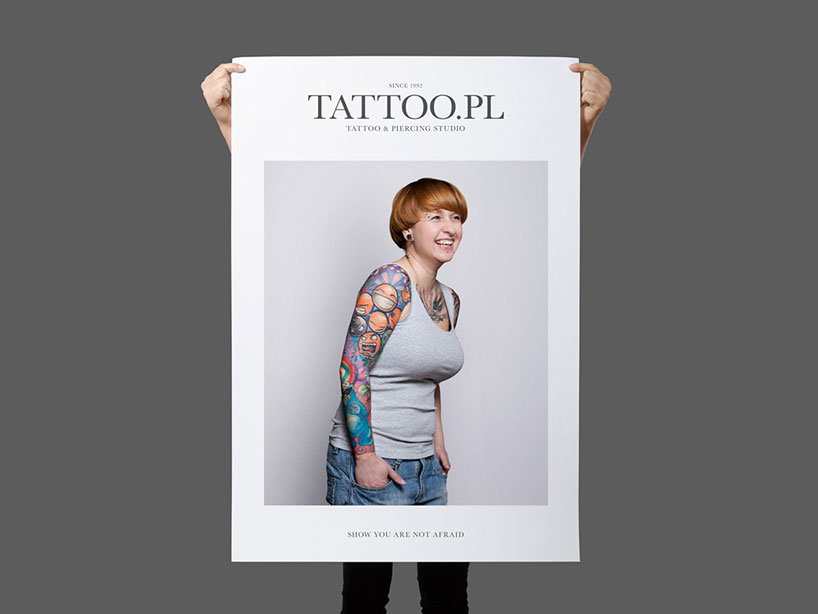
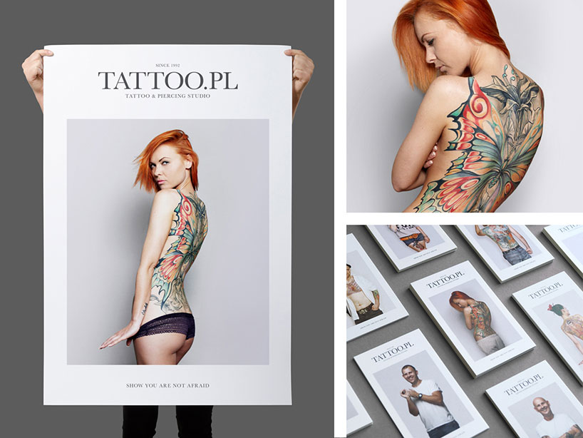
the new communication strategy and visual identity are far from the dark, stereotypical depictions of a tattoo studio. on the contrary, the design is simple and bright, with subjects presented on a backdrop of grey, white and black, holding aloft their smiling, intimate portraits. it’s a choice that’s more kinfolk than rolling stone, and succeeds in shining a thoughtful, uncluttered and meaningful spotlight on the tattoo and individual alike. minima’s design sweeps away the cobwebs surrounding society’s perception of what tattoos are, or what they represent, and suggests a more accurate, contemporary ideology based on artistry and self expression.
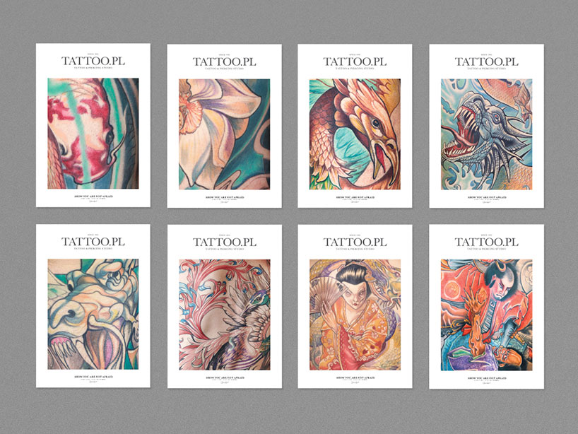
the images are framed using the passé-partout technique, where an image is mounted between glass and cardboard
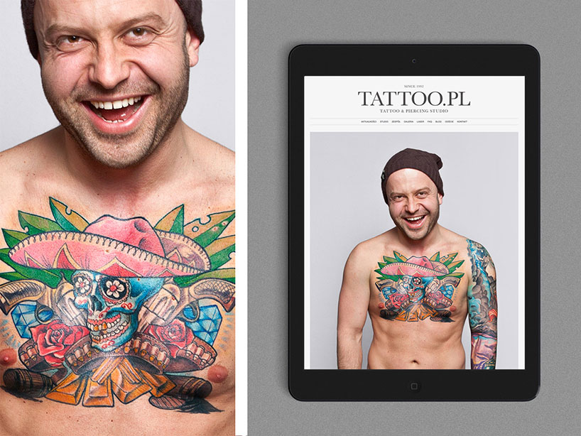
the idea is accentuated by the campaign’s tag-line, ‘show you are not afraid’, and encourages a change of perspective on tattoo culture. tattoos, despite their increasing popularity, are still widely stigmatized and are an ongoing source of employment discrimination. the collection also includes a set of close-up photos, highlighting specific instances of beauty from the assortment of tattoos featured, and elevating the pieces to their rightful place beside other forms of art.
the design is simple and bright, with subjects presented on a backdrop of grey, white and black
tattoos, despite their increasing popularity, are still a huge source of employment discrimination
minima’s design sweeps away the cobwebs surrounding society’s perception of what tattoos are, or what they mean
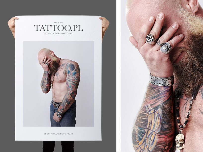
the images are simple, emotional, and intimate
the campaign aims to highlight the artistry of the tattoo, and its emotional relevance to the owner
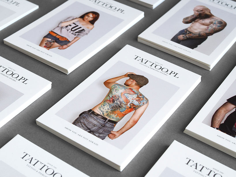
the aesthetic is more kinfolk than rolling stone
‘show you are not afraid’ encourages those with tattoos to display them proudly
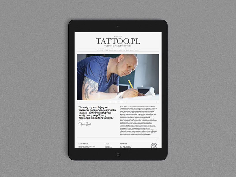
minima was responsible for designing the communication strategy, key visual, marketing materials and website
the collection also includes a set of close-up photos, highlighting specific instances of beauty
designboom has received this project from our ‘DIY submissions‘ feature, where we welcome our readers to submit their own work for publication. see more project submissions from our readers here.
edited by: peter corboy | designboom
TATTOO ART AND DESIGN (35)
 Jun 30, 2022
 Jan 21, 2022
 Oct 15, 2021
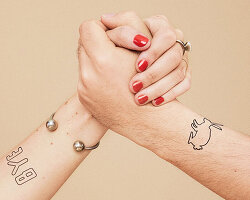 Jun 17, 2021
 Mar 14, 2021
PRODUCT LIBRARY
 Apr 15, 2024
 Apr 15, 2024
 Apr 12, 2024
 Apr 04, 2024