
diet coke has revealed its new fall aluminum cans designed by turner duckworth, which will be in US stores for only the next two months.
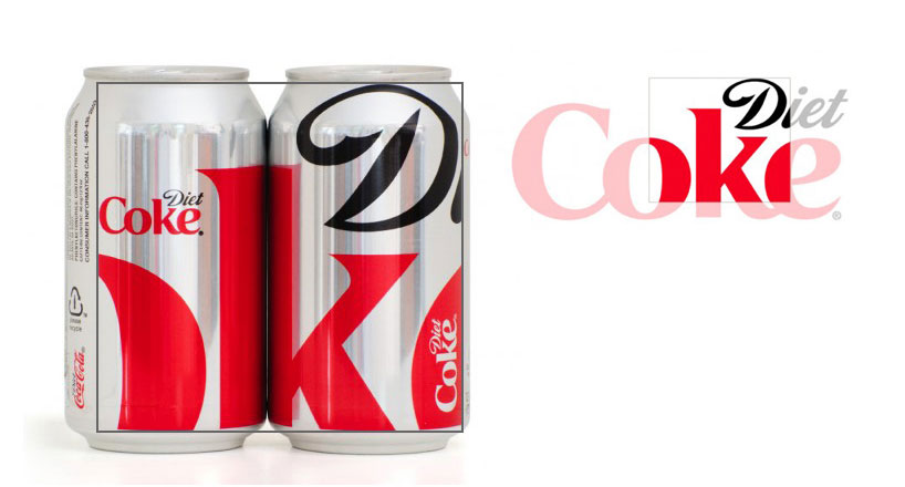 the standard diet coke logo is cropped to create a bold new graphic for the fall 2011 cans image – nfgraphics
— following text courtesy of diet coke / fast horse inc
‘the design, created by turner duckworth, features a section of the diet coke logo, cropped to feature the ‘D’ and ‘k’ set against the brand’s signature silver backdrop, creating a bold, tailored look for fall.’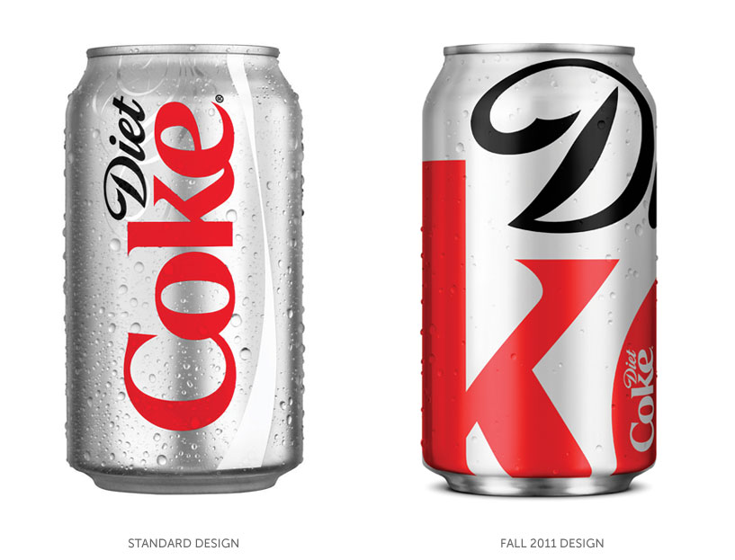
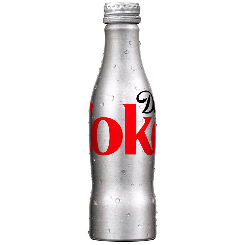 aluminum bottle
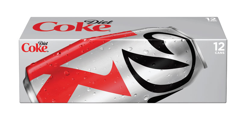 12 can box
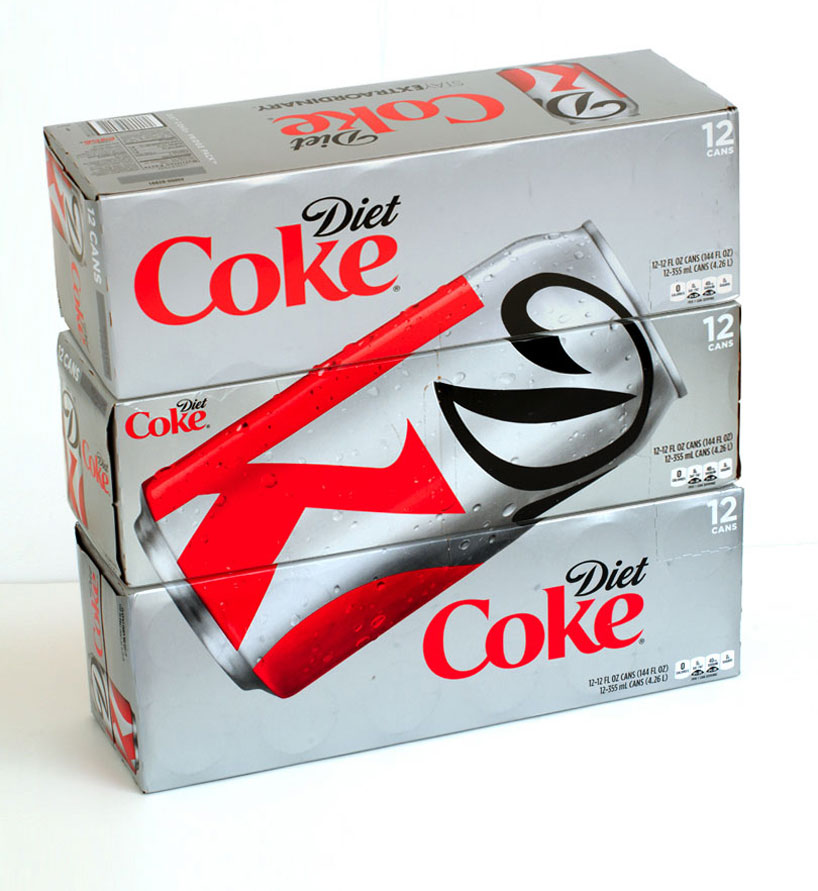 image – nfgraphics
the new can design will be available nationwide beginning september and only on shelves for two months.via brand new
KEEP UP WITH OUR DAILY AND WEEKLY NEWSLETTERS
LOGO DESIGN (244)
 Aug 14, 2023
 Aug 02, 2023
TURNER DUCKWORTH (4)
 Jun 23, 2008
PRODUCT LIBRARY
 Apr 17, 2024
a powerful symbol of the house’s cultural heritage, the jockey silk with colorful geometric motifs is an inspiration for leather goods and textiles.
connections: +670
 Apr 15, 2024
watch our livestream talk with BMW Design at 19:15 CEST on monday 15 april, featuring alice rawsthorn and holger hampf in conversation.
connections: +320
 Apr 15, 2024
the solo show features five collections, each inspired by a natural and often overlooked occurence, like pond dipping and cloud formations.
 Apr 12, 2024
discover our guide to milan design week 2024, the week in the calendar where the design world converges on the italian city.
connections: 49